The Brief:
Reposition the brand for a comeback.
What Actually Happened:
A complete brand system that fueled 4 new locations.
World Wrapps has been a Bay Area fixture since the early ’90s — pioneers of the gourmet wrap. In 2017, the original founders came back to take the chain forward. The challenge: prove that a 25-year-old fast-casual brand still has something to say.
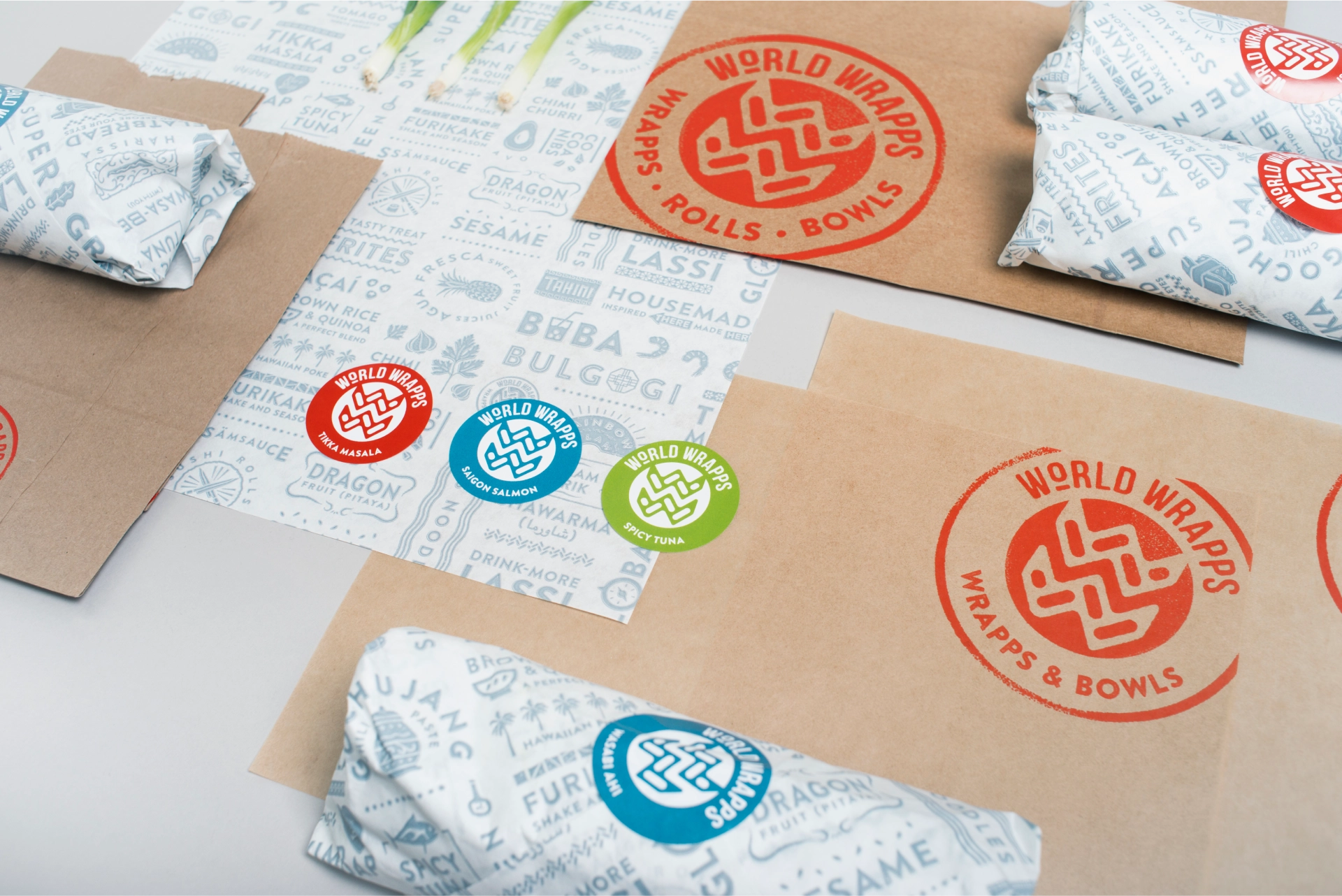
The repositioning centered on what made World Wrapps distinct in the first place — global flavors. We distilled that into a new tagline: Destination Flavor. Travel became the design language. The logotype’s stamped texture draws from street food signage and passport stamps. The color palette pulls from the spice and urban street markets.
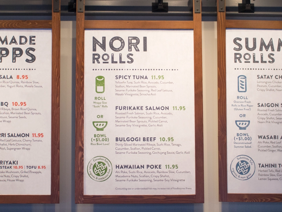
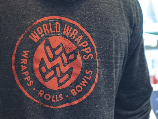
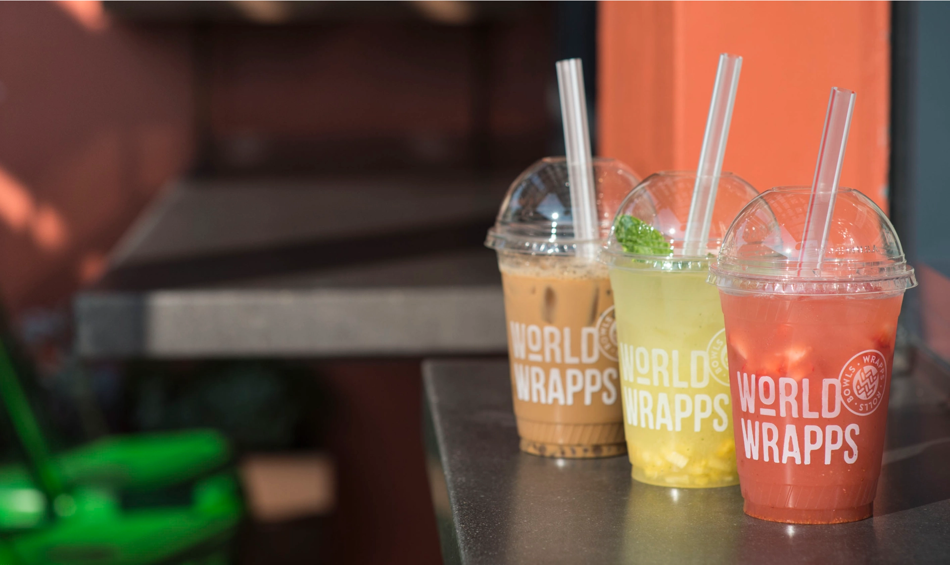
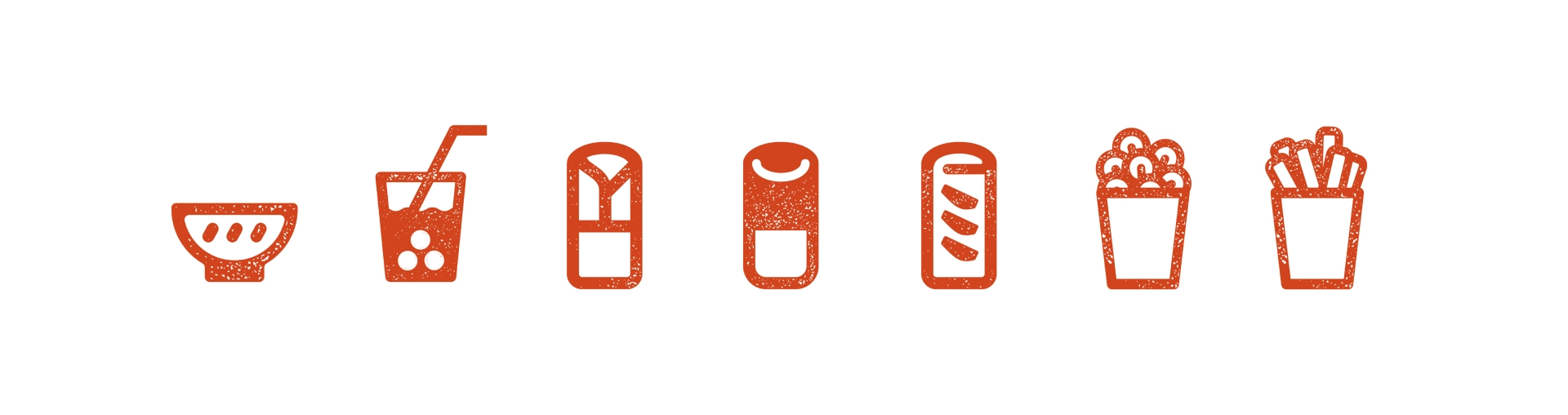
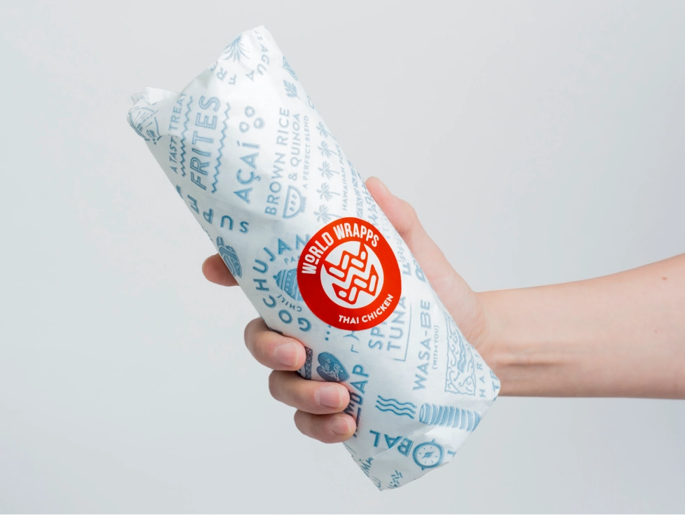
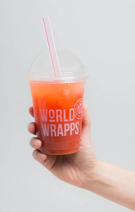
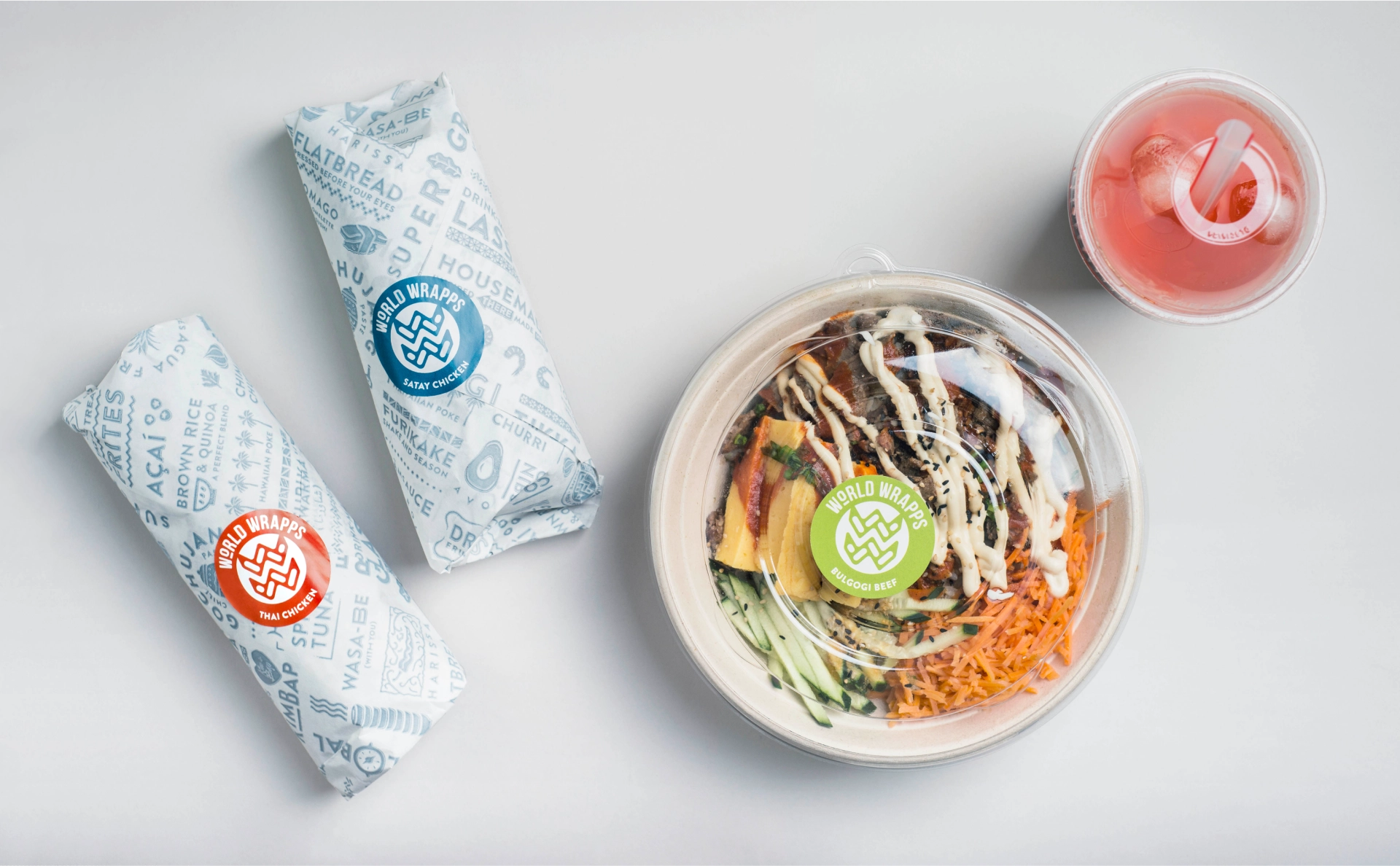
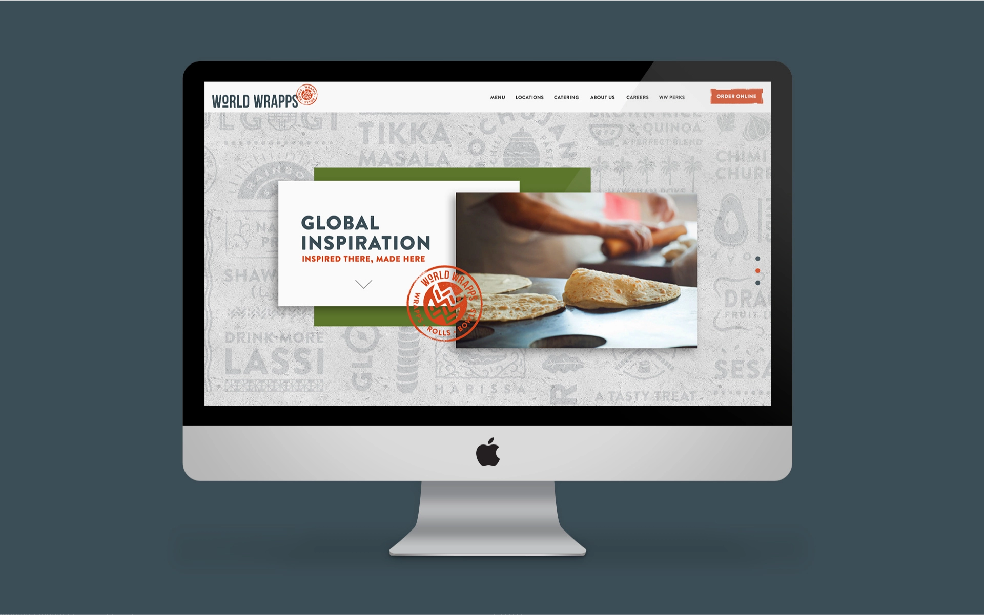
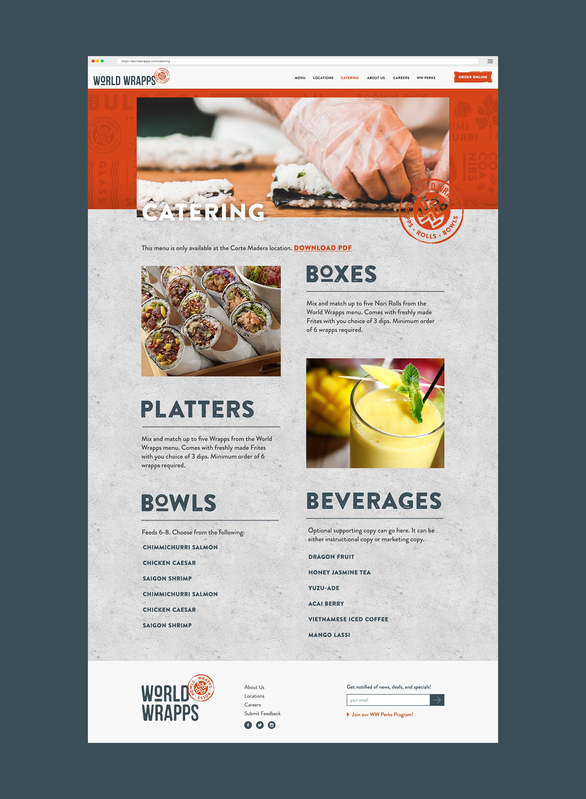
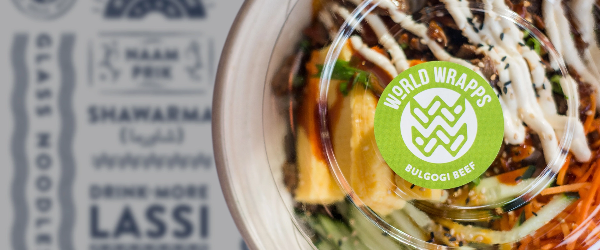
We carried the traveler’s experience through every touchpoint: branded cups, tray liners, wrapping paper for the rolls. A custom stamp-style icon set and pattern library rolled out across menu boards, interior decor, and staff uniforms. Then we built a website that told the story, integrated online ordering, and gave the brand a digital home that matched the physical one.
The system was built to scale — and it did. World Wrapps has since remodeled 2 locations and opened 4 new ones, all running the new brand system.