Objective
San Francisco General Hospital Foundation (SFGHF) is all about community. As part of our on-going partnership, they requested a fresh website that would honor existing donors, encourage participation from stakeholders across the community, and celebrate frontline workers dedication through the Covid 19 pandemic.
Strategy
Noise 13 utilized our foundational strategy work as part of their verbal reband project to inform this website redesign. We centered this around building a website that would take advantage of the important legacy they had built across the community by keeping design extremely straightforward and earnest. This strategy focused the usage of their brand toolkit, with only two primary colors and a few typefaces. This allowed the images of the people to stand out.
Design
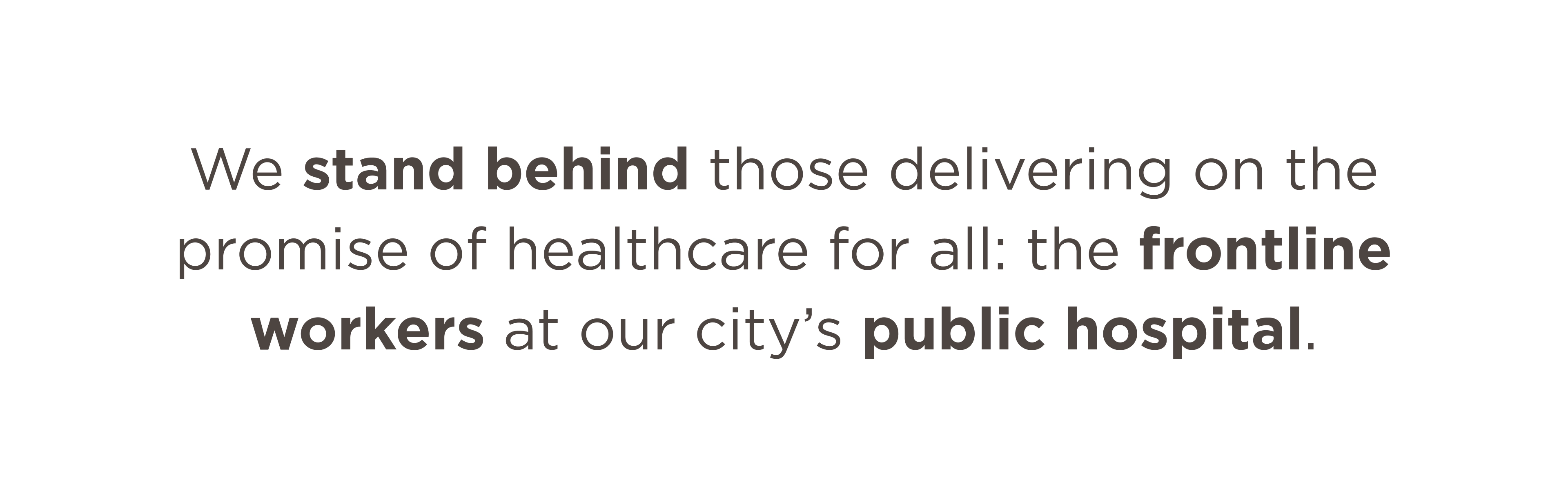
Noise 13 prioritized SFGHF’s eye-catching and action inspiring bright red across critical CTAs. With strategic use of this brand color we were successful in avoiding a splash of such an intense color asset while creating a strong user experience and navigation. Rather than defaulting to black, the warm gray was applied across all typography, rules, icons, primary navigation and secondary CTAs, which paired perfectly with their logo, giving visitors a strong, intentional brand experience.
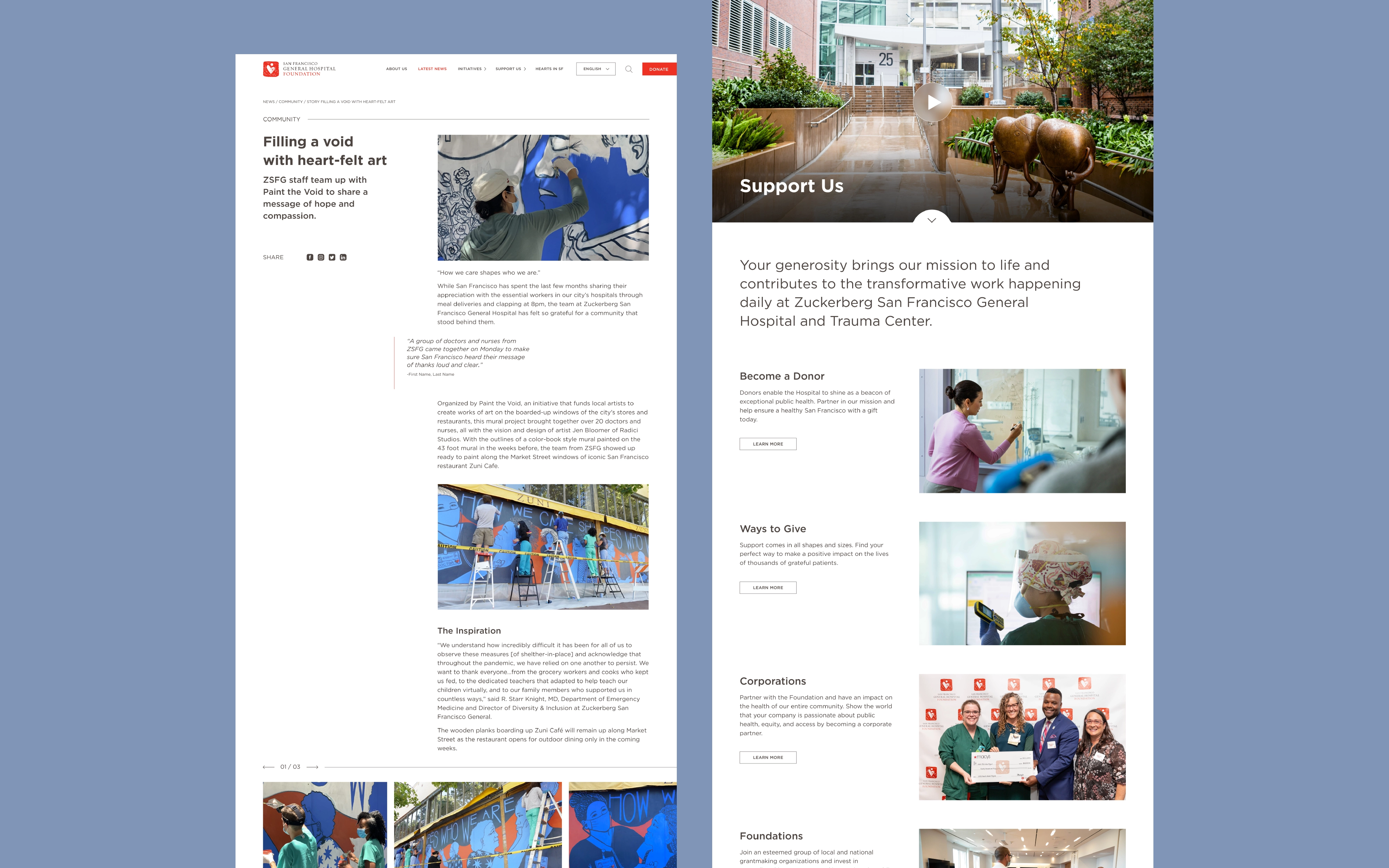
With the boundary lines of minimal design and brand icons, we were excited to create an ownable set of photography and a photo guide that would speak to SFGHF’s mission and help articulate their intention to always “have the back” of their care workers. With this “support point of view” approach to photography, the lens of the camera was always right behind the Frontline worker, creativing a behind the scenes, support perspective. This was a breakthrough in giving their photography an ownable, clear point-of-view, and marrying images to what they do.
Our previous brand strategy work gave SFGHF a succinct way to articulate their work, where donations are allocated, and why people should care. Noise 13 wanted to be sure these critical messages were represented well with large headlines and highlighted words for bigger impact even with a quick skim of the contents.
For ease of use and future updates, Noise 13 worked with development to ensure a more modular structure, allowing the client to drag-n-drop how they’d like to prioritize all they have to communicate throughout the year. Noise13 wanted to be sure the foundation’s staff had the flexibility to make the most of donor opportunities as they arise.
Value
Noise 13 was proud to help create a brand experience that felt more confident, clear and critical. We delivered on the challenge of not alienating the older donor base, while still feeling fresh and important enough to attract the attention of an entirely new and younger demographic of philanthropists. Most importantly, we were concisely communicating what the foundation did. giving all donors an easy way to support SFGHF’s work.