Objective
OSO Ferments is so much more than a CPG company offering functional products. They are historians, and scientists, and deeply passionate about good food being beneficial to your entire system. The opportunity was to craft a brand personality, and design a visual identity and packaging system that would break through the noise in the functional beverage vertical.
Strategy
Our brand strategy and messaging phases focused on communicating the deeply complex story of the founder, their passion for fermented foods and adaptogens, and OSO’s truly exemplary approach to flavors and technique.
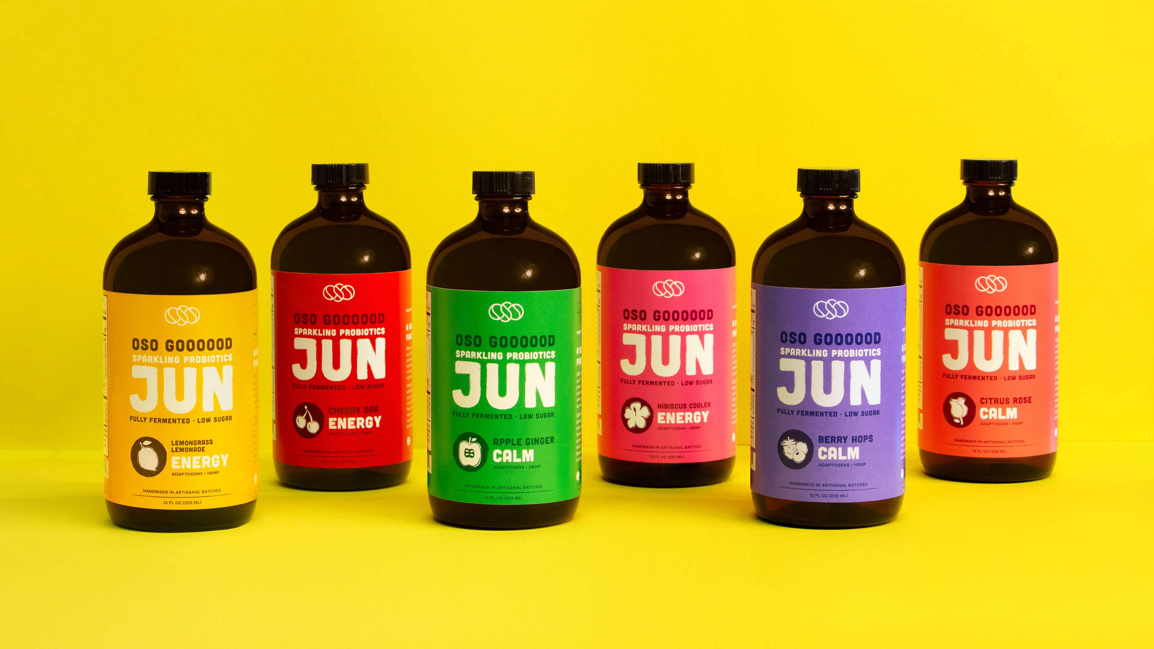
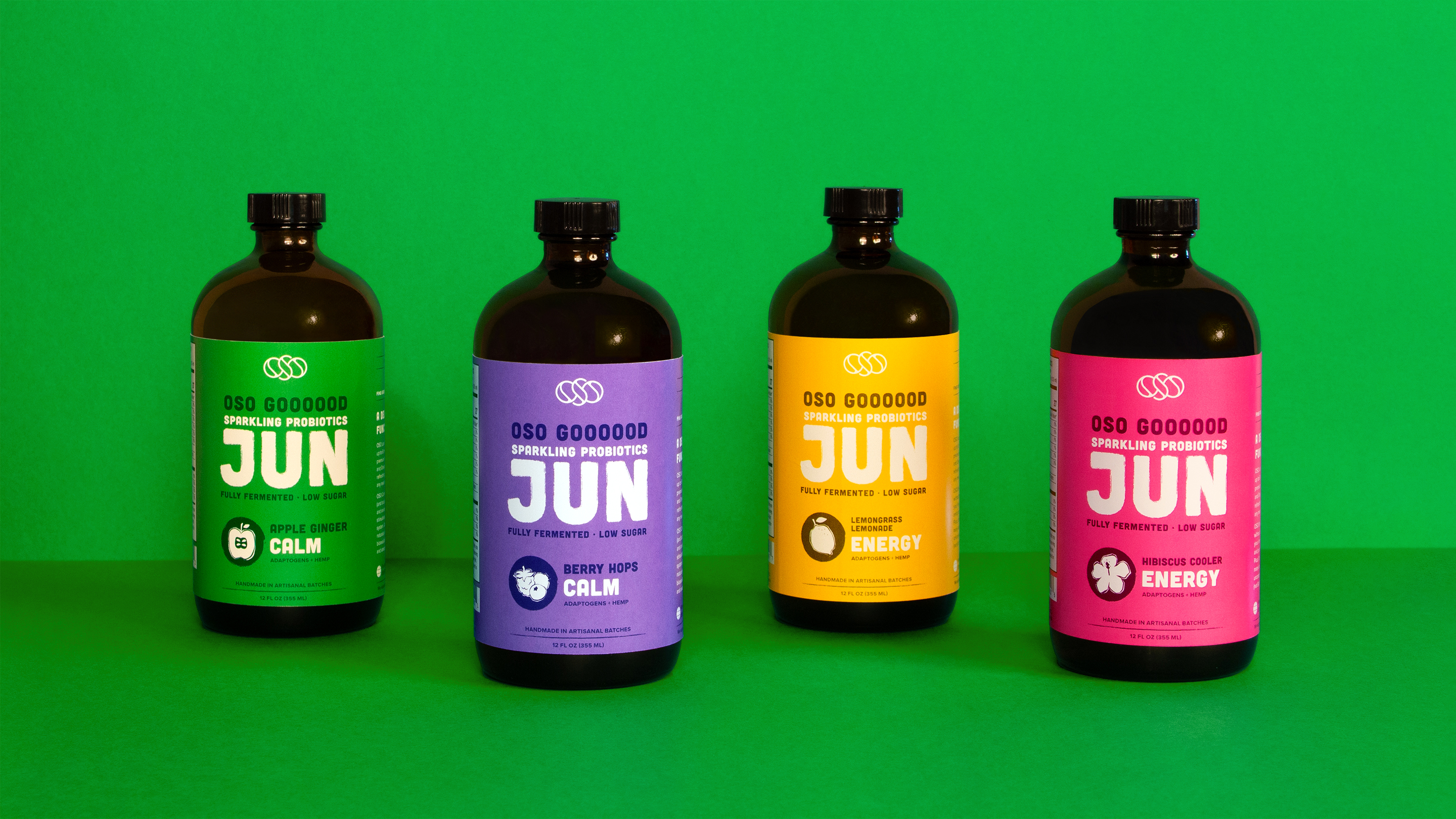
With so many stories to tell, we needed to prioritize information on the product label to be communicated quickly. Messaging highlights essential facts for simple customer consumption and understanding.
Design
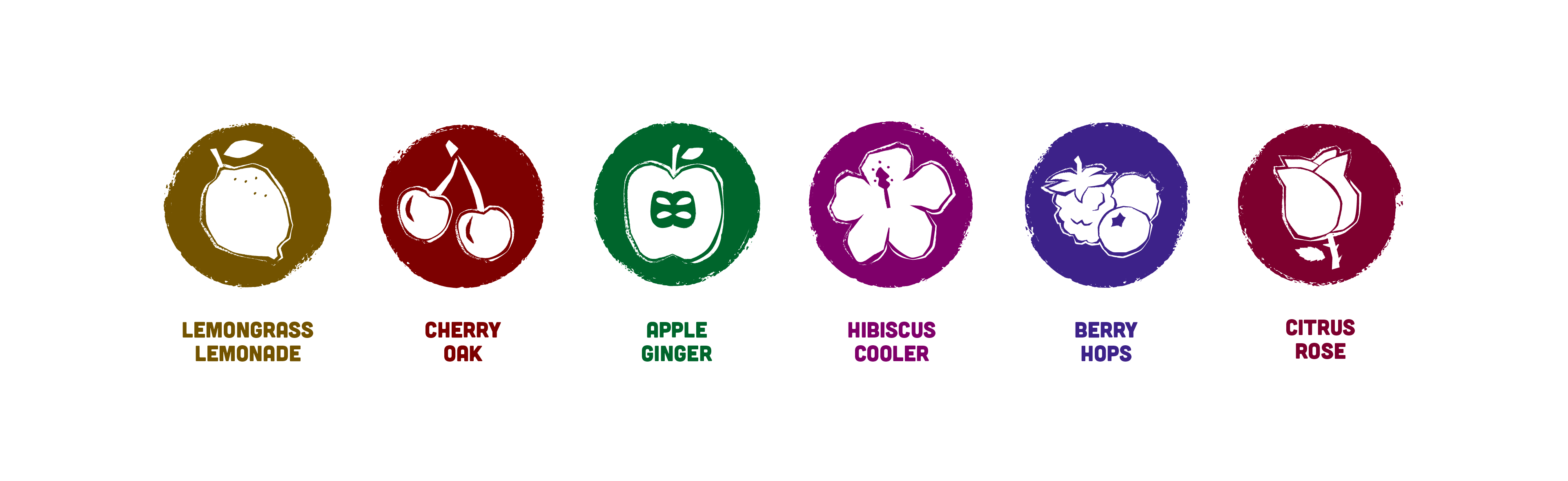
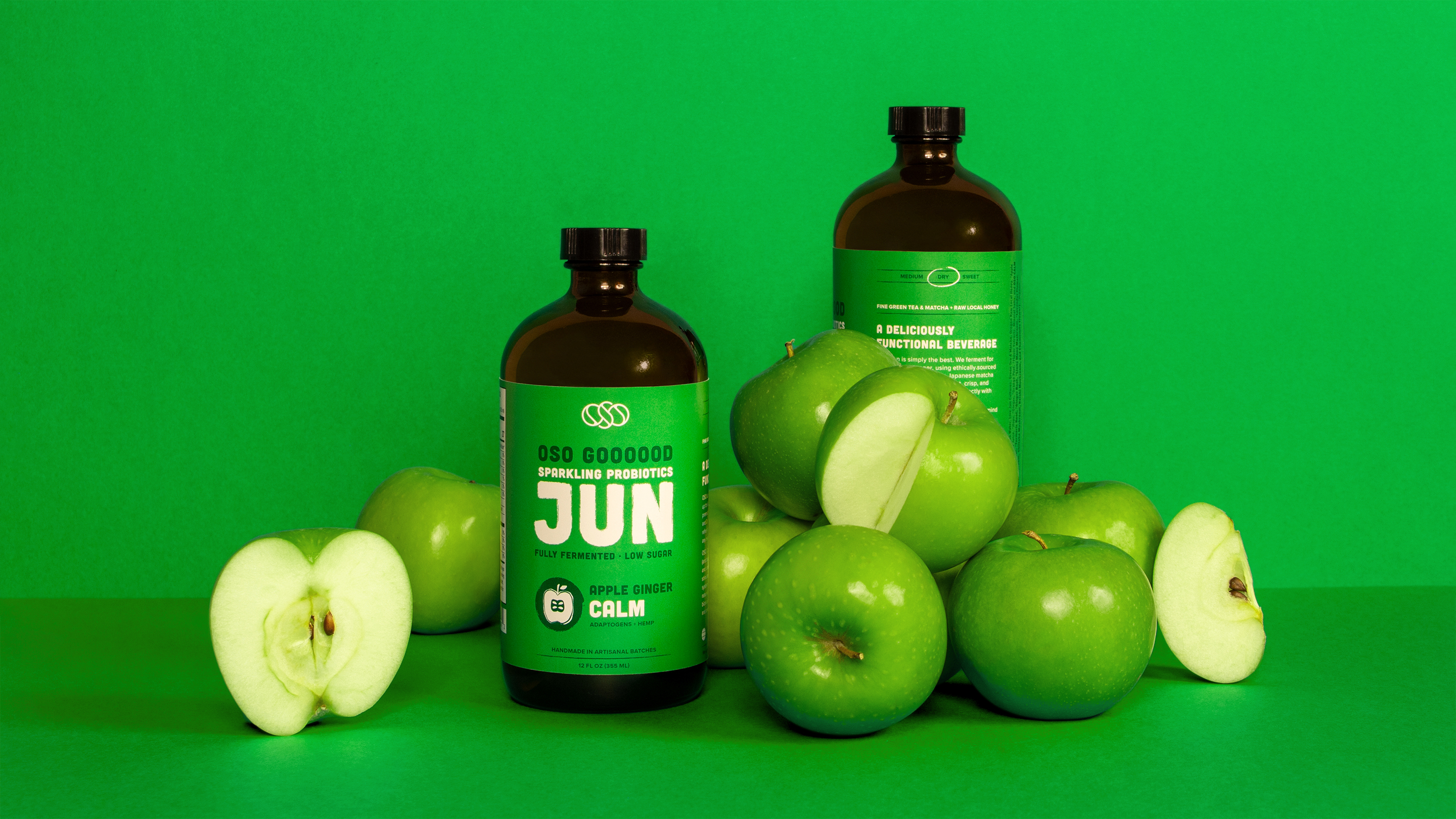
The Oso Jun is the first of many products that can be created with their functional ingredients. We designed a typographical approach that would allow us to entice consumers with the flavors and left space in the system for product variation. From custom illustrations denoting ingredients to typography hierarchy communicating the layered story of craft and product function, the OSO packaging is a bold and delicious shelf statement.
Value
Standing out from the crowd and functional beverage pretenders, OSO’s identity, visual design, and messaging strategy were born from strategy, research, and a customer-based approach. Emboldened by these tools, OSO Ferments can now consistently and clearly articulate how their highly functional and beneficial products are the ones you need.