Objective
Galvanize and Hack Reactor tasked us with bringing the two distinct brands together to gain recognition as a family of brands vs separate entities. The brand hierarchy and the visual update was set to signal company growth and celebrate Galvanize as a leader in education.
Strategy
One company with two halves, the Hack Reactor side was getting most of the brand recognition as the consumer facing entity. While Galvanize, as the parent company, was known mostly to corporate and government partners. We heard from our Discovery & Audit findings that a drastic change to logo identity would cause a disconnect from loyal alumni, but the two entities needed to unite to strengthen recognition across services. Unified messaging, tone, and a single master brand platform started the transformation.
Design
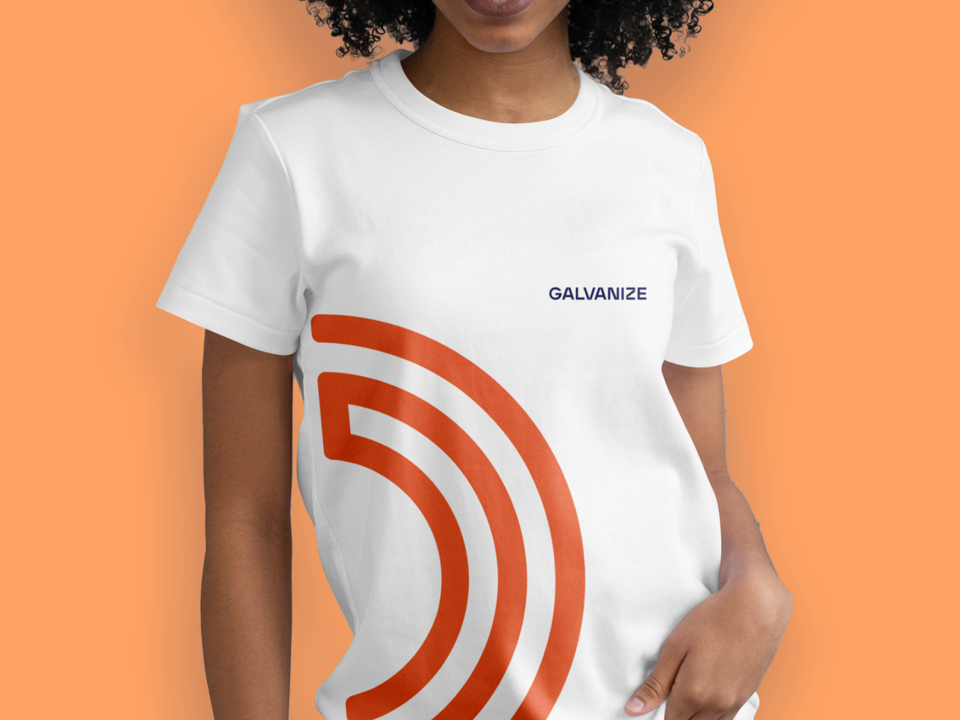
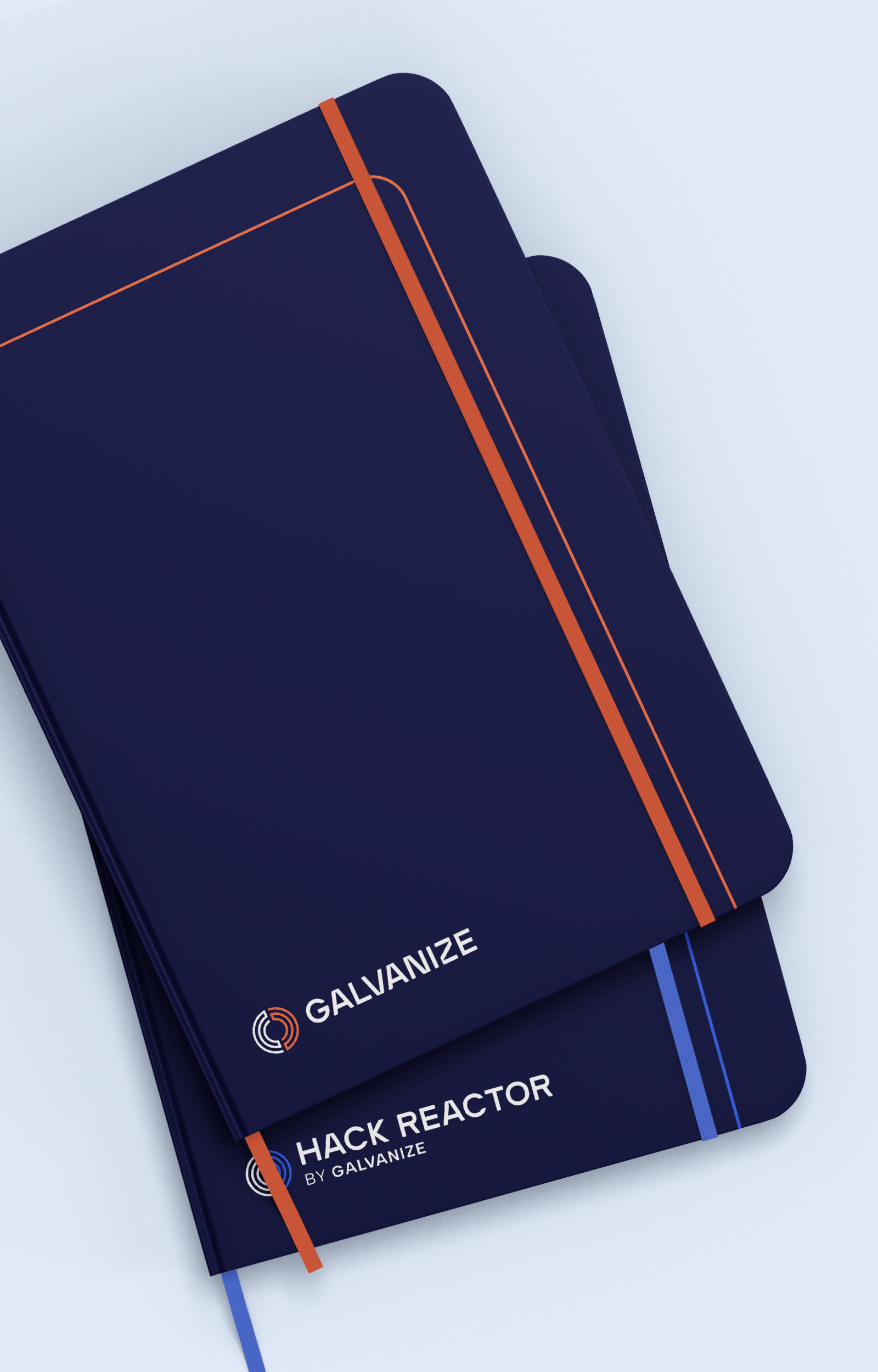
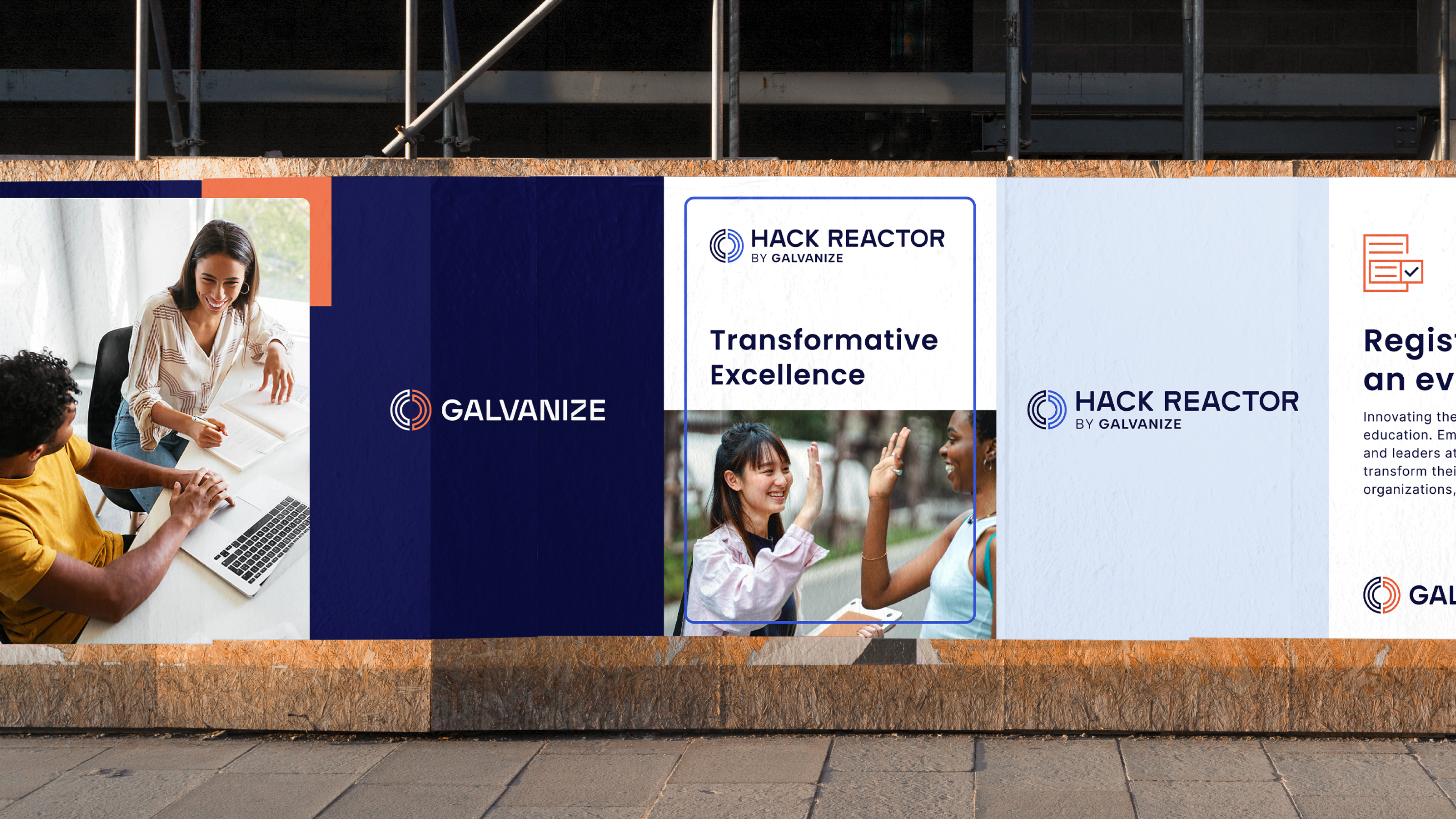
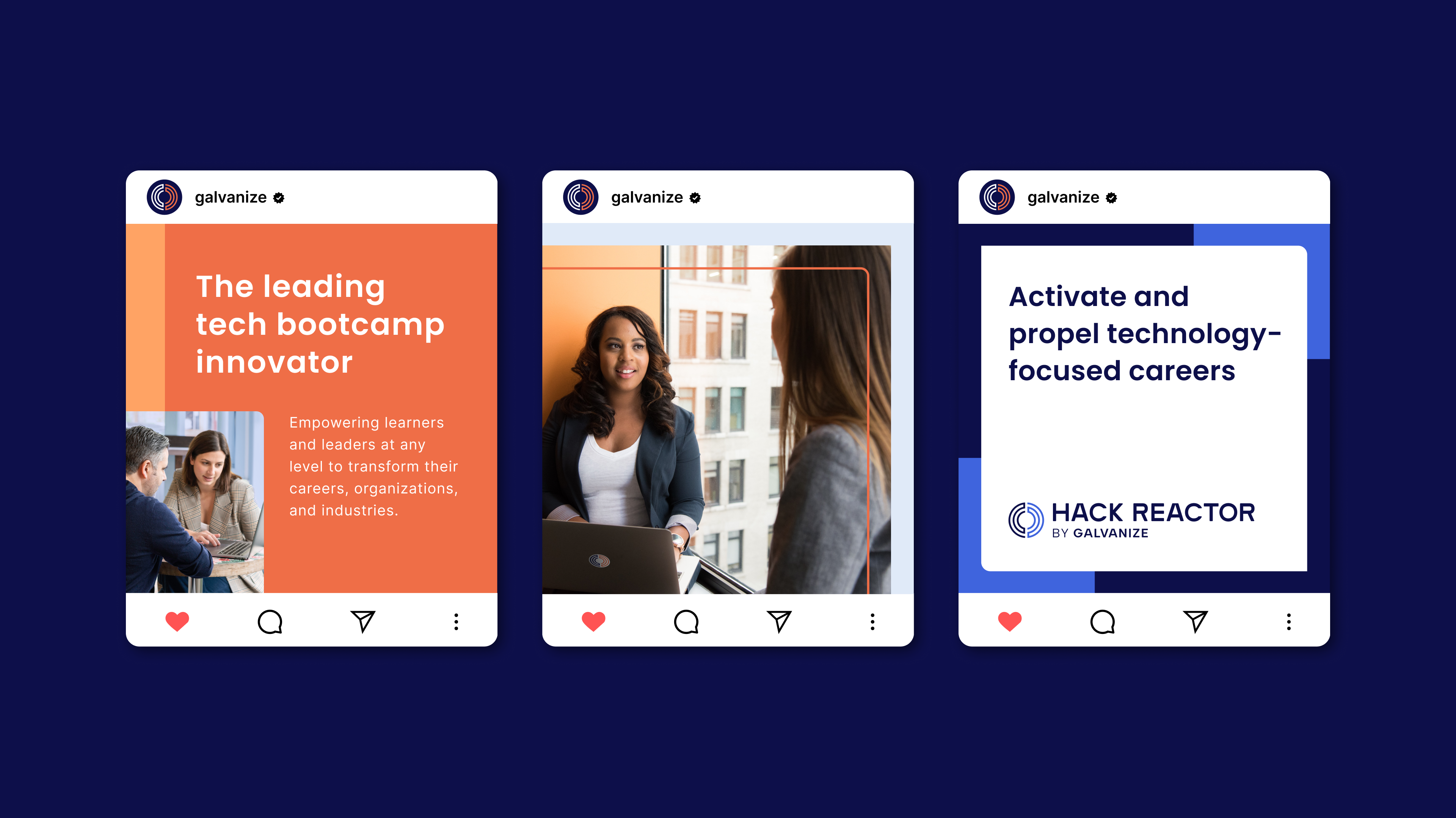
While in search of a system that updated both brands and connected them as a family, we tested completely new identities vs. existing ones, and explored updated colors in lieu of a completely palette. Due to our findings in the earlier phases of strategy and client research, we decided to use the Hack Reactor logomark as an unifying symbol due to their audience’s visual recognition.
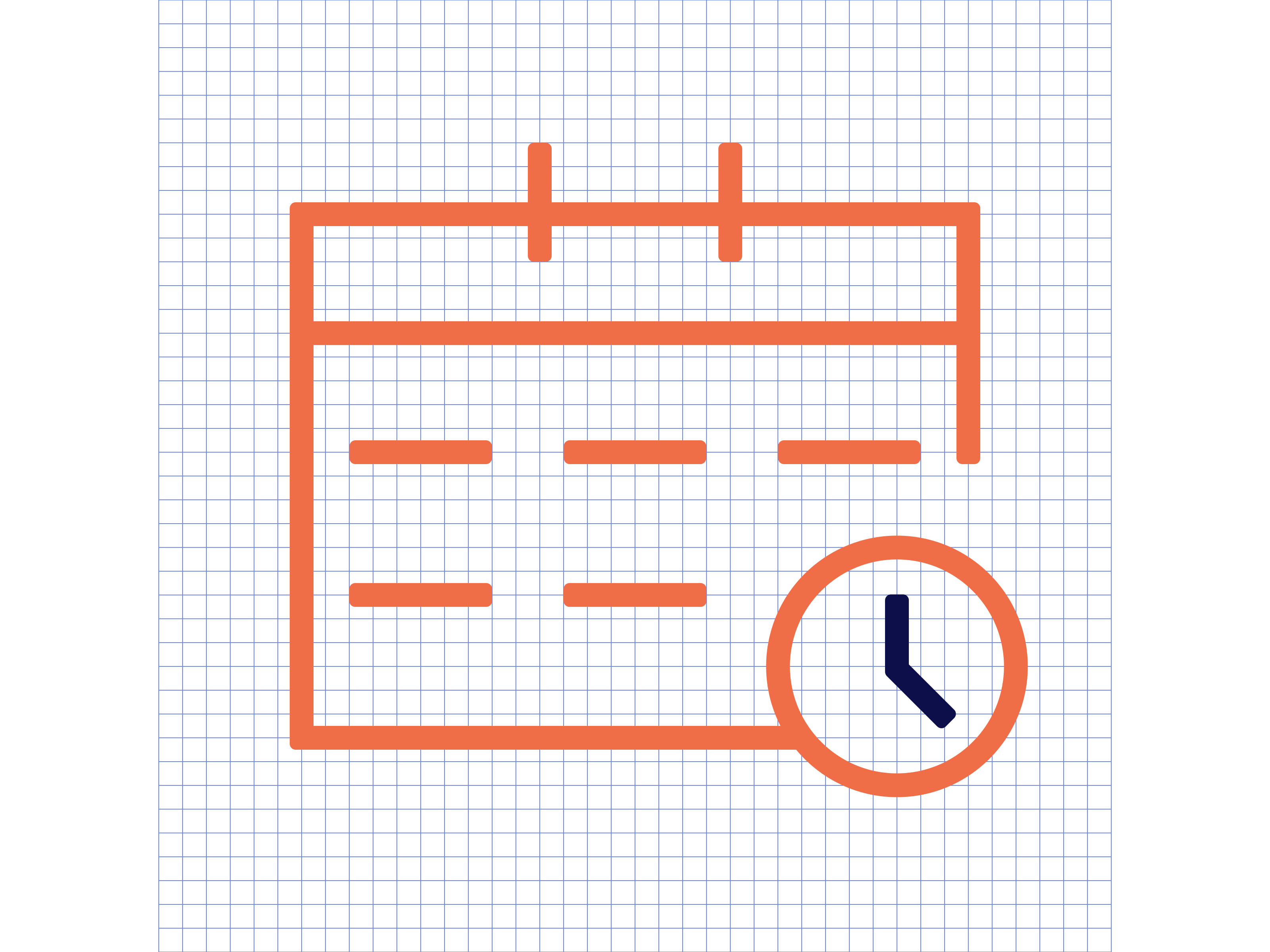
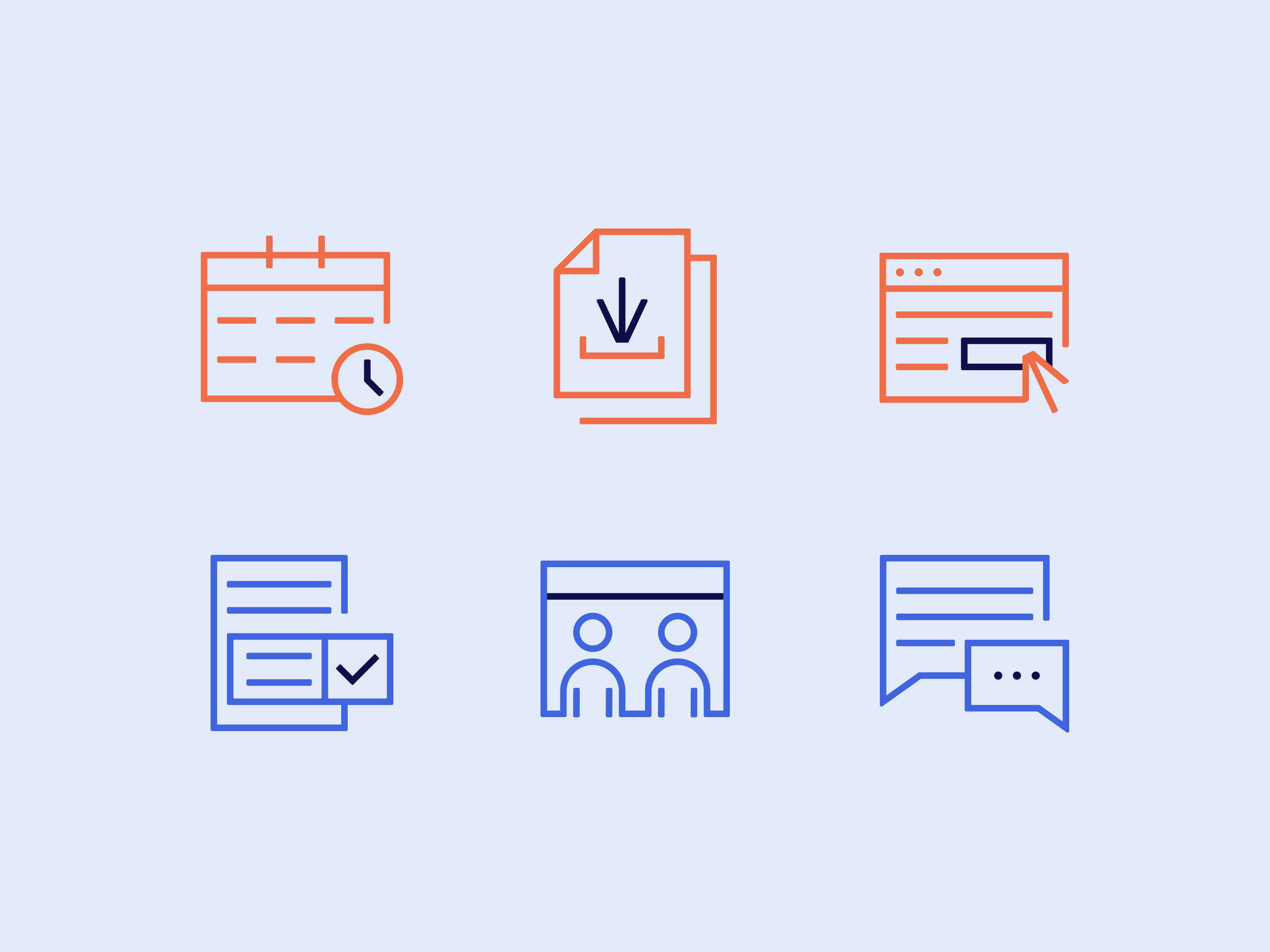
We developed an identity system that leveraged both brands’ equity through color. We also built out an identity system of graphics, icons, and a photo style that could be used in both color palettes to further connect the family of brands.
Value
Through strategic messaging and a system that united both companies visually, we succeeded in maintaining Hack Reactor’s and Galvanize’s long-earned equity as leaders in tech education. The brand guidelines we created with creative direction given to the Galvanize team, supported other partners in building out the new website, and will support the internal teams in their marketing efforts as the company grows.