The Brief:
Refresh the food packaging to align with the Mangia! emotive connection.
What Actually Happened:
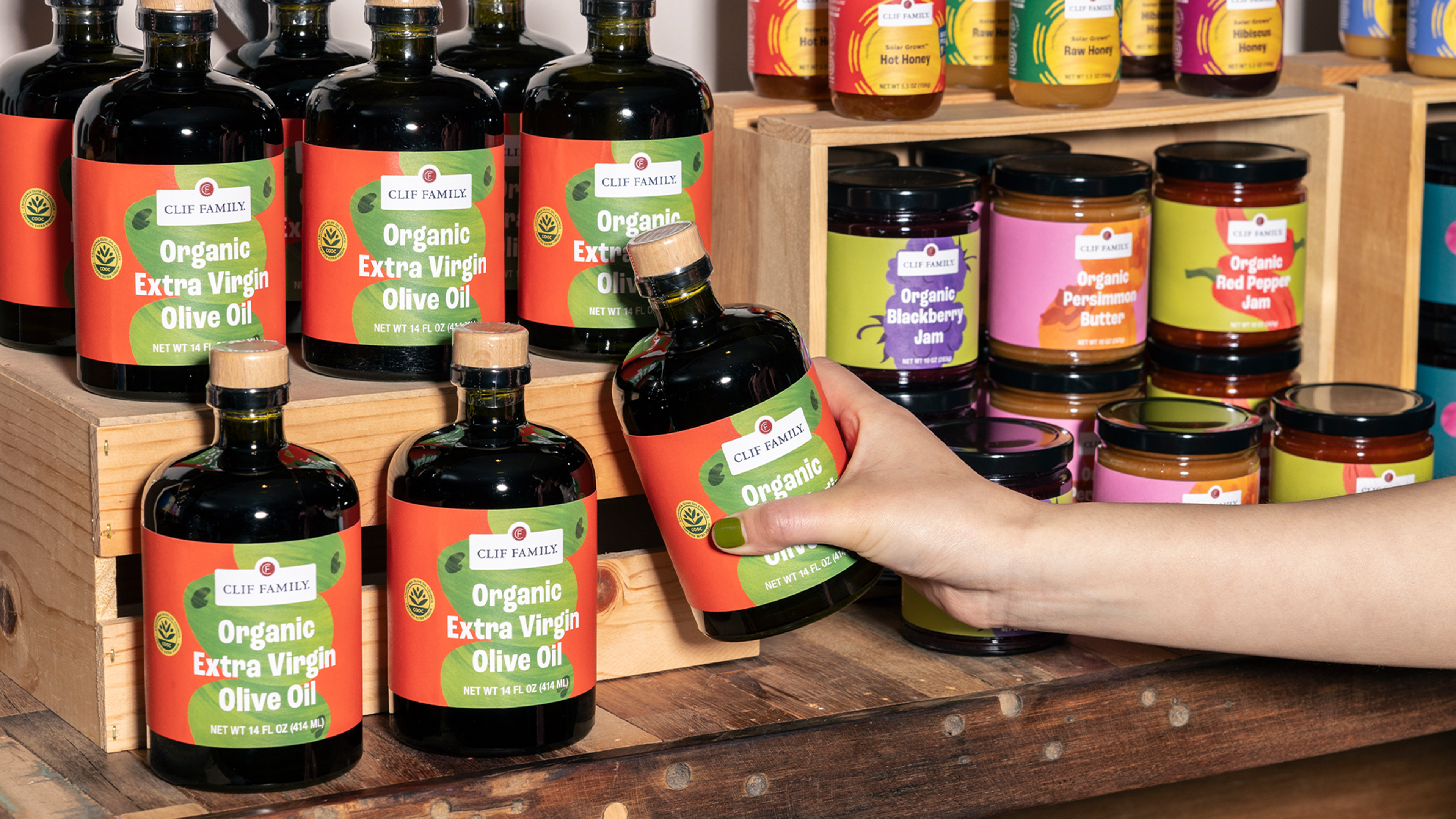
Building a visual system that had to work everywhere.
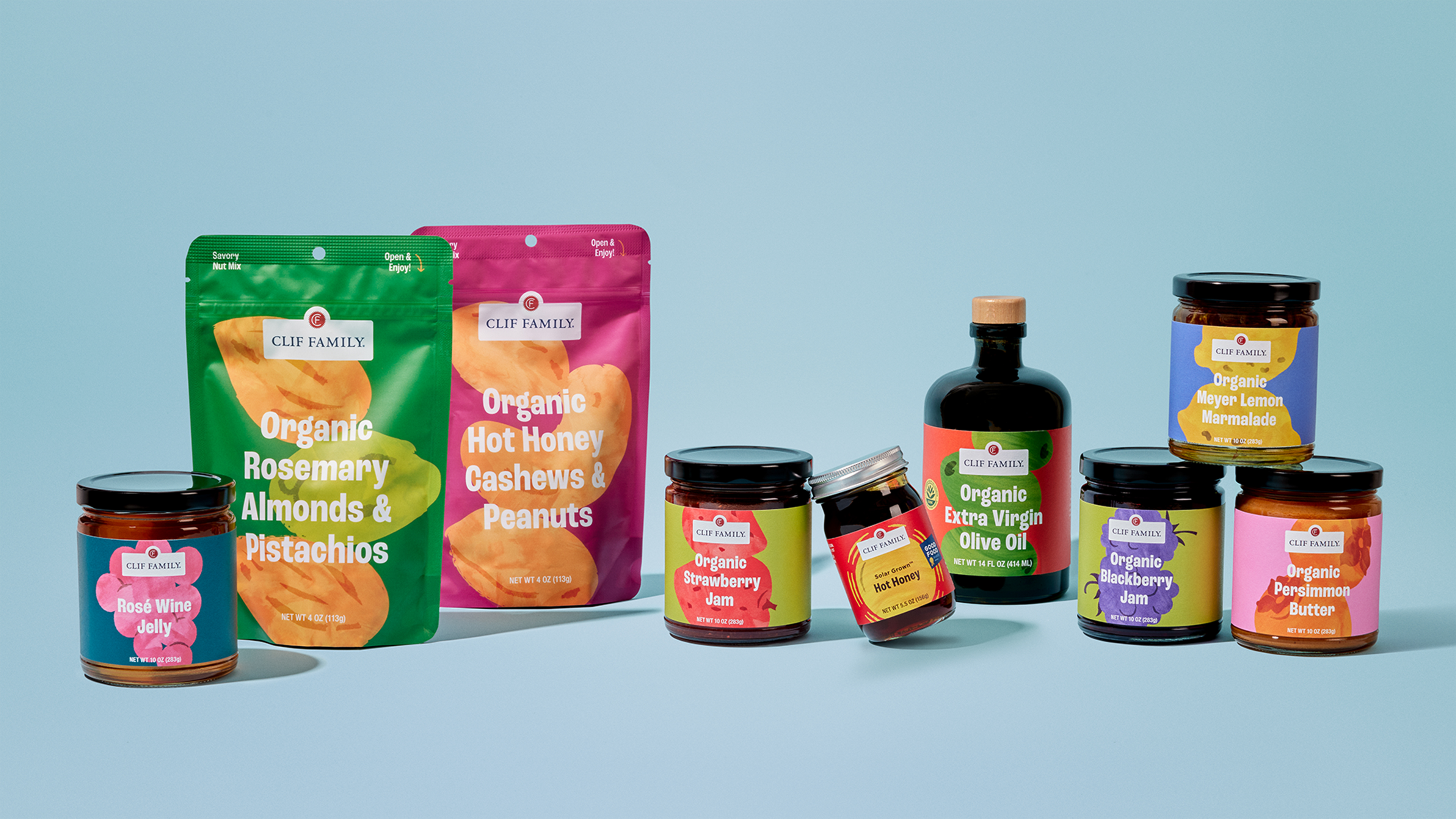
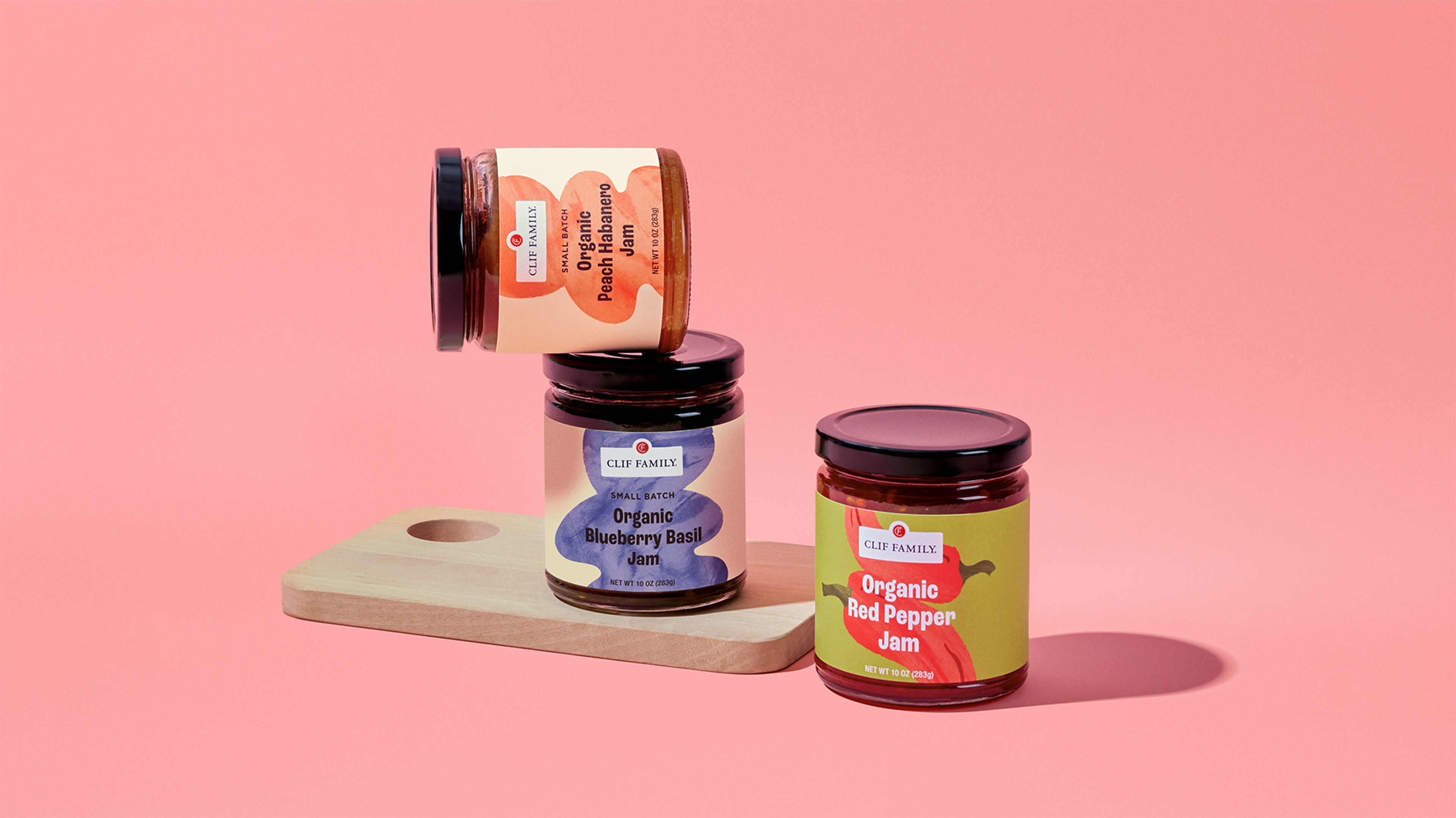
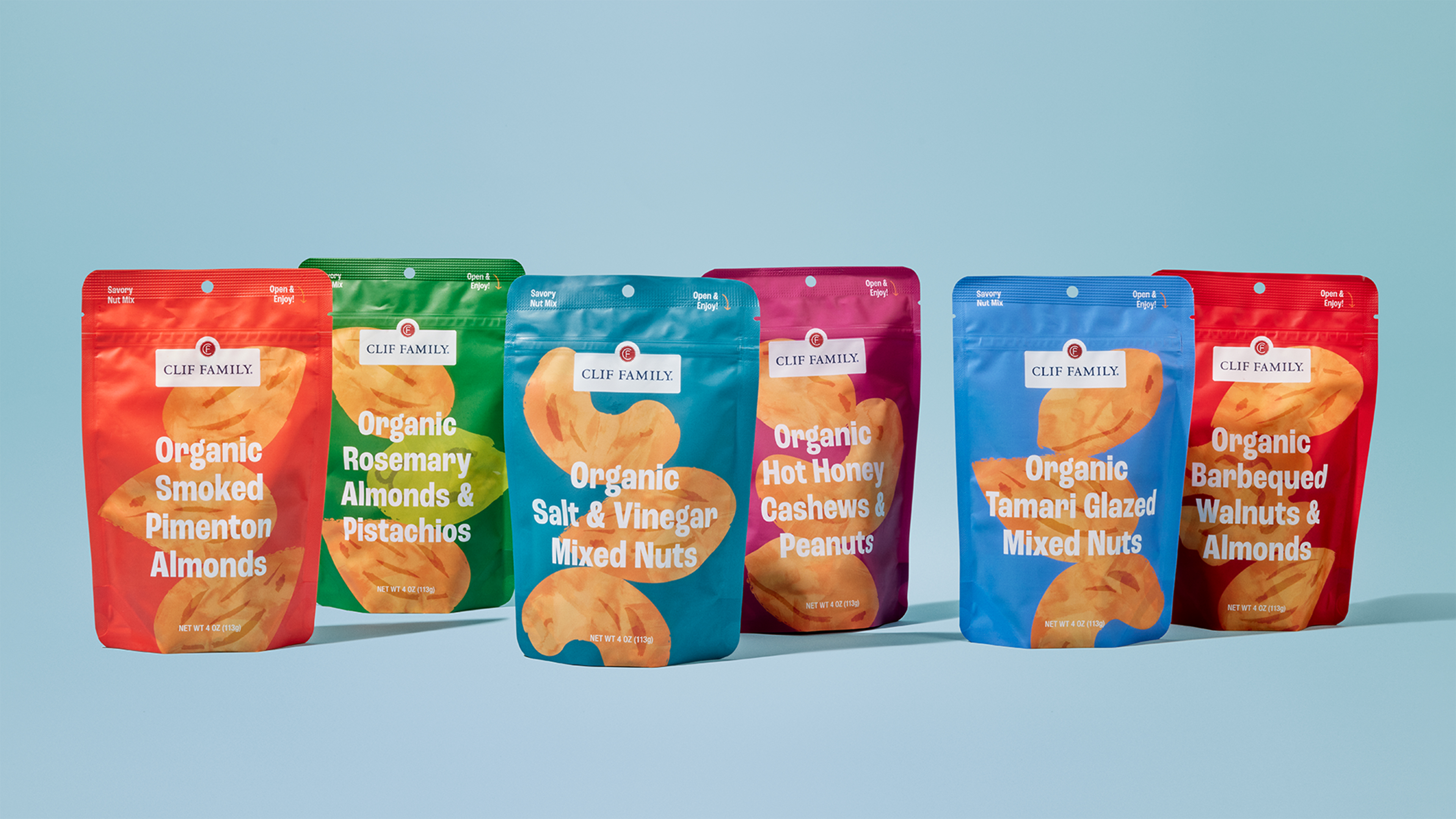
Clif Family didn’t just need new packaging that aligned with their sustainability goals. They needed a system — one that could navigate between product lines, hold its own on specialty grocery shelves and airport kiosks, and still feel like the same brand you’d find in their Napa Valley tasting room. This update stemmed from the Mangia! project and the need to bring their unique brand personality to life.
As fellow B Corps, we didn’t need to convince each other that sustainability mattered. The audit focused on the harder question: how do you make packaging that’s honest about its ingredients, clear in its hierarchy, and bold enough to compete at retail — without losing the artisanal craft that makes Clif Family worth buying in the first place?
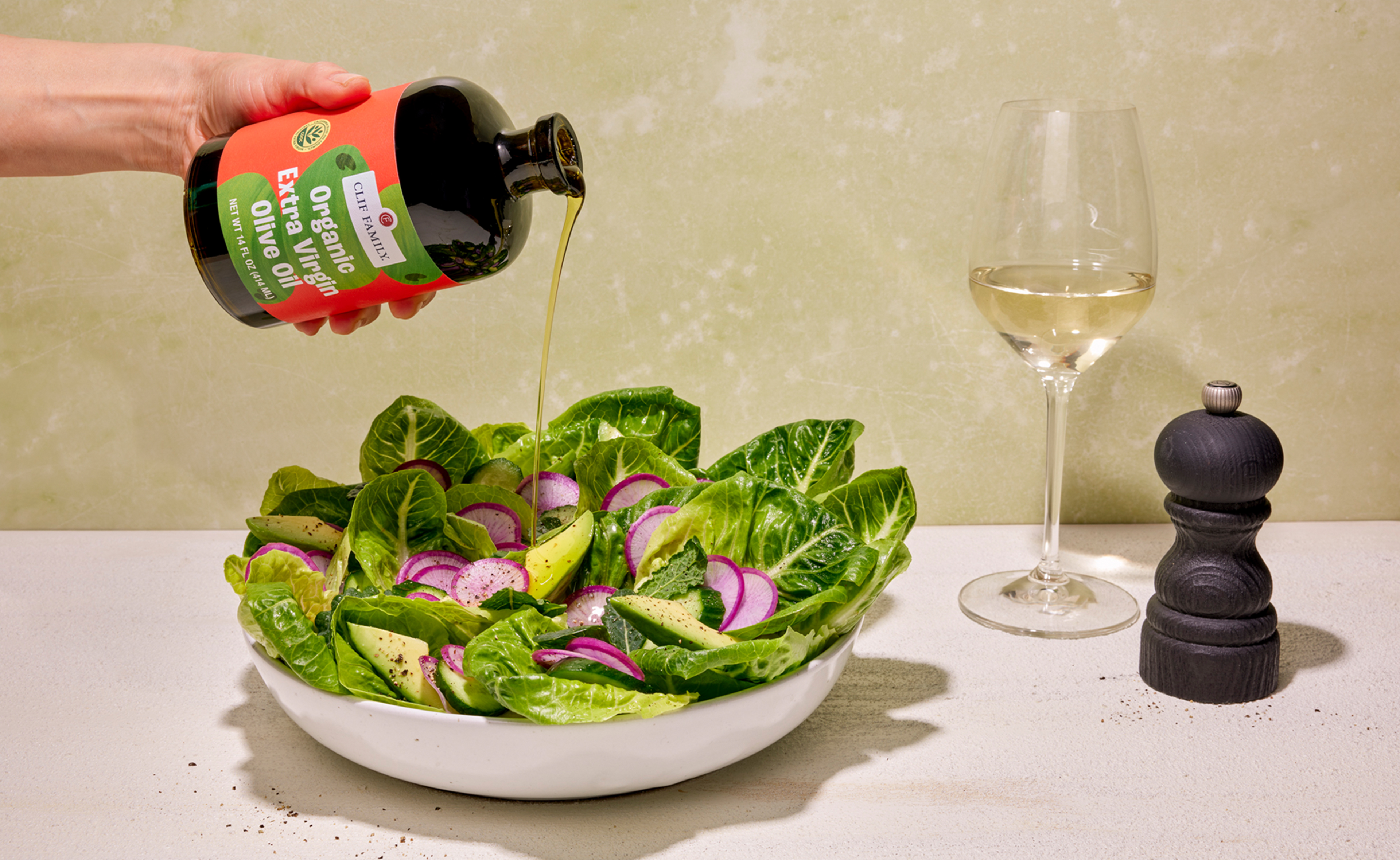
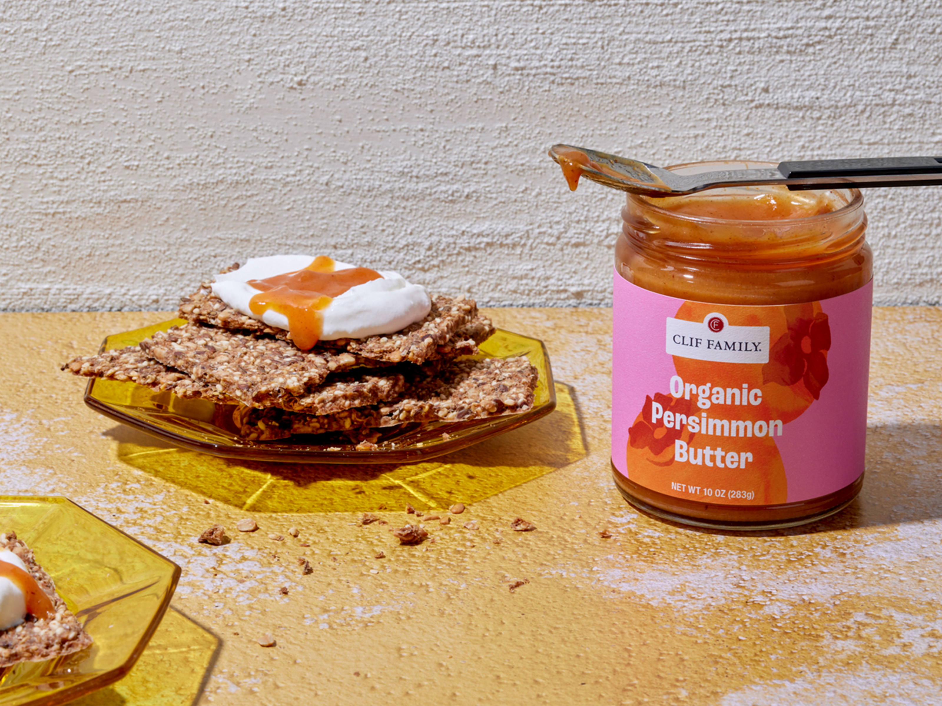
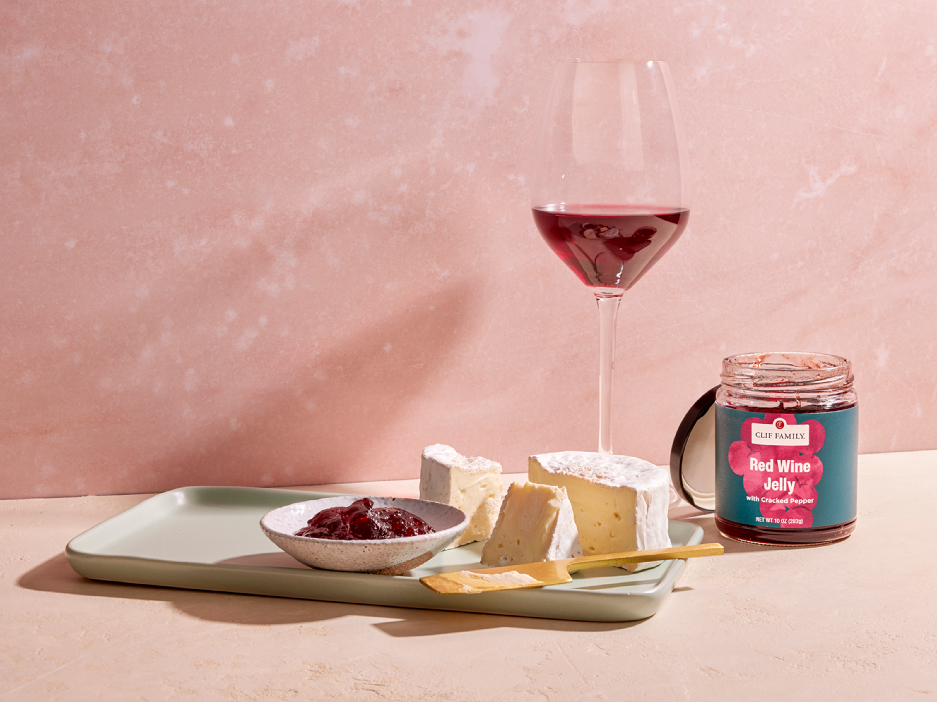
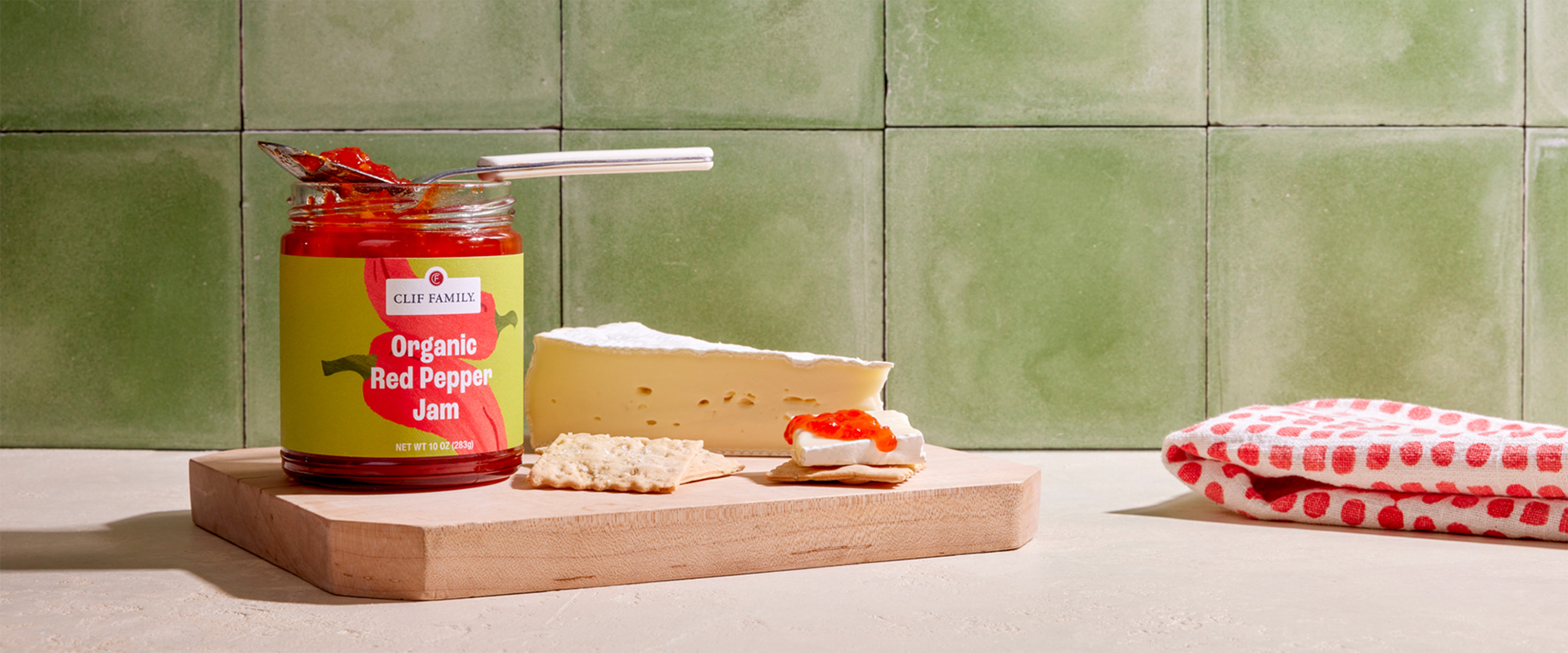
The answer was a design system: color palettes and textural illustrations that hero the actual ingredients — citrus, nuts, olives — bold typography that was readable in retail, and photography guidelines that brought the same brightness to every touchpoint.
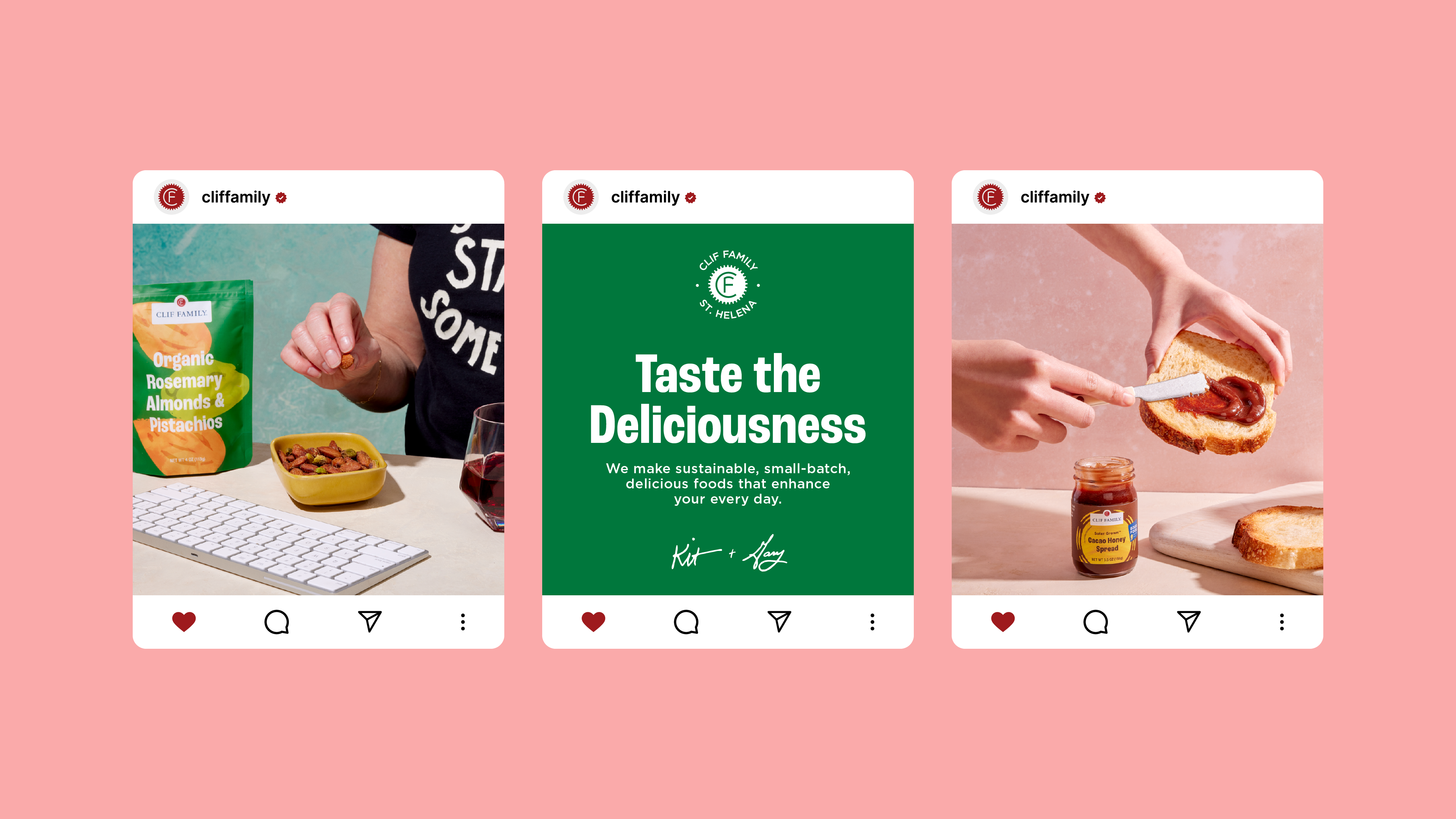
The result became the visual foundation for more of the brand experience: the website, the wine labels, and ultimately an identity update.
With the design, the products are now featured at Erewhon, SFO, and many other quality retail locations.