Objective
Julia Street is the founder and maker of J. Street Chocolate. We initially discovered her in our search for a custom holiday gift for clients and were thrilled to support her packing and identity update as she grows her business.
Strategy
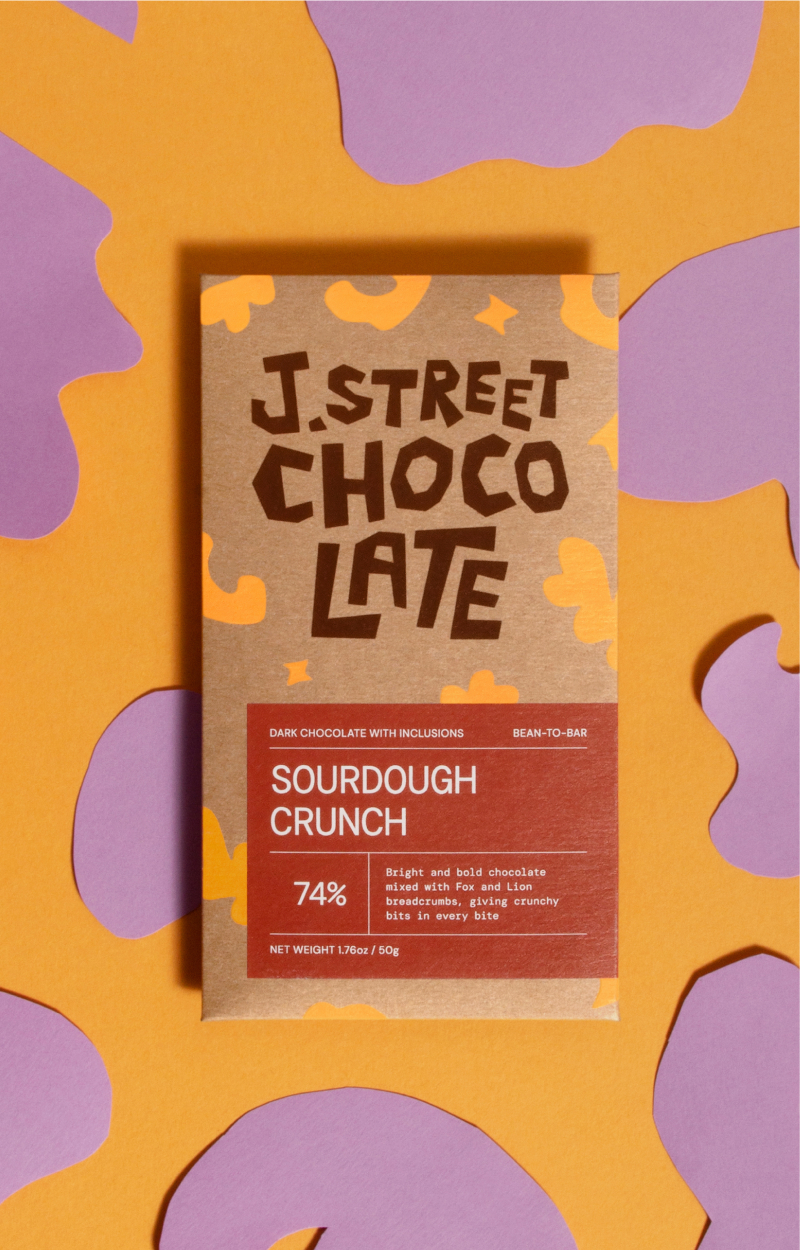
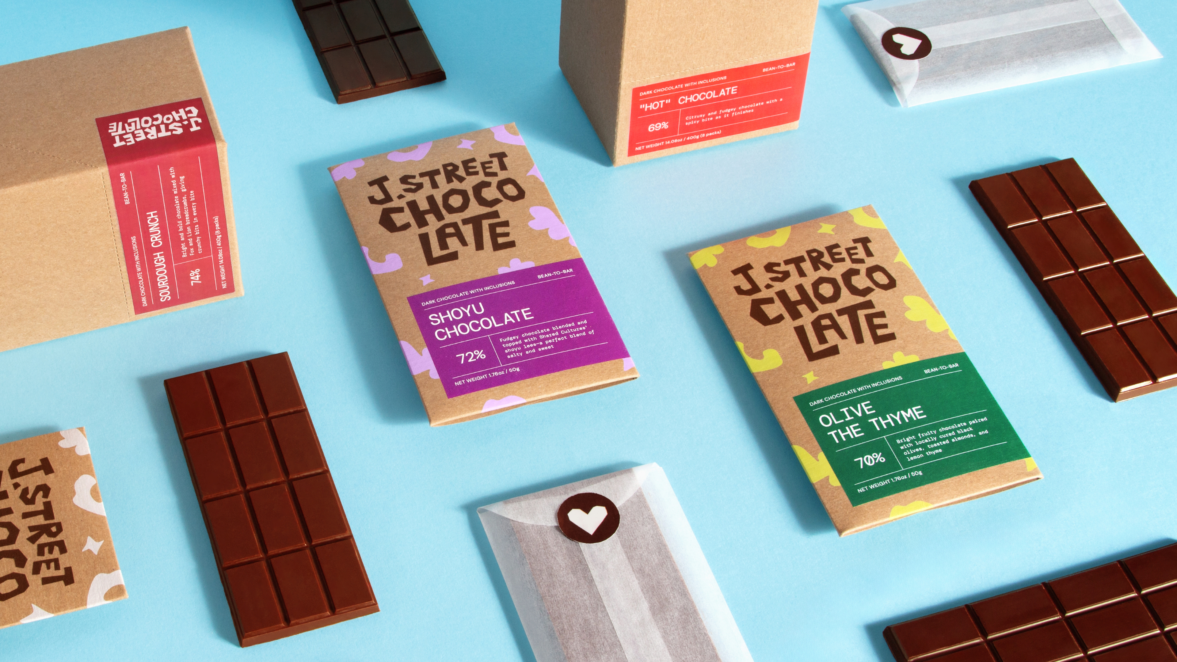
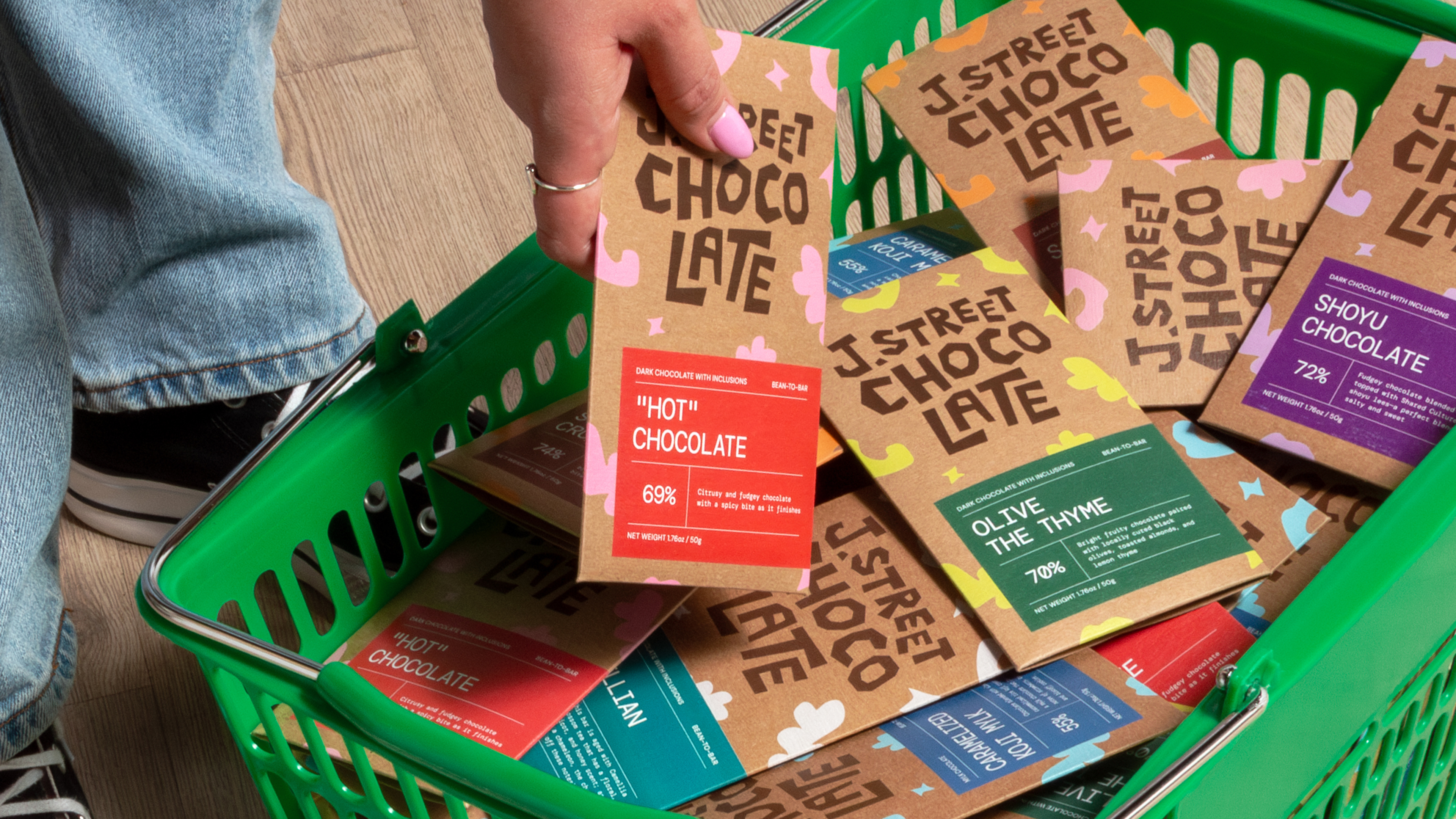
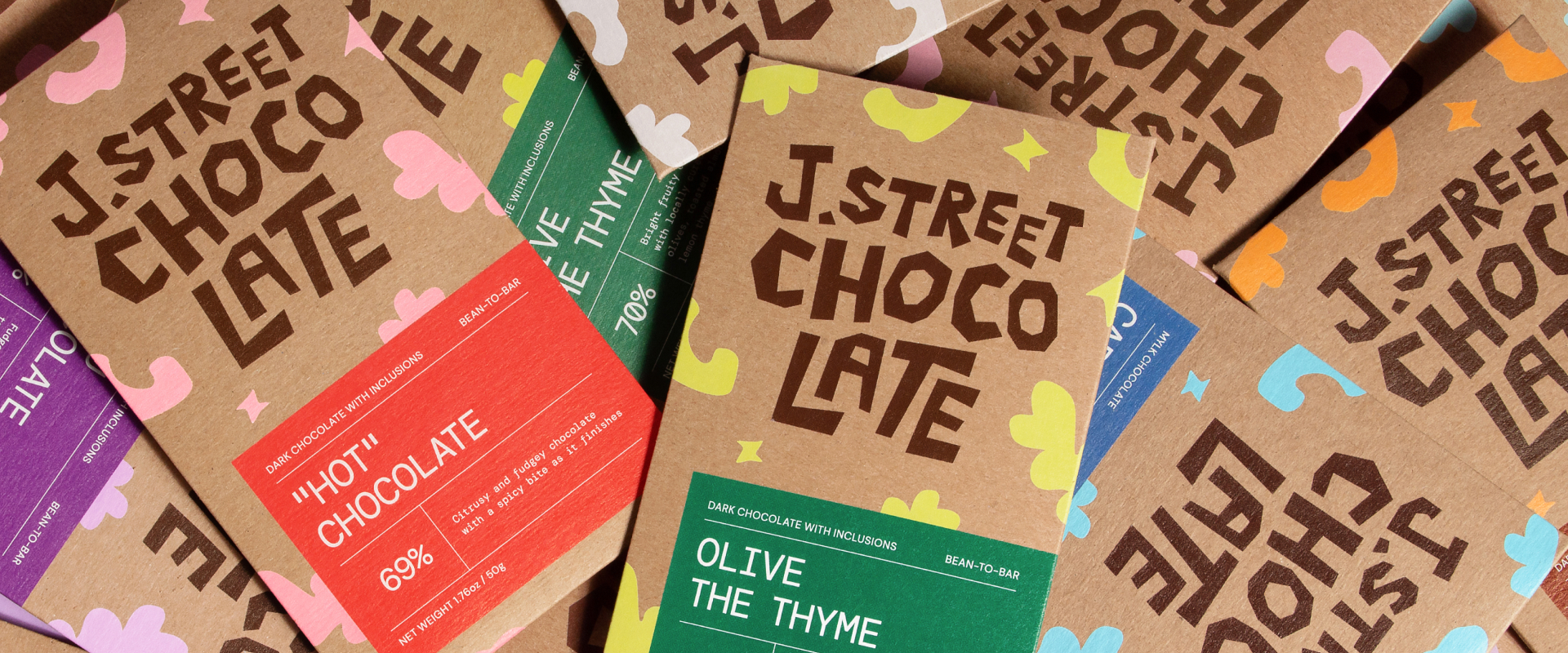
Fun was the focus for J Street, plus adding readability to the logo and packaging. The original logo was abbreviated to “Jst” which read as just, and her playful illustrations left little room for flavor titles to stand out. Our strategy was reorganizing the flavor system and hierarchy as well as crafting a logo that kept the fun but made the name readable.
Design
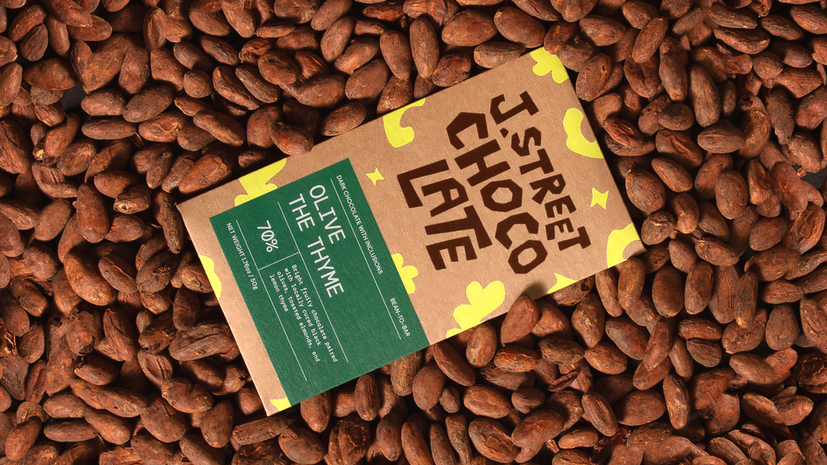
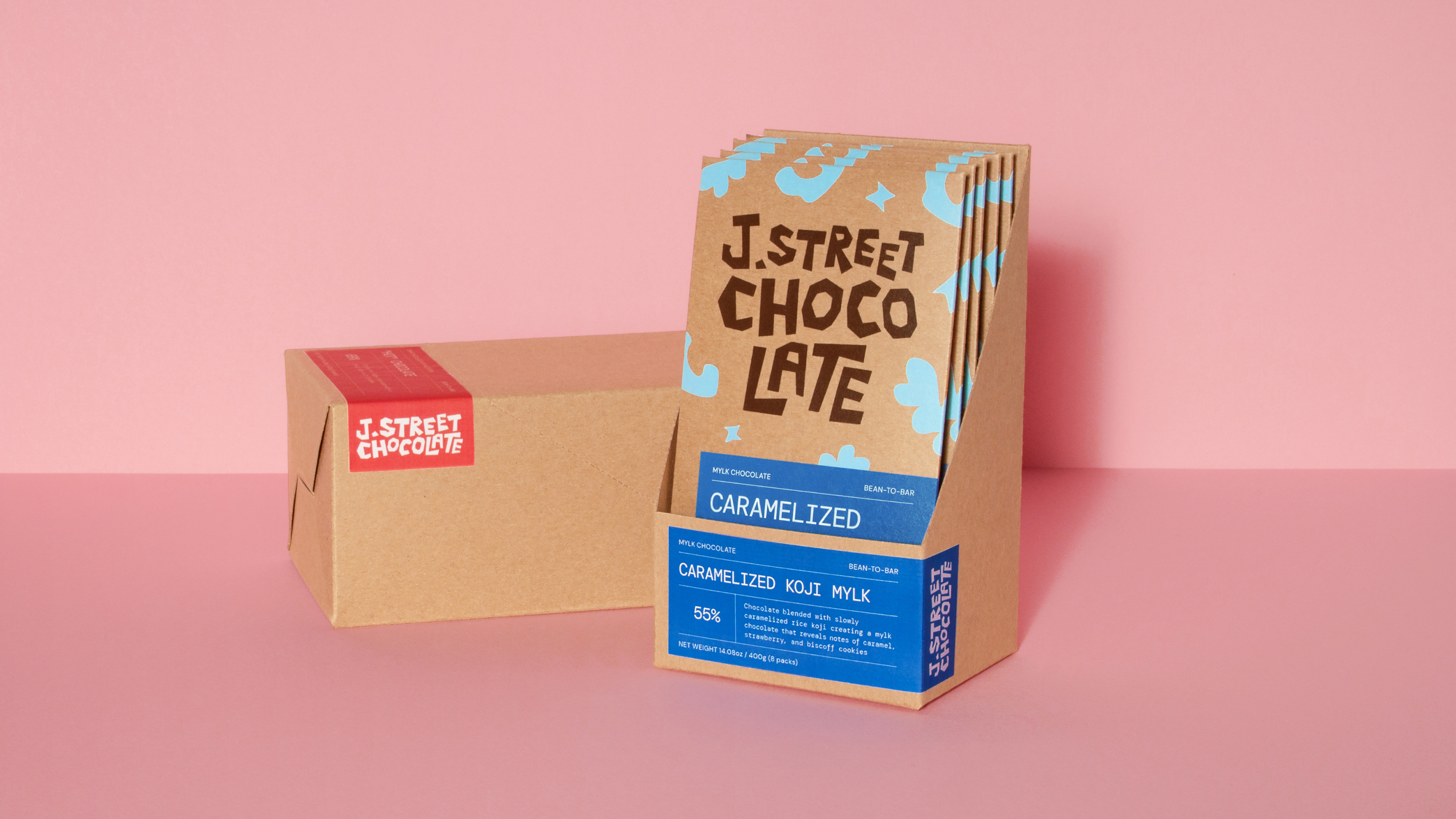
Everything about J. Street Chocolate is handmade; we didn’t want to lose that spirit in the update. We went back to basics for this project and broke out the paper and scissors to create the logotype and the background patterns. We also developed a color system to showcase the library (always available) flavors, vs the seasonal limited selections. We also developed icons to showcase the sustainability and process of chocolate making in this product line.
Value
This new logo and packaging system added shelf presence with bold typography and colors and aids in product readability. The new outer structure of the packing also speeds up production with fewer pieces to the process. Right after the launch, J. Street was able to secure new retail clients from the famed Chocolate Covered, and Rainbow Grocery here in SF.