The Brief:
Build a premium egg brand rooted in Asian culture, for Asian markets and beyond. Rich in Health, Rich in Life.
What Actually Happened:
Wellthi Eggs was built for the Asian diaspora first, with a story rich enough to reach everyone. The brand draws from Asian culture, particularly Chinese and Vietnamese traditions and the belief that you are what you eat and food is medicine. The name carries that belief too: Wellthi combines richness and longevity. The chicken farming and the eggs they produce live up to it, pasture raised from a regenerative farm.
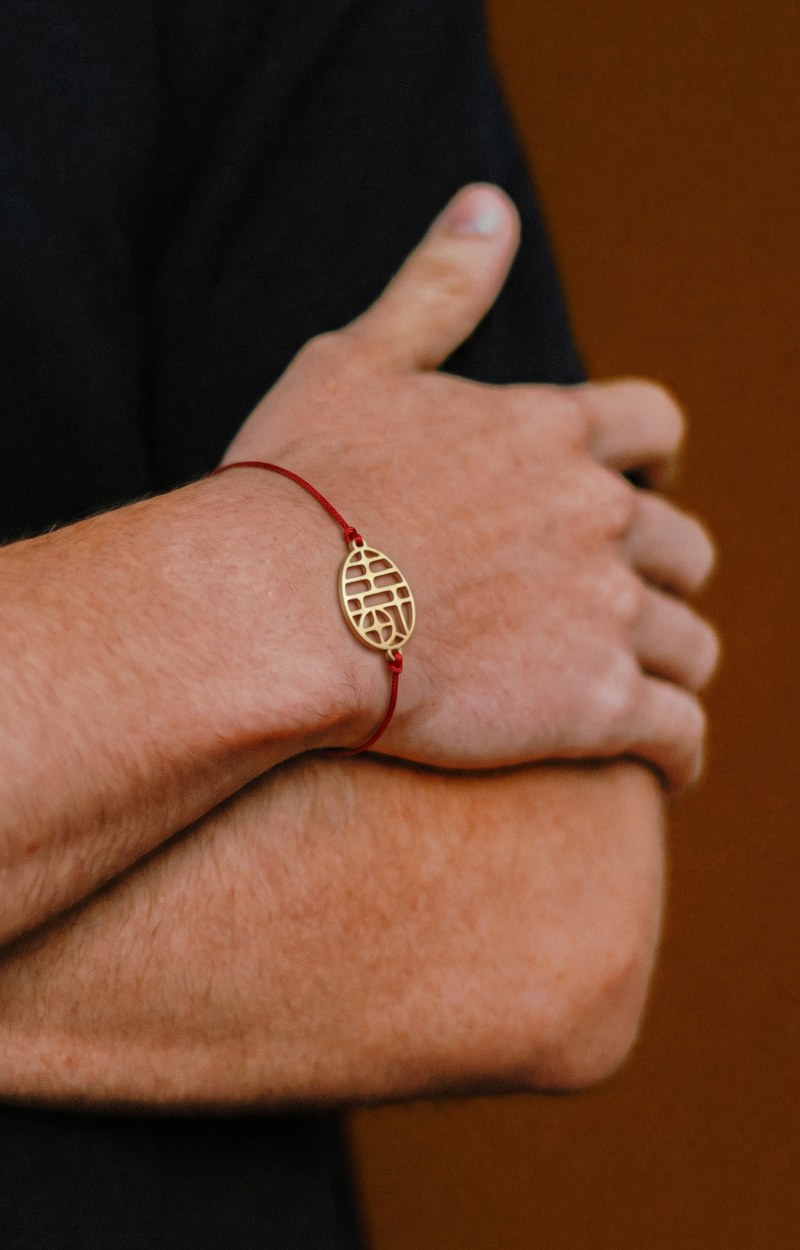
That idea became the brand’s tagline, translated in Vietnamese, and simplified Chinese. For the design, we built a symmetrical layout rooted in Asian visual culture and architecture, carrying the idea of reflection. The primary color is gold, the color of the yolk, a sign of richness and warmth. A premium touch: an elastic band with Chinese character charms, 富 (rich) and 寿 (longevity), for good fortune. It doubles as a collectible bracelet and natural protection for the carton. A sun ray pattern on the packaging represents the sunny, outdoor environment the birds live in.
Every detail carries the same belief—the translation, the symmetry, the gold, the charms, the sun. Wellthi Eggs is that belief, made real.