Our Opportunity
When we began working with Uber in early 2013, they had already established brand loyalty and consistently delivered happy customer experiences. The challenge they presented to us was to further develop their brand amidst rapid global expansion.
Uber came to us with a few solid brand elements—an identifiable logo, clean typeface, and a grid pattern. These components collectively served as our launch pad for devising a brand-building strategy.
By working closely with their in-house team, we made sure we were honoring what was already created and aligning our work with their corporate values and goals
Our Approach
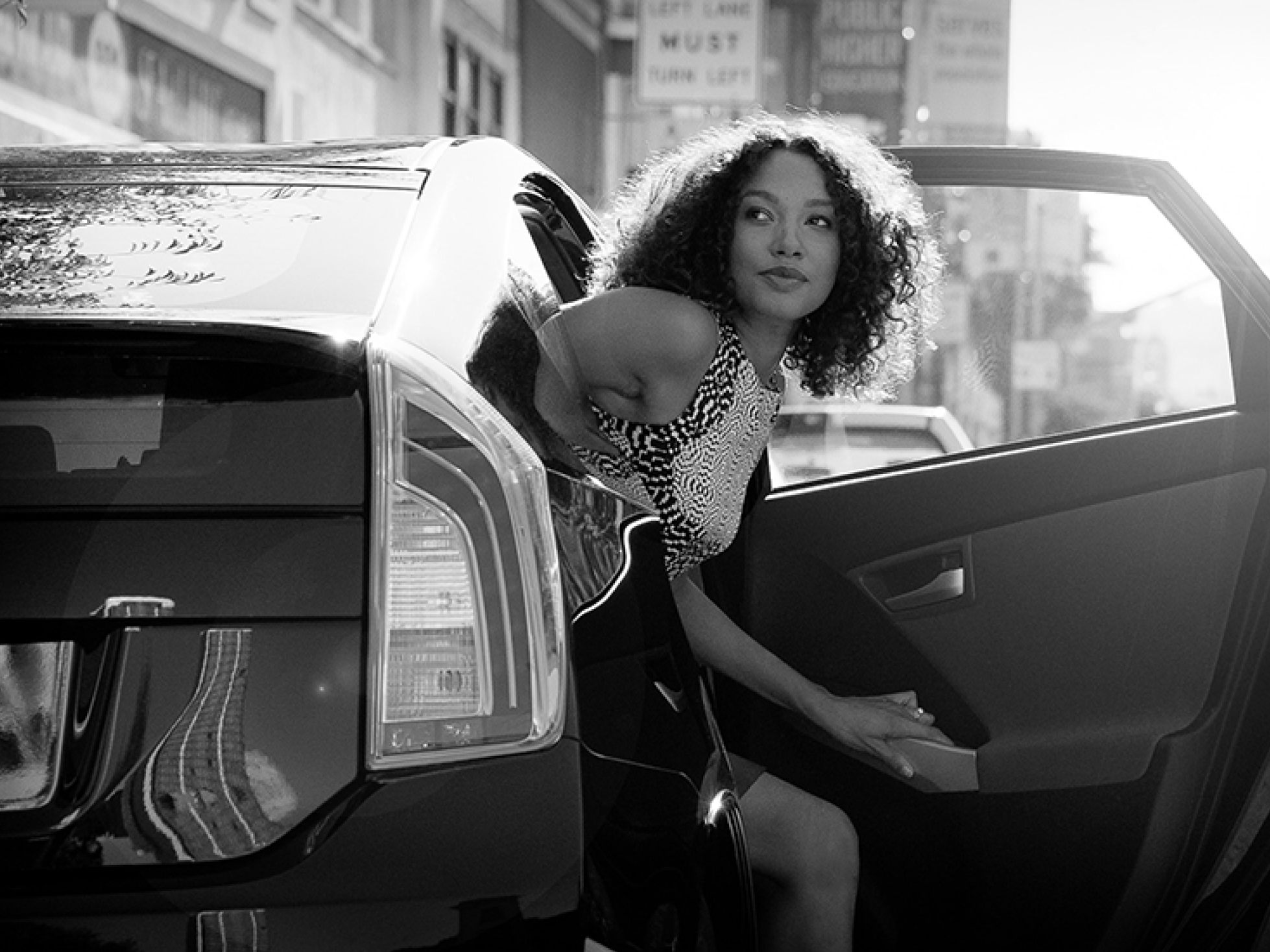
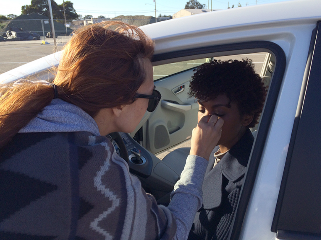
While Uber was developing their website in-house, we took on the art direction for the website photography. The process began with castings, location scouting, scheduling, production coordination, and continued to day-of art direction. Our photography partner was GammaNine.
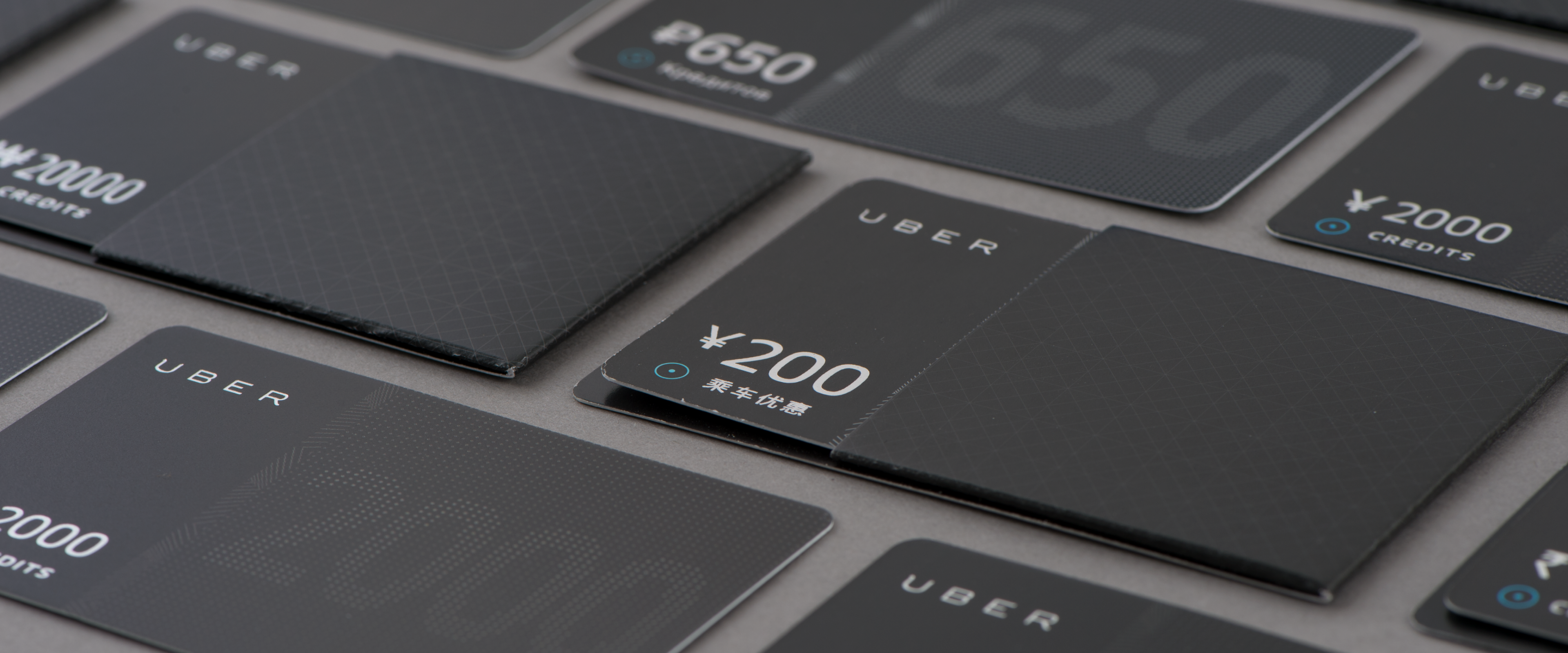
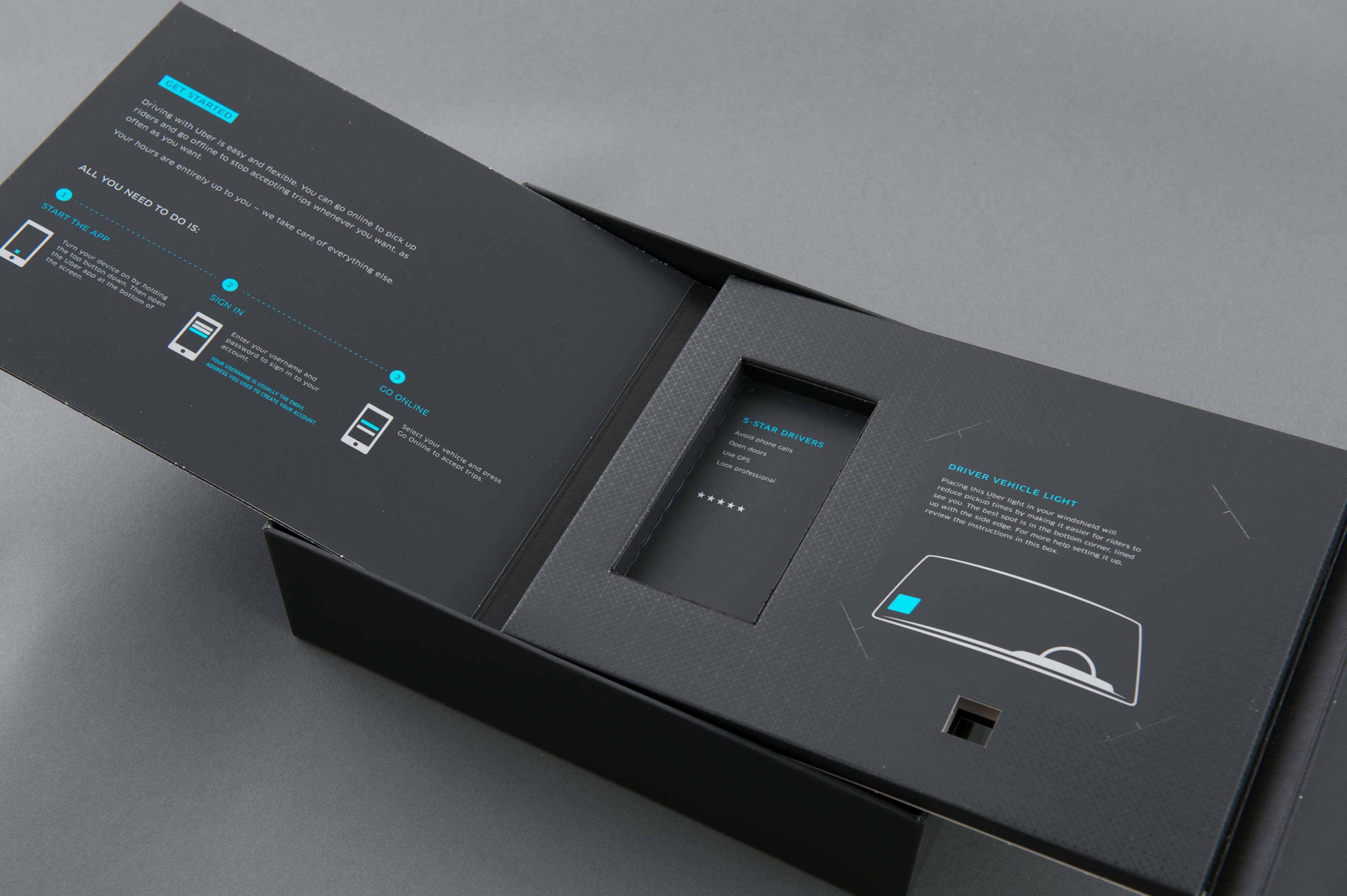
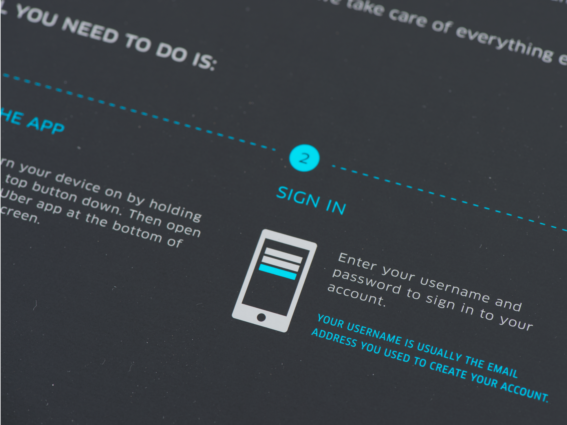
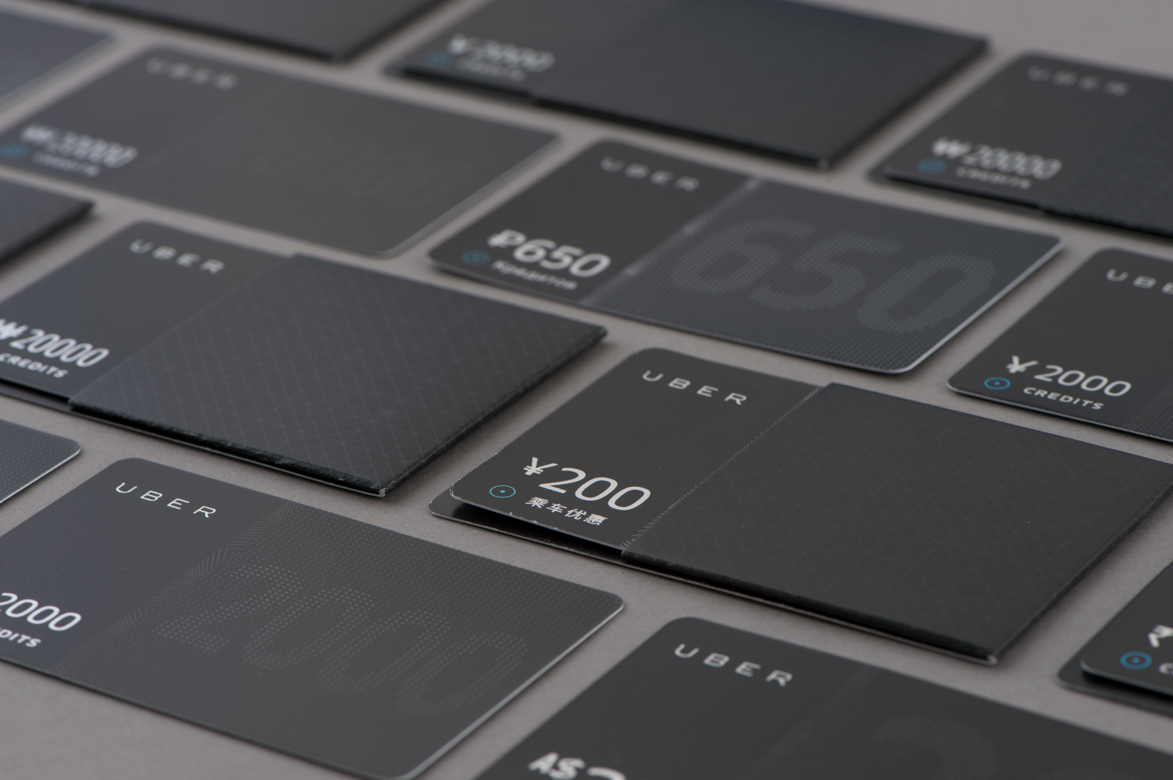
An important component of strengthening Uber’s brand was creating sleek, modern, and minimal printed pieces. From the silver foil finish on Uber black cards to the soft touch aqueous coating on the custom designed driver package, these thoughtful touches reflect a premium experience that evoke the Uber brand.
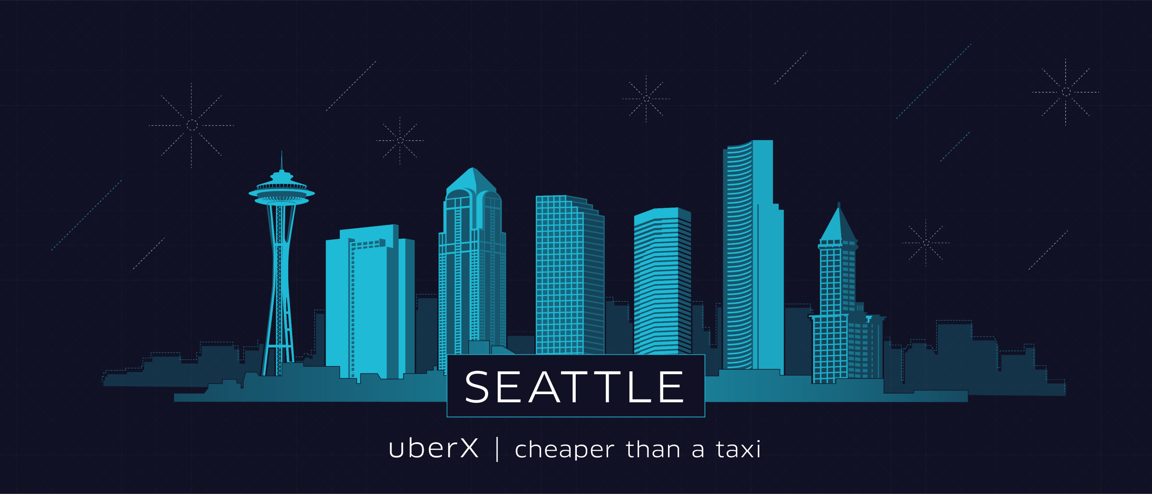
Although the clean black paired with high-end photography is the cornerstone of the brand, it did not always translate to worldwide, one-off promotions. We devised several illustration styles that allow for more versatility while staying on brand.
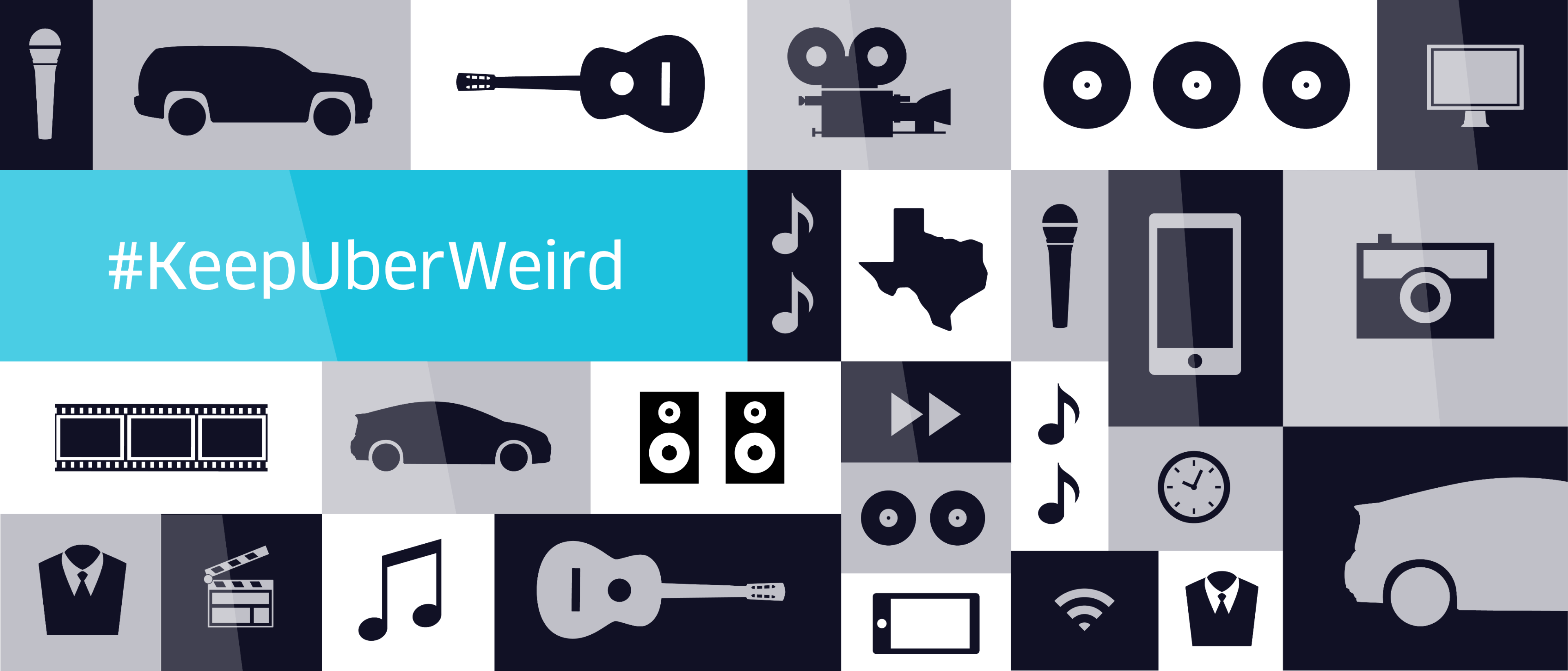
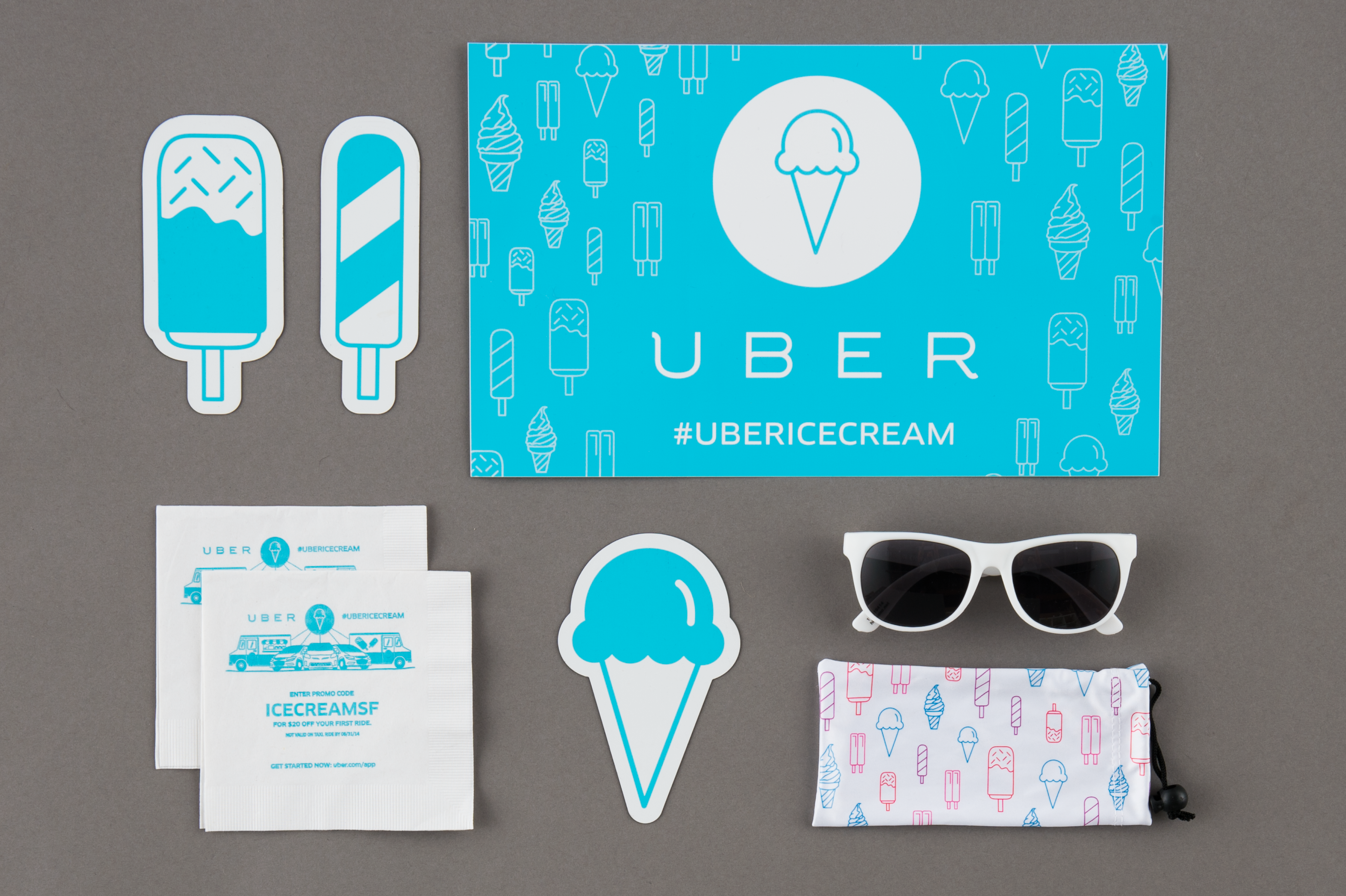
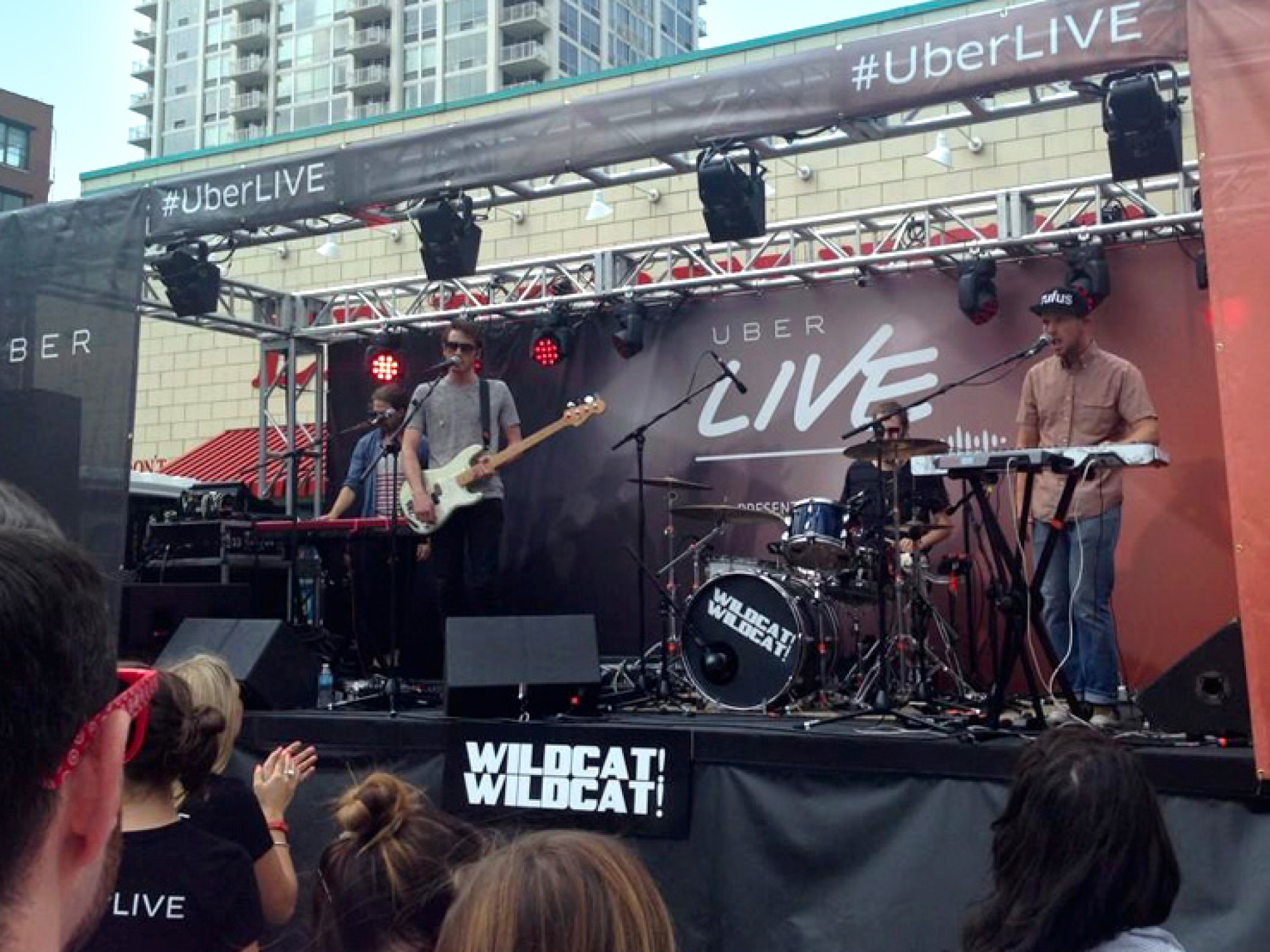
We designed graphics for varied global campaigns, branding everything from mobile DJ booths and elevators to ice cream trucks and surfboards. Our goal when designing promotional assets was to communicate the initiative in a unique way.
For co-branded campaigns, we were mindful of the goals and brand standards of Uber and their partners—and worked hard to represent both.
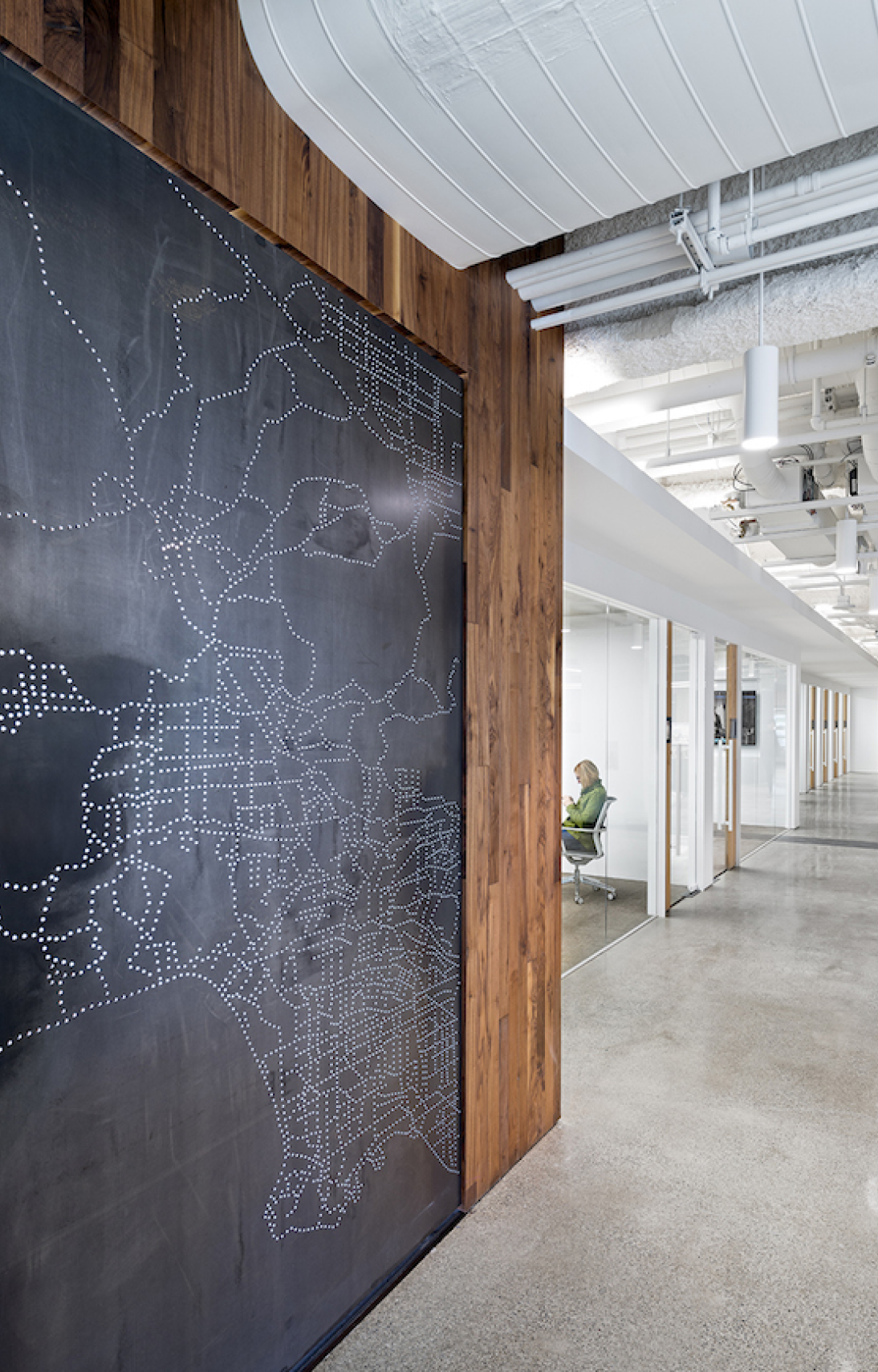
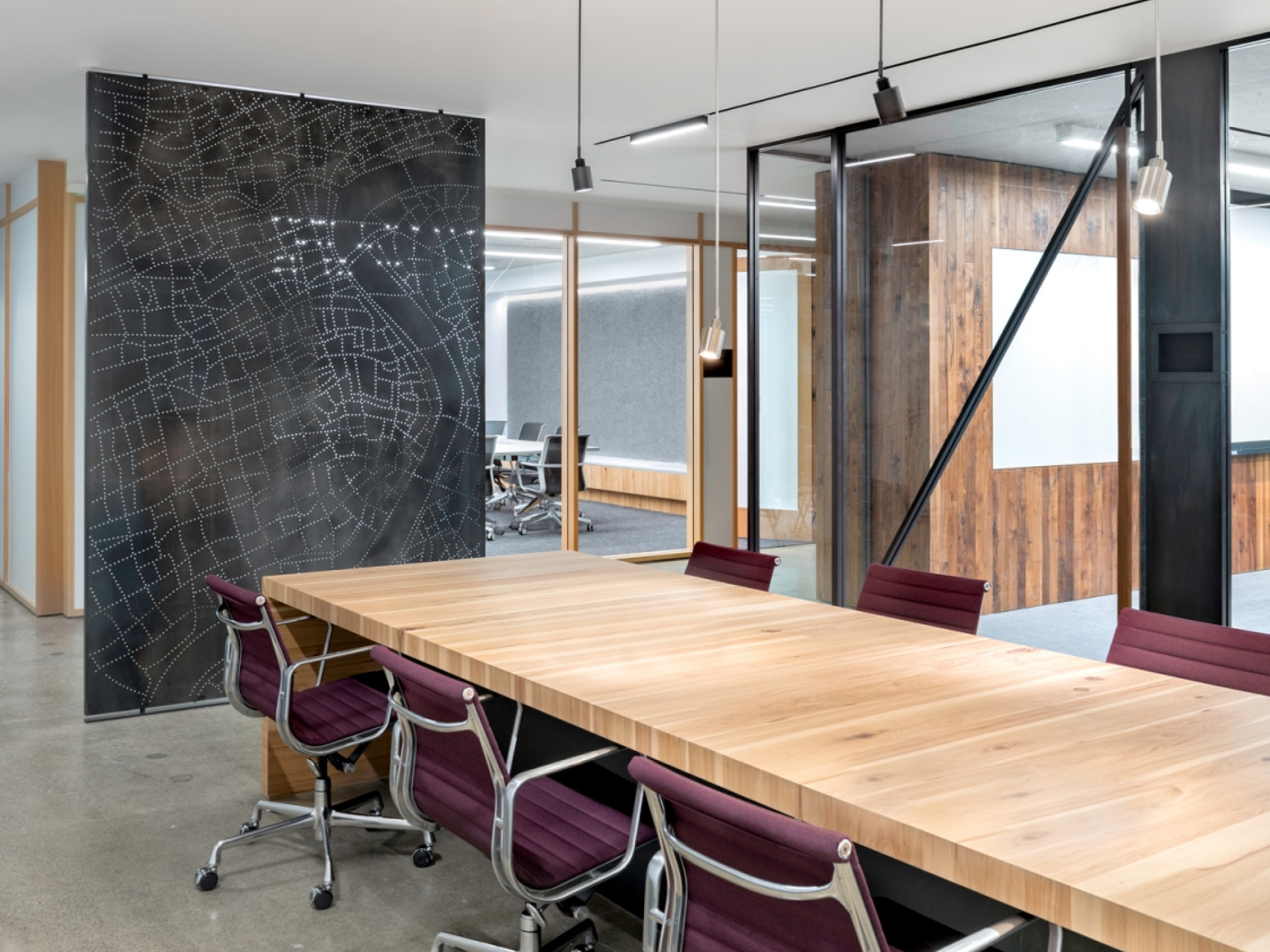
As Uber’s global presence has continued to expand so has their need for office space. This proved to be another opportunity to bolster the brand aesthetic-in an environmental setting. Working with teams from across the world, we made sure their surroundings are consistent and on brand.
(interior office photos by Jasper Sanidad)
The Outcome
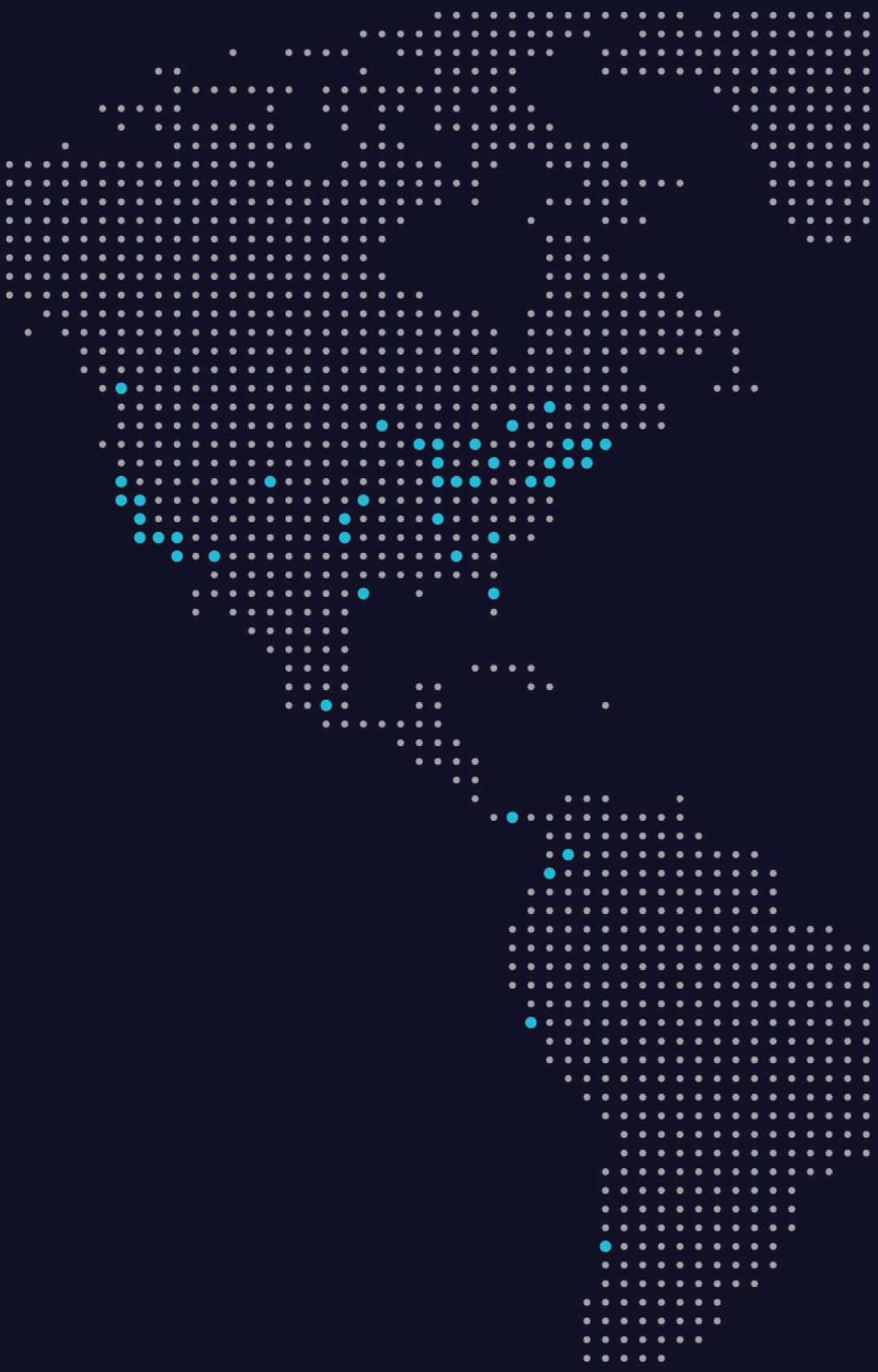
Close collaboration was the core of our strong relationship with Uber. The company now serves people in over 200 cities worldwide, and continues to implement systems and standards that support the company’s expansion and build brand loyalty.
We Uber to our clients’ offices and our clients Uber to ours. Uber has become a part of the way we do business, and we look forward to partnering with them as they continue to grow.
