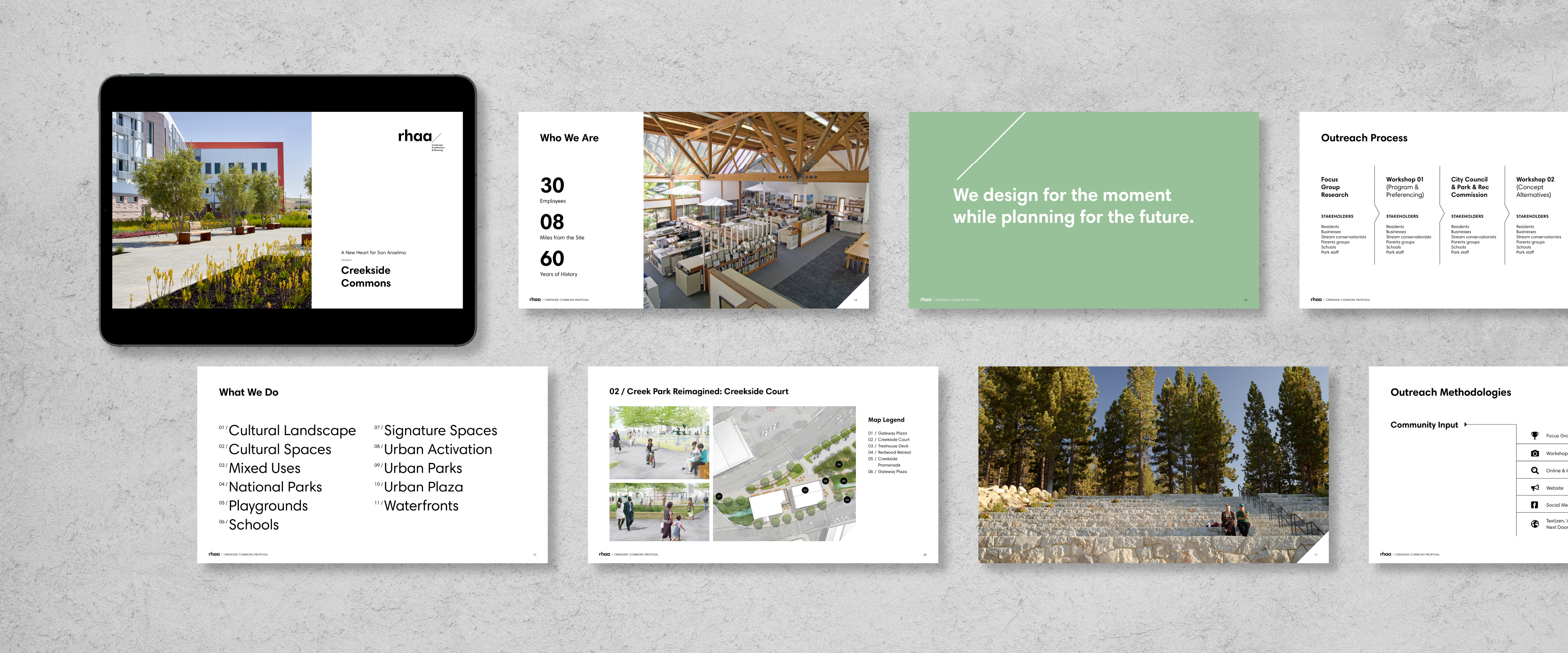
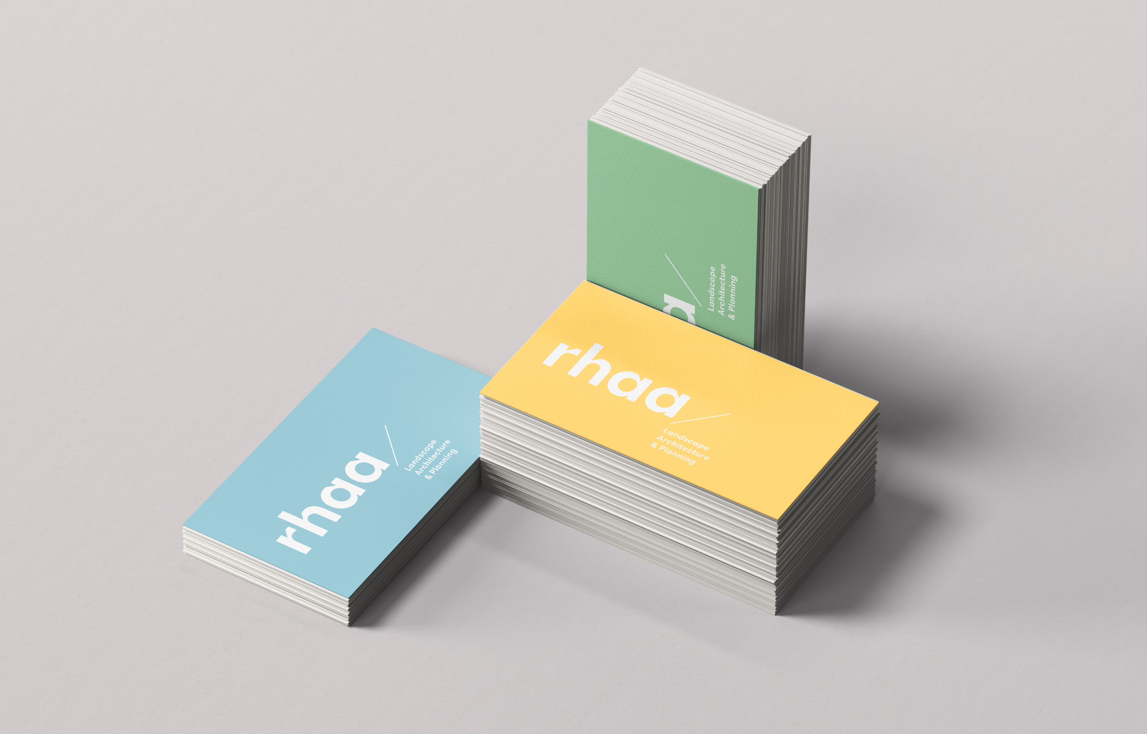
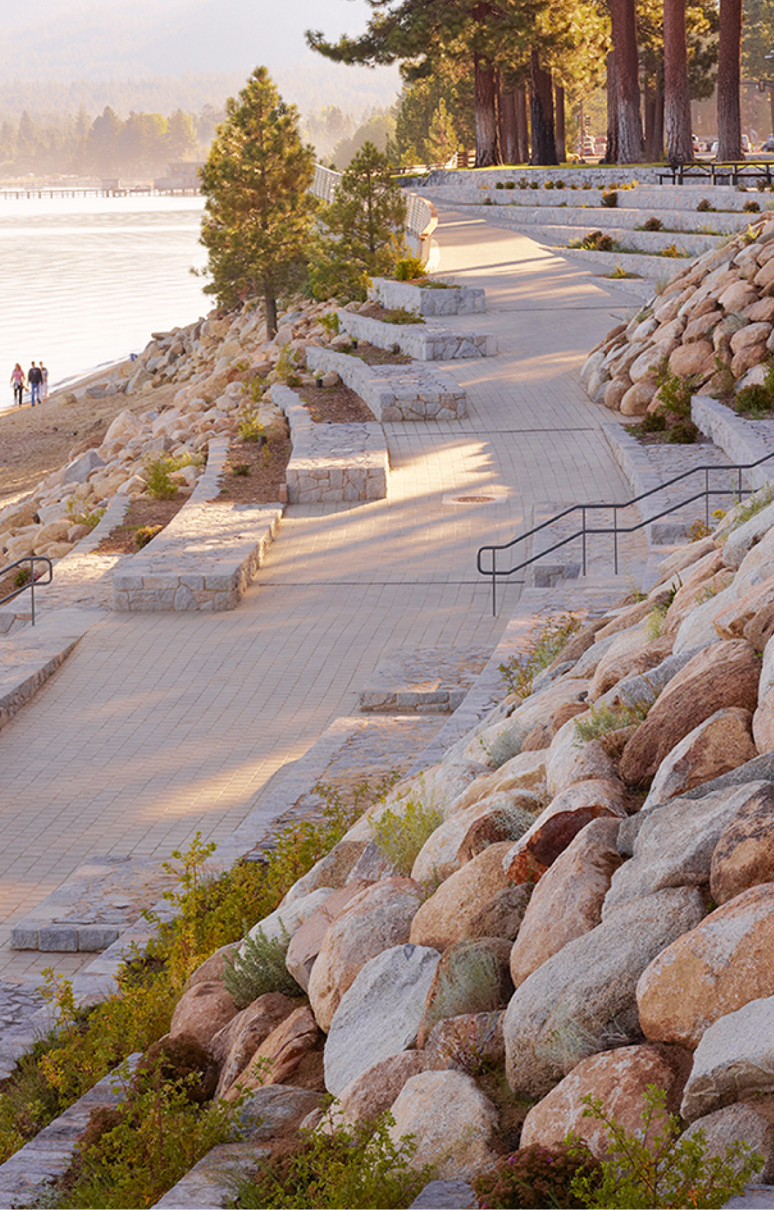
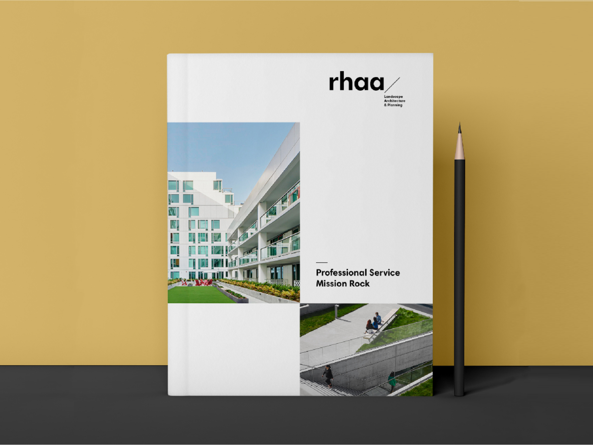
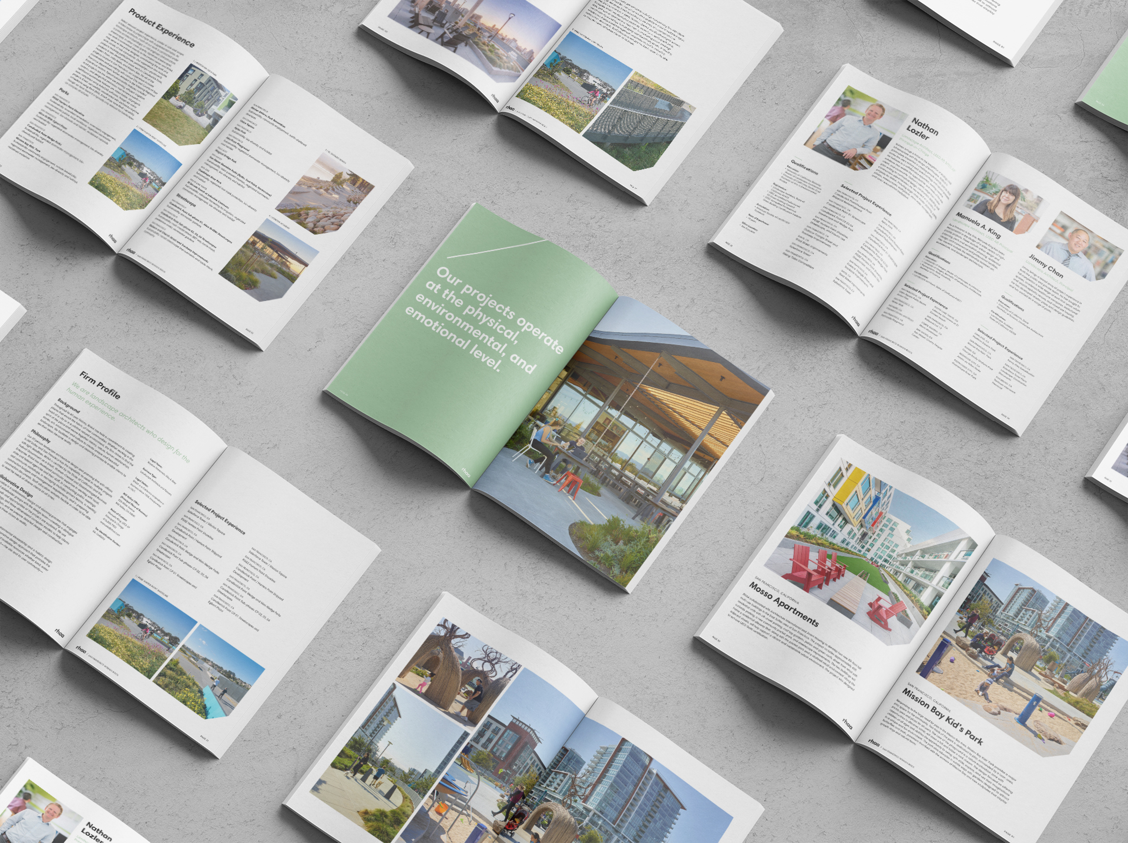
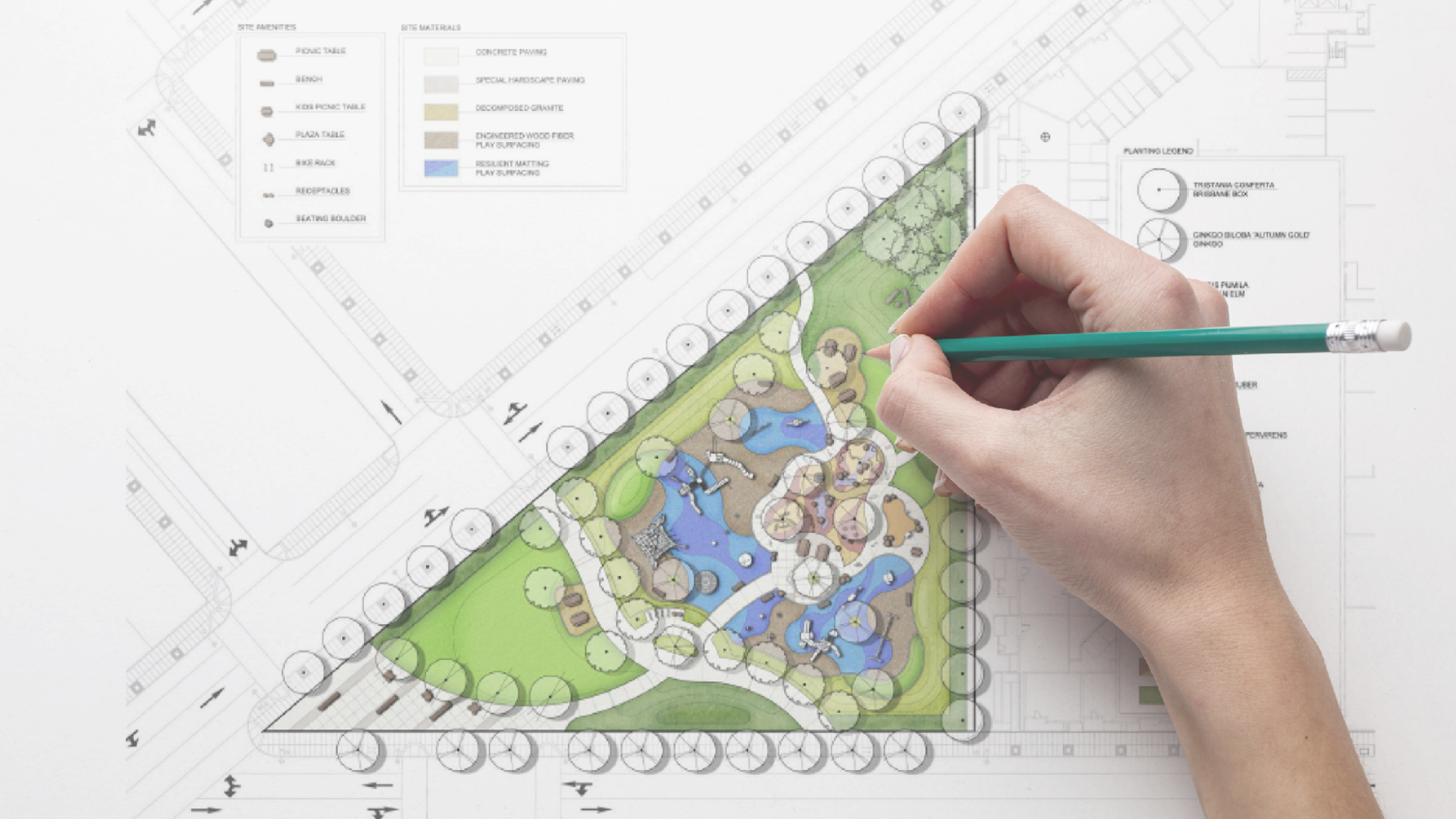
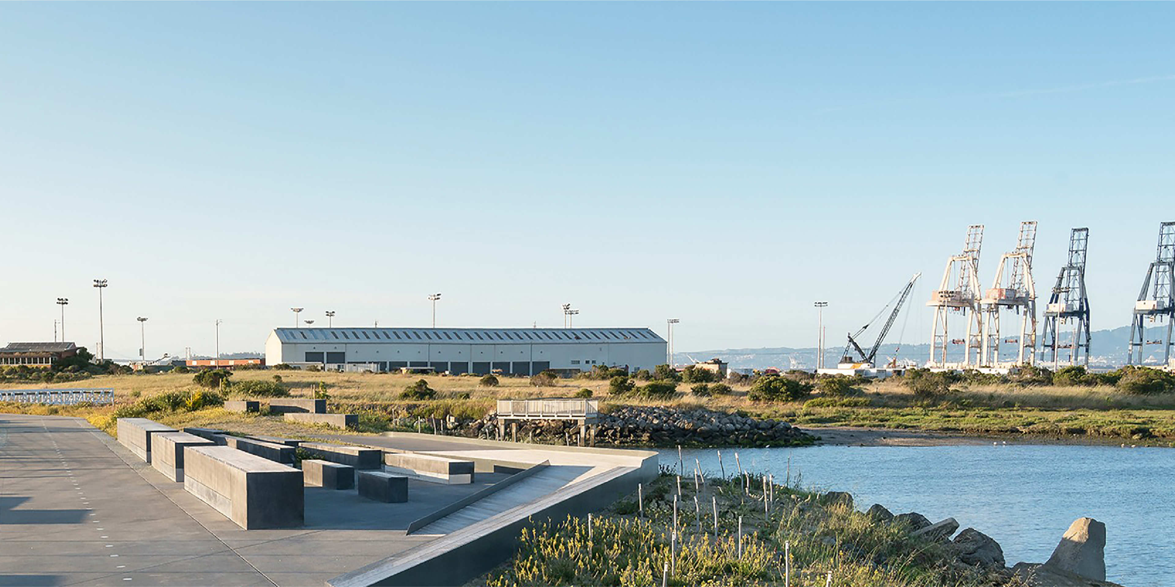
The historied landscape architecture firm RHAA has a legacy of designing memorable spaces tailored to the human experience. RHAA approached Noise 13 to revamp their brand identity and develop a collateral system that would reflect the care and passion that comes through in their work. Success was achieved by creating a flexible toolkit that would allow RHAA to tell stories as big and impactful as their projects.
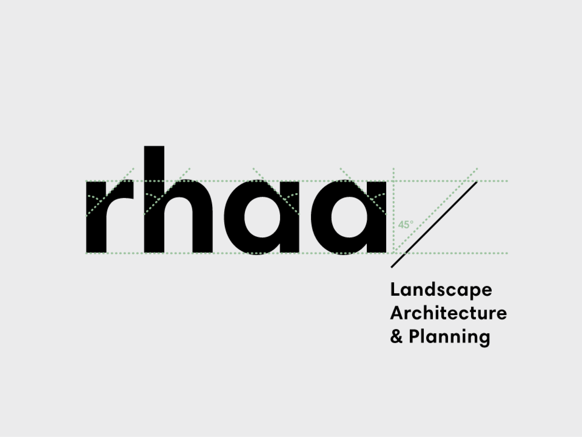
Structural custom typography stands out from the competitive set. The features of the wordmark were thoughtfully selected to reflect visual details that exist in the landscape architecture practice. Triangular cuts in the shoulders of the letterforms are suggestive of structures that appear on architectural plans. We expanded on this concept by using a diagonal rule, reminiscent of the division of space and pathways placed within the landscape.
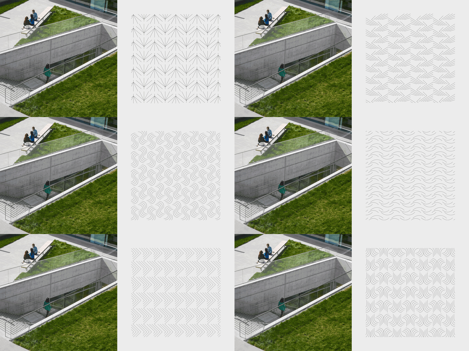
Monoline patterns add a point of visual interest for the system. While abstract, they are inspired by natural materials like wood, water, and grasses. Similarly, a modest color palette was selected to mirror the hues of these elements.
RHAA now has a cohesive brand toolkit that reflects the rich ideas and considered work that their clients have come to expect over the last 60+ years.
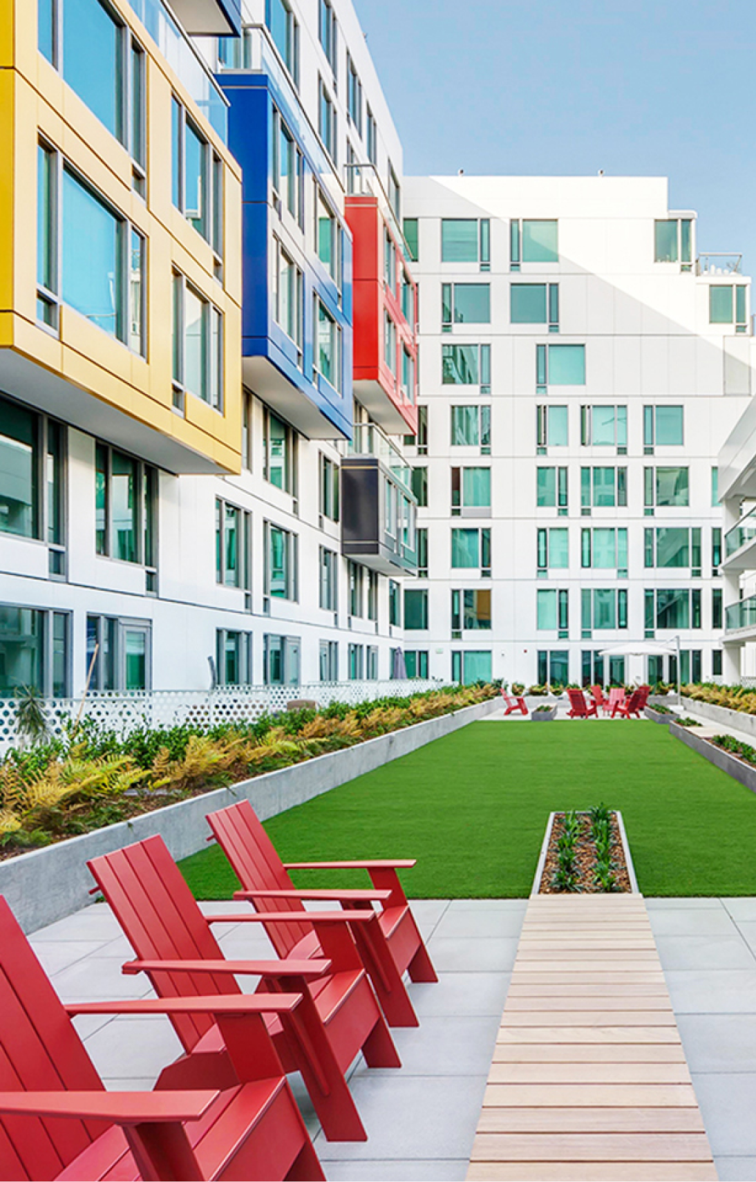
Photo credits: RHAA
