The Brief:
Refresh the packaging.
What Actually Happened:
Bring the reputation and legacy of the brand into its visual system.
OM has been a legal cannabis company in the Bay Area since 2008 — before most of their competitors existed. They had the product, the expertise, and a cult following. What they didn’t have was packaging that communicated any of that.
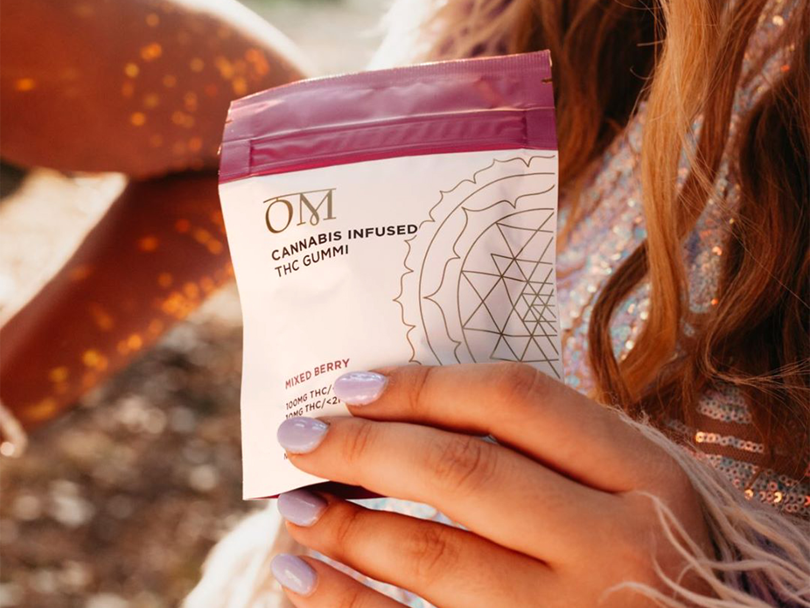
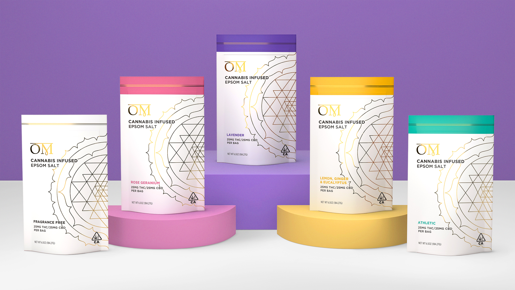
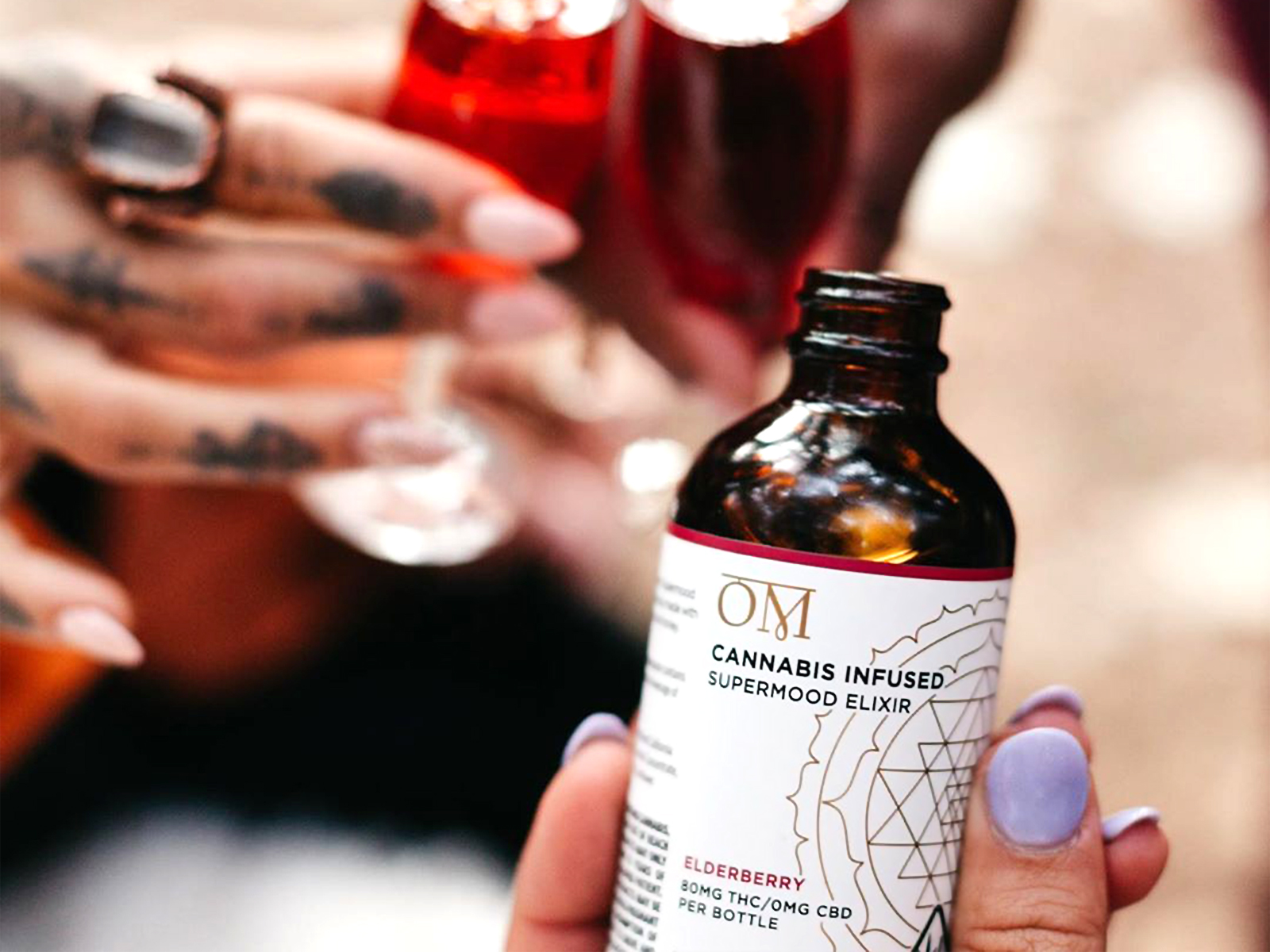
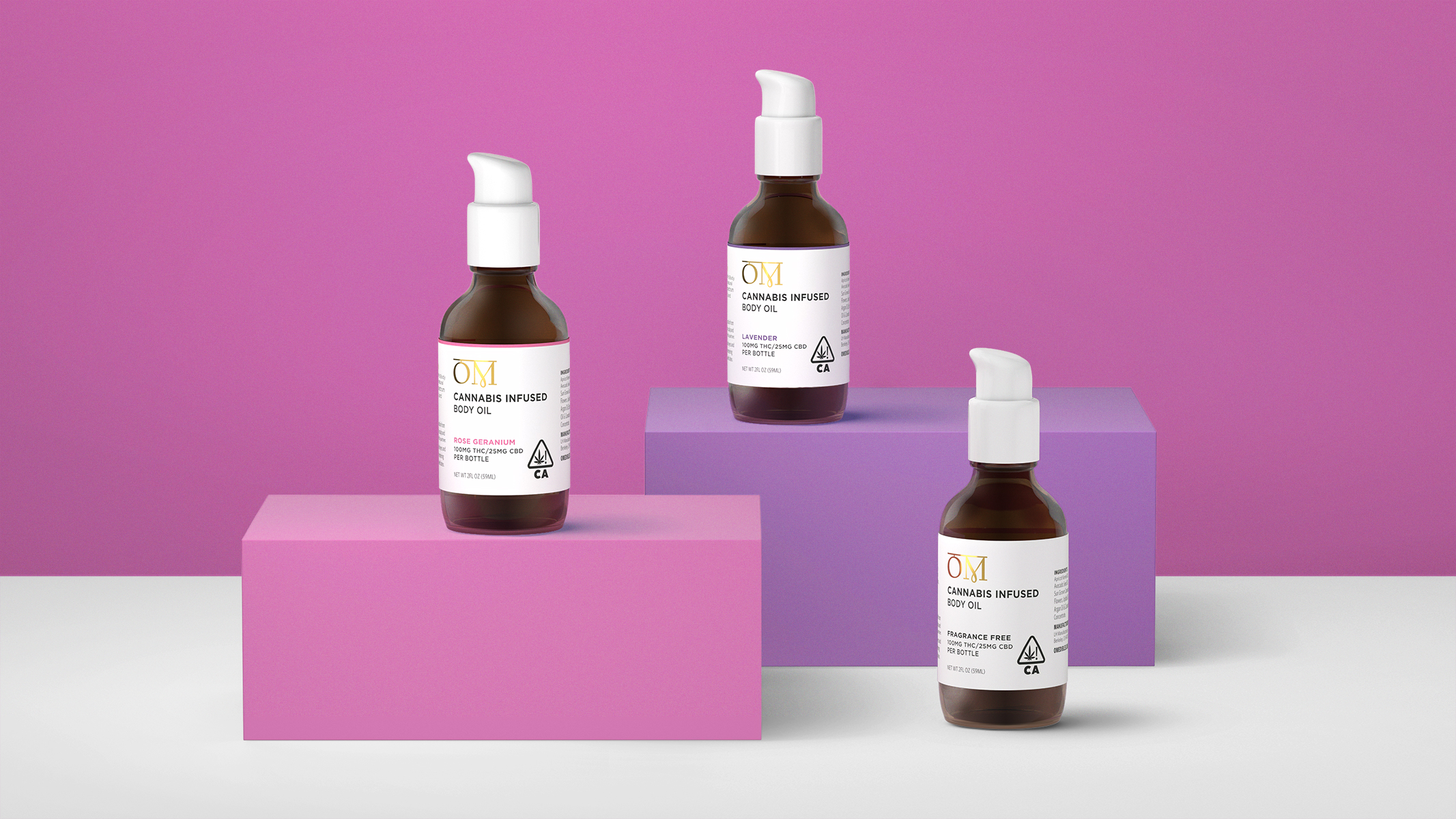
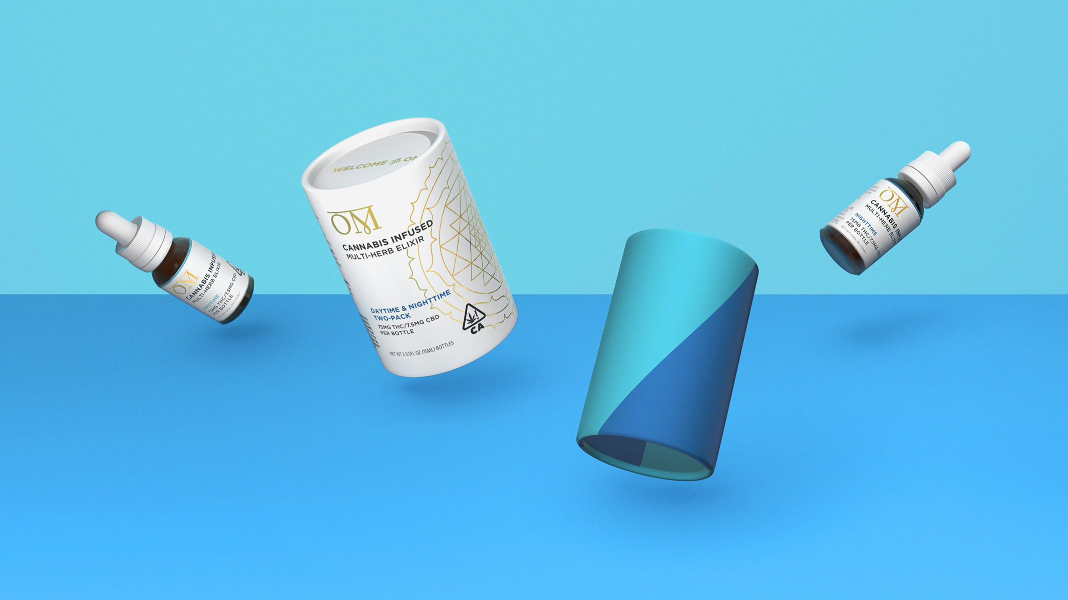
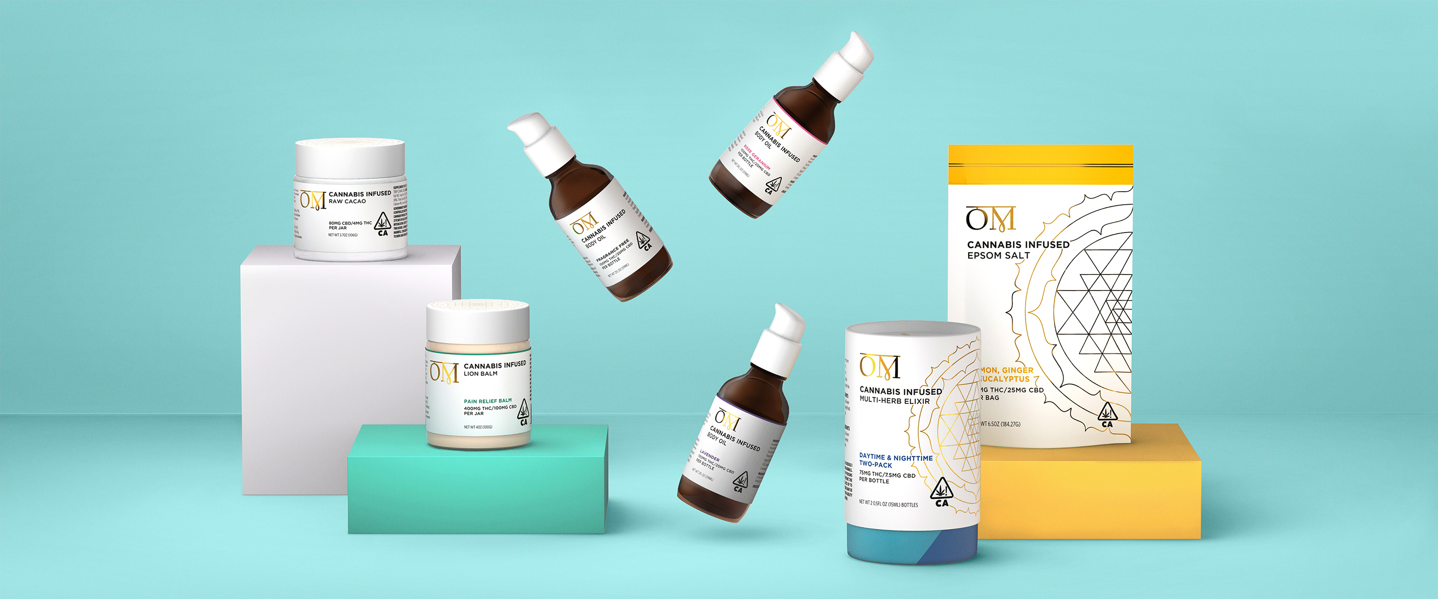
The audit covered 40+ SKUs across topicals, edibles, and elixirs in different form factors. The challenge wasn’t inventing a new identity — it was building a system precise enough to hold across all of it while doing justice to what OM had already built.
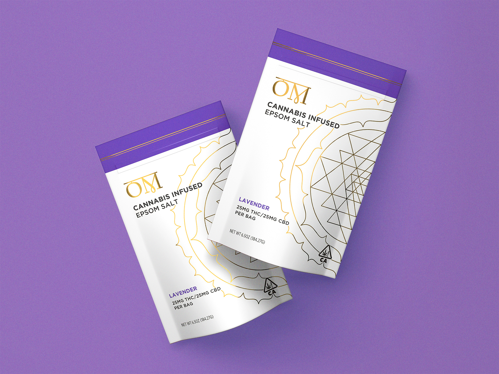
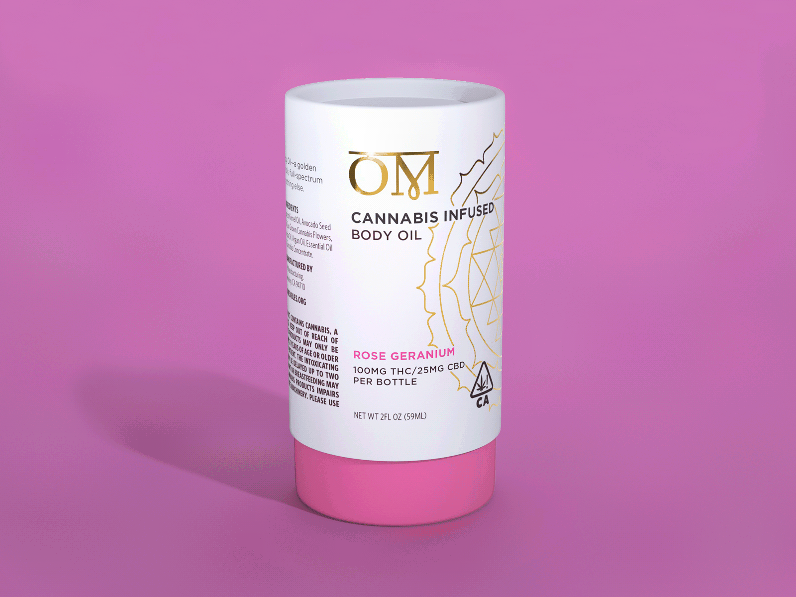
The most important decision in the project was also the most delicate: what to do with the Sri Yantra. Founder Maya Elisabeth has a deep personal connection to the sacred geometry. The complexity of the symbol is part of its meaning: it takes precision to render it correctly. The previous packaging used a filled-in gray version as background texture — present but muted.
We brought it forward. A line-art version in gold, placed prominently. The symbol finally had the weight it deserved.
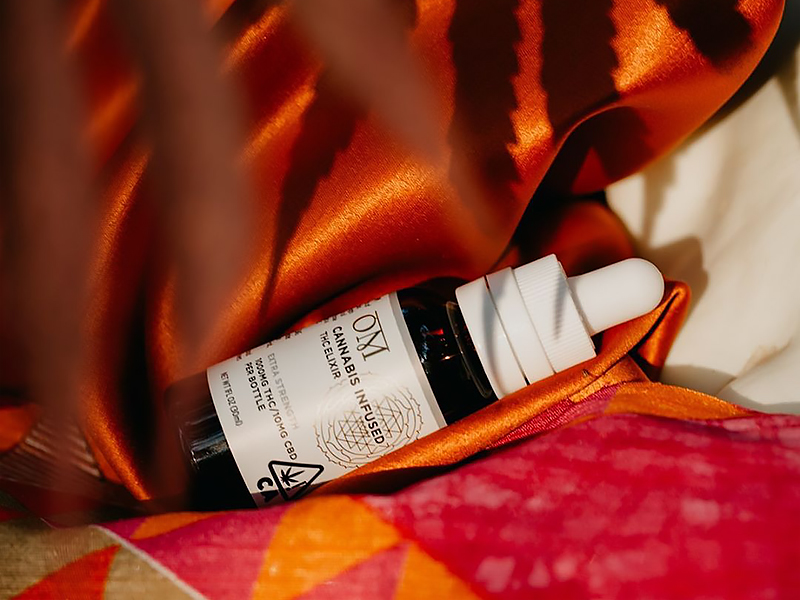
Everything else served that decision. We simplified the logomark — removing the crown for legibility at small sizes. We kept the surrounding system minimal and clean so the Sri Yantra could anchor the design without competition. We increased color vibrancy slightly to match the energy of the products, and made a system for the complex product naming.
The Result:
A system that scales across 40+ SKUs, holds across form factors, and gives OM’s visual identity the same authority their products have had for nearly two decades.
Featured in Best Packaging Designs on DesignRush and on Packaging of the World