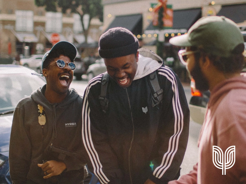
Objective
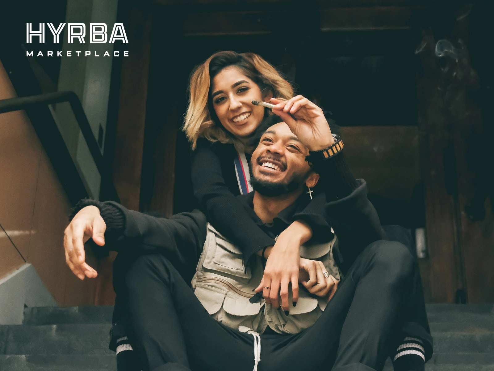
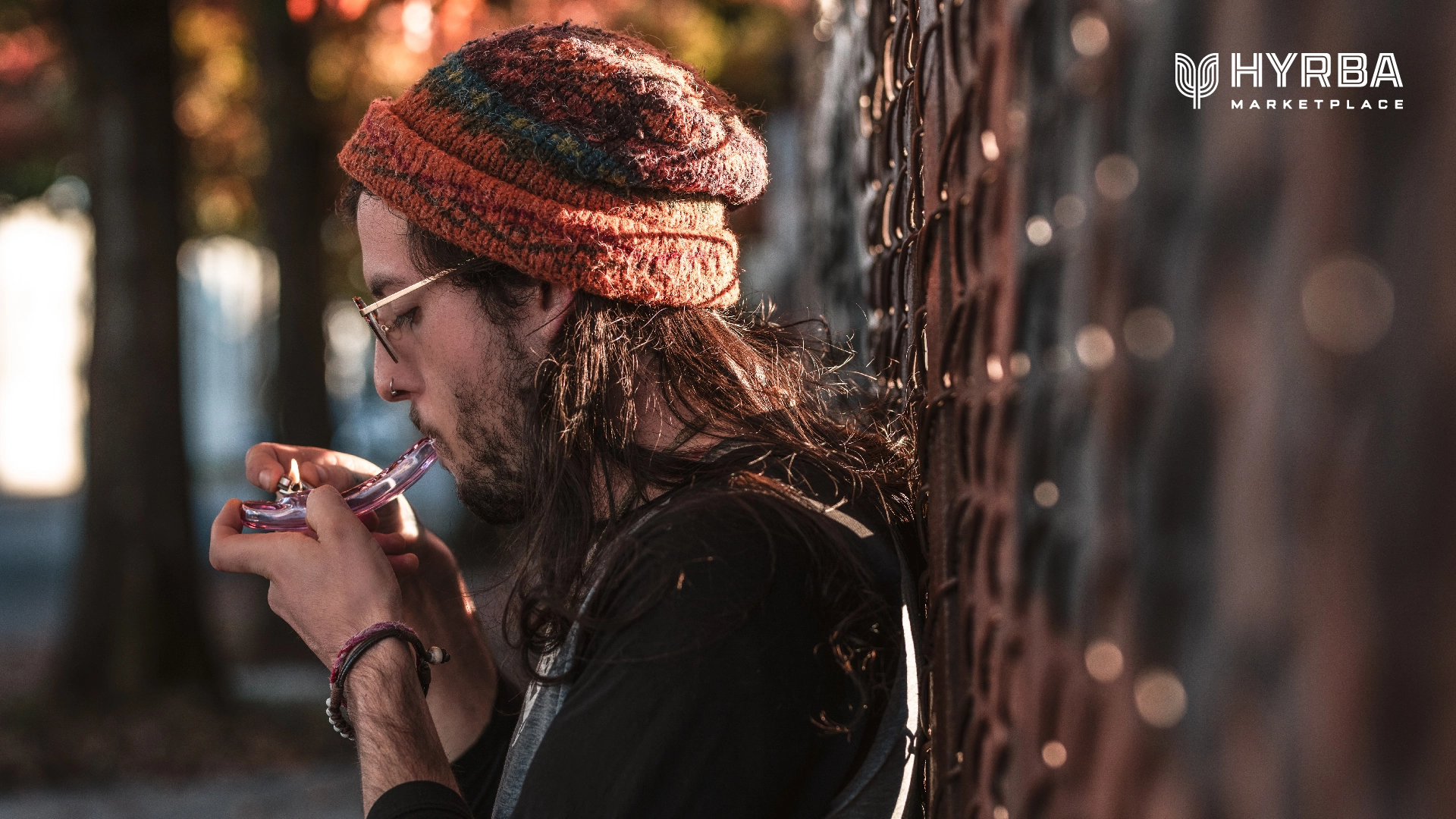
Hyrba is San Francisco’s first Cannabis Equity Marketplace, an innovative cannabis shop and consumption lounge dedicated to elevating the voices of underrepresented communities. They came to us to create an all-encompassing brand identity that is instantly recognizable across all touchpoints, in their locations as well as on products on shelves. We delivered an identity that feels welcoming, unique, fresh, bold, and best-in-class, and also communicates Hyrba’s values of equity, diversity, inclusion, and sustainability.
Strategy
Hyrba aspires to be a gathering place, so community engagement was integrated throughout our process. Noise 13 hosted remote workshops to better understand Hyrba’s target customers, competitors, and unique differentiators. Audits of the information we gathered helped us to home in on Hyrba’s visual and verbal representations. We also found inspiration in the places where people physically gather—neighborhood anchors like grocery stores, corner delis, farmers’ markets, and taquerias.
At the core of Hyrba’s values is their mission to be an equity marketplace that supports people who have been impacted by the criminalization of cannabis. Community outreach gave us opportunities to listen to community members, which resulted in the development of an advisory board. Having this insight aided in the development of their identity system in order to support its values.
Design
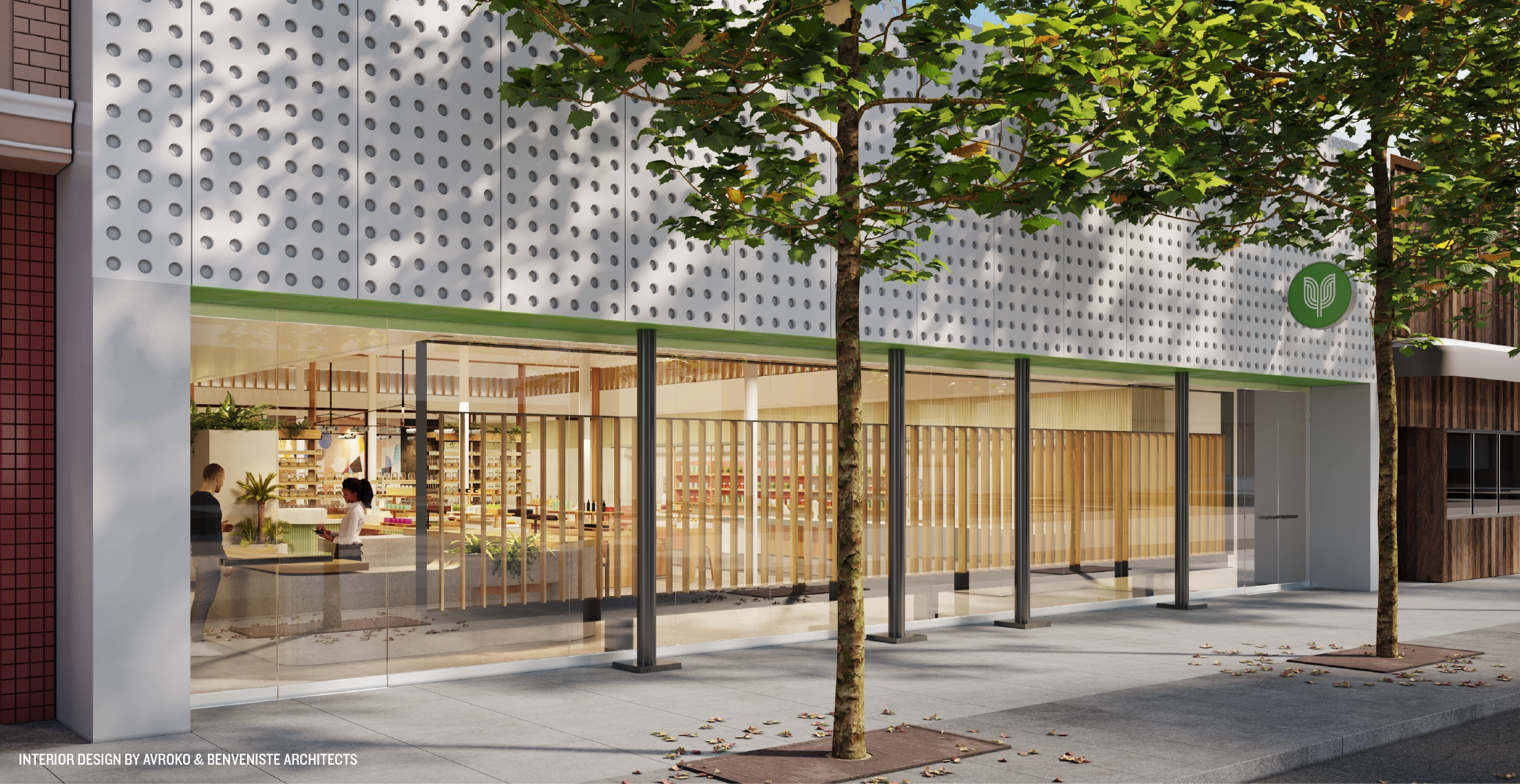
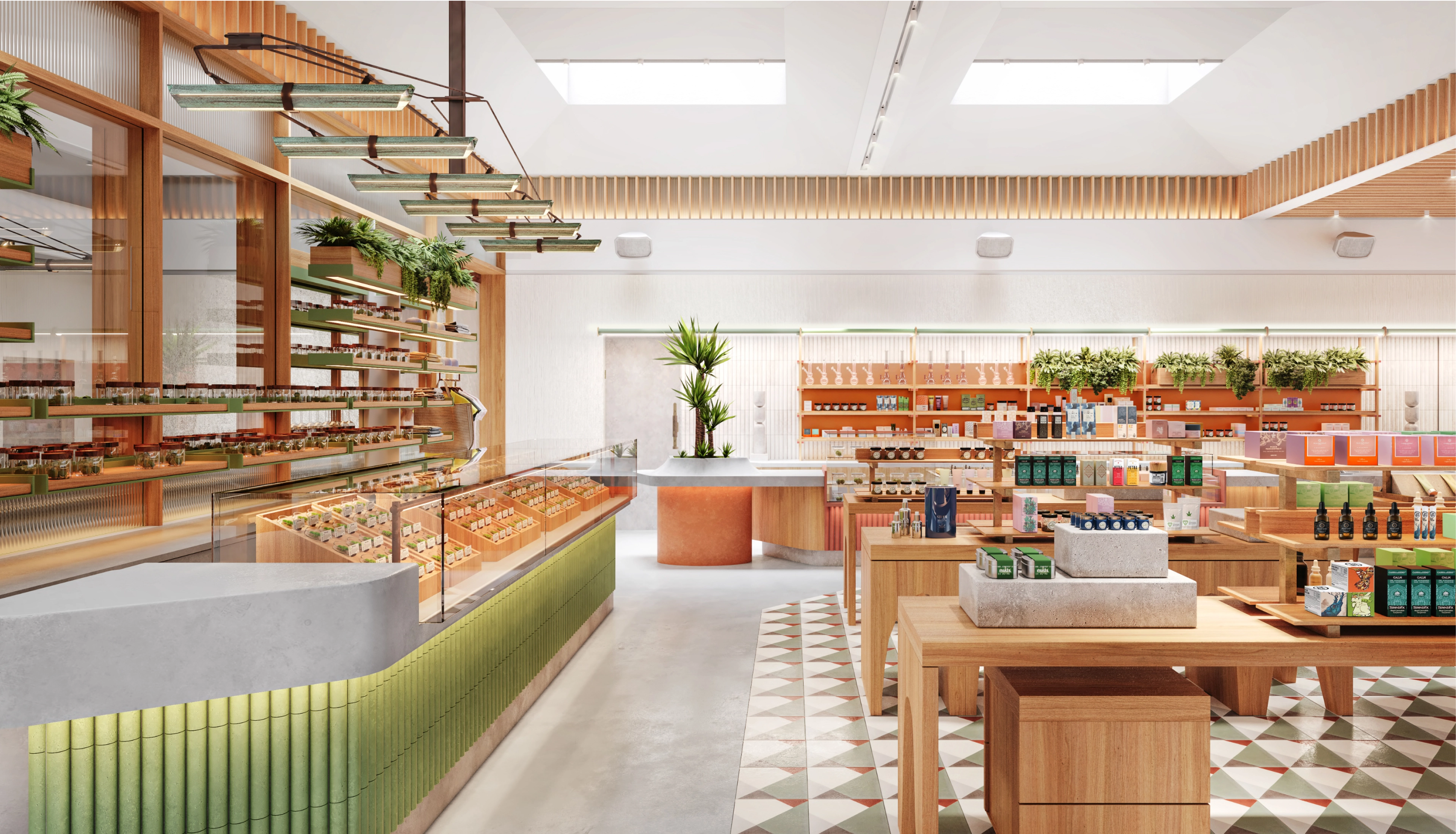
Our design process was truly a communal collaboration. Since the flagship store is in San Francisco’s Mission District, we looked to that neighborhood for flavors, colors, and art, especially murals that celebrate the area’s Latino culture. We drew inspiration from all of the cultures that have called the district home through the years. Including textures tiles, typography, paneling, and art. We studied iconic shapes and patterns in tiles from around the world and experimented with themes of connectivity. Together with our discovery & assessment strategy work, it helped guide not only the visual identity but the communications with Hyrba’s interior design partners Avroko and Benveniste Architects.
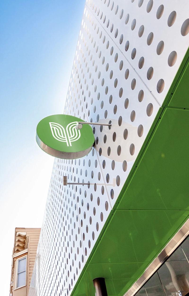
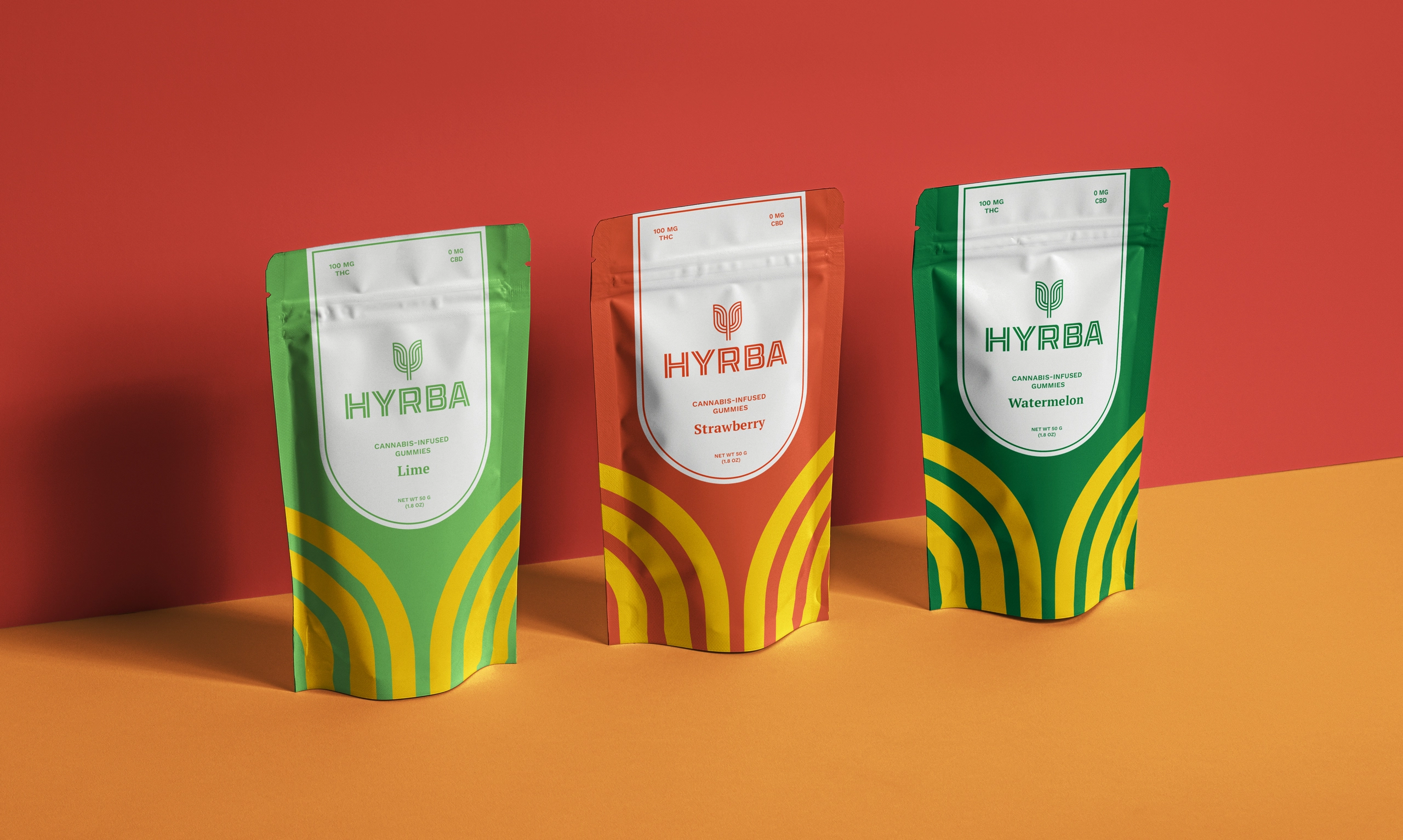
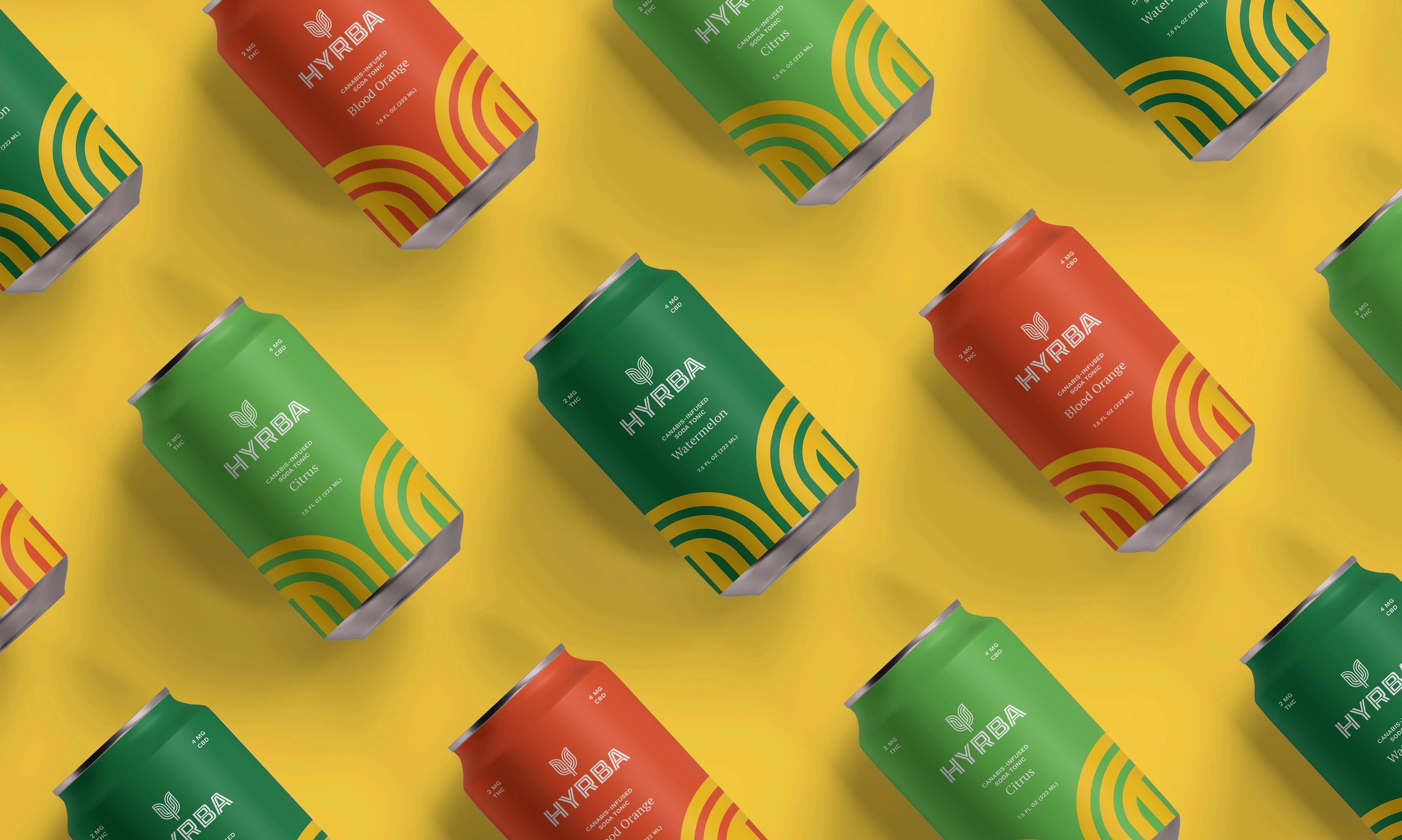
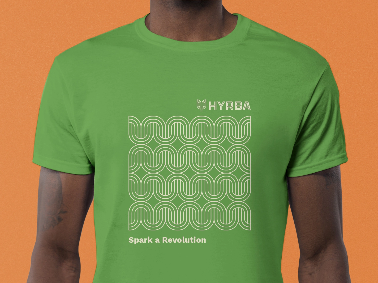
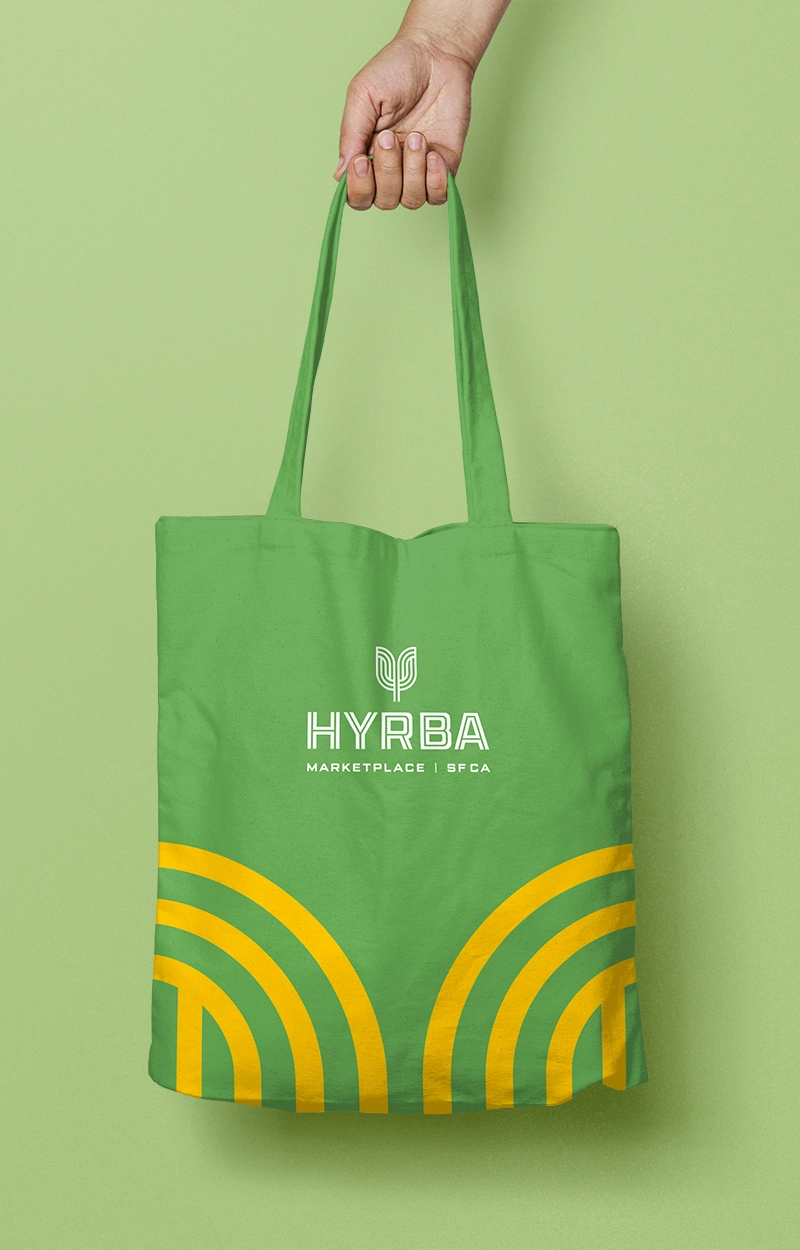
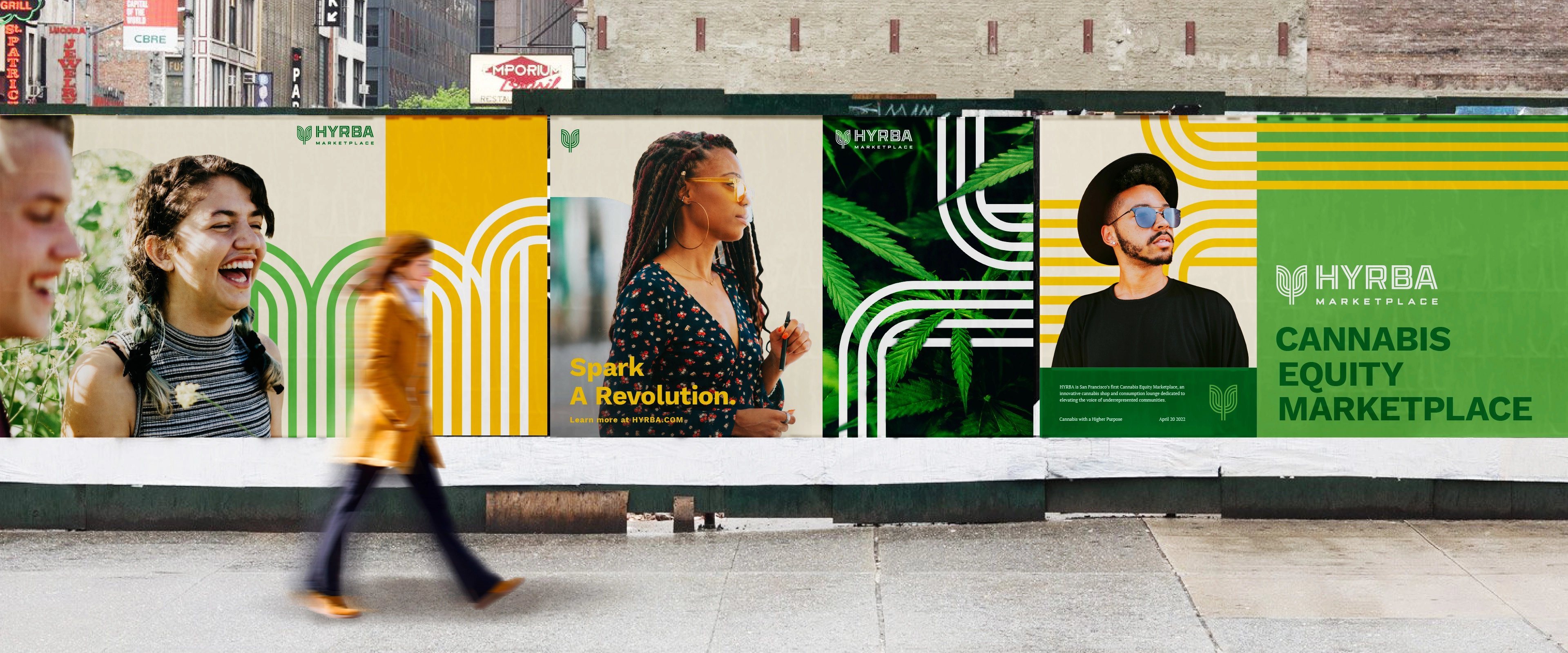
Hyrba had one directive: nothing too kitsch, such as cannabis leaves or tie-dye. We knew a strong mark could serve them well, and we drew on our experience and knowledge to create something that would effectively communicate their message. Our brainstorms evolved into a commingling of flora, of growth of a community, of movement and connectivity. We presented an abstract flower, the tree mark. It was a wildcard, for sure, and Hyrba fell in love with it, so we explored it and expanded upon it.
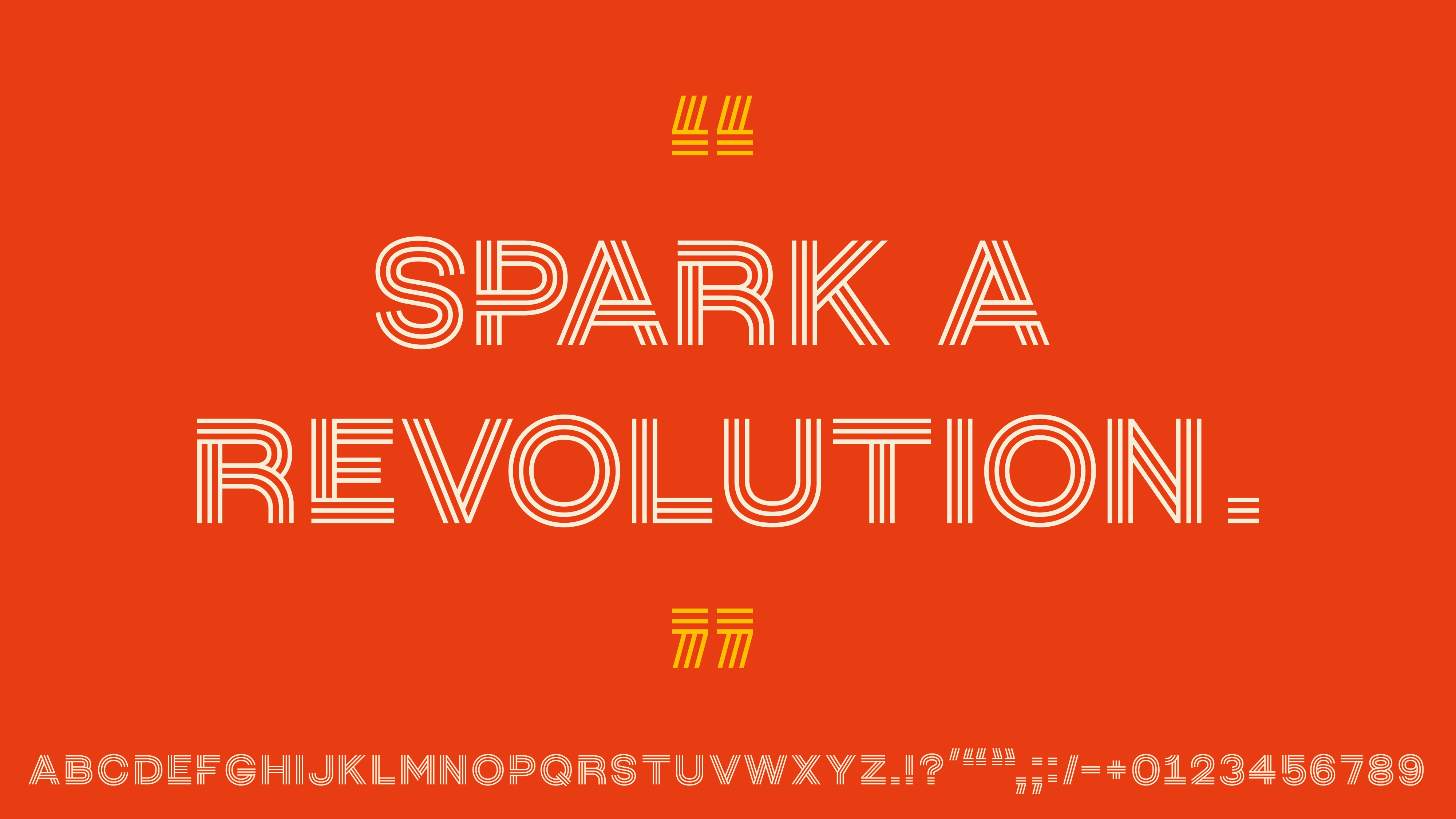
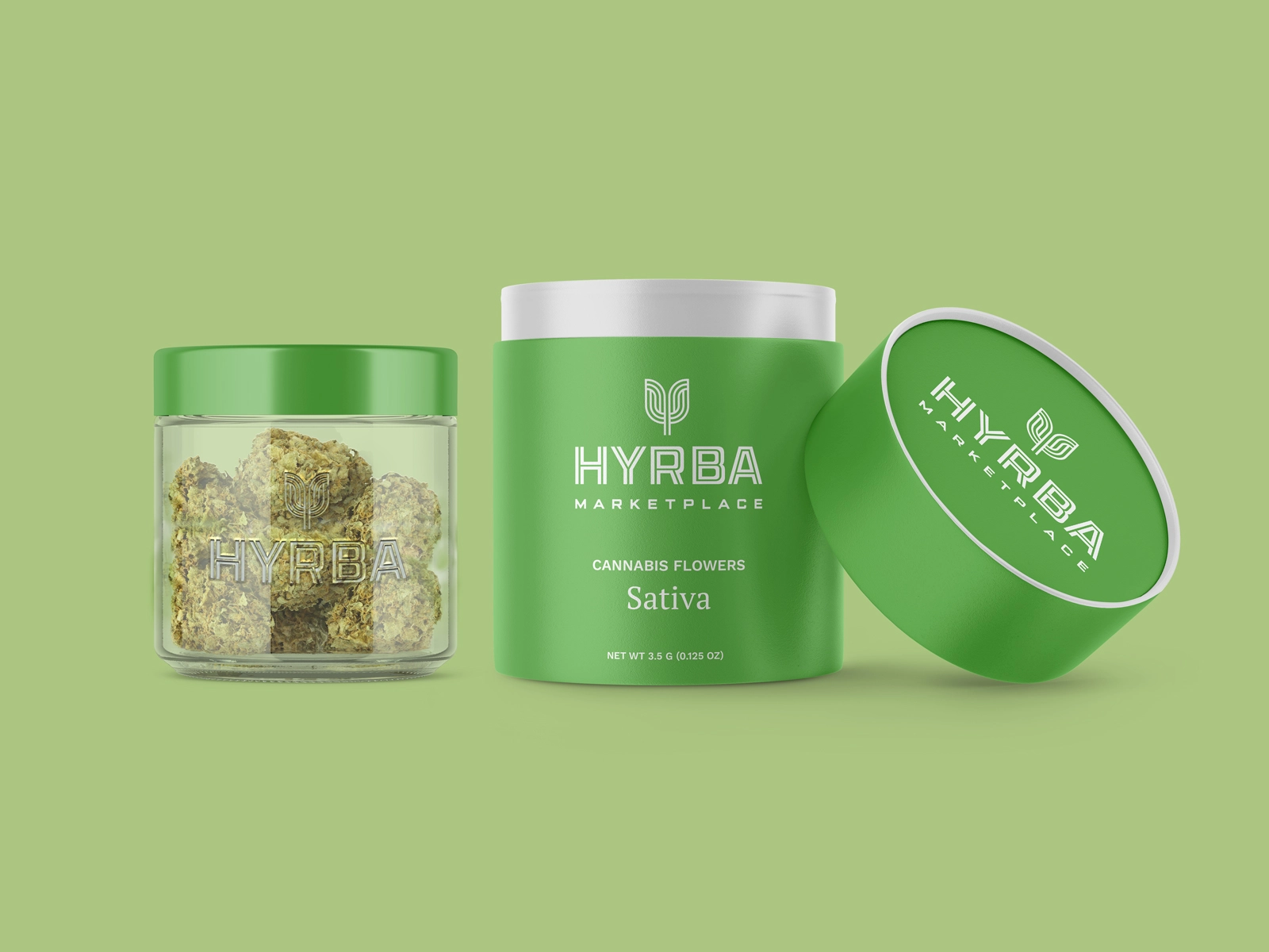
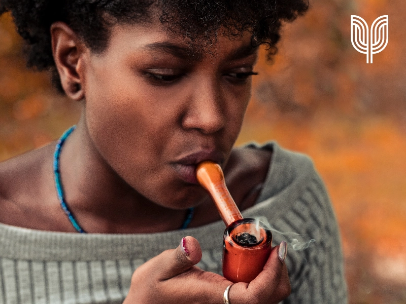
Graphic elements from the mark give a sense of transportation, of people moving throughout the city and coming together in the marketplace. This also appealed to the client, who was inspired by San Francisco’s MUNI. Other city icons—the Golden Gate Bridge, the Giants together with macro photography of cannabis ‘buds’—inspired the brand’s vibrant color palette. To add to the unique assets we added a custom display typeface inspired by the logo itself.
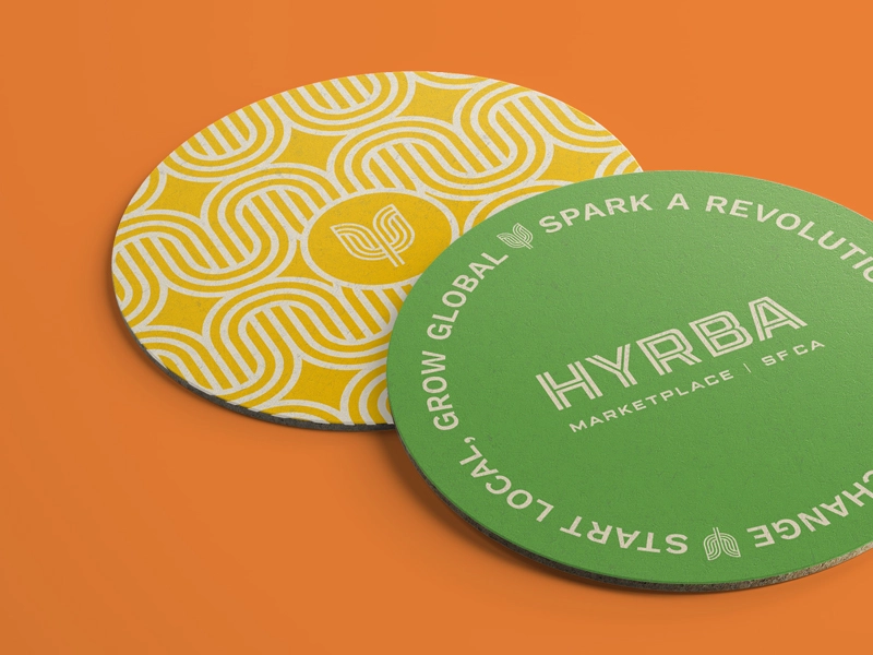
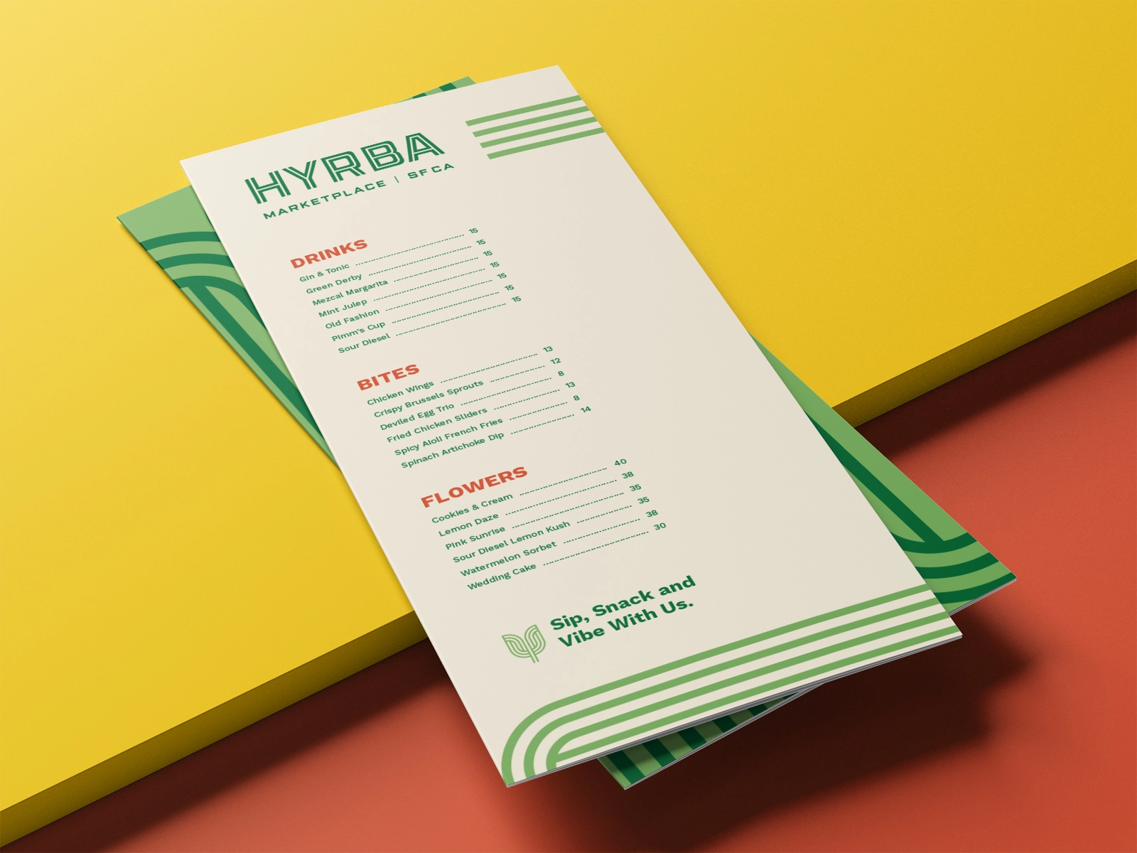
We used all these elements to create unique assets, as well as bags, menus, and coasters, to help Hyrba visualize the cohesiveness and potential for their growing brand.
Value
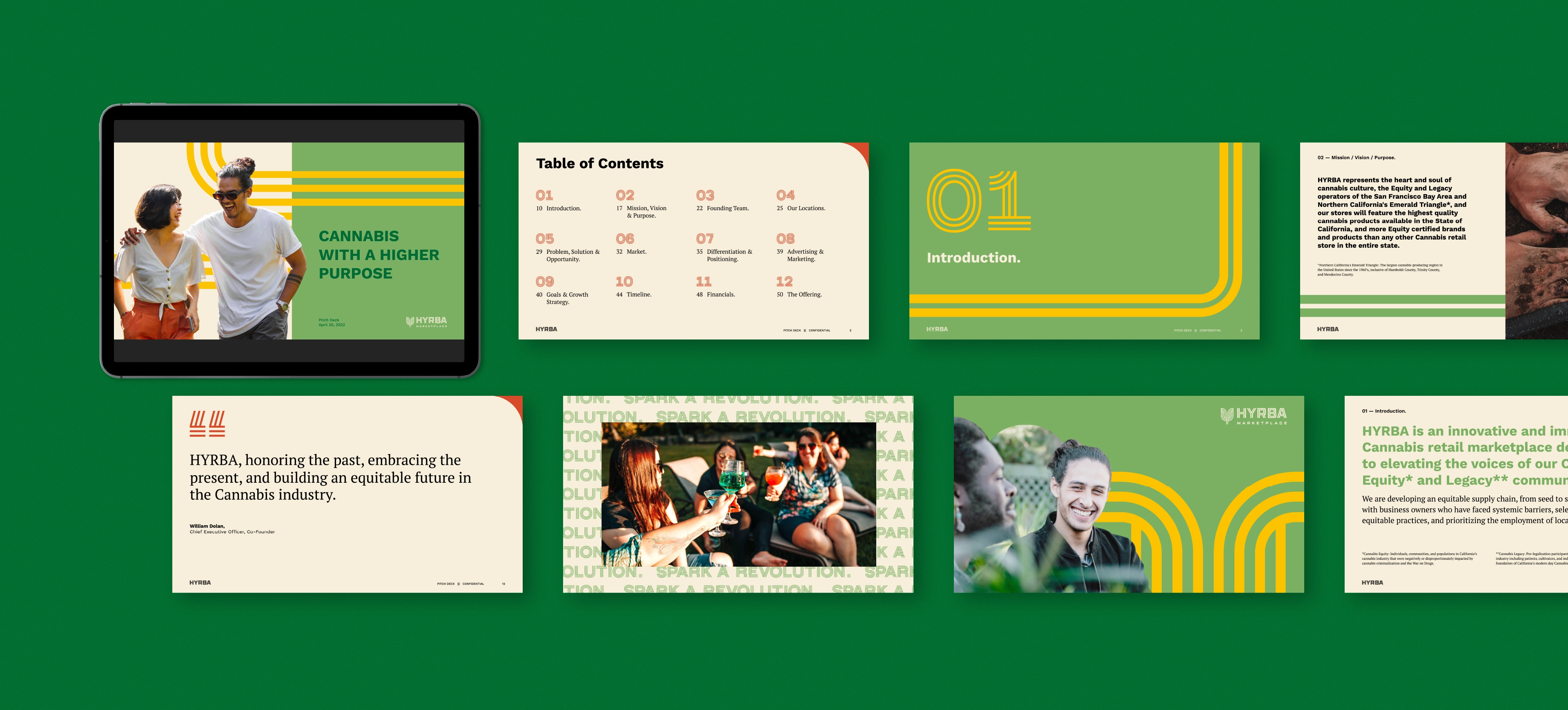
Noise 13 created a pitch deck—including example brand extensions like custom packaging and product lines to demonstrate the longevity of the brand—to help Hyrba pursue additional funding. Within a few months, they secured funding to start building.
We are proud to be part of Hyrba’s community.