July Top 13: Our Favorite Milton Glaser Works

The world recently lost one of its greatest designers and illustrators. Here are our Top 13 favorite Milton Glaser pieces that are not the I Love NY logo because that one is a given.
01
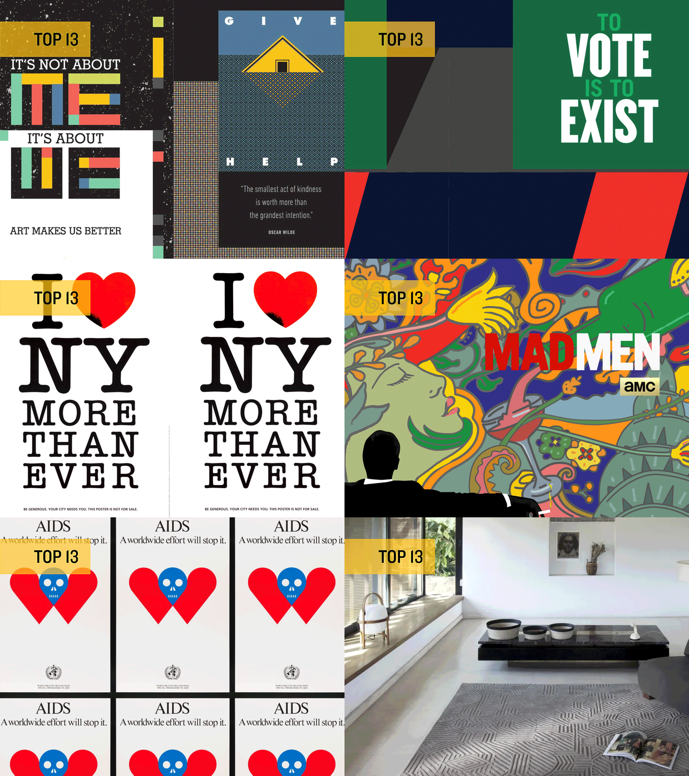
In the shadow of the famous Silence = Death campaign, it’s easy to forget the many pieces of graphic design created at the height of the AIDS epidemic. We’re struck by the simplicity of Glaser’s poster, AIDS: A Worldwide Effort Will Stop It, for the World Health Organization.
02
For a man who didn’t consider himself a type designer, Glaser sure designed a lot of typefaces! We’re in love with his Hologram Shadow typeface.
03
A great designer is always iterating and building on past works. In the wake of the September 11 attacks, Glaser created a new version of his iconic “I Heart NY” campaign, to support a grieving city.
04
Glaser’s illustrations are not to be overlooked! He and his wife Shirley created the delightful children’s book, “If Apples Had Teeth.” You won’t want to miss the zebra in striped pajamas.
05
We love Glaser’s use of simple graphic forms to express the female figure (and their hair).
06
Simplicity and information are at the center of this poster designed for the release of a line of pasta-inspired pillows.
07
Like all good designers, Glaser worked in more than one medium but did you know he also designed a line of rugs?
08
Taking inspiration from his wildly famous Dylan piece, Glaser delighted the design and advertising world by creating the title animation for the final season of Mad Men.
09
Glaser iterated on his portraits of Shakespeare over and over again for his poster series for Theatre for a New Audience.
10
In 2016, Glaser contributed to AIGA’s Get Out The Vote campaign, with a message that is still pertinent today.
11
The boldo and foldo sunglasses were Glaser’s first stab at product design. Despite entering a different realm, Glaser did not shy away from creating concepts that were unconventional and risky.
12
We’re digging this contemporary series of posters that addresses the themes of collective experience and the role of art as a facilitator for personal and social change.
13
Glaser’s poster for the 1988 New York Film Festival is just downright fun. From the geometric forms, to the placement of typography, the piece feels both of-an-era and timeless.


