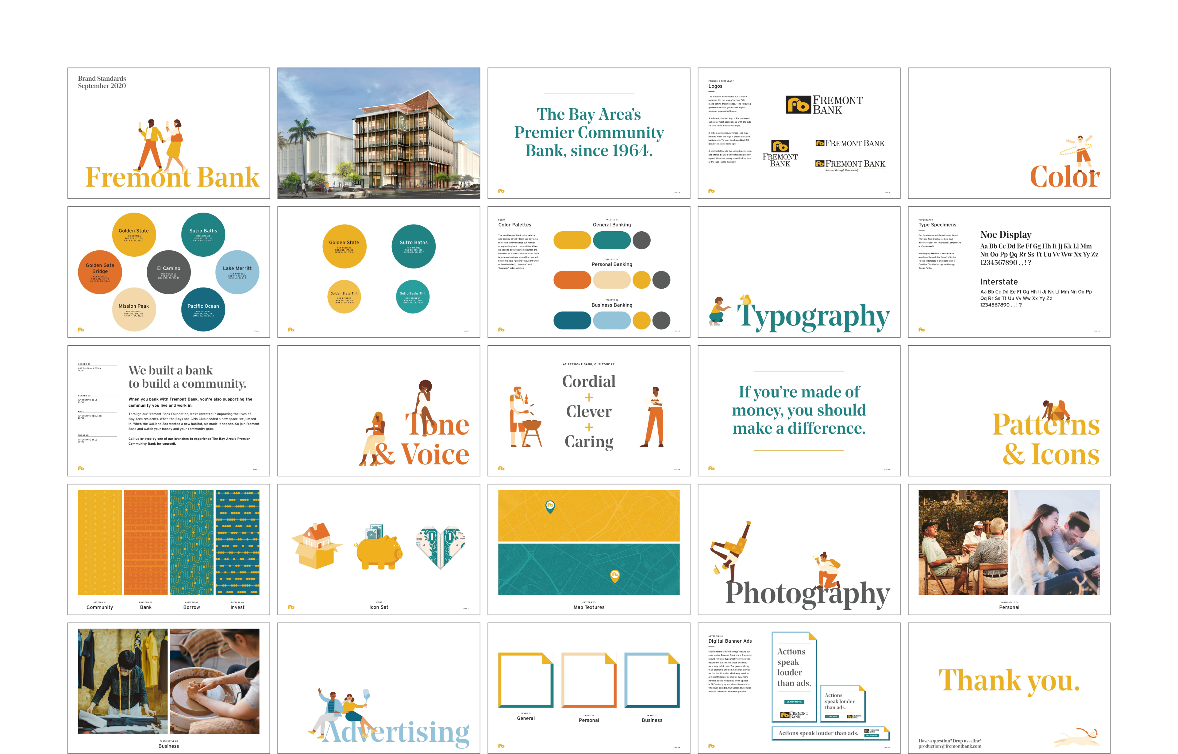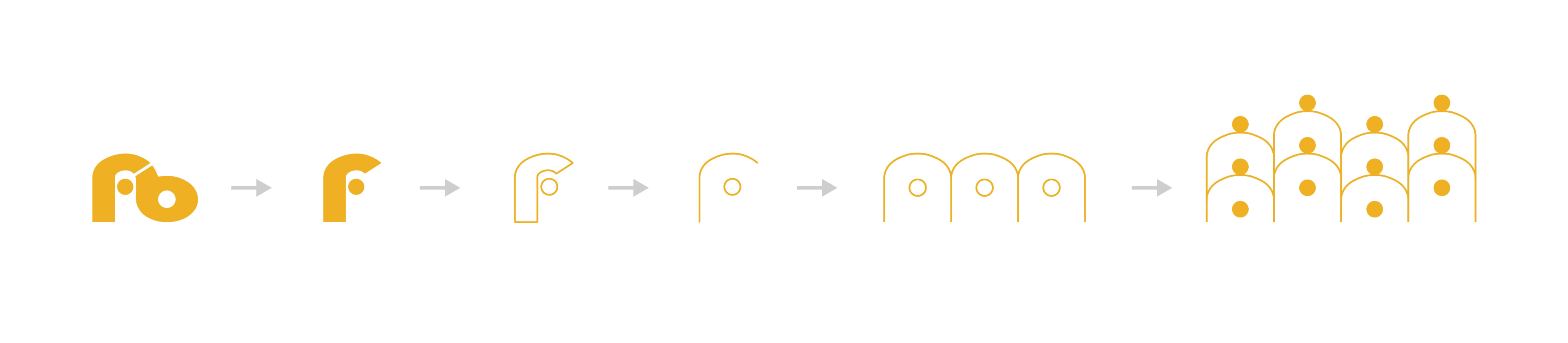
Fremont Bank is a local community bank in the San Francisco Bay Area, with branches from Walnut Creek to Oakland to Mountain View. Their focus on personal relationships with clients and strong history of community service have made the bank a highly respected business for nearly 60 years. They asked Noise 13 to revitalize their brand, with one caveat: we couldn’t touch the logo that has served them since 1964.
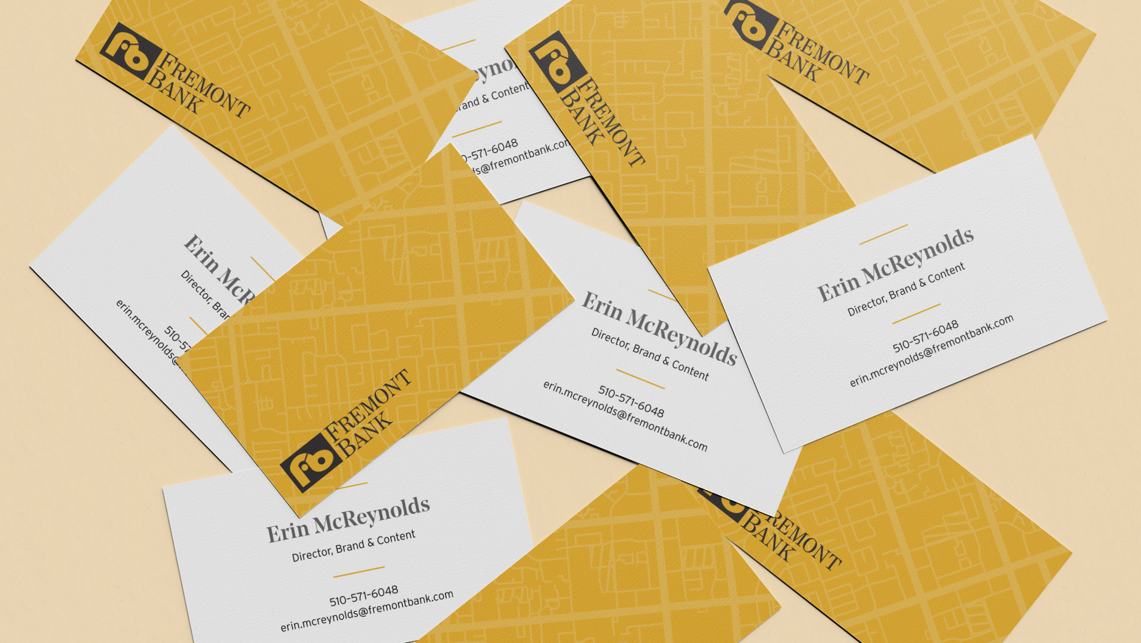
To begin, we built a comprehensive brand toolkit for Fremont Bank to use. We updated the bank’s brand colors of gold and teal, and built a secondary palette inspired by Bay Area landmarks, that can be used to help differentiate between the bank’s different product offerings. For typefaces, we introduced a bold serif for eye-catching headlines, and a clean sans serif for clarity and readability.
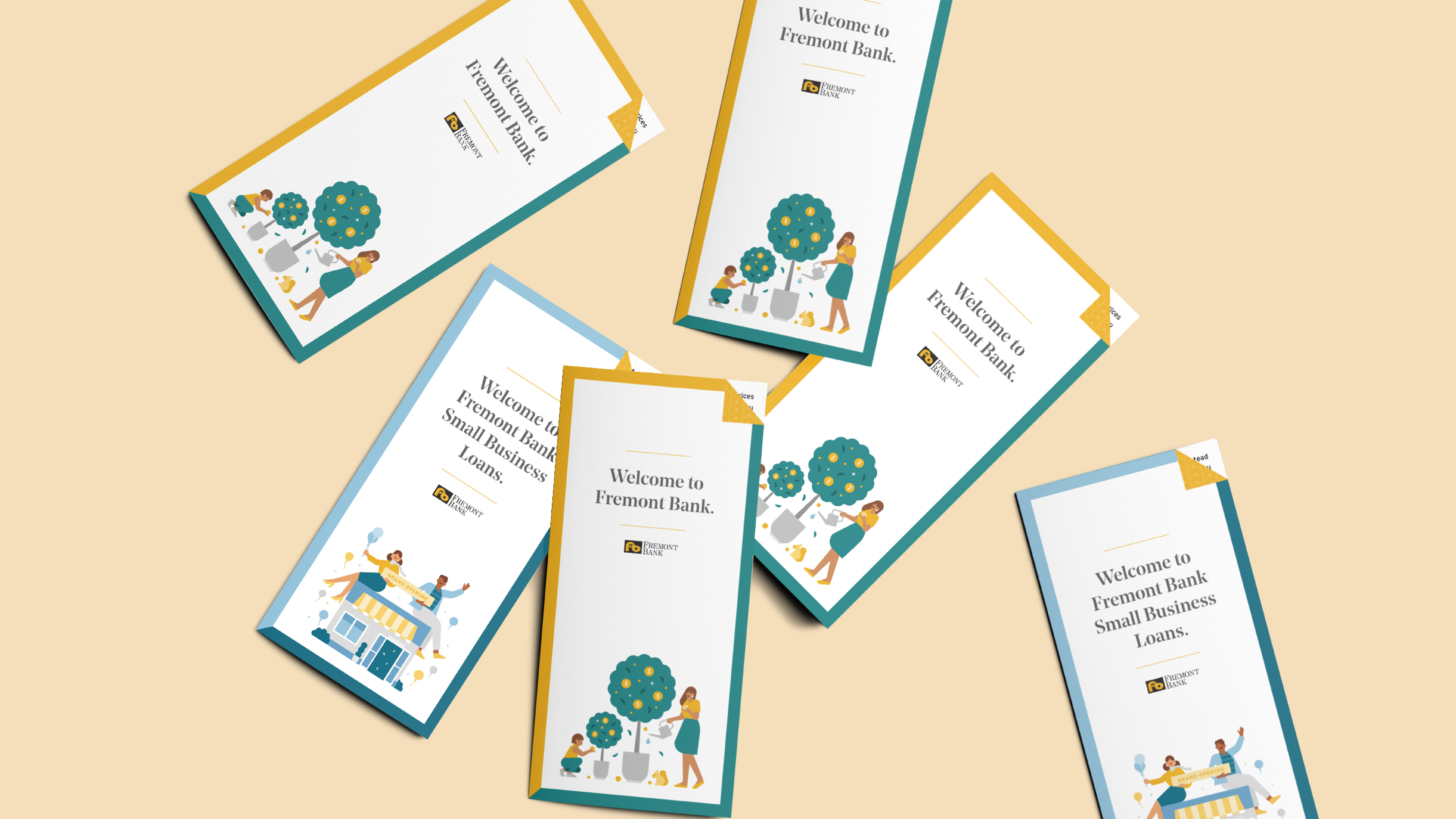
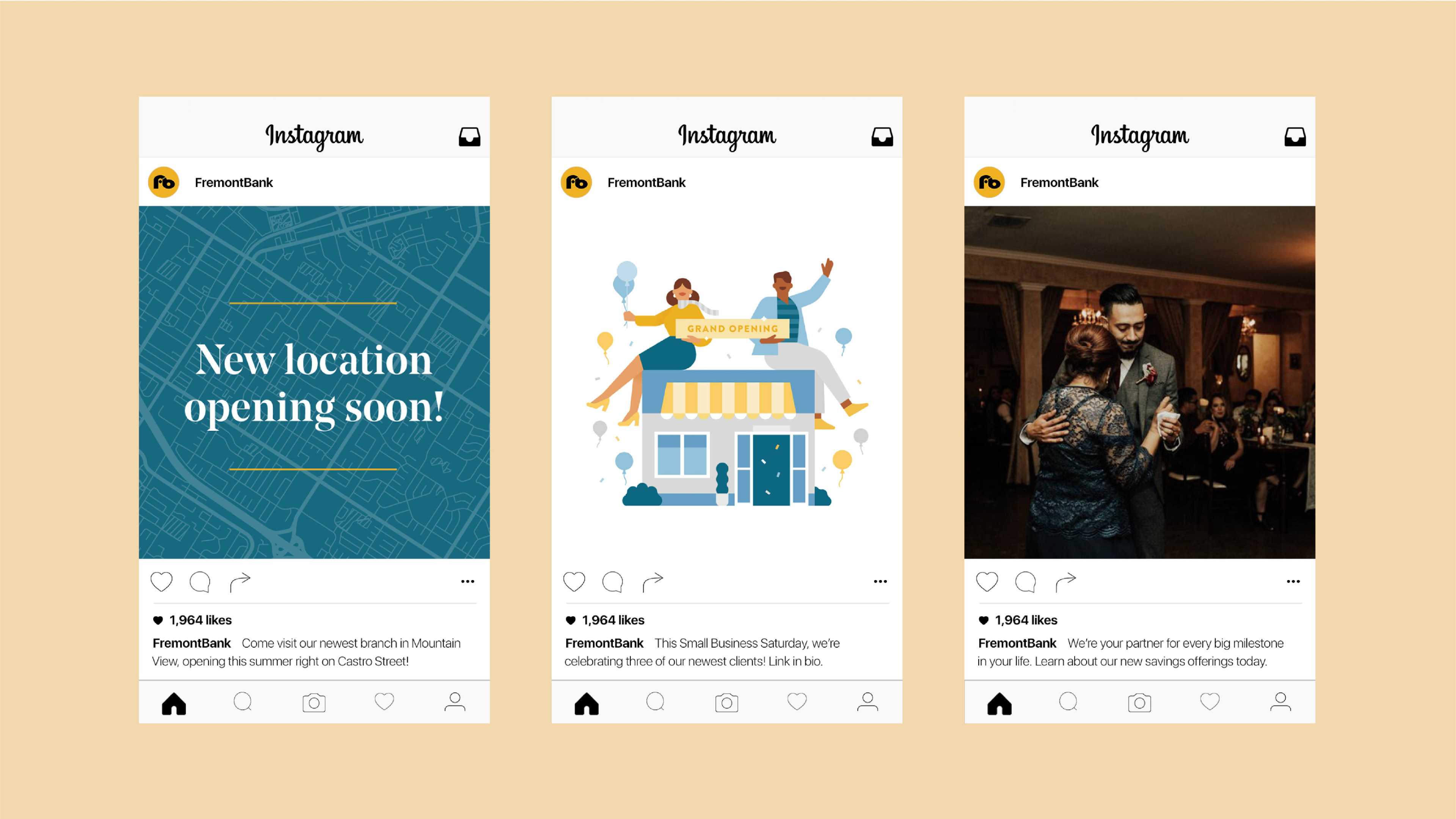
We knew we wanted to emphasize the human touches of banking with Fremont Bank, too. We created a library of playful illustrations and icons, and a warm, candid photography style, focusing on the many communities of people who make up the Bay Area. We designed a set of patterns, deconstructing the Fremont Bank logo to express the themes of Community, Bank, Borrow and Invest, as well as a series of topographic textures celebrating where Fremont Bank’s locations can be found. Lastly, we developed an elegant marketing template that uses a colorful frame and dog-eared page to capture viewers’ attention across all applications.
With all these new elements, Fremont Bank now has a cohesive look that will serve it for years to come. We’re proud to be a member of their community.
This work went on to win two Graphis Design Annual awards in 2022!