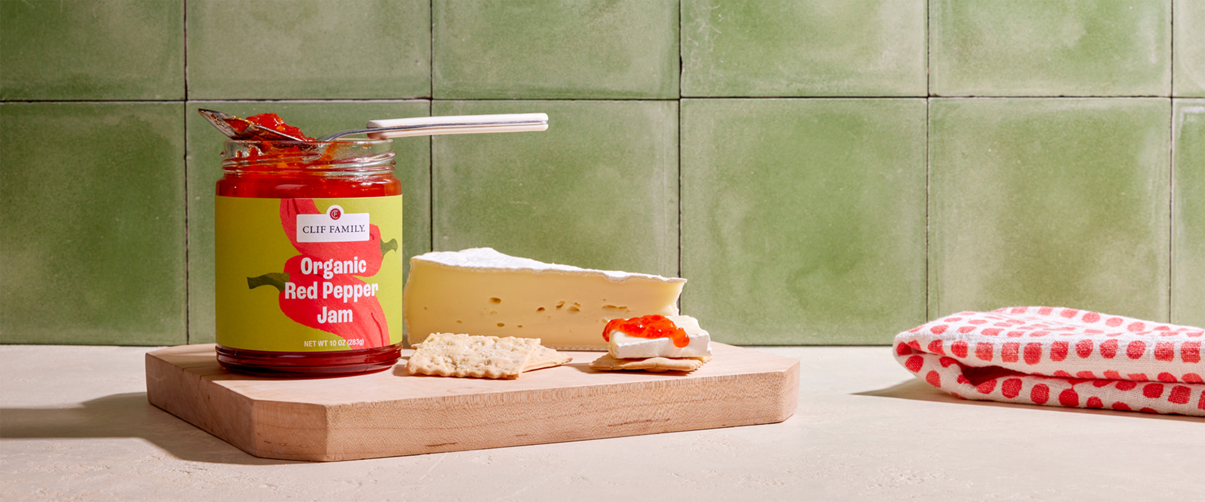
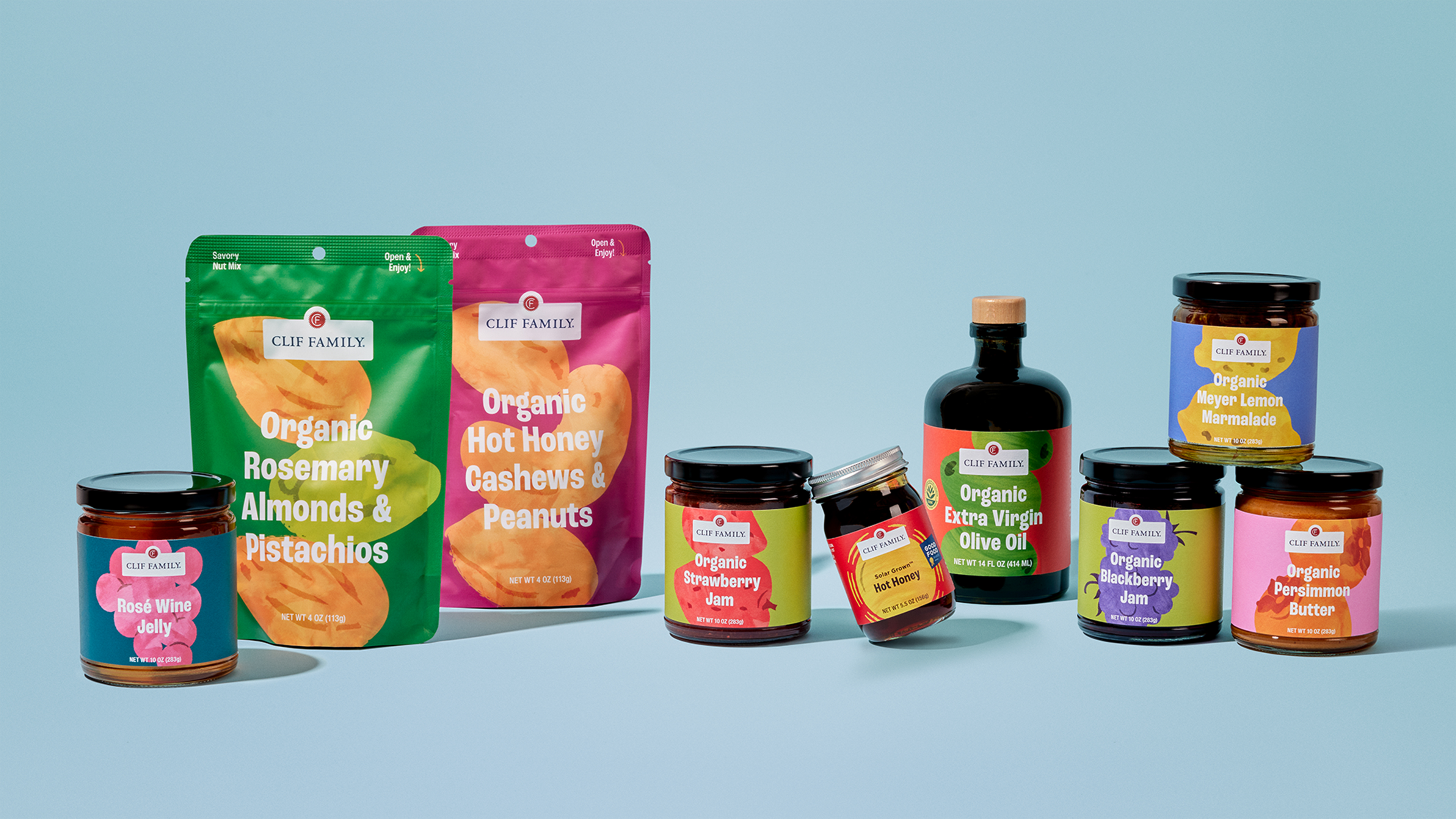
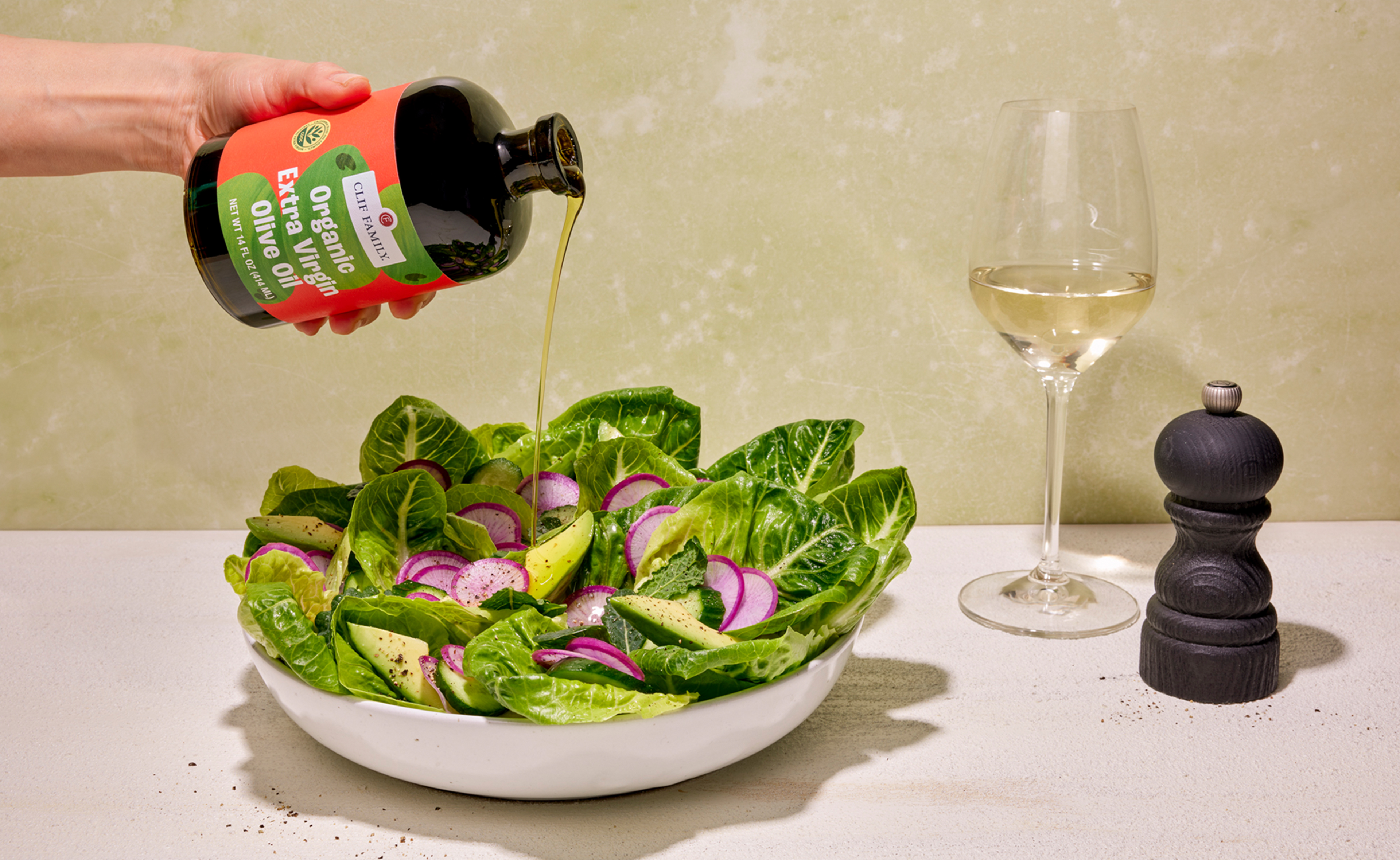
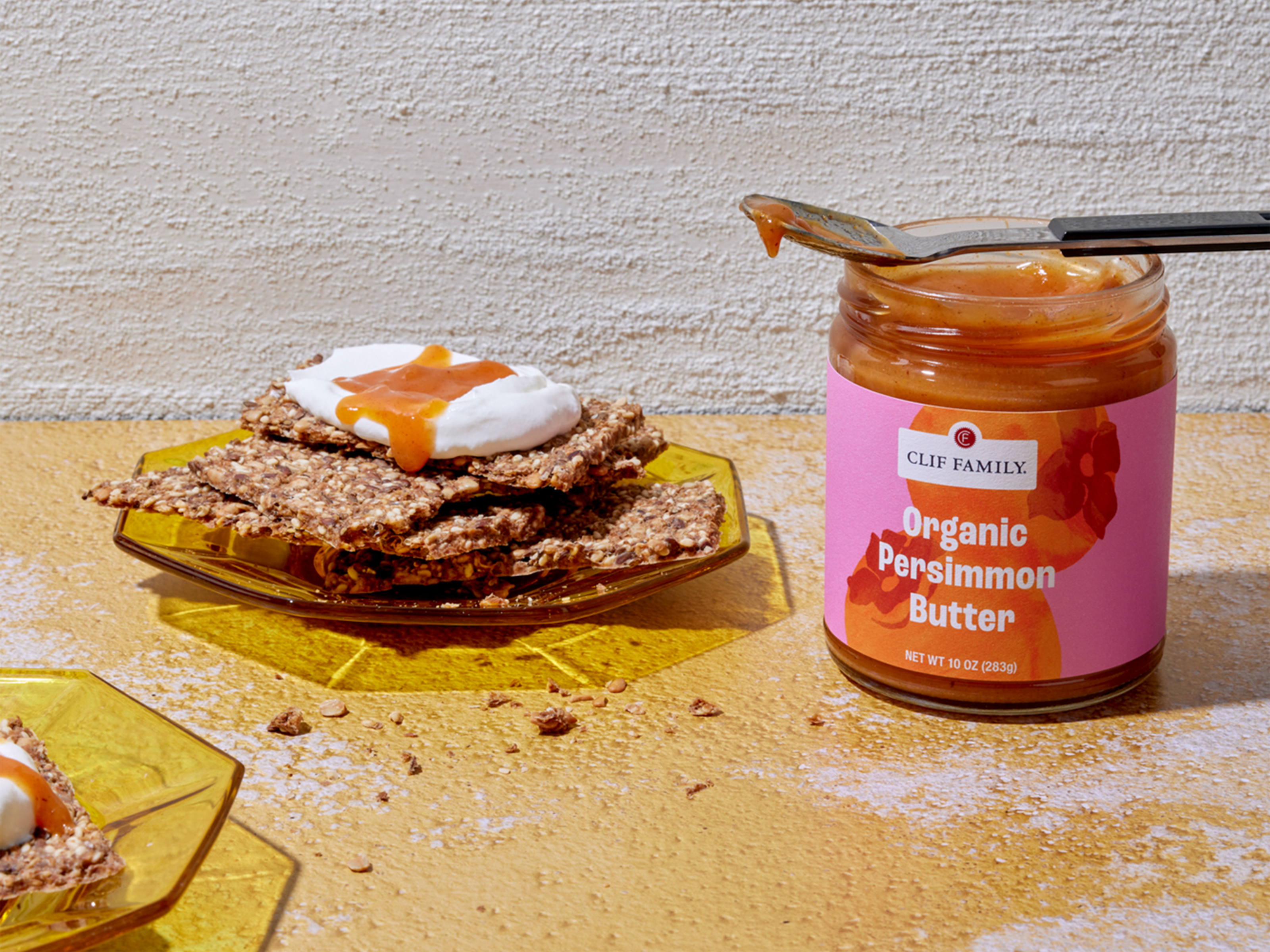
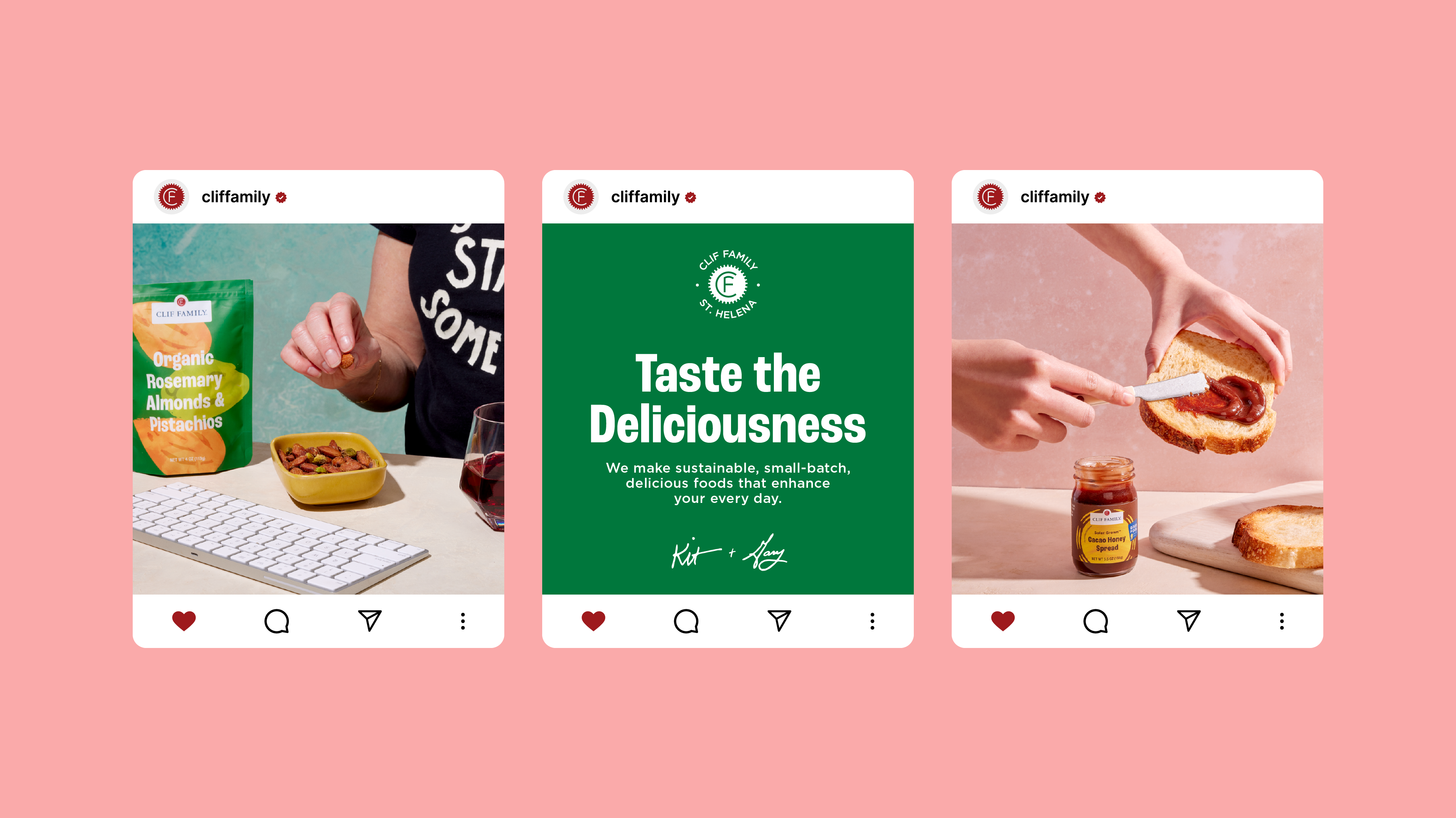
When Clif Family approached us to reimagine their packaging, we were thrilled to partner with a brand that shares our values around sustainability, transparency and being a force for good. As fellow B Corps, we were in lockstep with their vision for a creative revamp. Updating their packaging for greater sustainability provided the opportunity to refresh their visual identity systems.
The goal was to embrace Clif’s adventurous and playful spirit while celebrating their Napa Valley roots. The packaging needed to appeal to a broader, younger audience while staying true to the brand’s artisanal products.
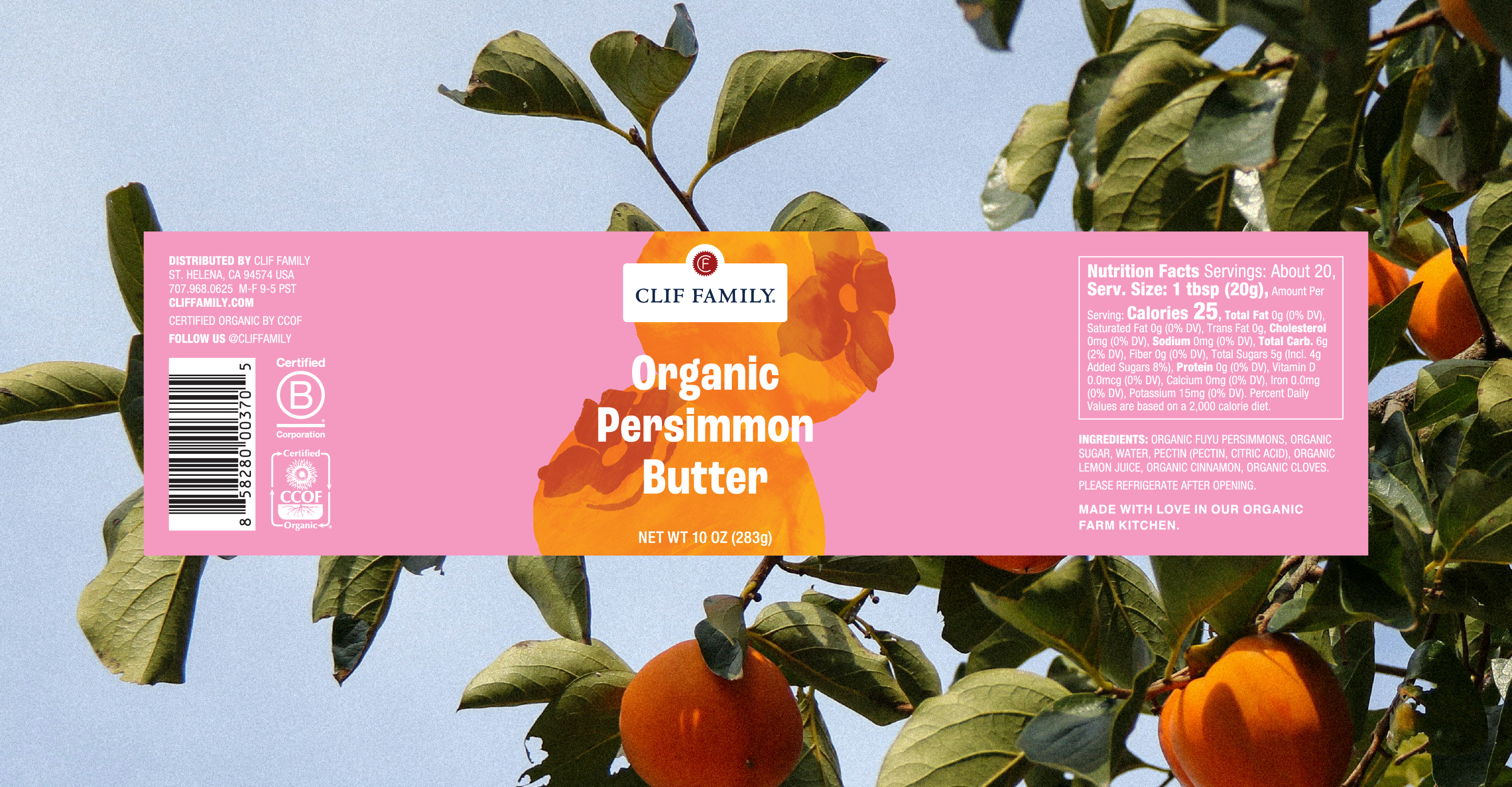
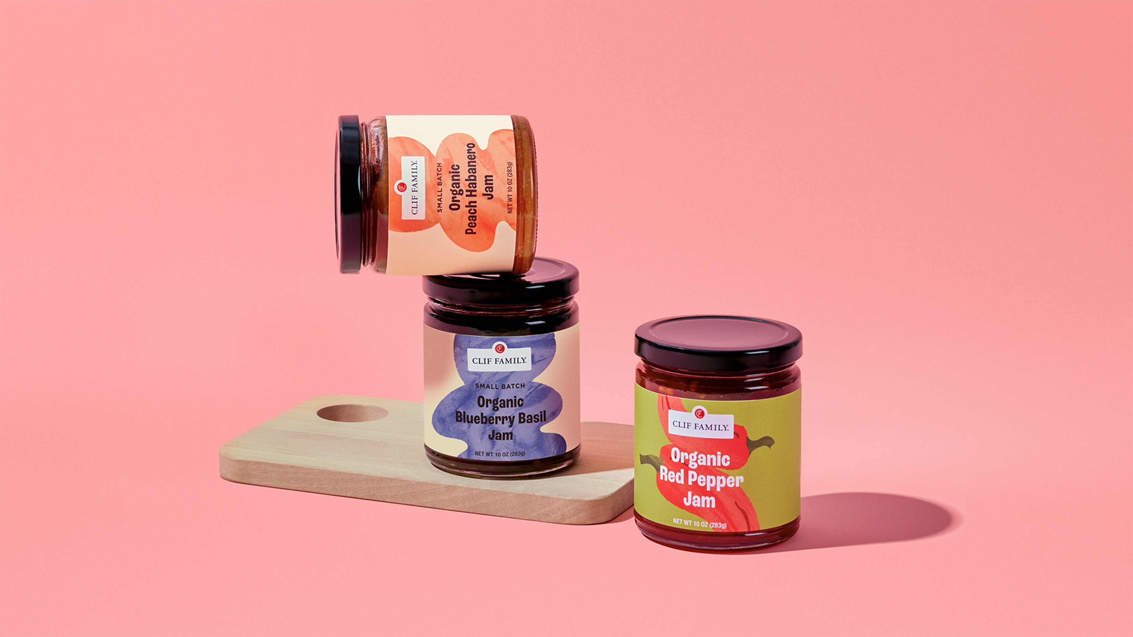
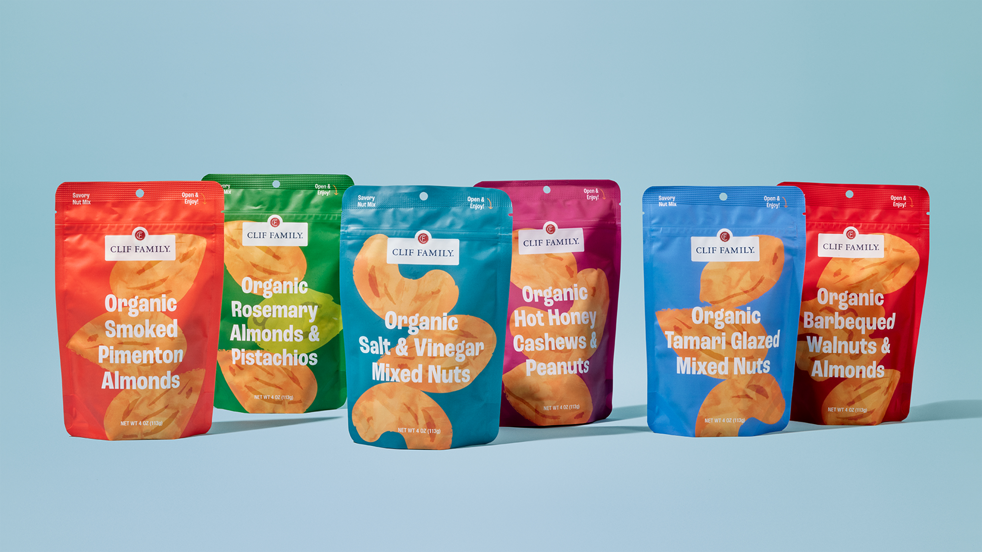
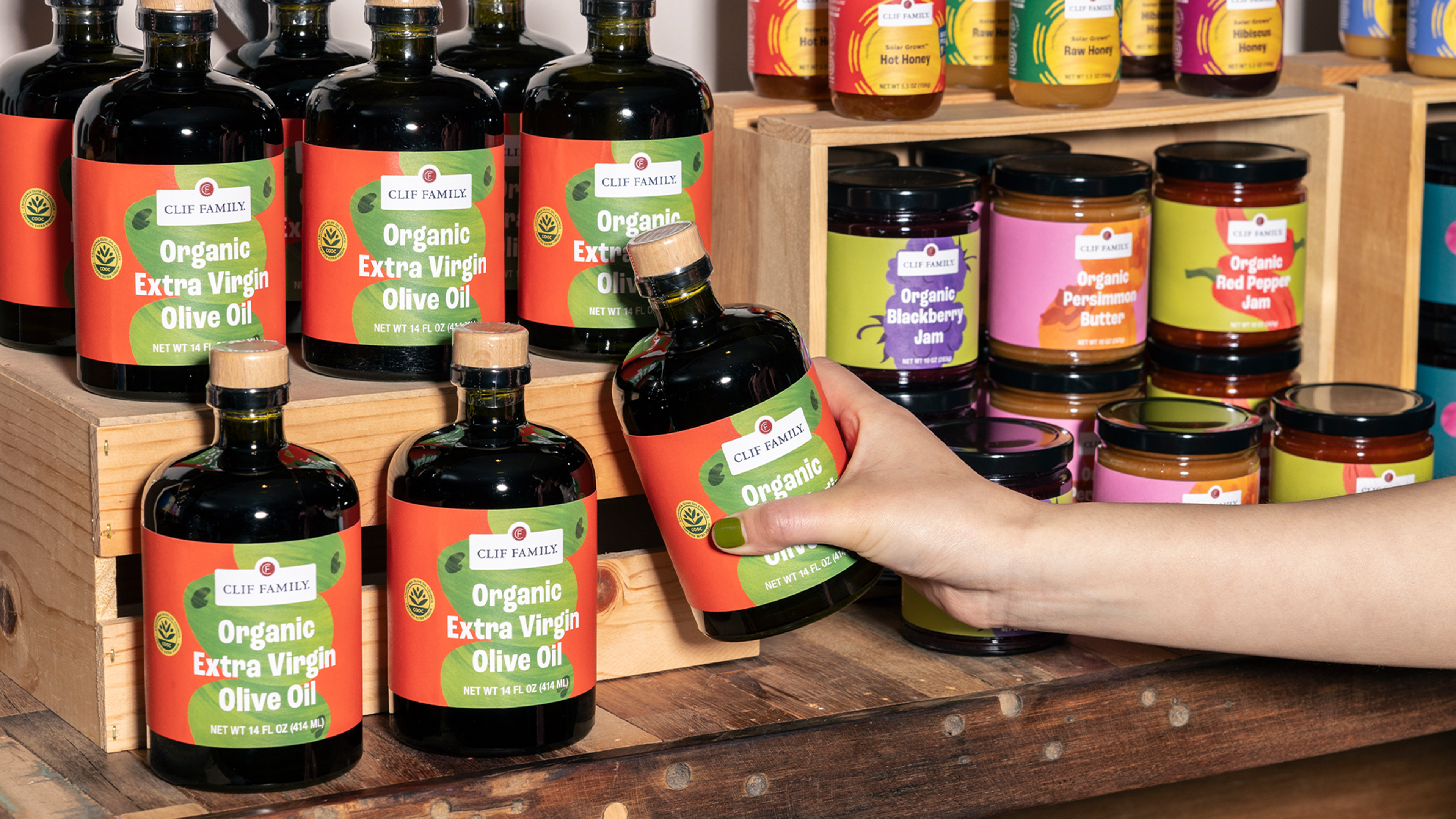
Strategically, we developed a design system with clear navigation between product lines, anchored by consistent yet energetic color palettes and typography for each SKU. Textural organic illustrations hero-ed key ingredients like citrus, nuts, and olives.
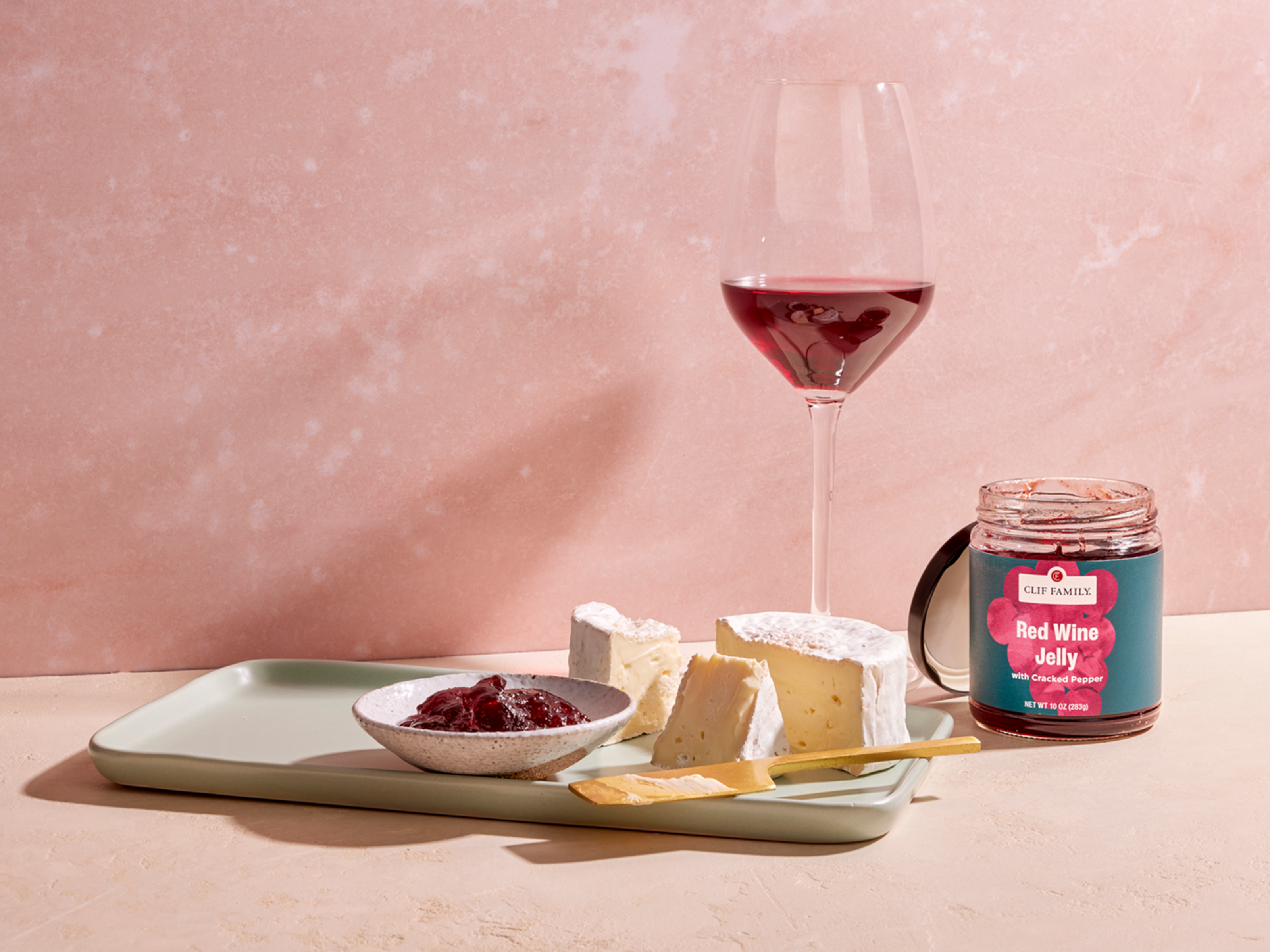
The resulting packaging system is a bold, beautiful expression of who Clif Family is today. Beyond the tasting room, Clif’s products need to stand out on retail shelves from specialty grocers to airport offerings. This new look practically jumps into your hands with bright, appetizing colors and delightful illustrative details. Eye-catching type spotlights product names while the vibrant ingredient illustrations evoke the fresh, high-quality ingredients inside. We also updated Clif’s photography with new guidelines to achieve a brighter, more approachable style reflective of their brand evolution.
This was a truly collaborative partnership founded on shared principles. United with Clif Family, we created packaging that authentically embodies their purpose while capturing the magic, craft, and sustainability of their California roots. The vibrant rebrand brings new energy to a beloved brand, positioning Clif for the future. It’s a fresh yet recognizable expression of who they are.
