The state of poverty in the Bay Area calls for a transformative moment. Both poverty and wealth are rapidly growing, presenting an opportunity to connect the two to create positive change.
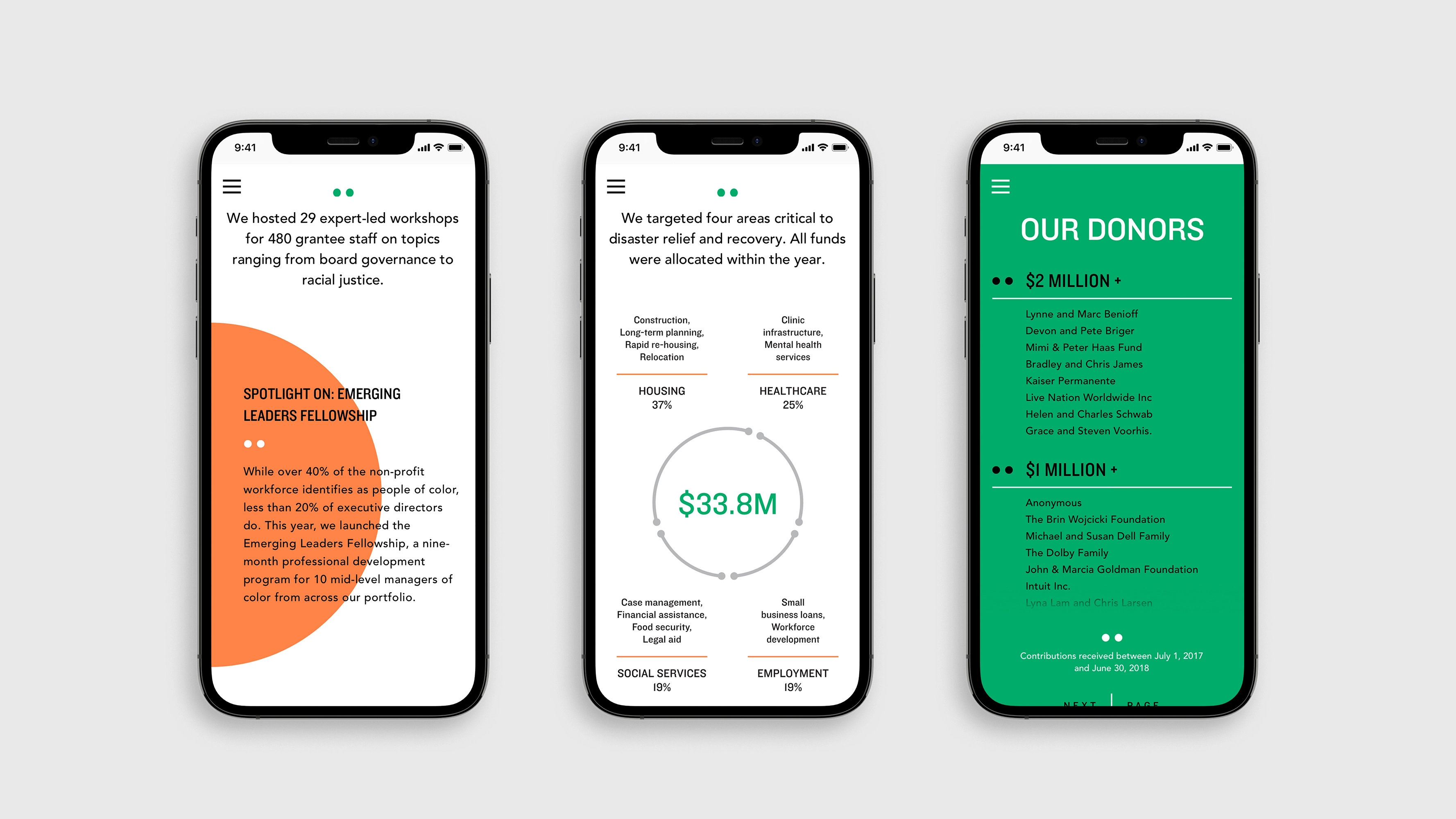
Tipping Point Community is a highly respected Bay Area non-profit committed to fighting poverty by distributing funds from high-profile donors to thoroughly vetted and effective organizations. They sought out Noise 13 to create a campaign concept that could lay the foundation for an annual appeal mailer, series of newsletters, presentation templates and microsite to showcase their annual report.
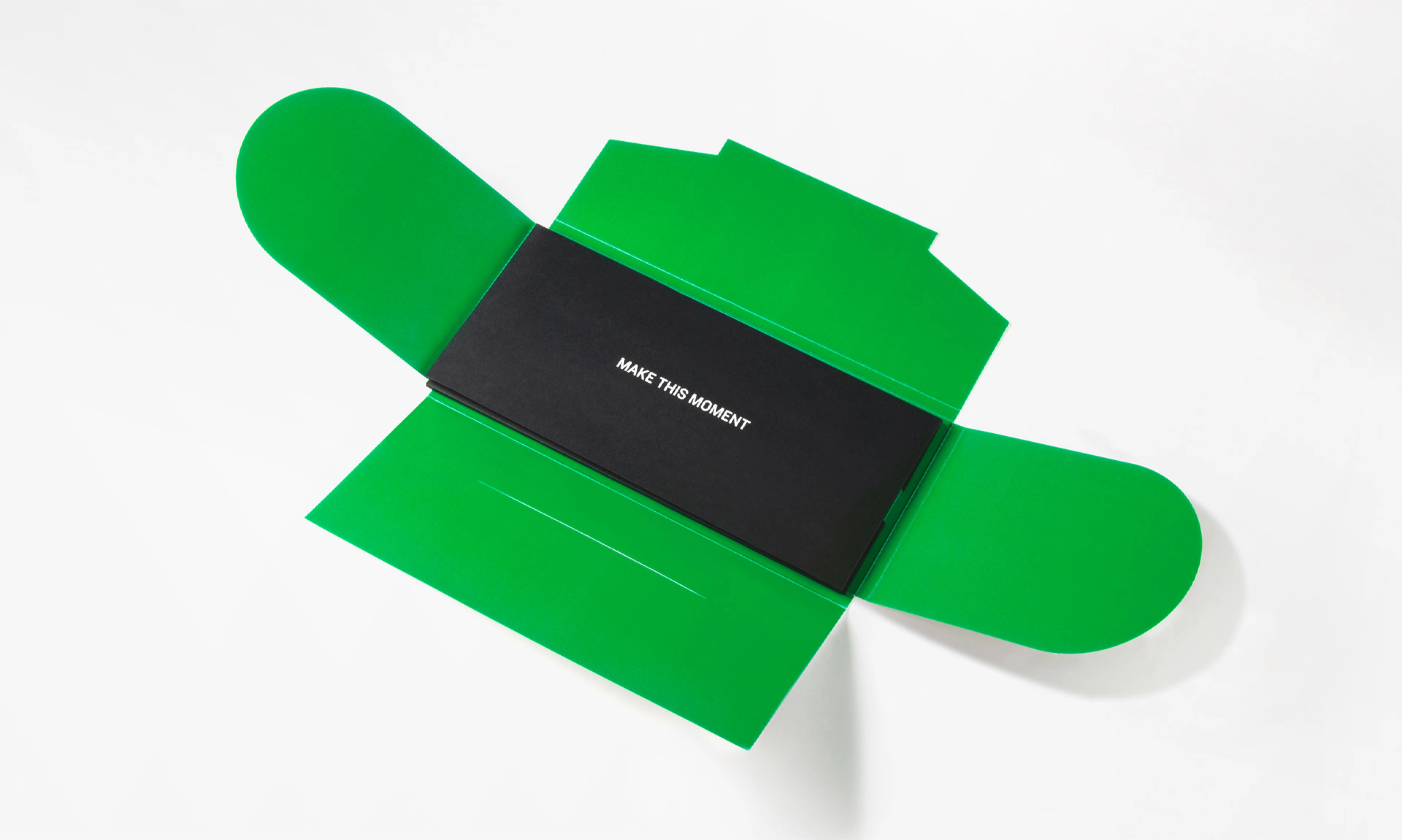
Make This Moment is based on the idea of transformative moments. Staying close in to Tipping Point’s existing look and feel, we created a simple visual palette to express this idea. For the impact report, we expanded the color palette to include a bright orange to amplify the feeling of optimism. The use of circles in fun and dynamic ways was another key visual that helped reinforce this tone while nicely tying back to the core brand.
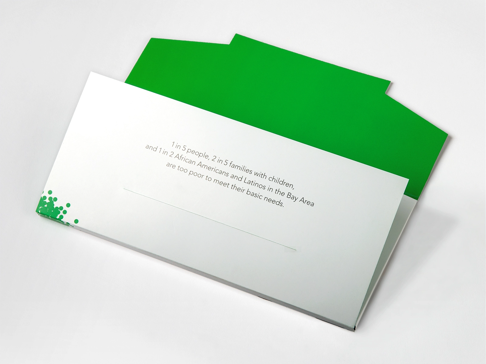
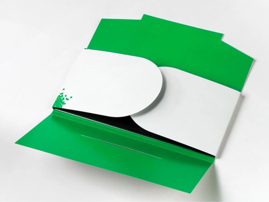
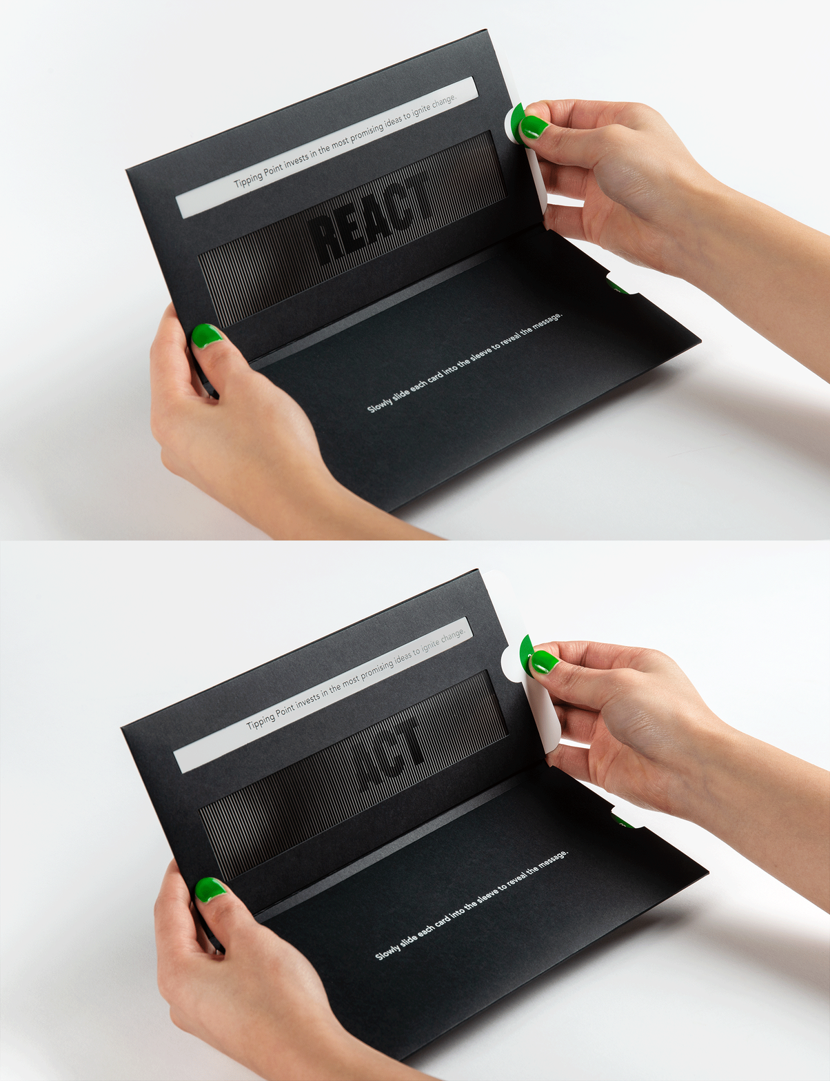
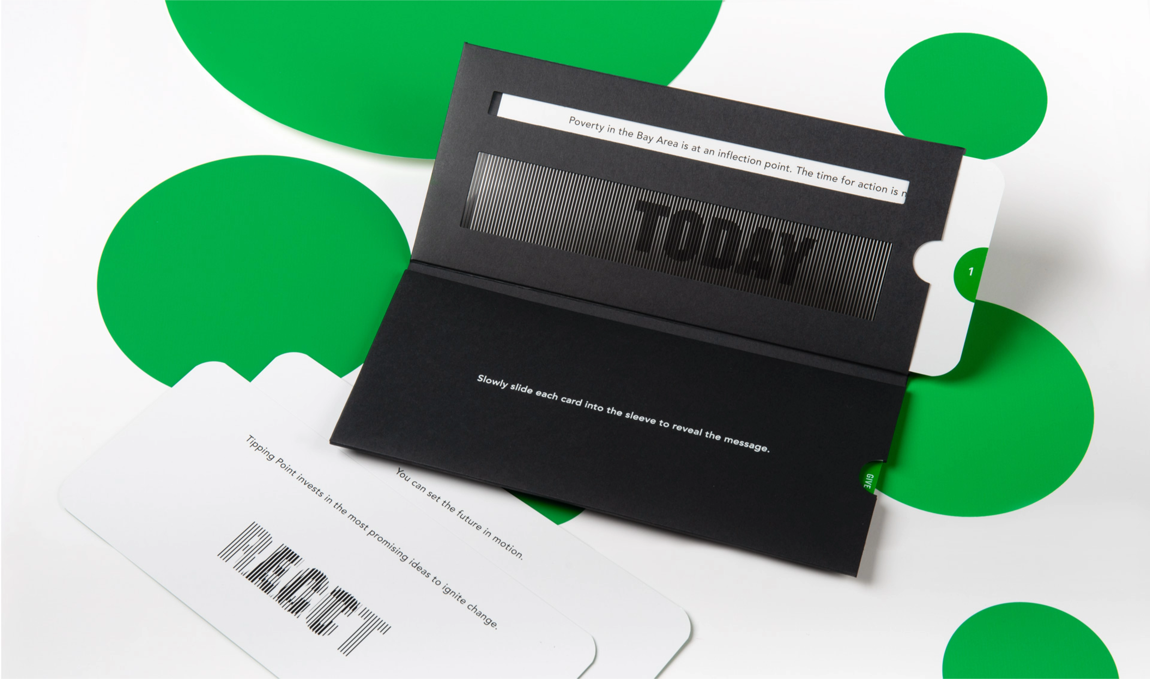
The campaign was refreshing because it was not overt—each touchpoint offered a slightly different expression of why the fight against poverty can’t wait, spurring the donor base to give. The annual appeal mailer utilized a lenticular animation to speak to this sense of urgency, transforming words like “someday” into “today.”
