The Brief:
Build a brand for a frozen treat that’s loud, fun, and just happens to be good for you.
What Actually Happened:
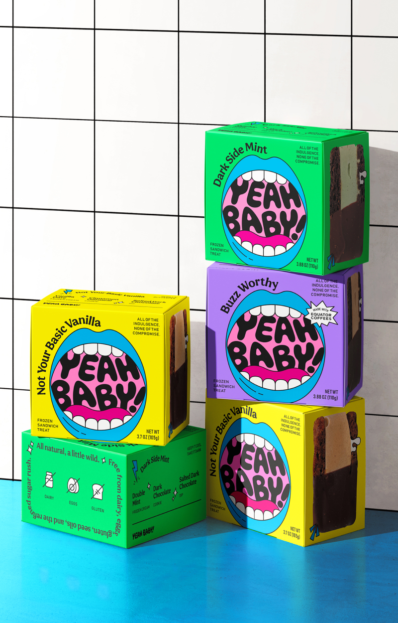
Most “better-for-you” frozen treats look the same — soft pastel colors, quiet packaging, whispering their virtues. Yeah Baby! does the opposite. It’s loud about being healthy, fun and delicious.
We started with the name. “Yeah Baby!” is a little silly on purpose. You can shout it or say it soft and almost sweet. That gave us a lot to work with on the logo and the package itself.
The main graphic is the Yeah Baby! logotype sitting inside a big mouth — blue lips for the cold of the frozen treat, wide open for the delight of a big bite. Bright colors, pop art energy, and very expressive. Small icons and illustrations layer in around it, hinting at flavor, texture, and the feeling the ice cream sandwich gives you. Bold, playful text wraps around the whole thing, so the package feels like it’s talking to you. Flip to the side and you see the real thing — actual size, real texture, the dip, the flavor.
Nothing about it says “plain healthy treat.” It says “pick me up.”
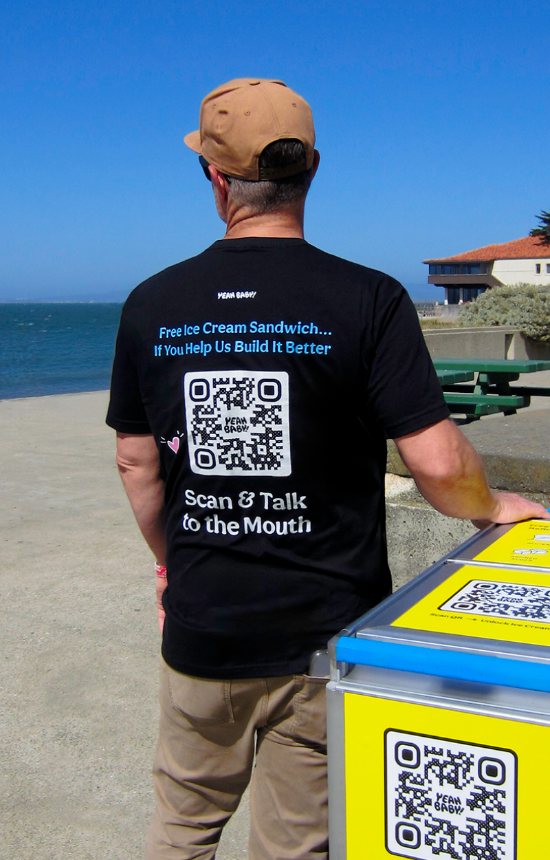
This brand launched with a push cart and tasting samples at the park. Having guests taste the product and provide instant feedback allowed for size improvements and brand awareness as we launched into gourmet grocery later this year.