OUR OPPORTUNITY
Paso Robles makes for the perfect weekend escape. With some of the world’s best food and wine, events, and festivals throughout the year, plus accommodations ranging from country inns to downtown hotels, there’s something for every traveler. The challenge lies in making this information easily accessible, in a way that truly represents the unique Paso experience.
The Paso Robles Wine Country Alliance asked Noise 13 to help reimagine its brand and website by creating a user experience that would help travelers easily find what they are looking for, whether they are planning their trip or they are already on the road.
OUR APPROACH
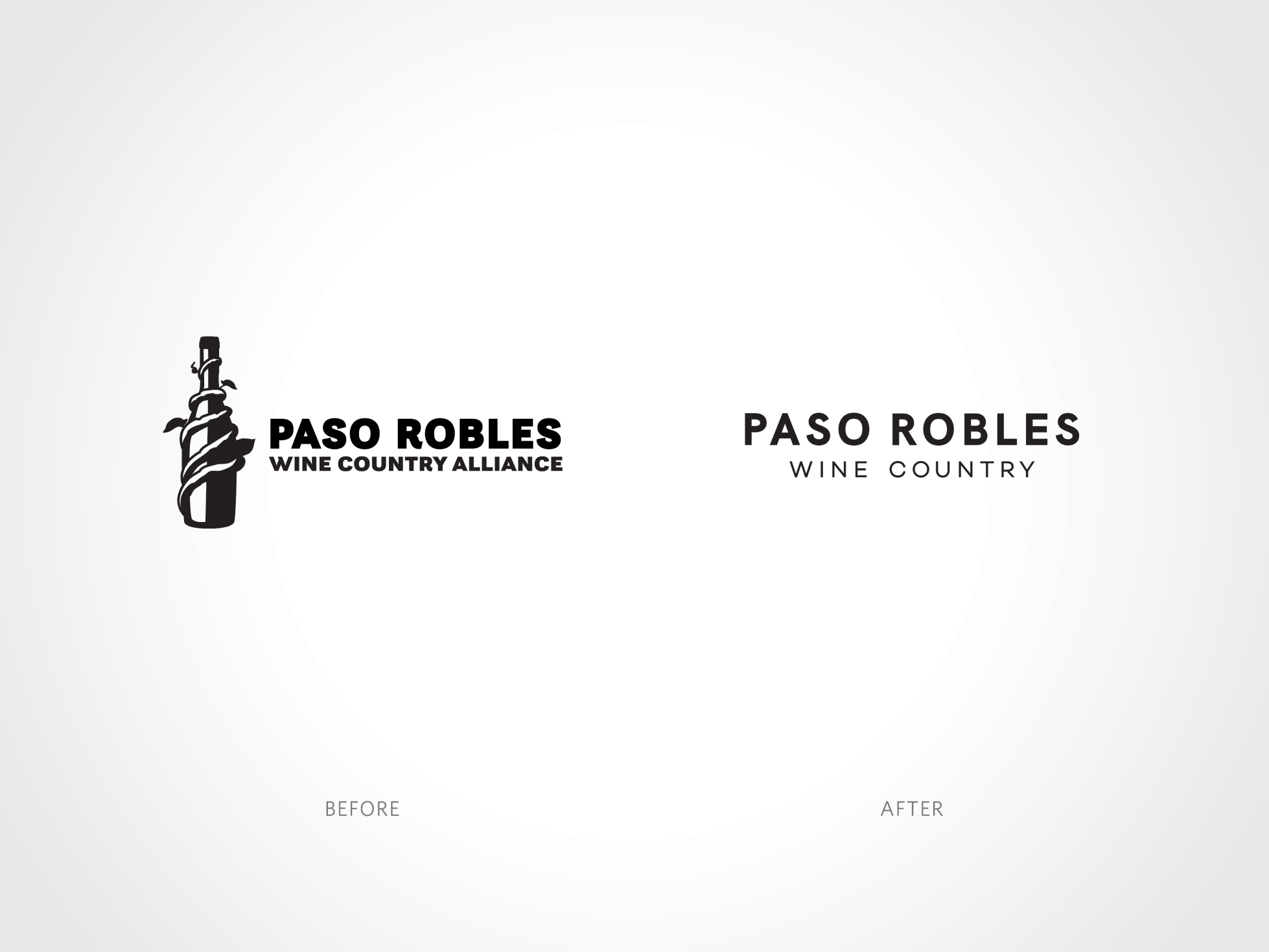
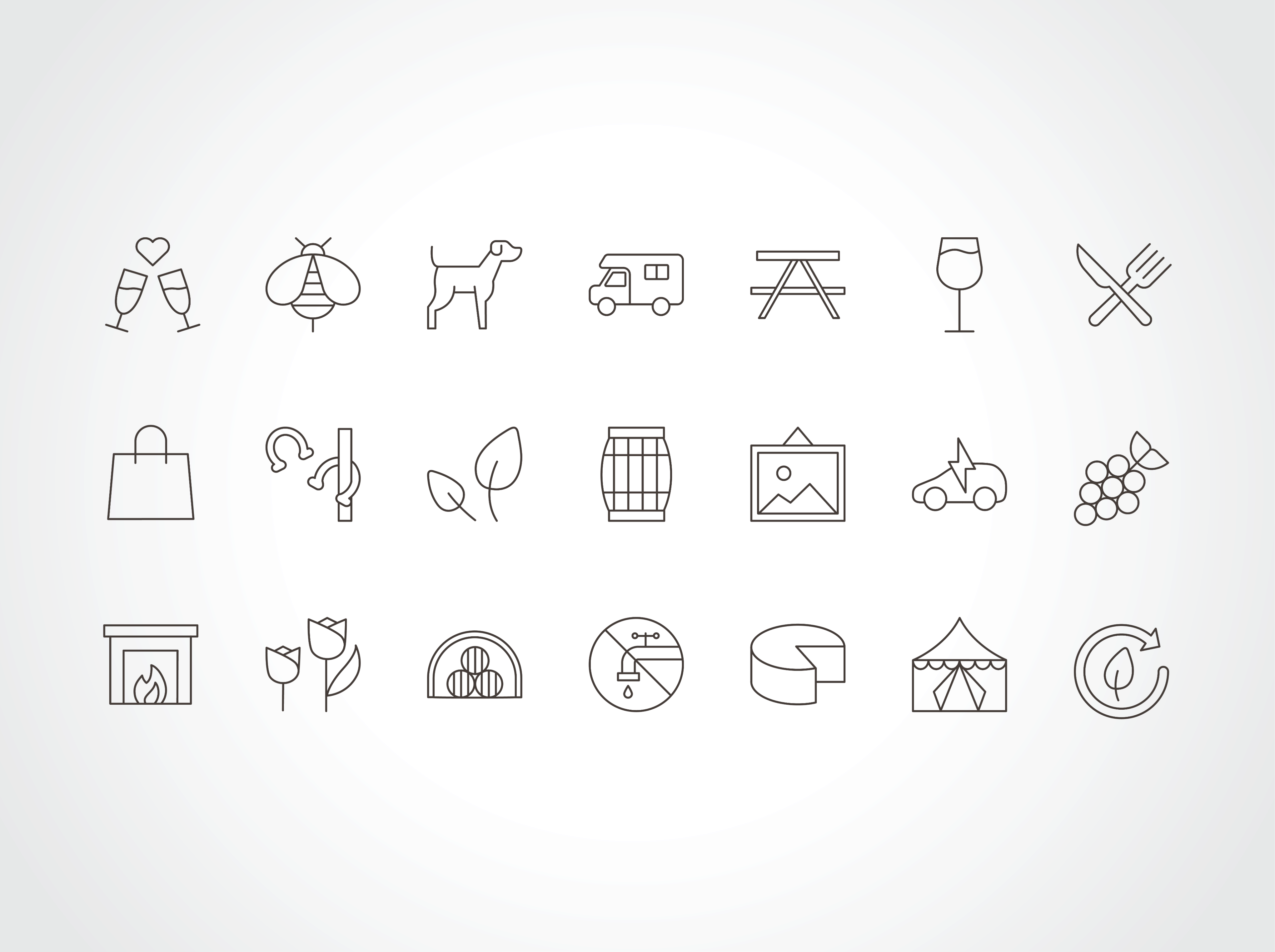
We started by refreshing the overall look and feel of the brand to reflect the spirit and style of Paso Robles. The logo was simplified and modernized, ensuring better usability at all scales. We then developed a visual language that’s warm, inviting, and slightly rustic; vibrant colors and contemporary fonts are layered together with authentic photography, helping to distinguish Paso Robles from other wine regions.
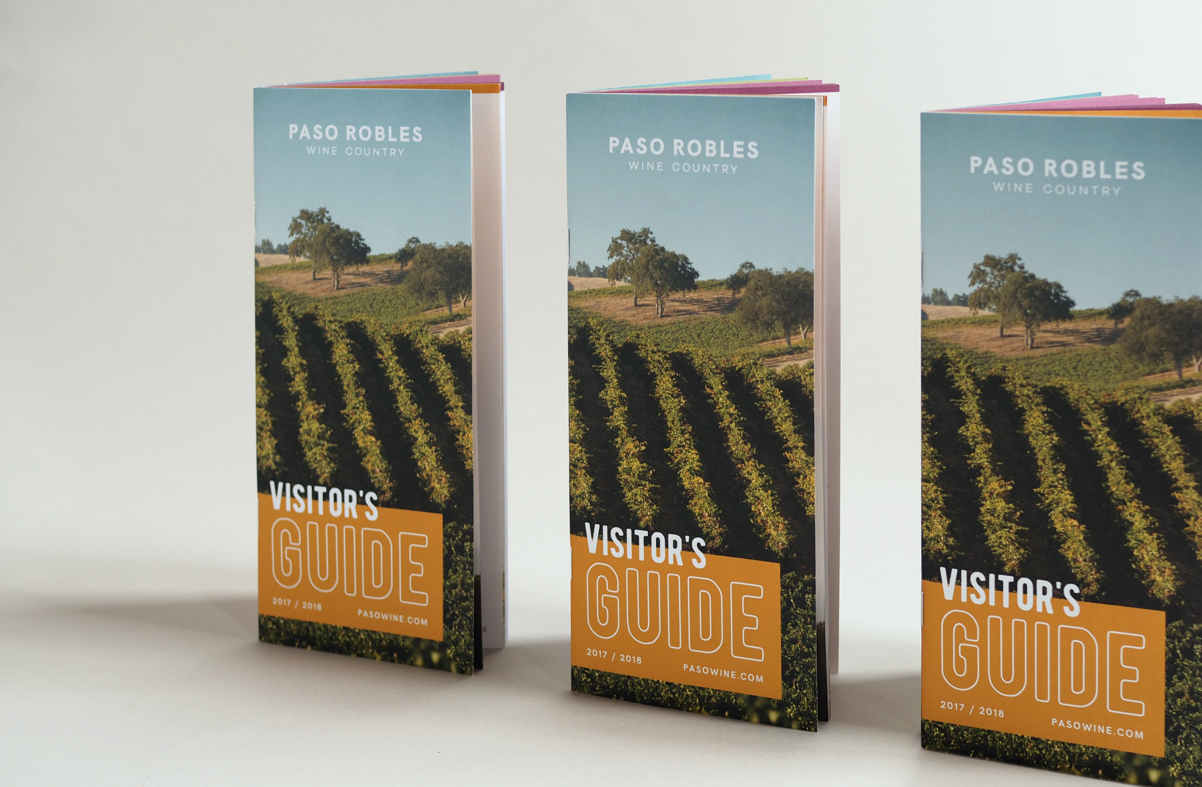
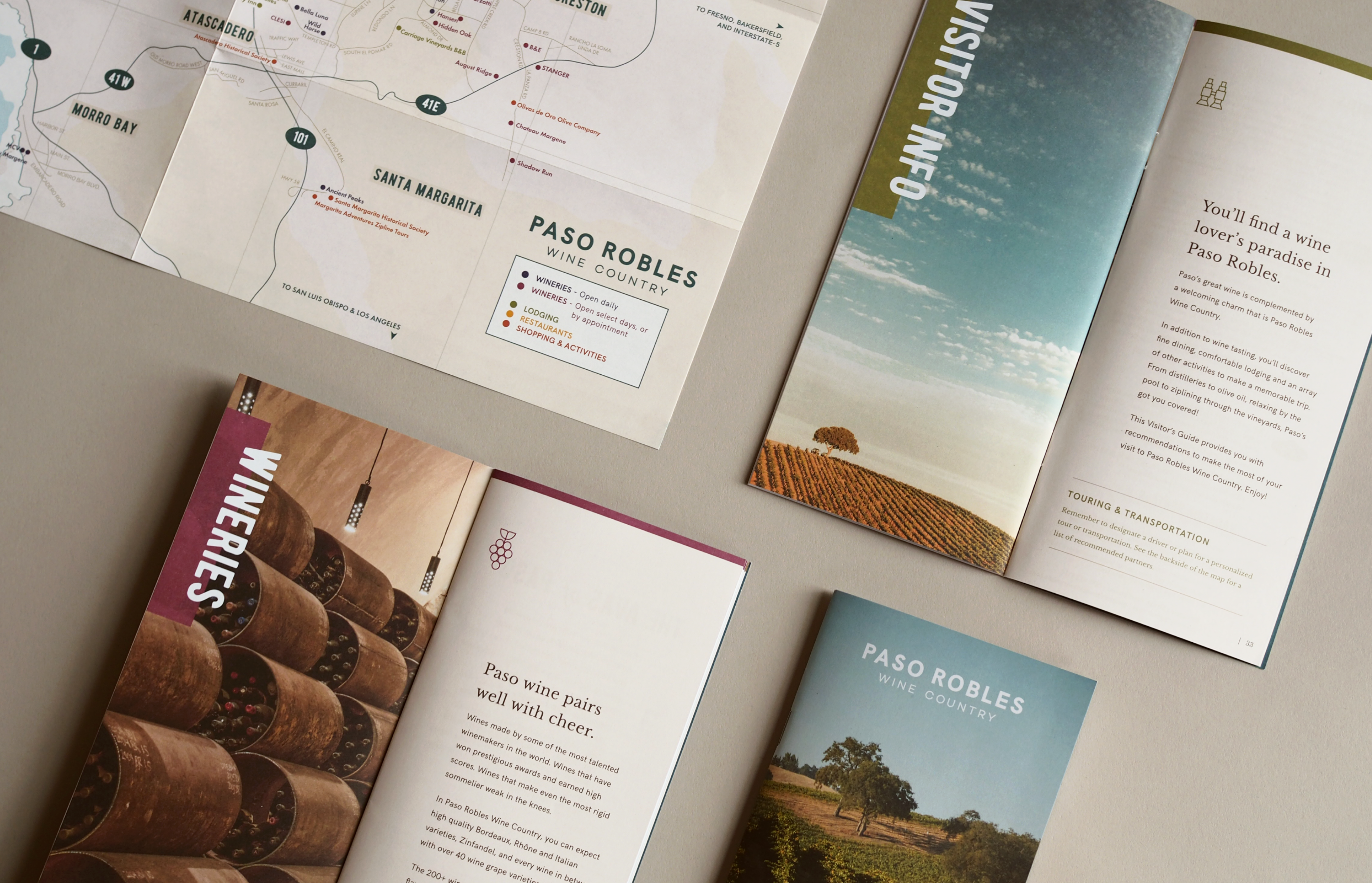
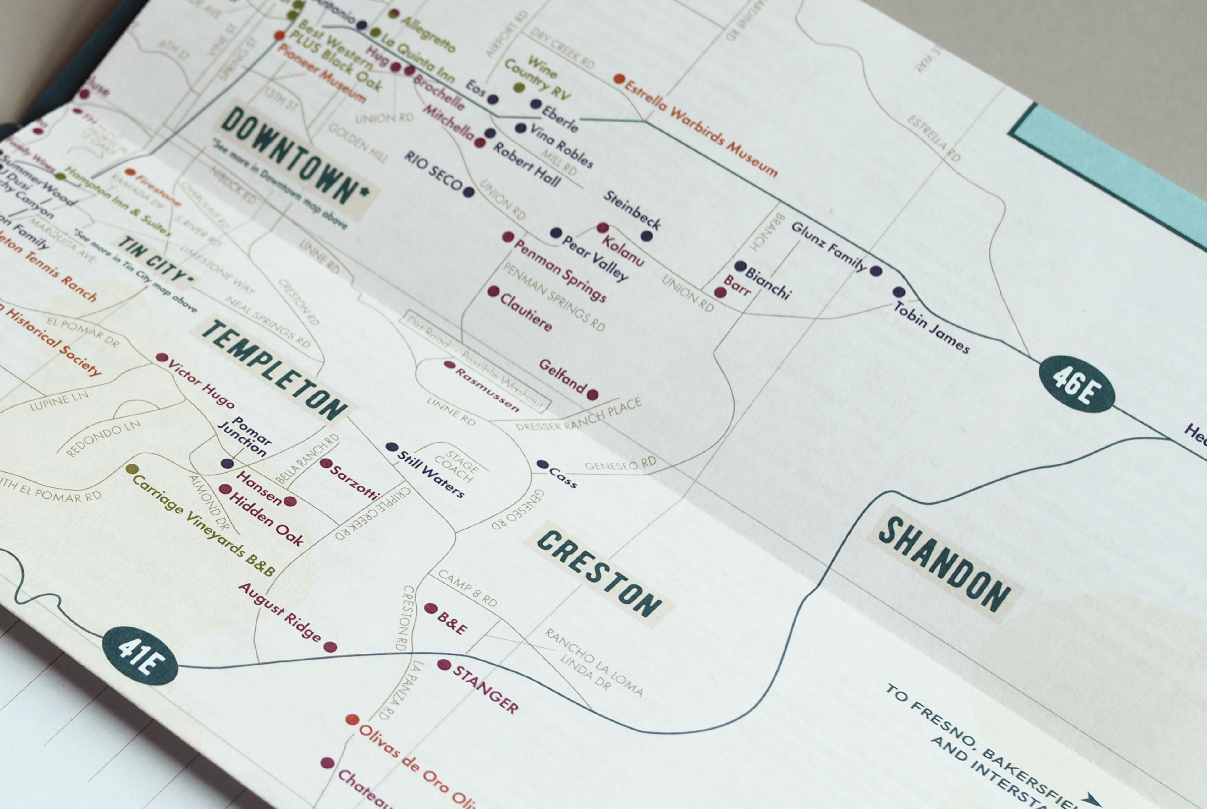
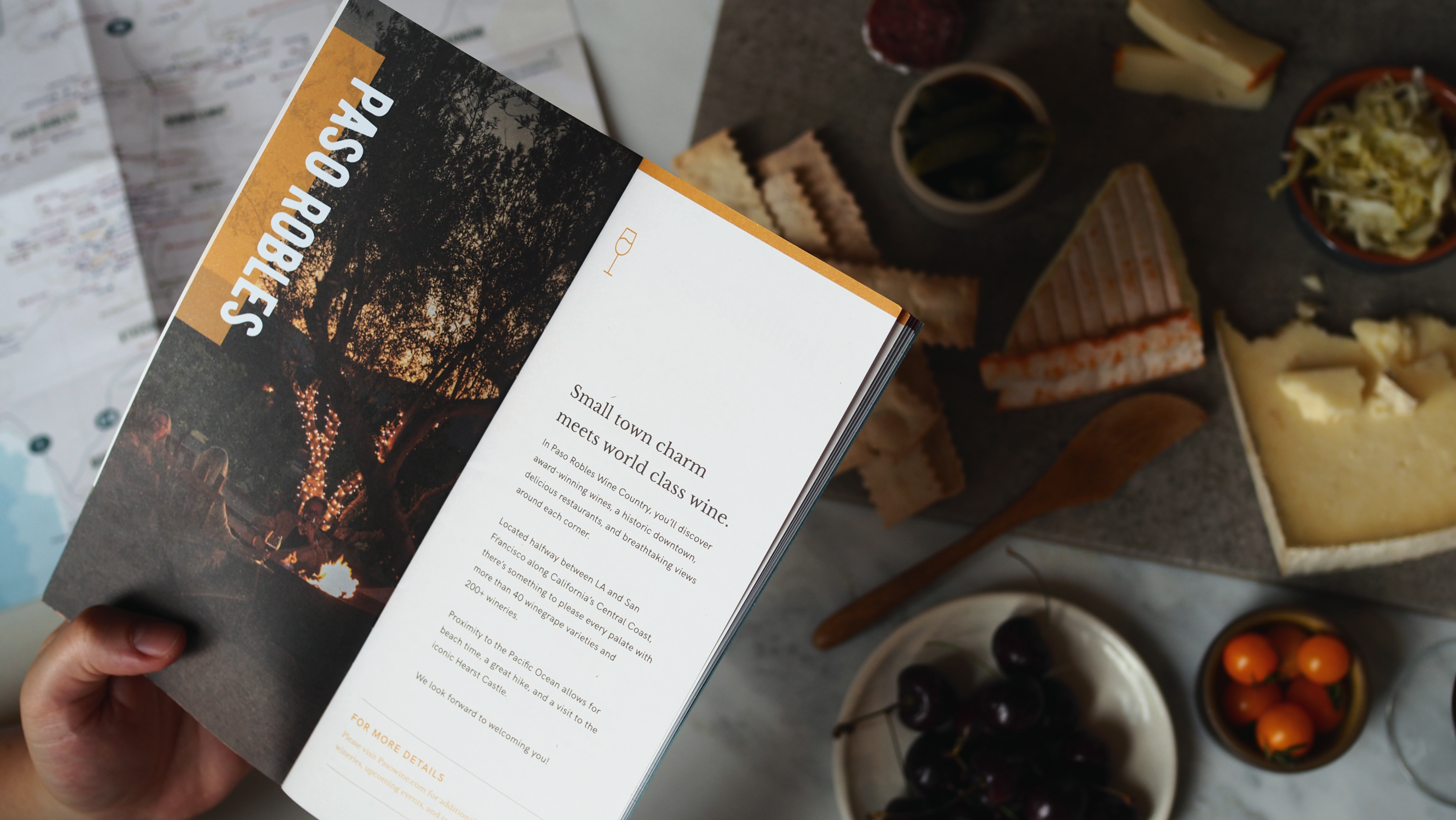
Updated print collateral lets this new, cohesive brand truly shine. We revamped the existing visitor guide by reorganizing the content before applying the visual styles. An accompanying custom map showcases all of the local wine-related attractions of the region in a clear and beautiful layout.
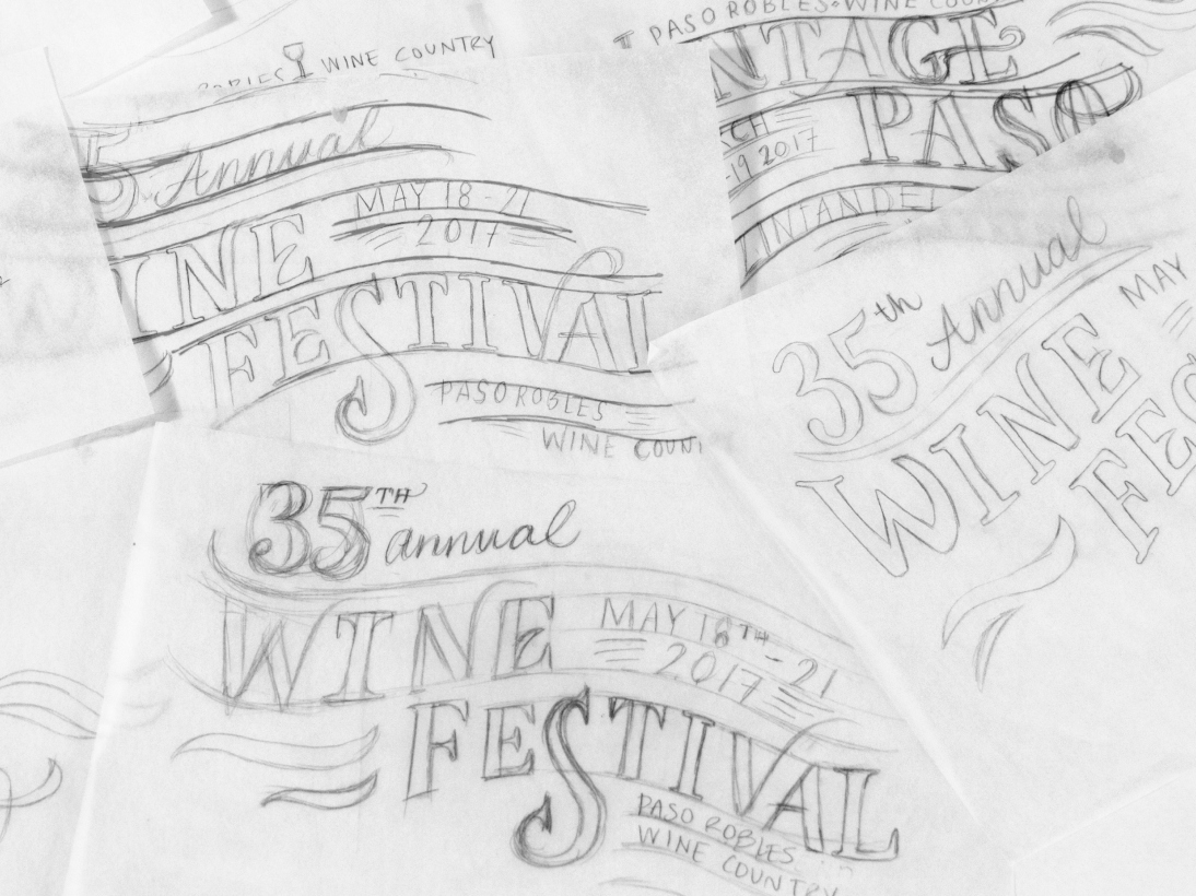
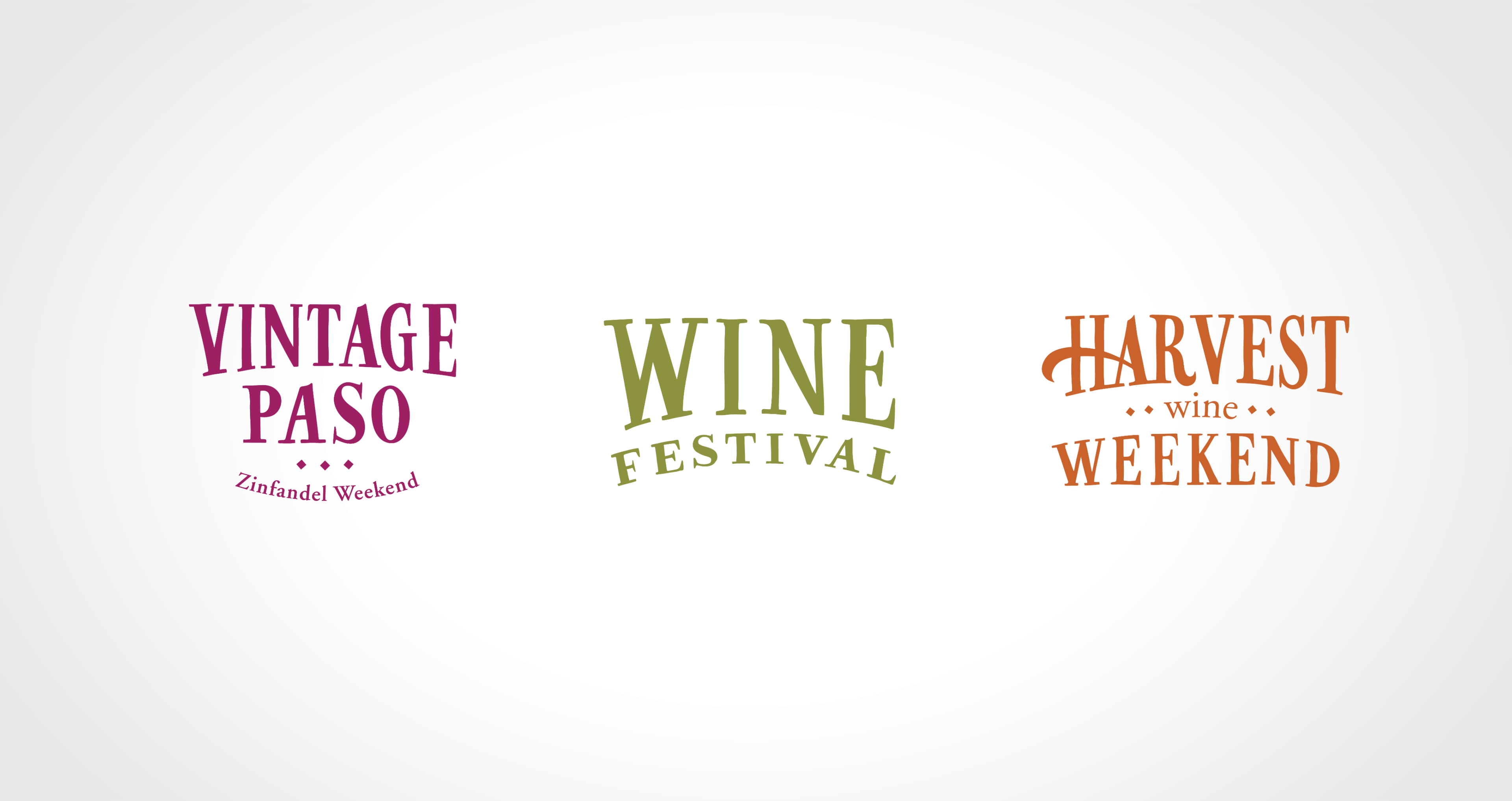
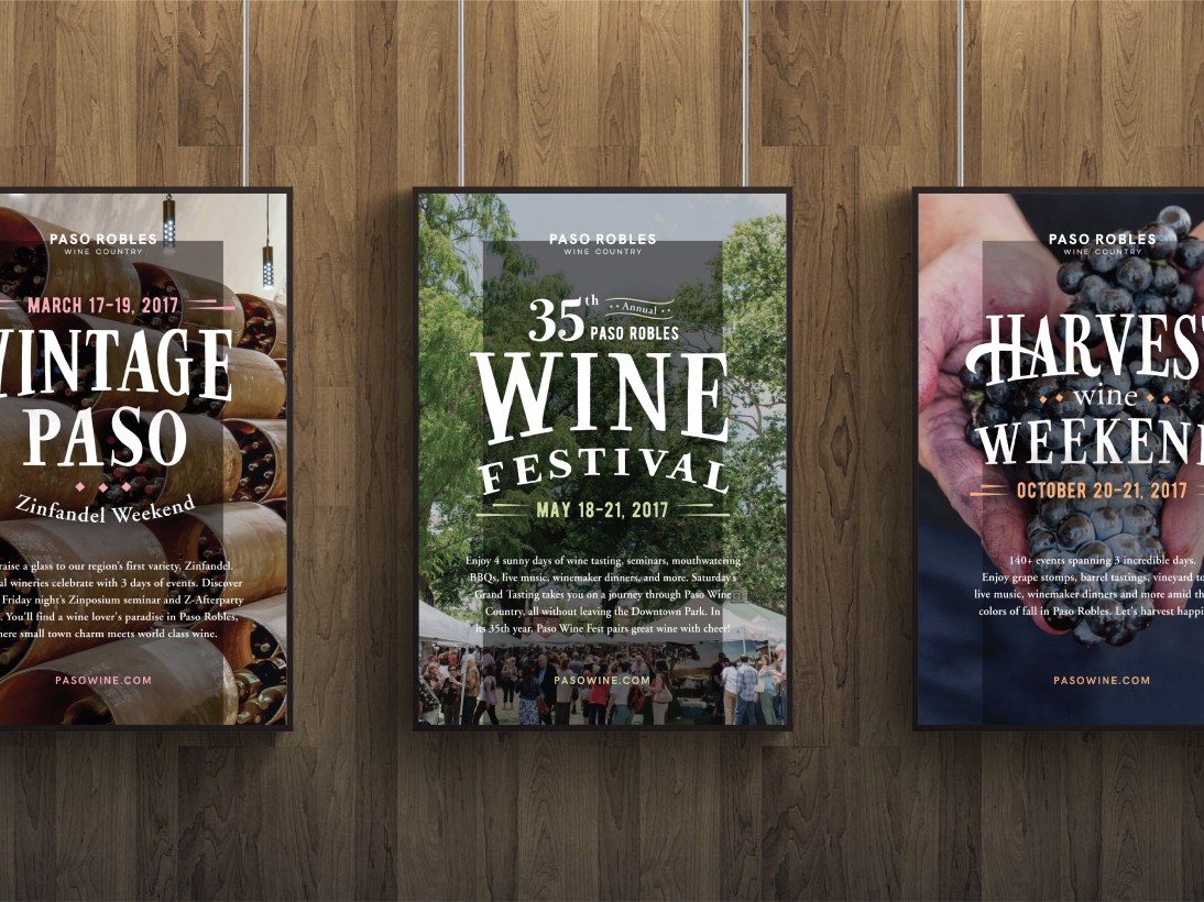
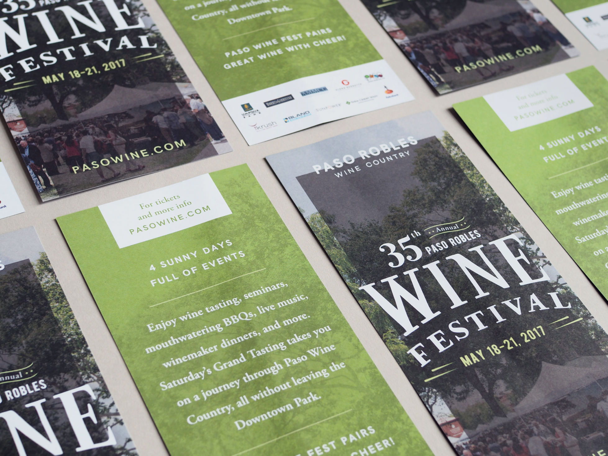
The Alliance hosts multiple events throughout the year, each of which needed to have its own look and feel that tied back to the brand itself. All of the event identities sport custom lettering within their typographic lock-ups, and draw upon the brand color palette to help differentiate between them. Overall, the effect is one of warmth and character, while still remaining elegant.
Pasowine.com had a classic chicken-and-egg problem: many member businesses were not keeping their profile pages up to date because they didn’t see the value, so the site’s content was not strong enough to attract visitors. To solve this challenge, we first focused on enhancing the design of the back-end by creating a user-friendly experience and refreshed look that would encourage businesses to fill out their member profiles with written content and compelling photography.
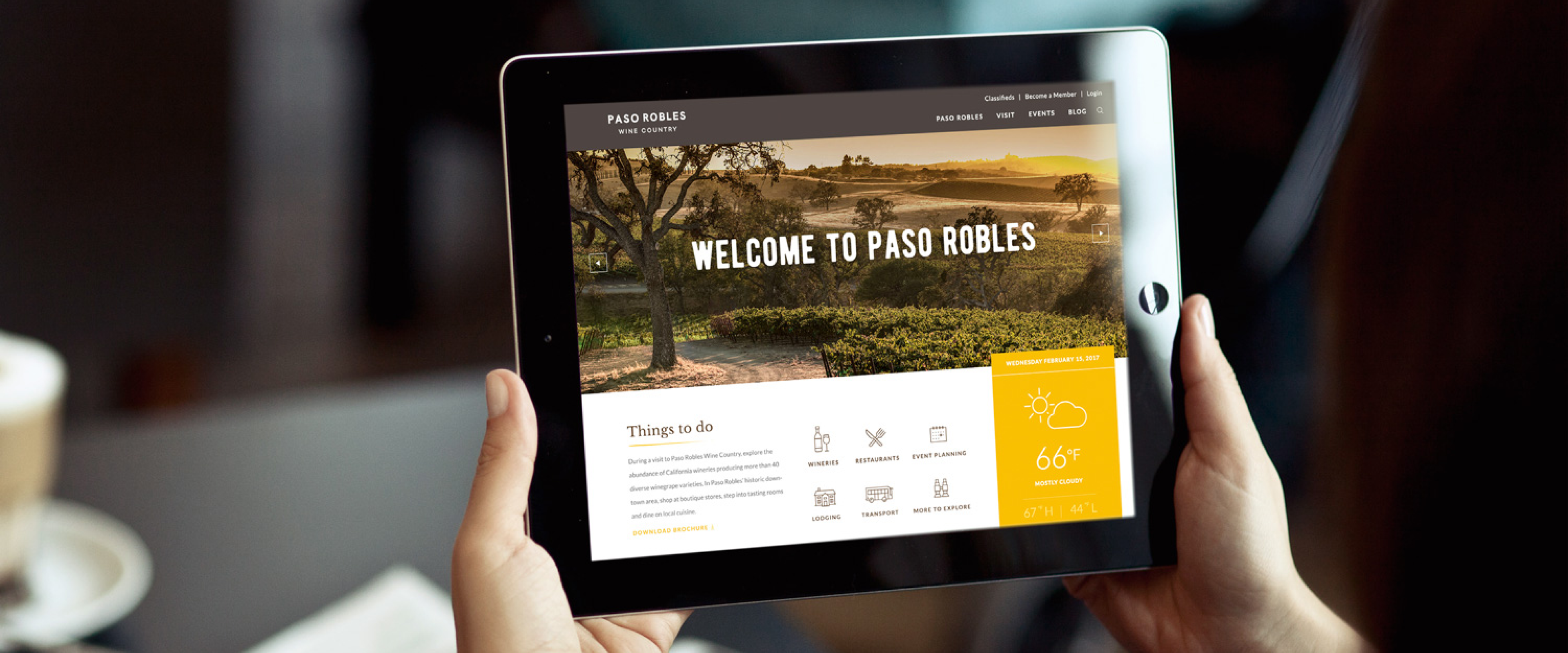
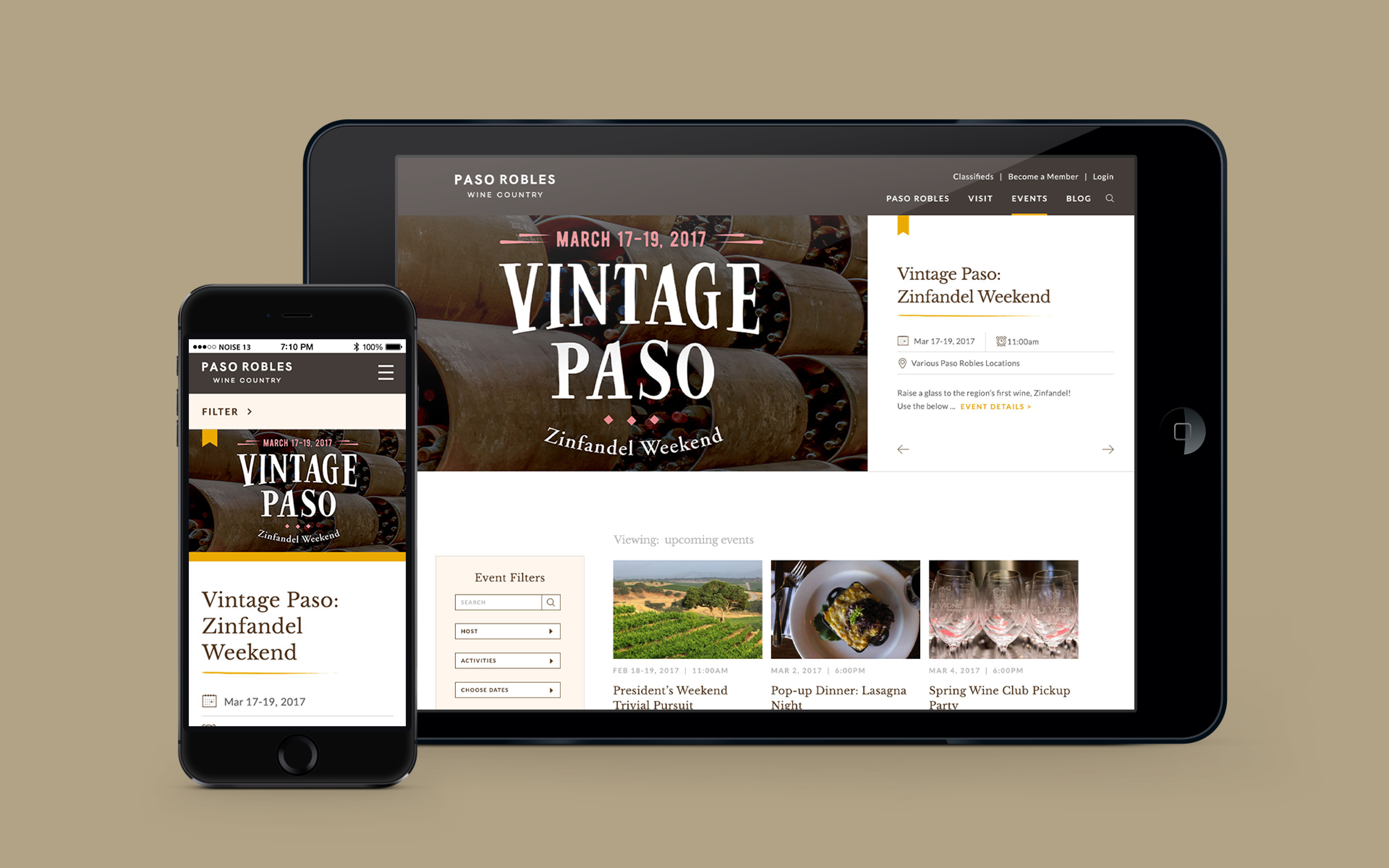
Next, we shifted our attention to the front-end of the site. Inviting photography and rich colors reflect the updated brand, and streamlined navigation makes for a fluid and intuitive flow. One critical part of the UX process was re-imagining the Visit landing page into an interactive experience. Previously focused only on wineries, it now showcases all that the region has to offer in a single view. Users can filter by type, search by name, and toggle between list and map modes so there’s no need to leave the site to look things up. Robust filtering options extend into the Events section, making it easy to narrow down your search by as few or as many parameters as you wish. This user-friendly structure translates seamlessly to the responsive mobile experience, where key information is prioritized for quick access when users are on the go.
THE OUTCOME
Today, the Paso Robles Wine Country Alliance brand is a real reflection of the experience itself: sophisticated yet accessible; rustic yet refined. The plethora of options, from food and wine to lodging and activities, are now easy to find and navigate so visitors can quickly discover all that the region has to offer.
As foodies and wine lovers, we loved partnering with Paso Robles, and have even discovered new places to visit there ourselves. Is it the weekend yet? Because our bags are already packed…
