Our Opportunity
The client brief was essentially a blank slate: create a brand, from scratch, in the hyper-competitive market of cell phone accessories. The only parameters were to focus on women, sell solely online, and set a reasonable price point.
We were tapped to lead a collaborative, cross-agency team from a strategic and design direction perspective. The multi-disciplinary group included members of the client team, who have extensive background in tech accessories and e-commerce sales, creative industrial design studio Dash Dot, and our team of designers, strategists, and researchers.
Our Approach
To successfully enter the $81.5 billion global tech accessories market, in which protective cases were the top growing category, we knew we would need to find a specific and unfulfilled niche. Yet with only months to go before the iPhone 7 release, there was simply not enough time to develop a product with innovative features or functions. Instead, the key to success would be to create a relevant brand for a specific audience and an unaddressed lifestyle need.
For this task, we utilized our extensive discovery and audit process, which led us to two key insights:
1) Color is the most important factor for consumers when it comes to the design/aesthetics of cell phone cases.
2) The ideal number of choices for consumers to not feel overwhelmed is between six and ten.
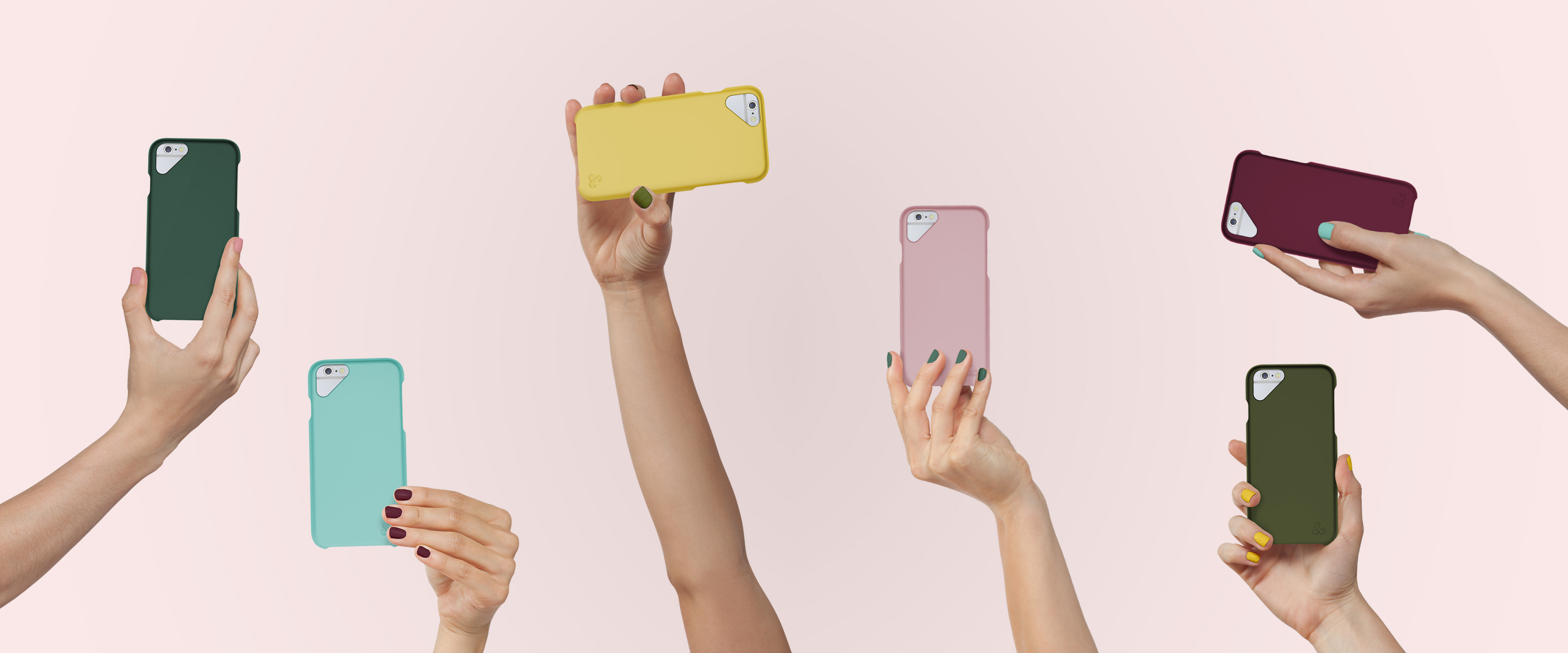
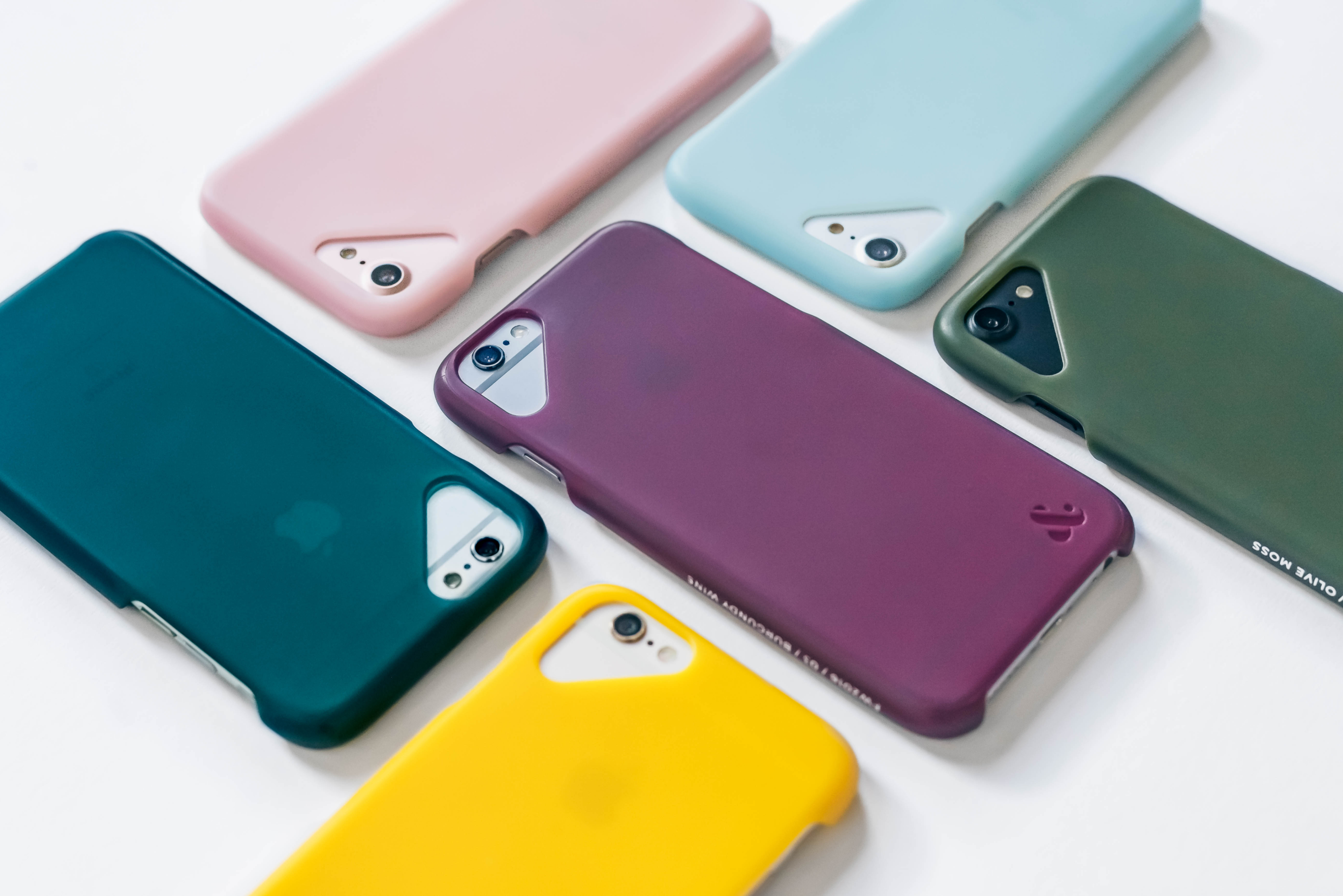
With the combination of these two insights, the core idea for the brand was born. Targeting an audience of women who appreciate style and design, we decided to offer a well-curated selection of beautifully-designed, protective tech accessories that showcase seasonal colors inspired by the runway.
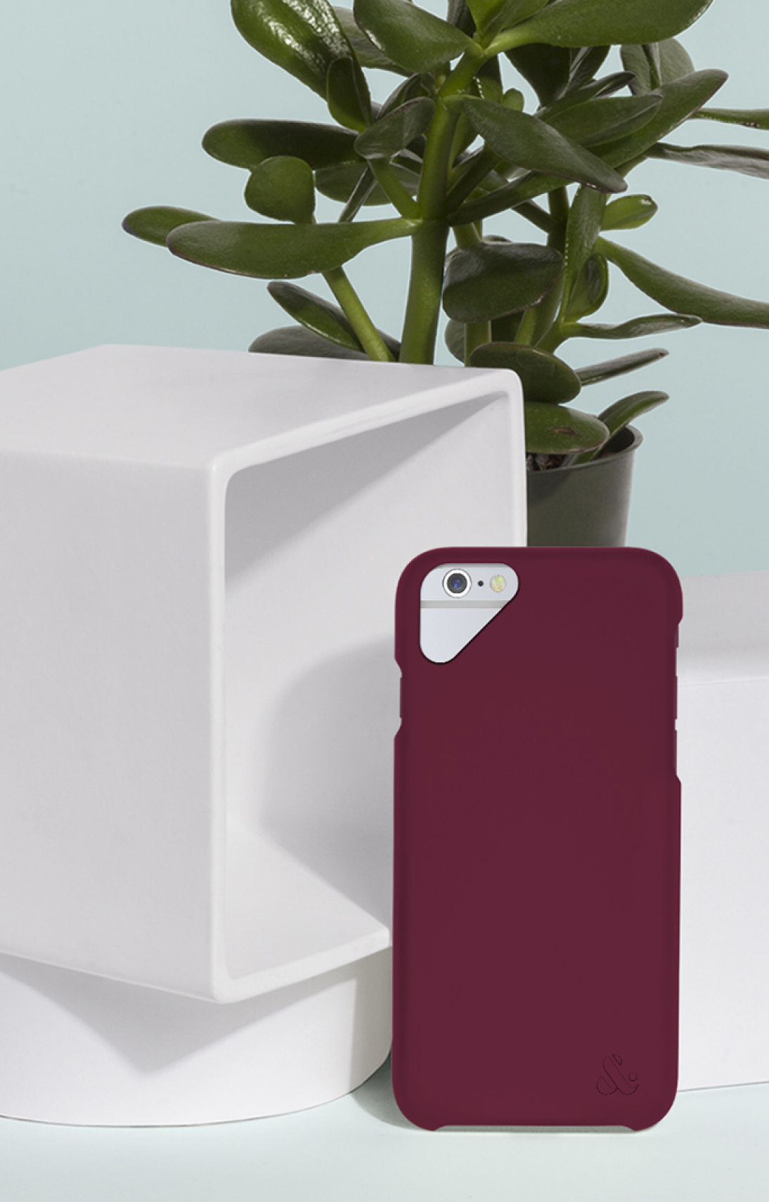
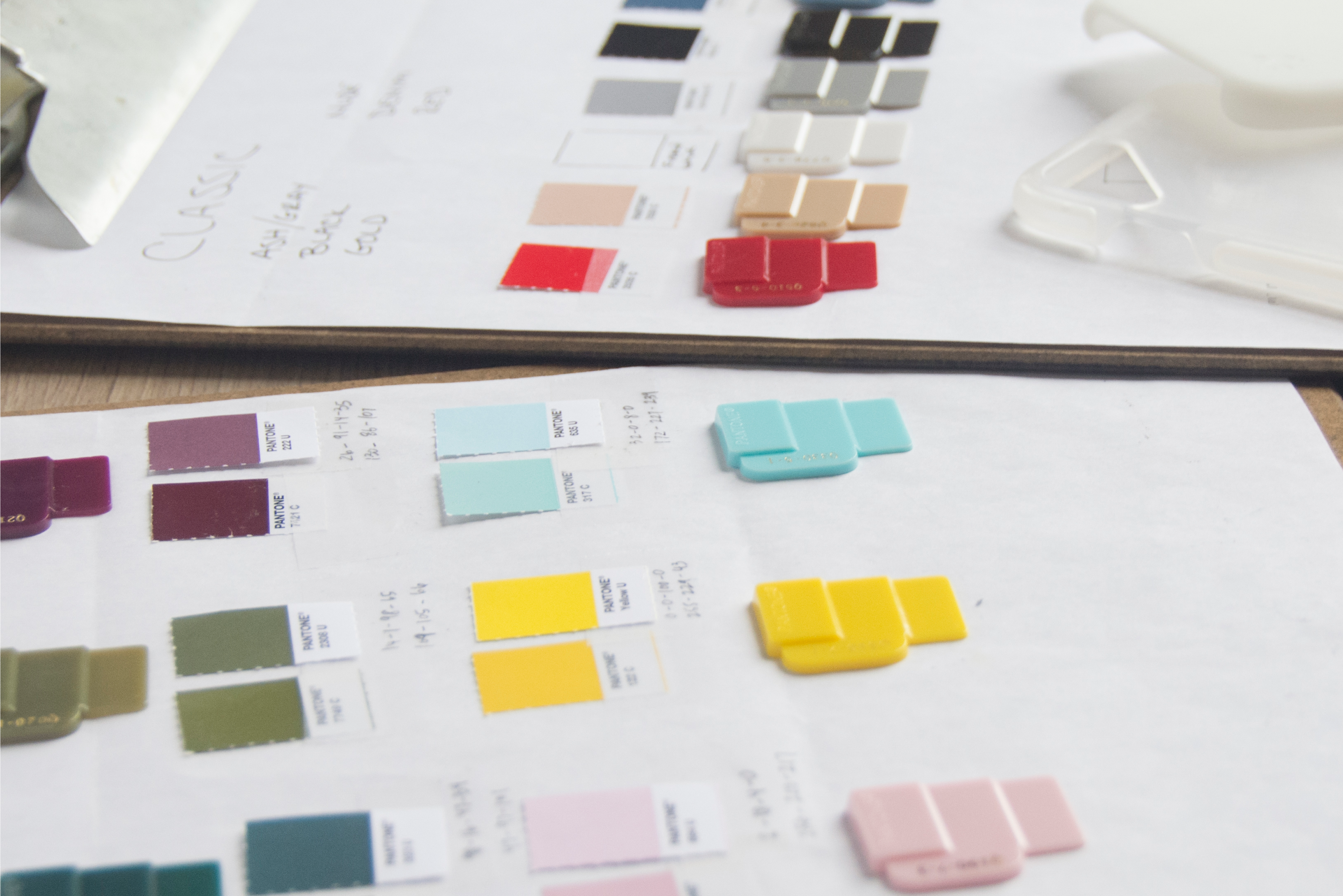
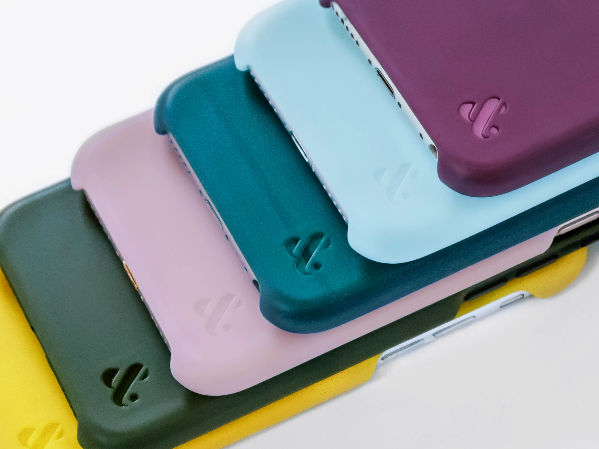
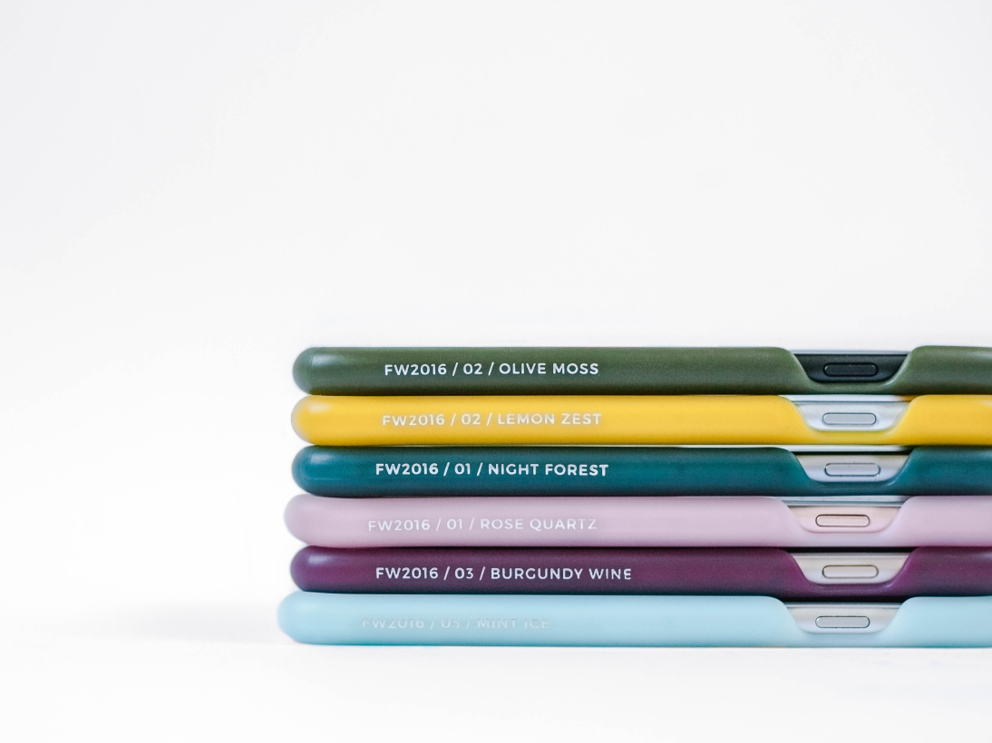
With our brand platform in place, we began the collaborative process of product design. We worked with the entire team on every aspect, starting with the design of the case itself — achieving both a sleek, minimal profile as well as effective drop protection. We conducted detailed research to determine the colors of the cases, including following trend-forecasting sources such as Pantone and Trend Council and observing the aesthetics of different designers upon the arrival of fashion season.
Pulling all of these concepts together, we developed our own color stories for the season, choosing not the most dominant colors, but rather ones that would complement what’s being worn. Thus, Amber & Ash showcases highly curated sets of color pairs inspired by the current fashion season, as well as classic colors that never go out of style. Finally, to bring our vision to reality, we needed to determine the price point, decide when, how, and where to sell the cases, and develop a high-level marketing strategy.
The Amber & Ash name comes from two classic colors and materials: amber, a mesmerizing stone and one of the world’s original accessories, and ash, a tree revered in some cultures for its powers of protection. Together, amber and ash represent a perfect balance of the feminine and masculine; they can each be astoundingly beautiful, but are also both solid and strong in their own rights.
The Amber & Ash logo is both bold and delicate. This balance is created through light, geometric typography and a striking, curvaceous ampersand — a unique and contemporary update to an old-style typeface typically used in fashion advertisements. The basic black and white treatment ensures the colorful products are always the star of the show, and creates an additional visual connection to monochromatic graphics found throughout fashion brands and magazines.
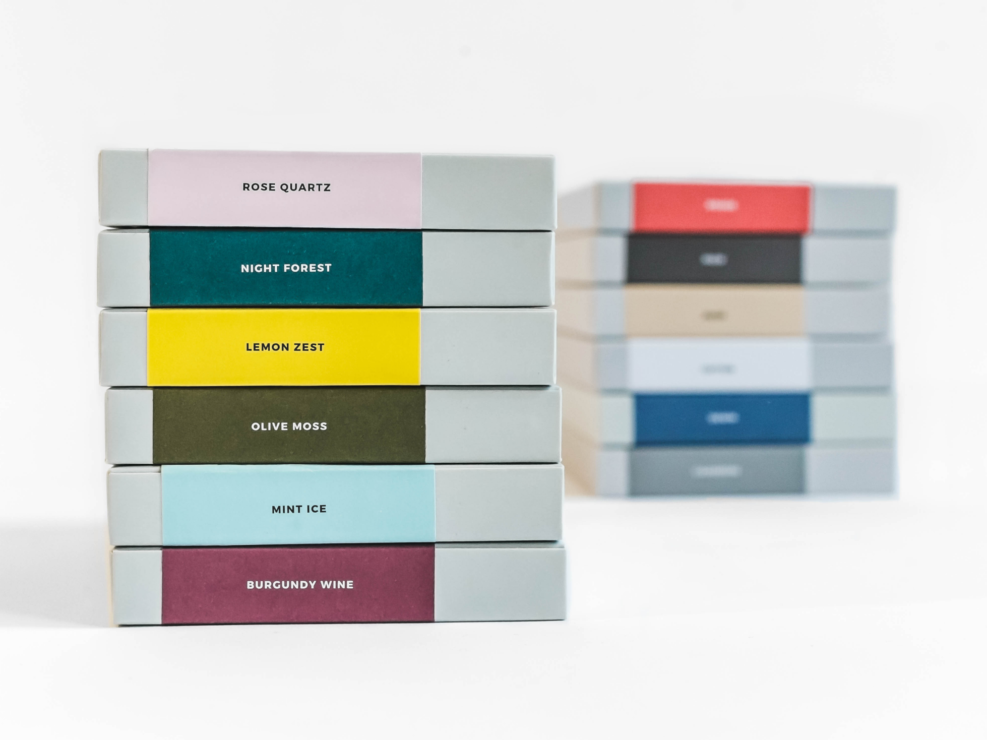
The packaging extends the brand’s qualities of simple, sophisticated elegance. We first developed a handful of different structural concepts, landing on this “drawer” format as the winner. By creating a generic outer sleeve and inner drawer, the costs of per-SKU customization can stay low; the outer label, inner plastic tray (for different phone models), and insert cards are separate and interchangeable.
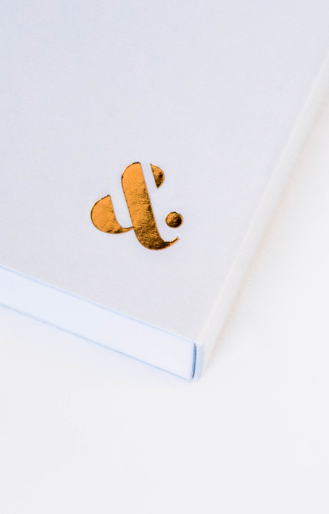
To add a premium touch to the packaging, the ampersand mark on the outer sleeve is printed with a metallic copper foil on a pale gray background, a nod to the amber and ash materials that inspired the company name. The layout of the outer labels is clean and straightforward, the large block of color taking inspiration from Pantone chips — highlighting the most distinctive feature of the case and the concept behind the brand itself. The insert cards give customers more background on the color stories and case features, reiterating the pairings within each collection and encouraging collectability.
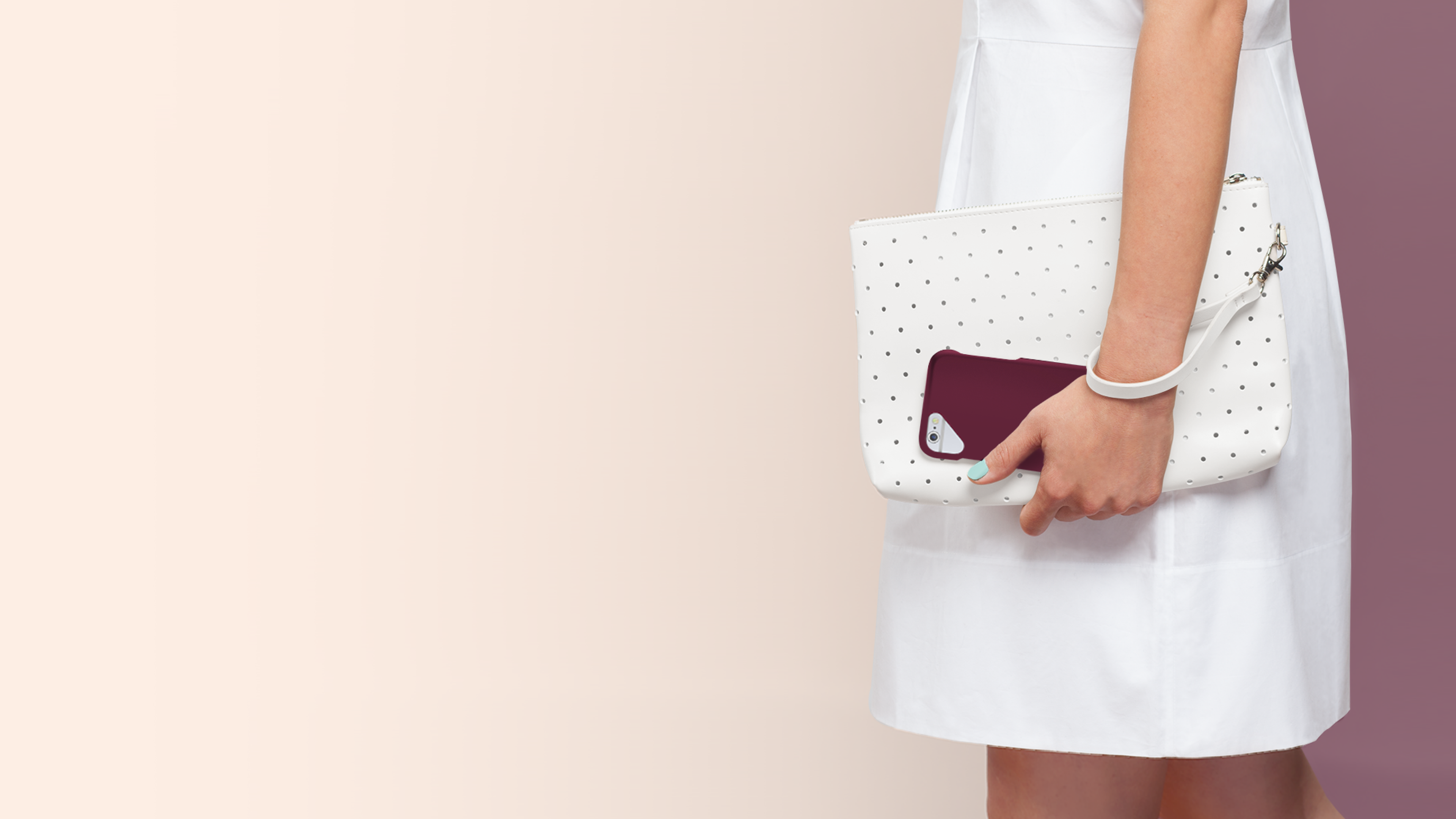
With the expedited timeline of launching Amber & Ash around the release of the iPhone 7, we faced the unique challenge of having to create brand assets before the products themselves were finalized. Working with a tight budget, this meant we had to get creative with photography! We strategically styled and shot all images in-house, knowing some heavy Photoshop work would be necessary to seamlessly merge the photos with final renderings of the cases. Ultimately, this requirement informed the creative direction of all imagery, along with research around photography styles commonly used in other fashion brands. The final images have a sense of restraint, but don’t take themselves too seriously. Clean backgrounds and hints of stylish clothing and accessories allow the products to shine while reinforcing the overall brand story and aesthetic.
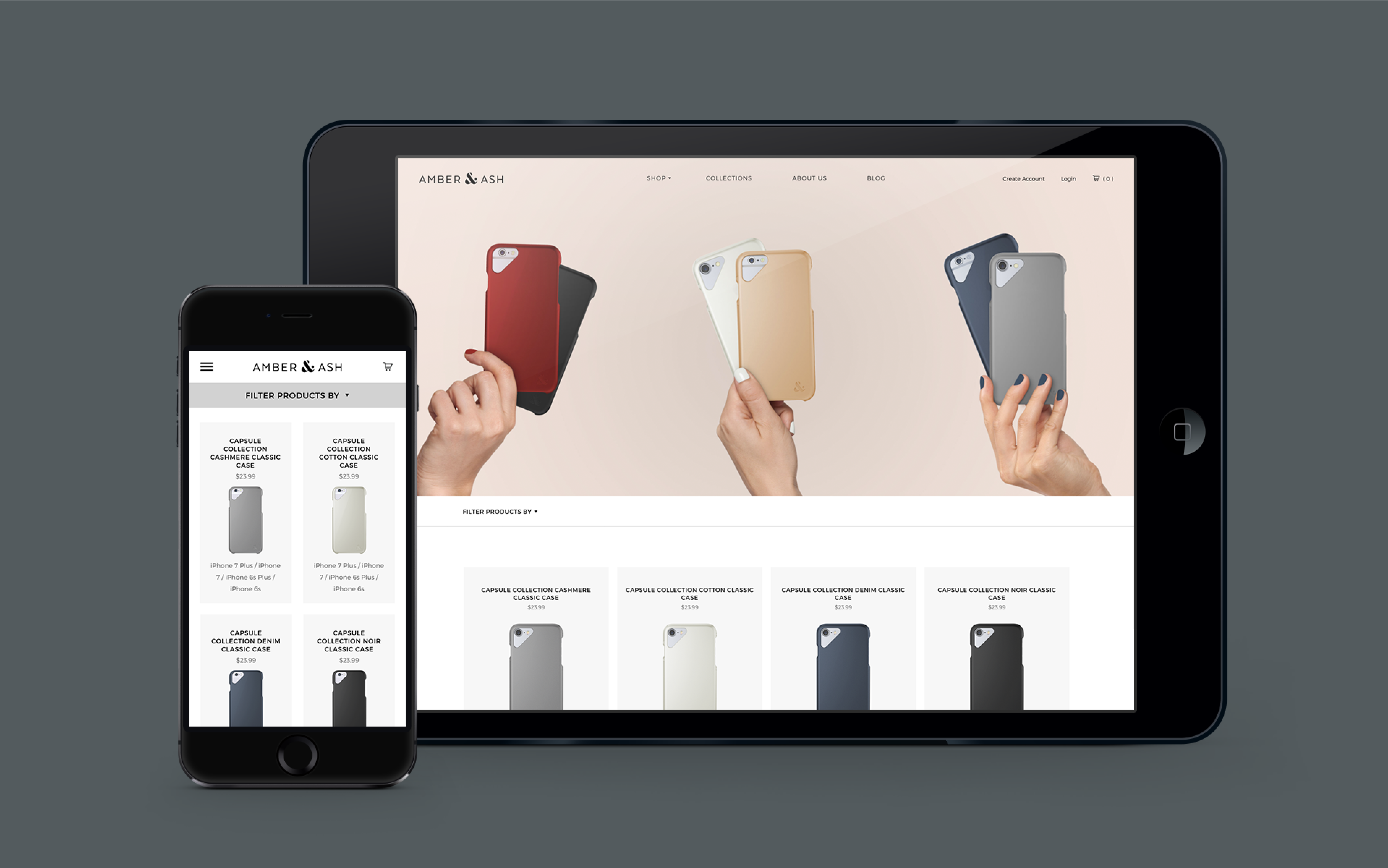
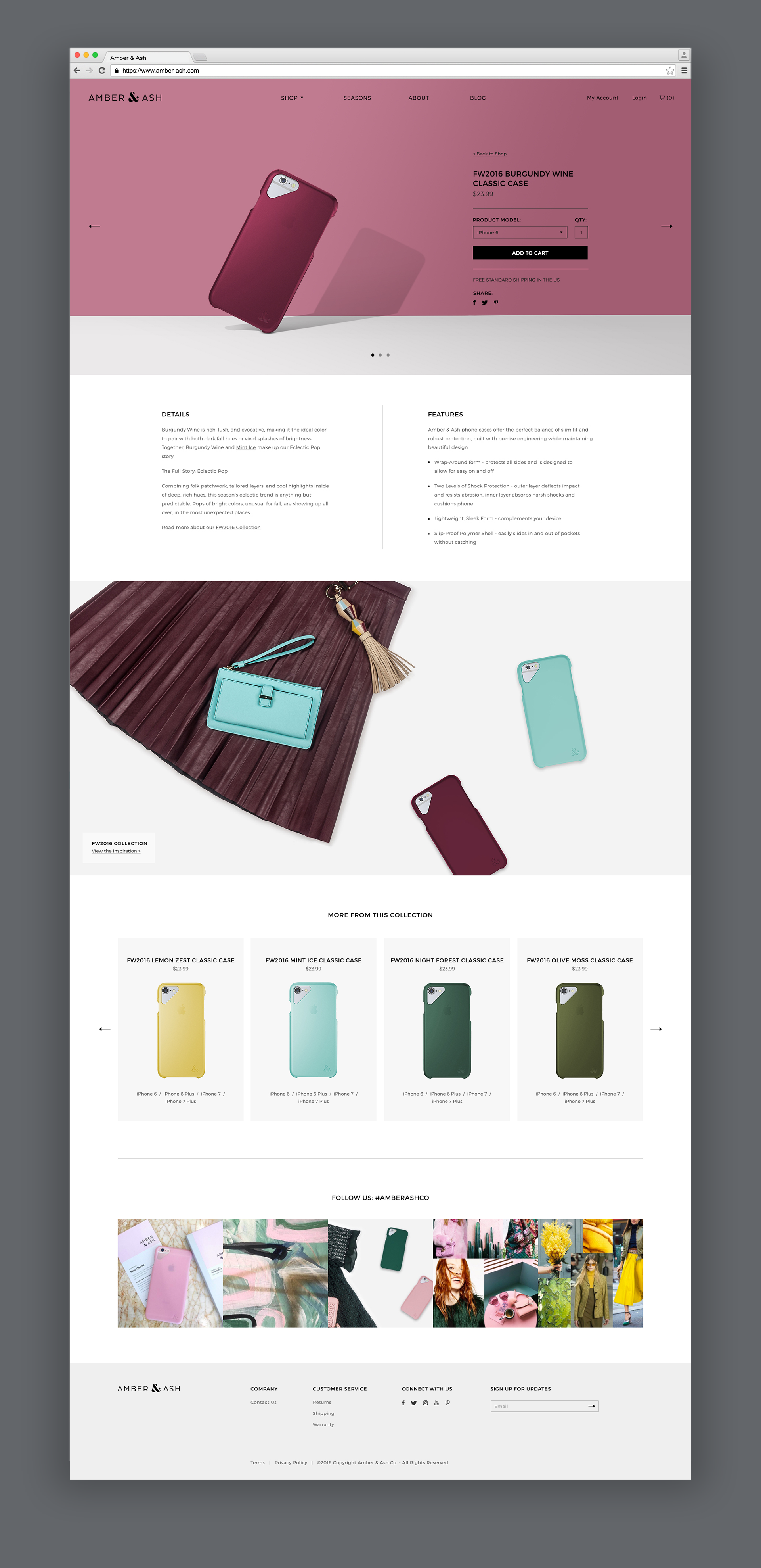
With an eye toward fashion-forward customers, we put our new library of imagery to work, creating a user-friendly and fully responsive website. Color stories are featured prominently on every product page as well as within their own “collections” section, reminding buyers of the thought and curation behind every hue. Shop categories and filtering options enable the user to quickly narrow down their search, and allow for expanded product offerings in the future.
The Outcome
Launched in the fall of 2016, Amber & Ash is emerging as a unique voice in the fashion and tech accessories market. Every item the brand brings to market is constructed to protect and last while beautifully complementing customers’ wardrobes with a highly-curated, rotating collection of seasonal and classic colors. Going forward, Amber & Ash has plans to expand beyond cell phone cases into a broader range of tech accessories, such as headphones, chargers, laptop cases and more.
A true labor of love, we are honored to have helped build this company, its products, and its unique brand from the ground up — our entire staff now proudly sports a rainbow of Amber & Ash cases on their phones. We are thrilled to stay intimately involved as the brand continues to evolve, grow, and succeed.
