The Brief:
Create a brand system and packaging for a new distillery.
What Actually Happened:
A flexible identity built around one founder’s energy — and a first bottling that sold out in under a week.
Tara Jasper has a clear vision: build a small-batch distillery in Sonoma County rooted in slow-food philosophy and community. The name says it: when you sip her gin, you slow down enough to hear your own voice — your “sipsong.”
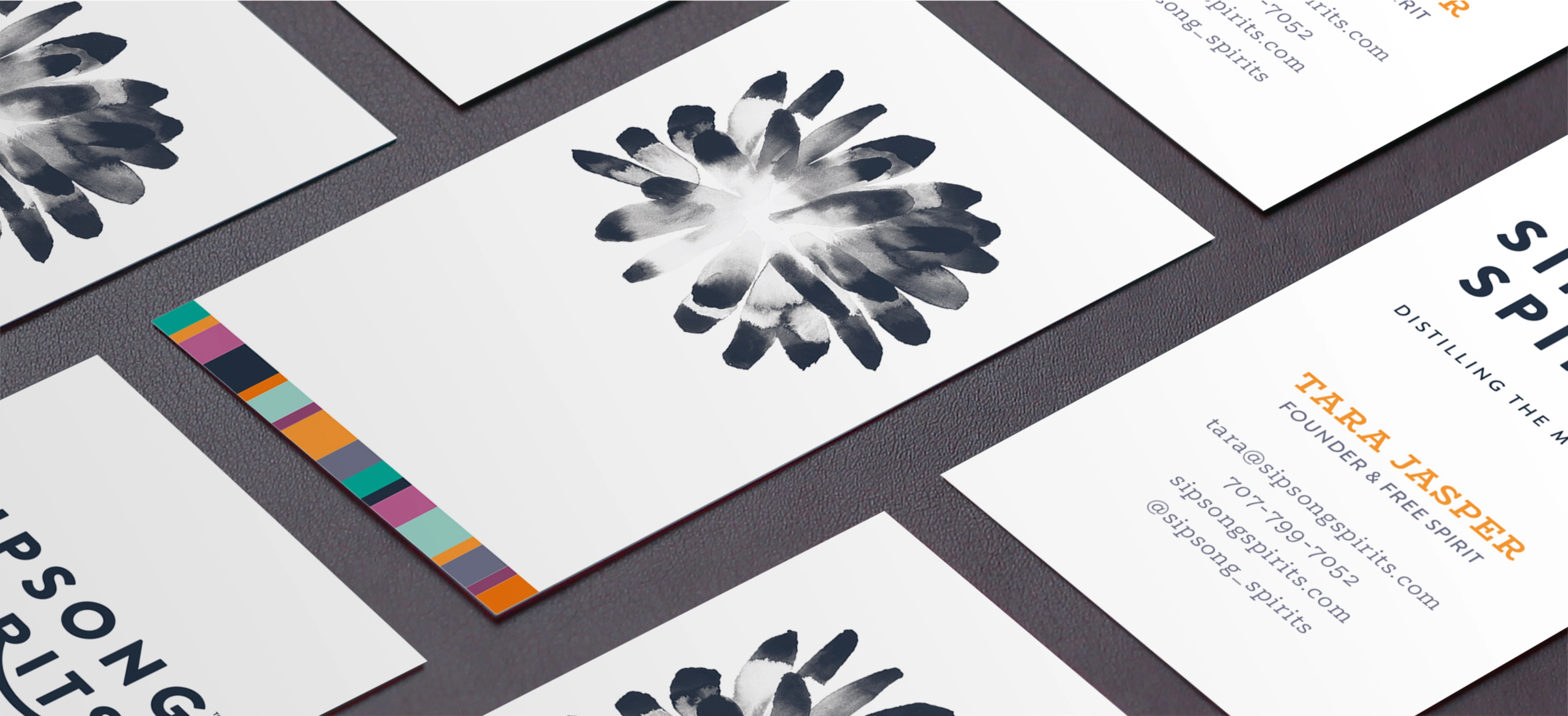
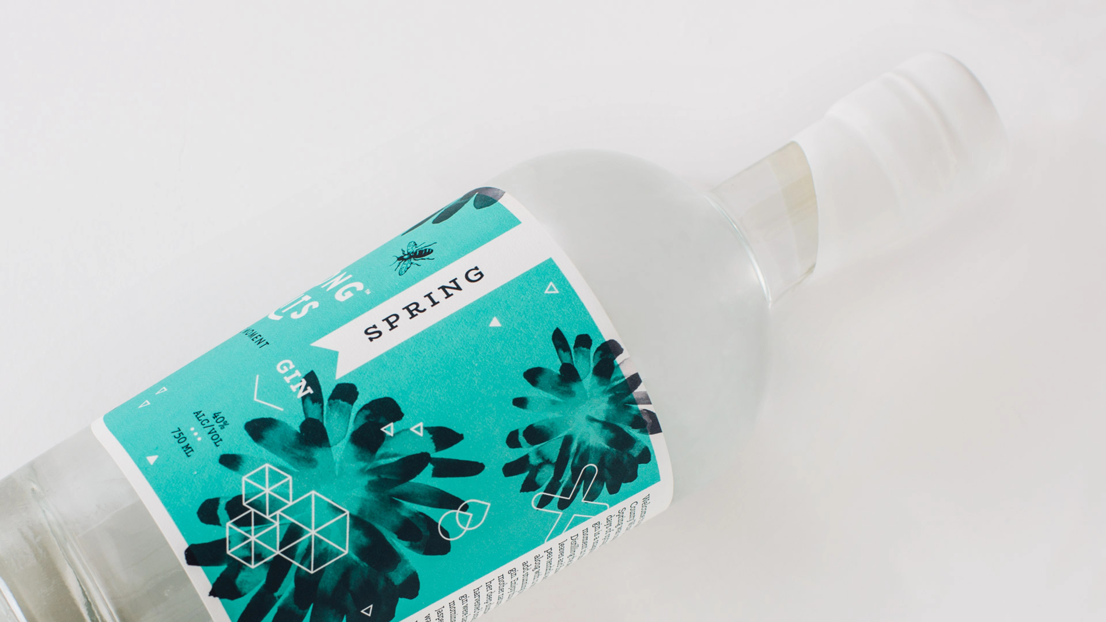
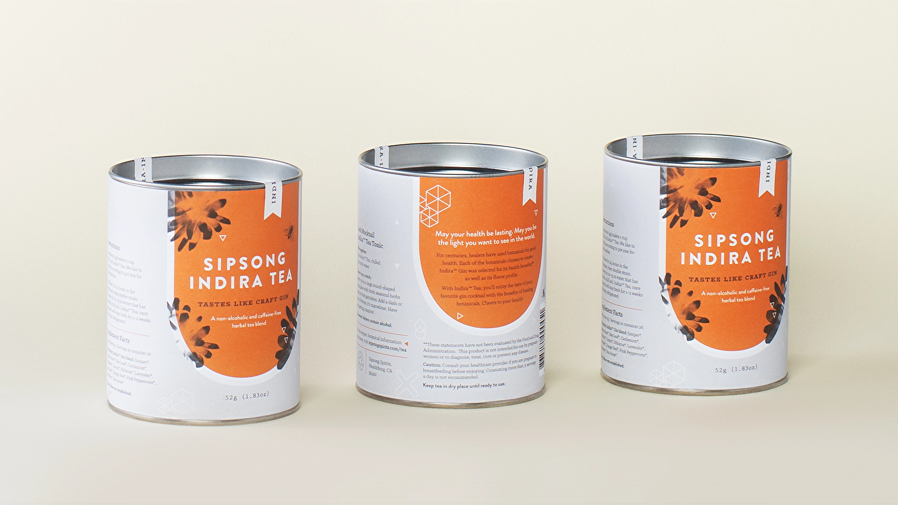
She needed a brand system flexible enough to grow with each new blend but grounded enough to hold together as a line. The audit started with Tara herself — her energy, her circle of collaborators, the painting hanging in her home.
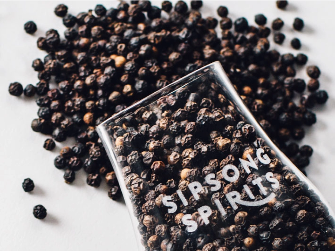
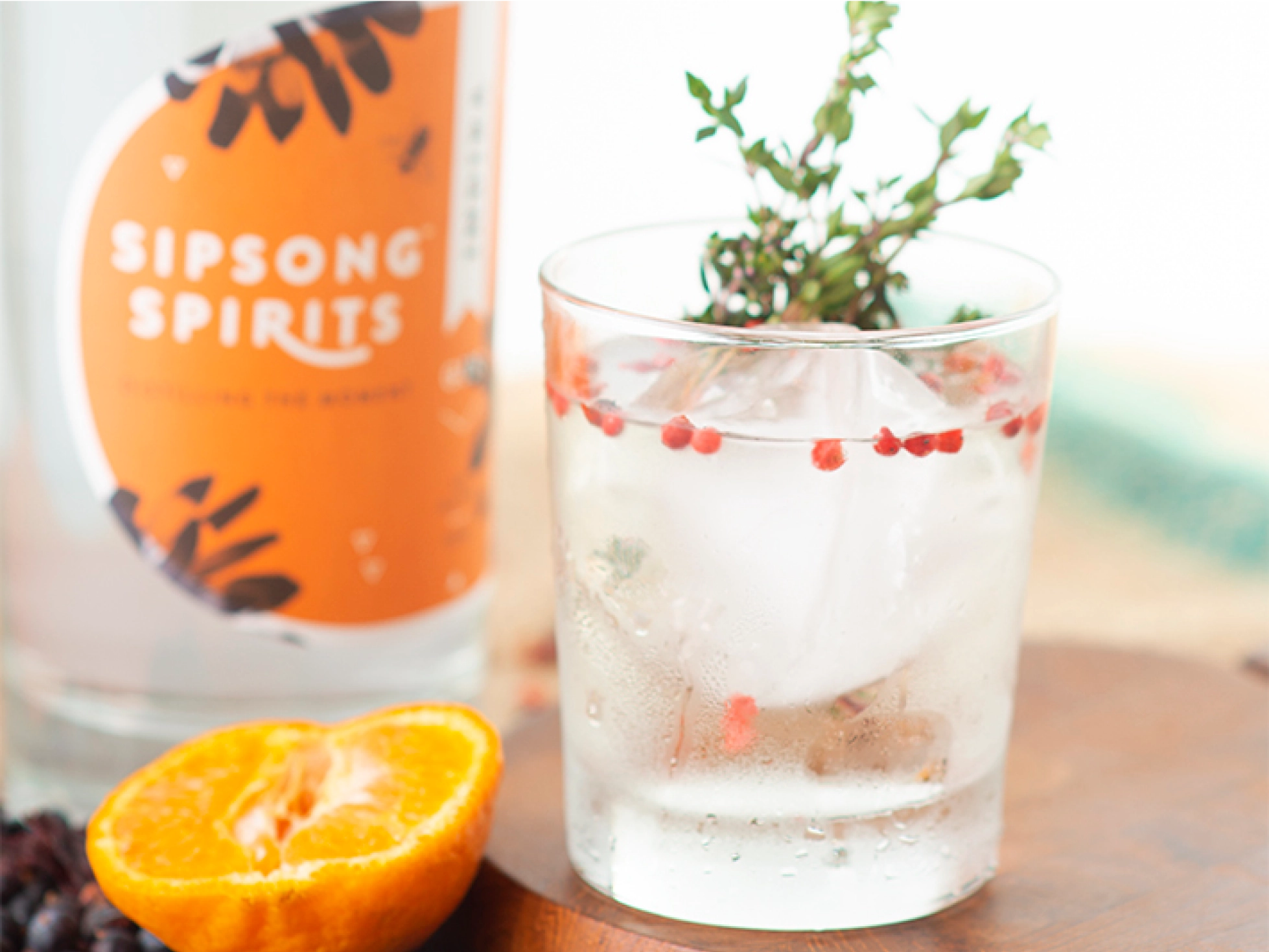
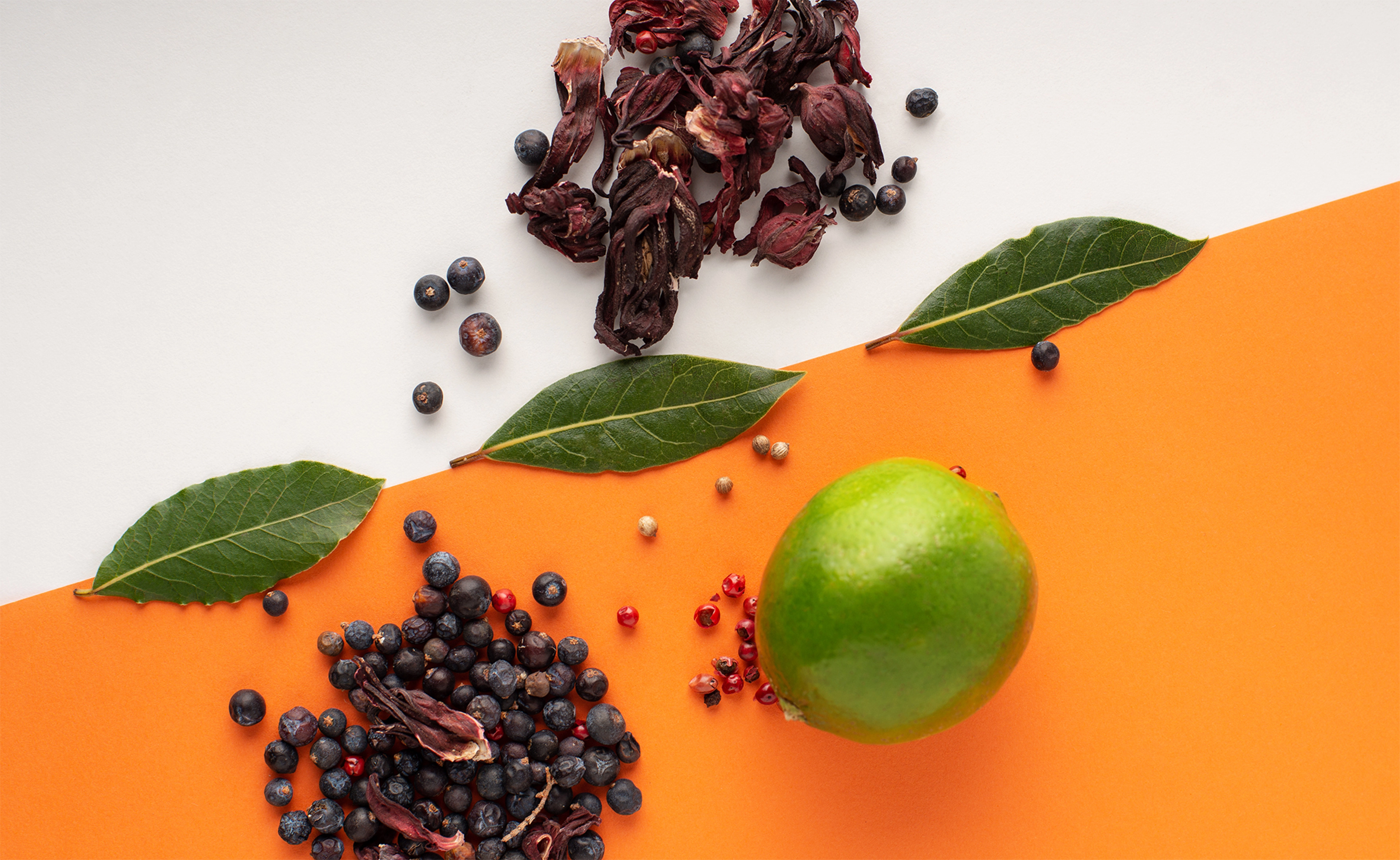
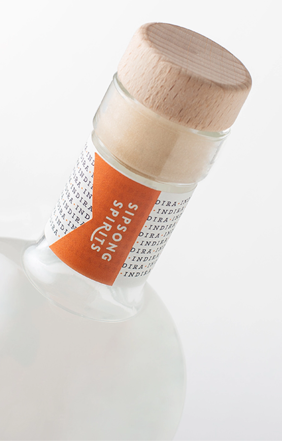
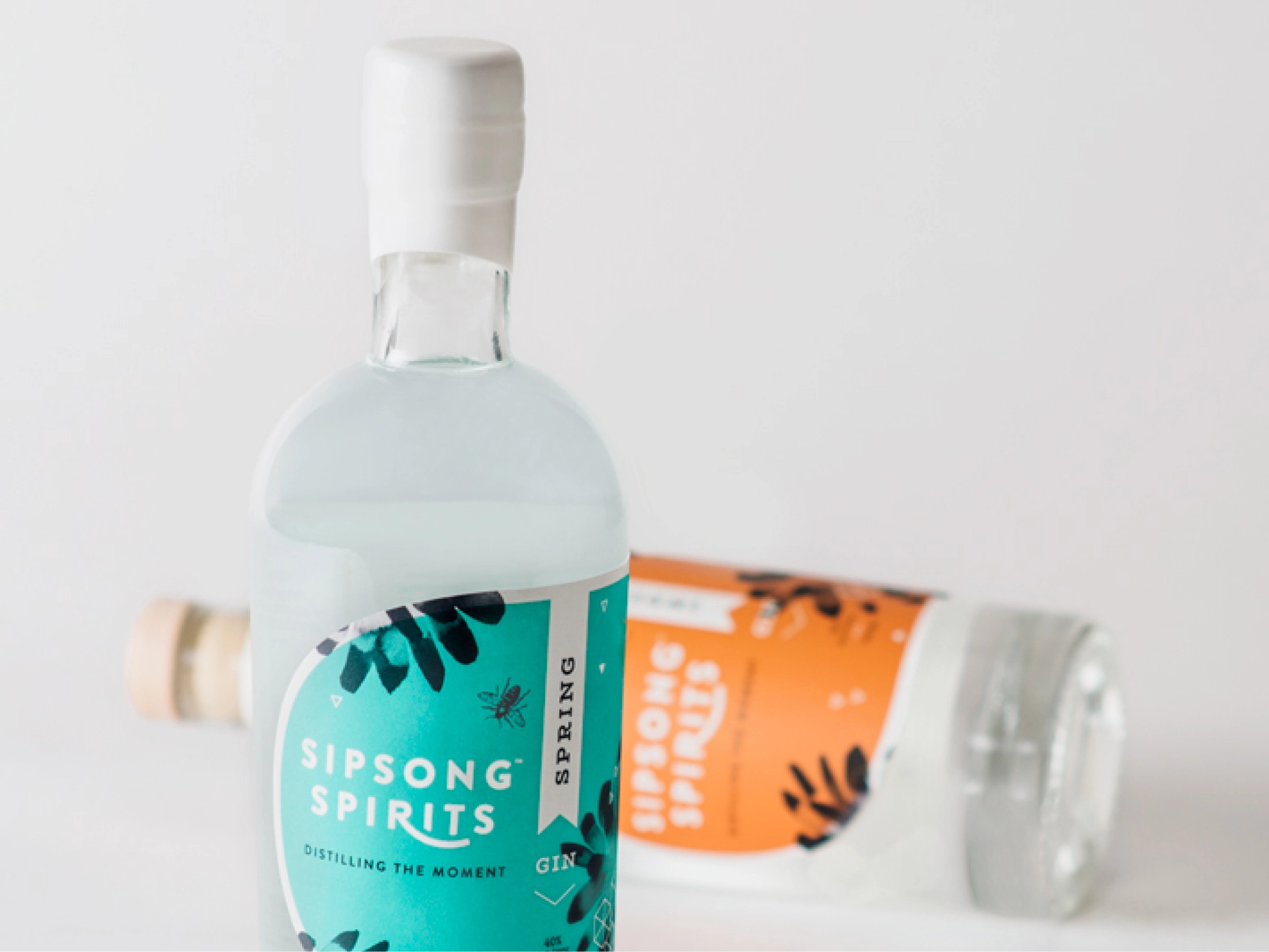
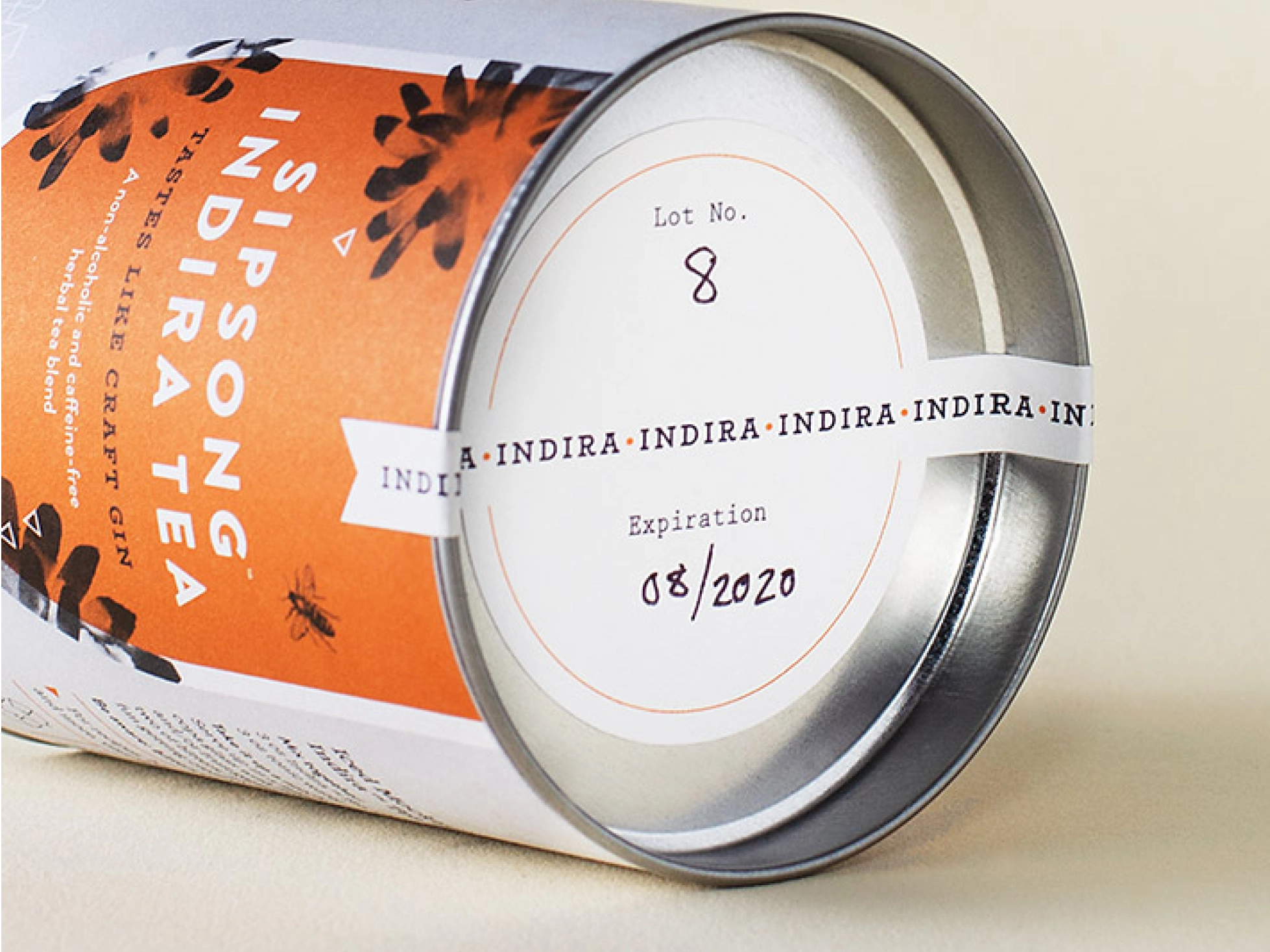
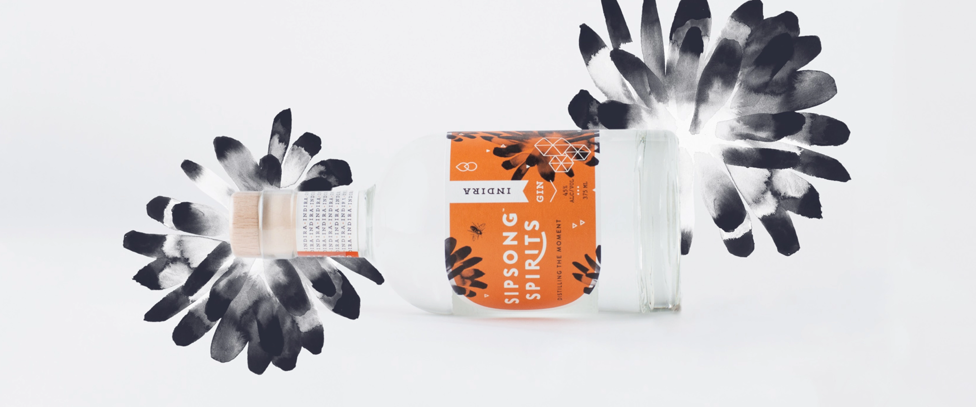
Indira Gin was first. Named for its warm East Indian botanicals — juniper, angelica root, pink peppercorn, kaffir lime, hibiscus, cumin — the packaging had to be as unexpected as the flavor. We choose a rounded bottle shape that mirrors Tara’s approach to community: a wide circle, held close. The color palette and illustrations were drawn directly from Indira’s ingredients and Tara’s personal art.
The first bottling sold out in less than one week. Indira is now available throughout California and has a subscription membership.