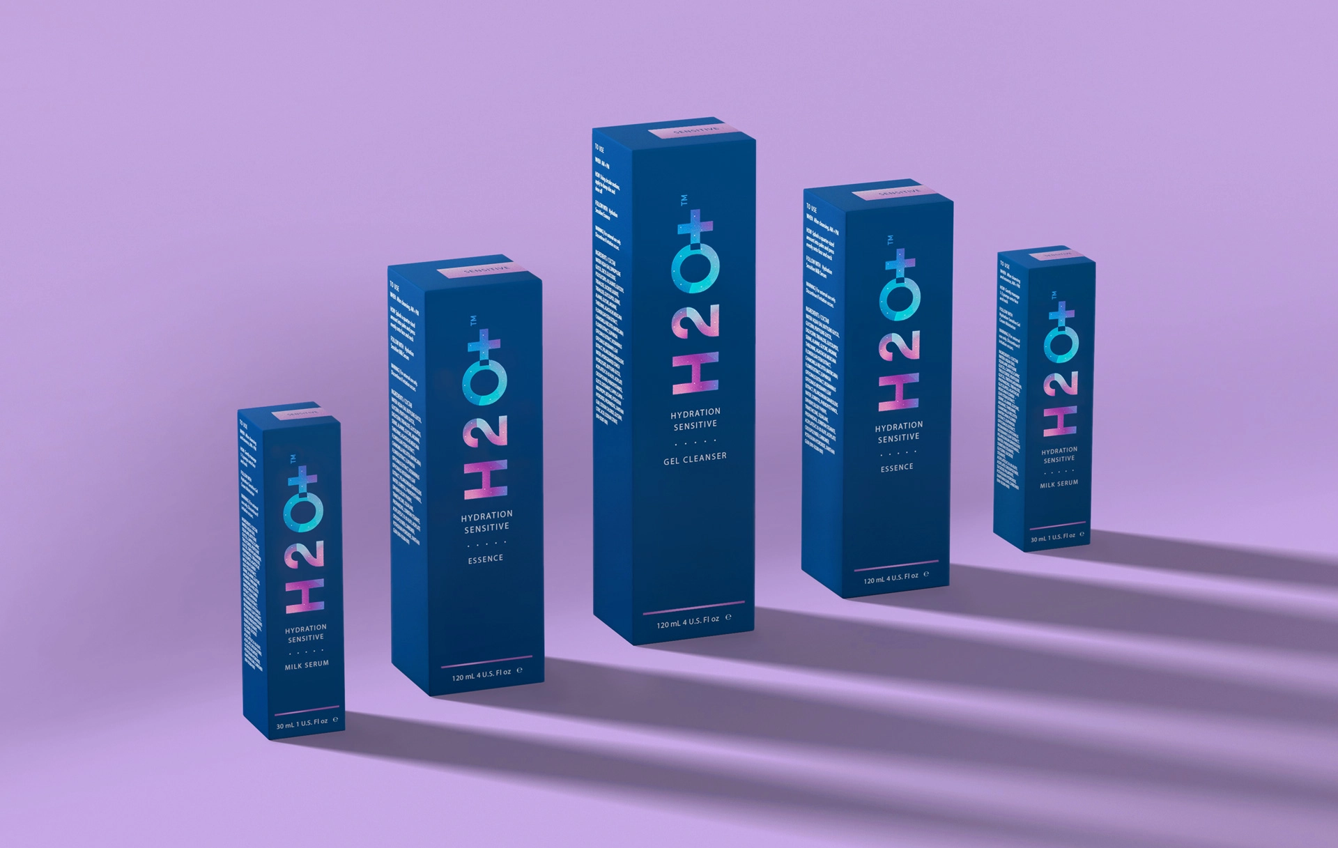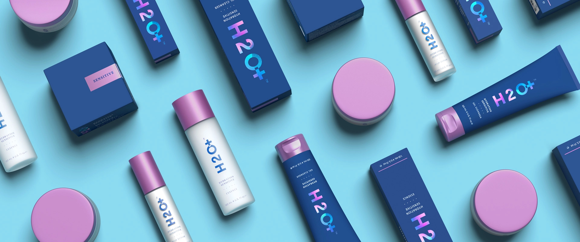
As H2O+ got ready to launch a new line of sensitive skin care and body products, they challenged us with designing packaging to catch the eyes of a different demographic and signal a shift in the company’s commitment to developing cleaner products.
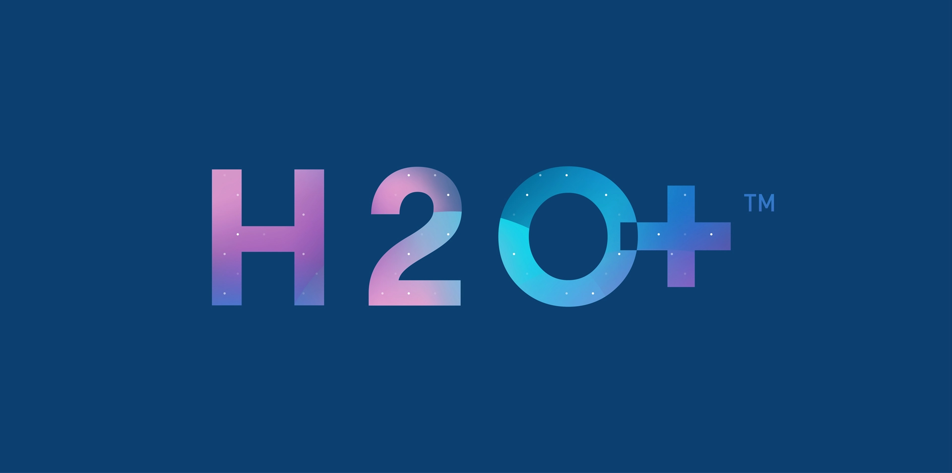
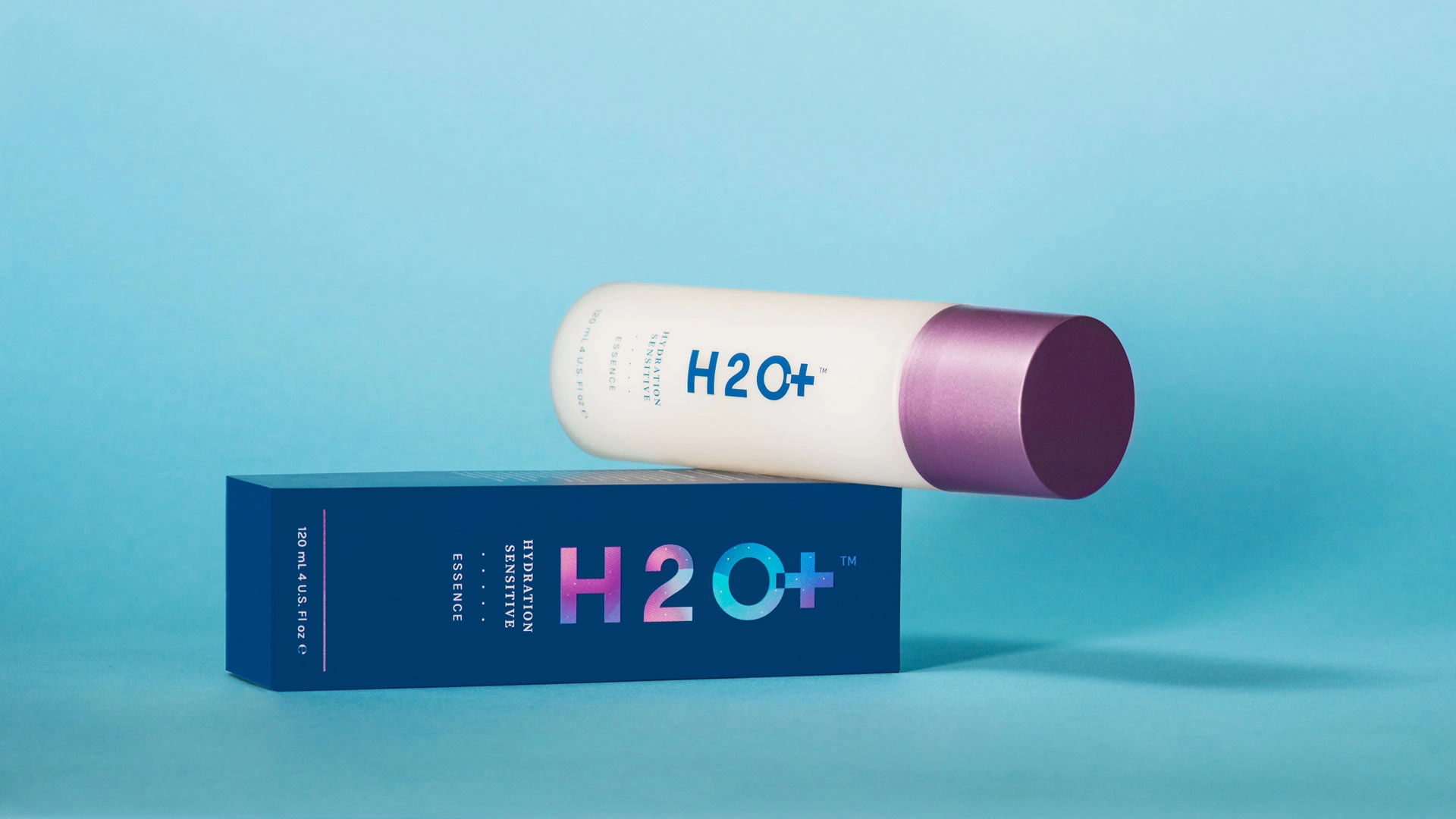
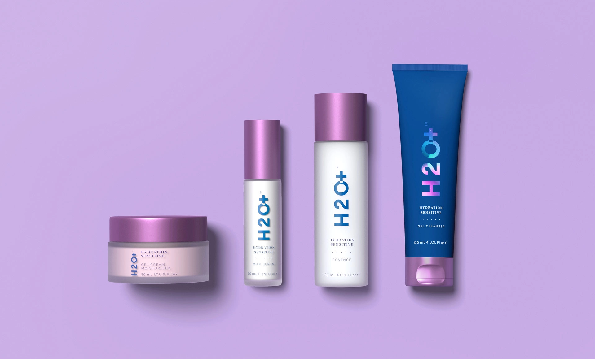
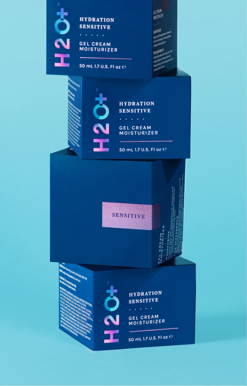
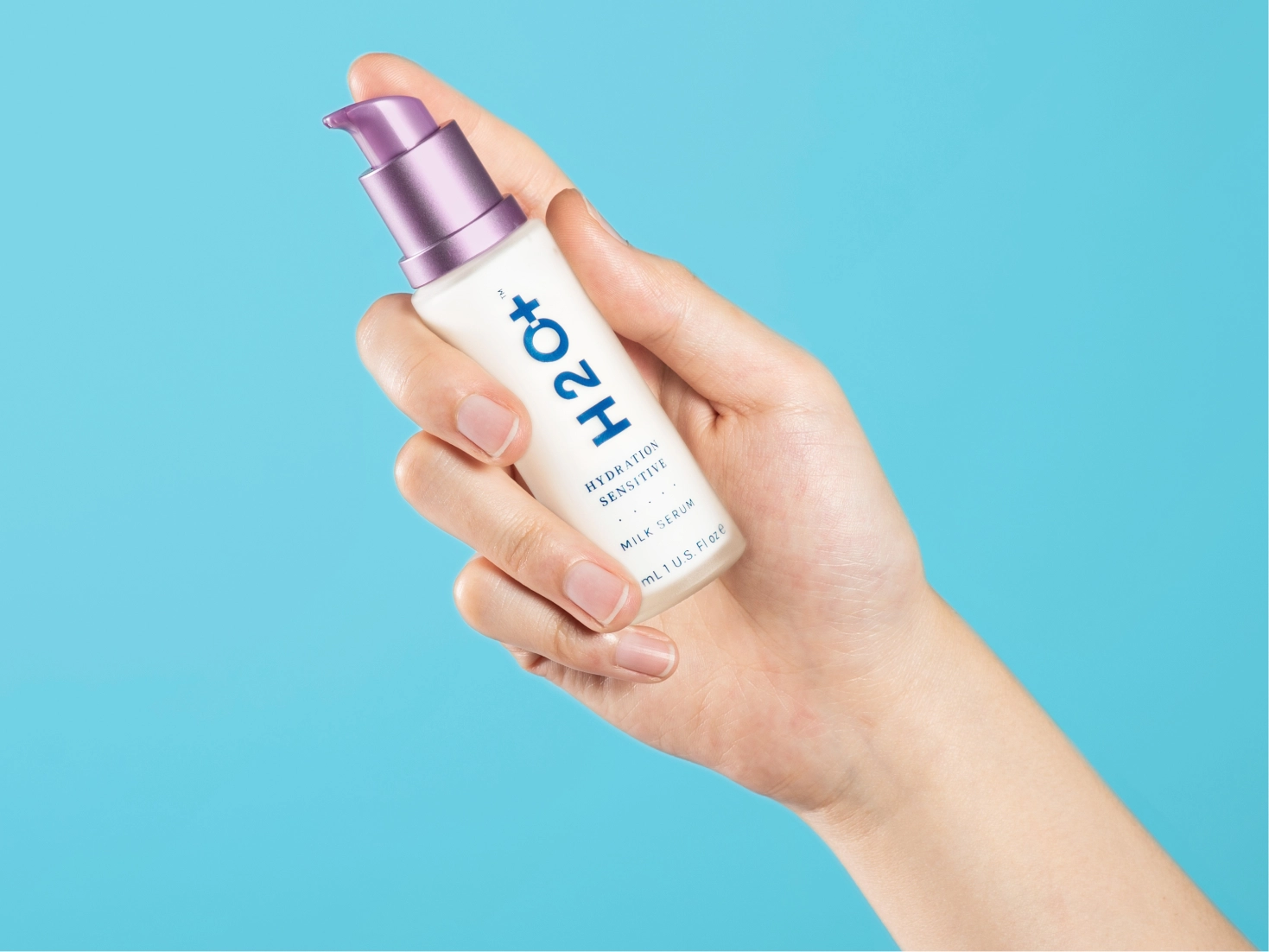
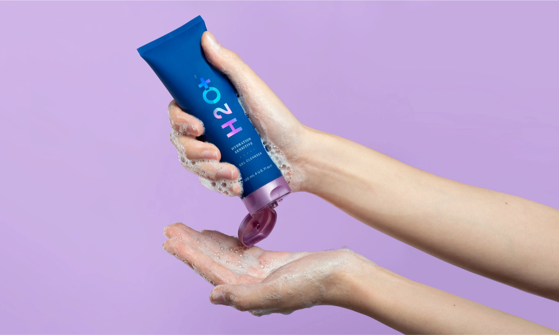
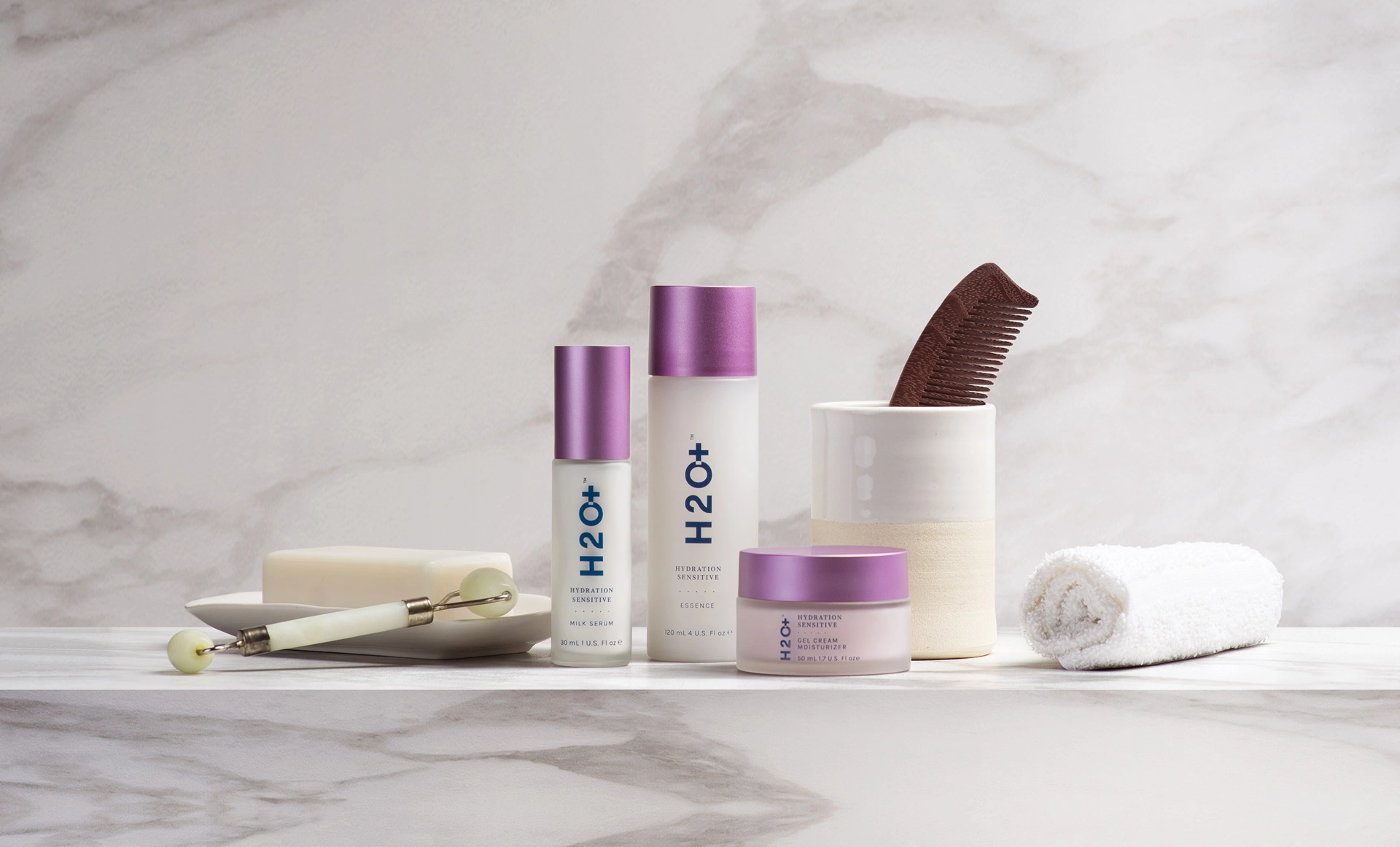
Our research showed most brands in this niche present with bright white packaging. It’s minimal and elegant; it looks crisp and expensive. It also blends together when placed side-by-side on shelves, and the lighter blues H2O+ had been using on previous packaging got lost in that glare. To evoke their products’ ability to deliver deeper hydration and retention of moisture than their competitors, we explored the levels of the ocean where light barely penetrates. The rich, almost black, midnight blue we found there became the canvas upon which the brighter colors of the extended palette can pop. Tides, currents, bubbles, and other physical characteristics of water inspired the dots, waves, and gradient meshes, giving the graphics a vibrant sense of movement. The colorway, textural elements, and bold new iteration of H2O+’s logo (minus “Beauty”, which we felt was unnecessary) update and differentiate the look and messaging of their bottles and boxes.
Still elegant and clean, also now fun and energetic, this visual continuity allows room for expansion as additional products join the line.