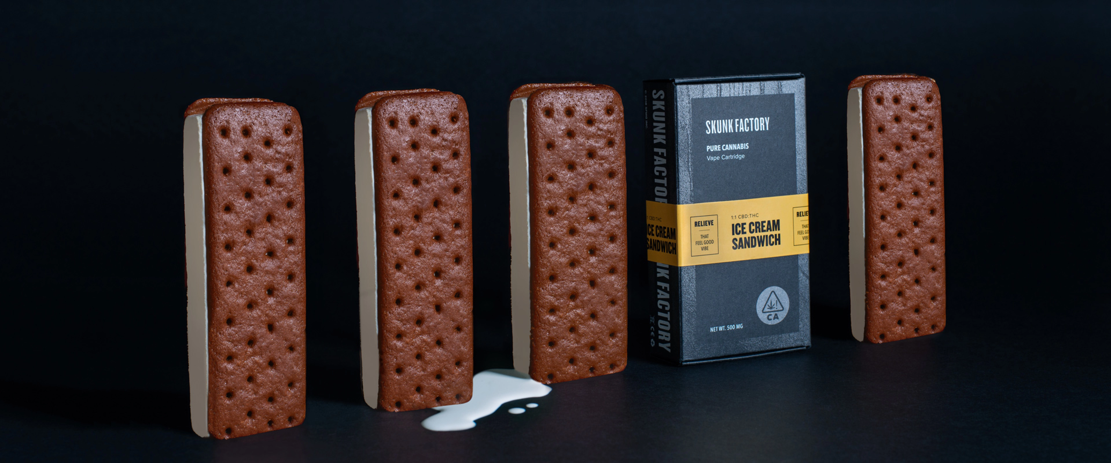
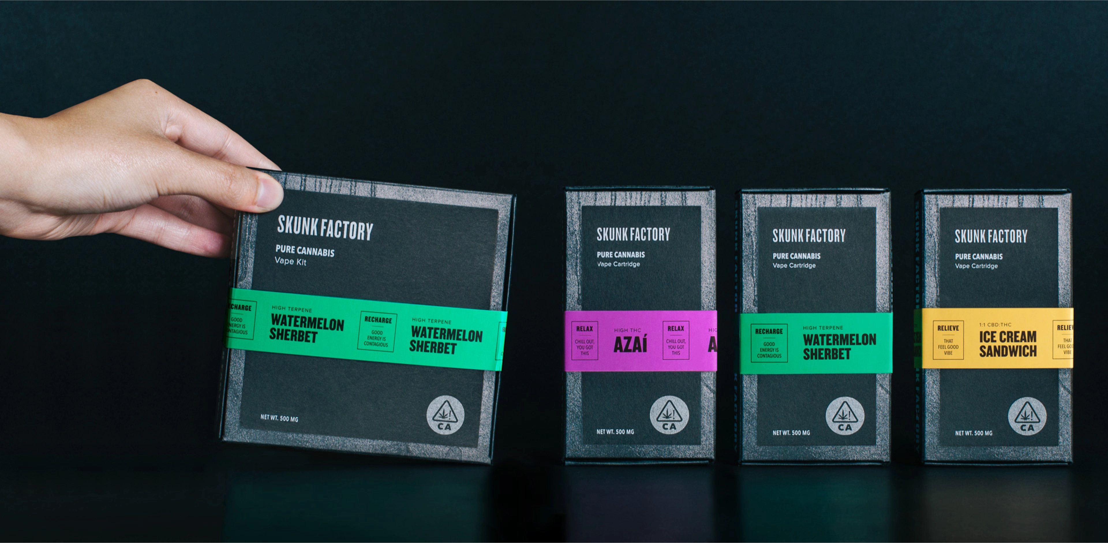
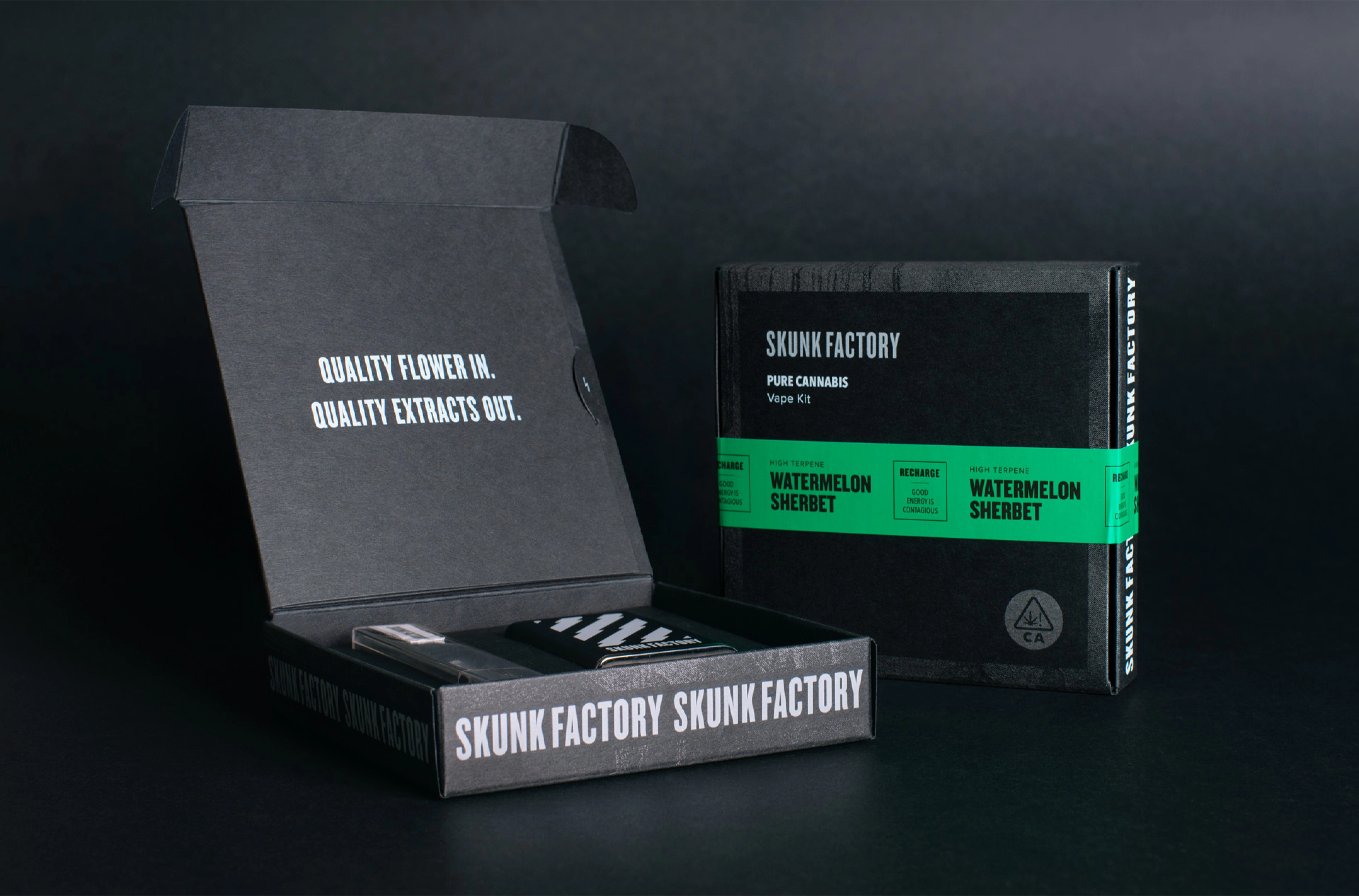
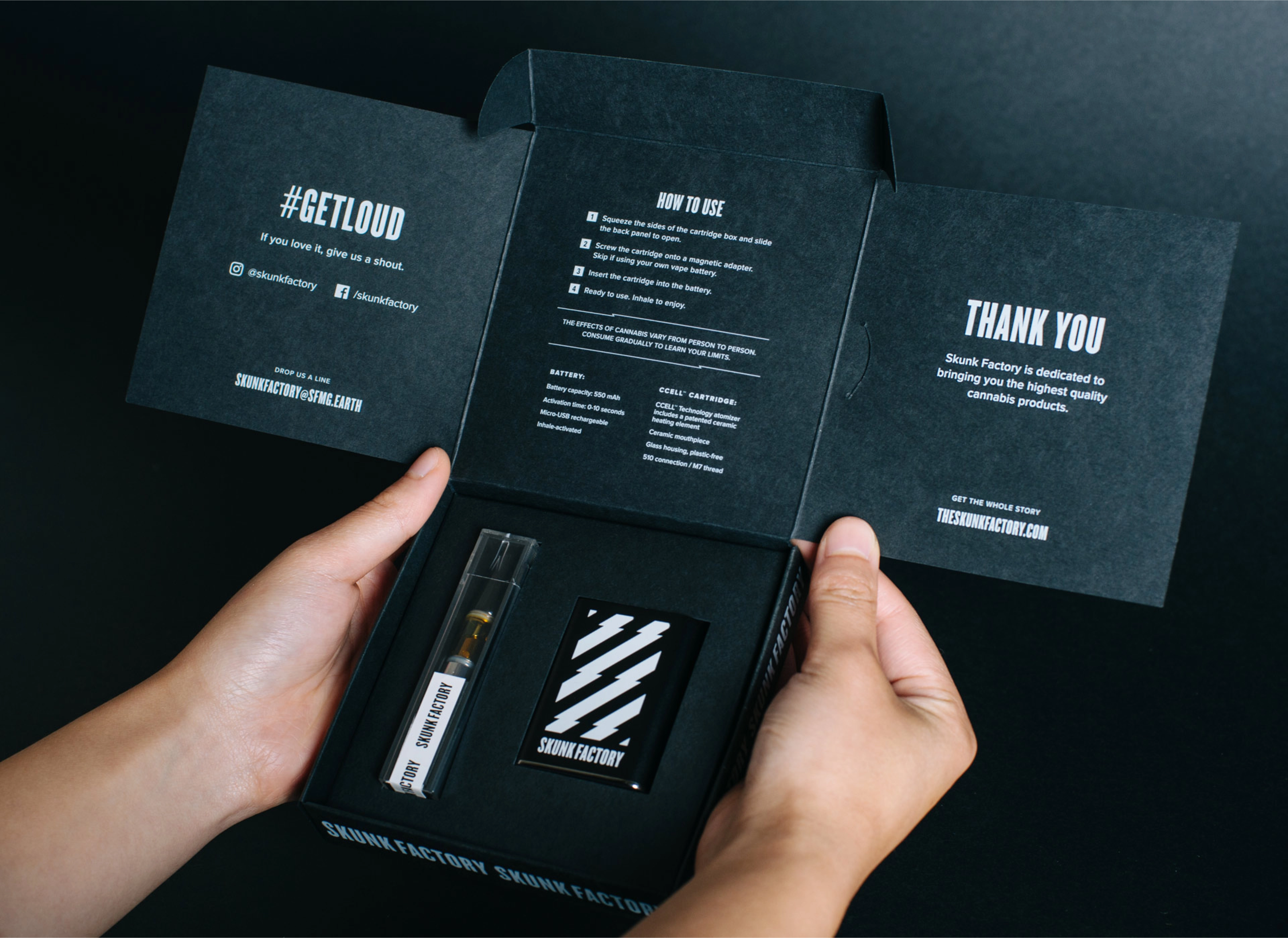
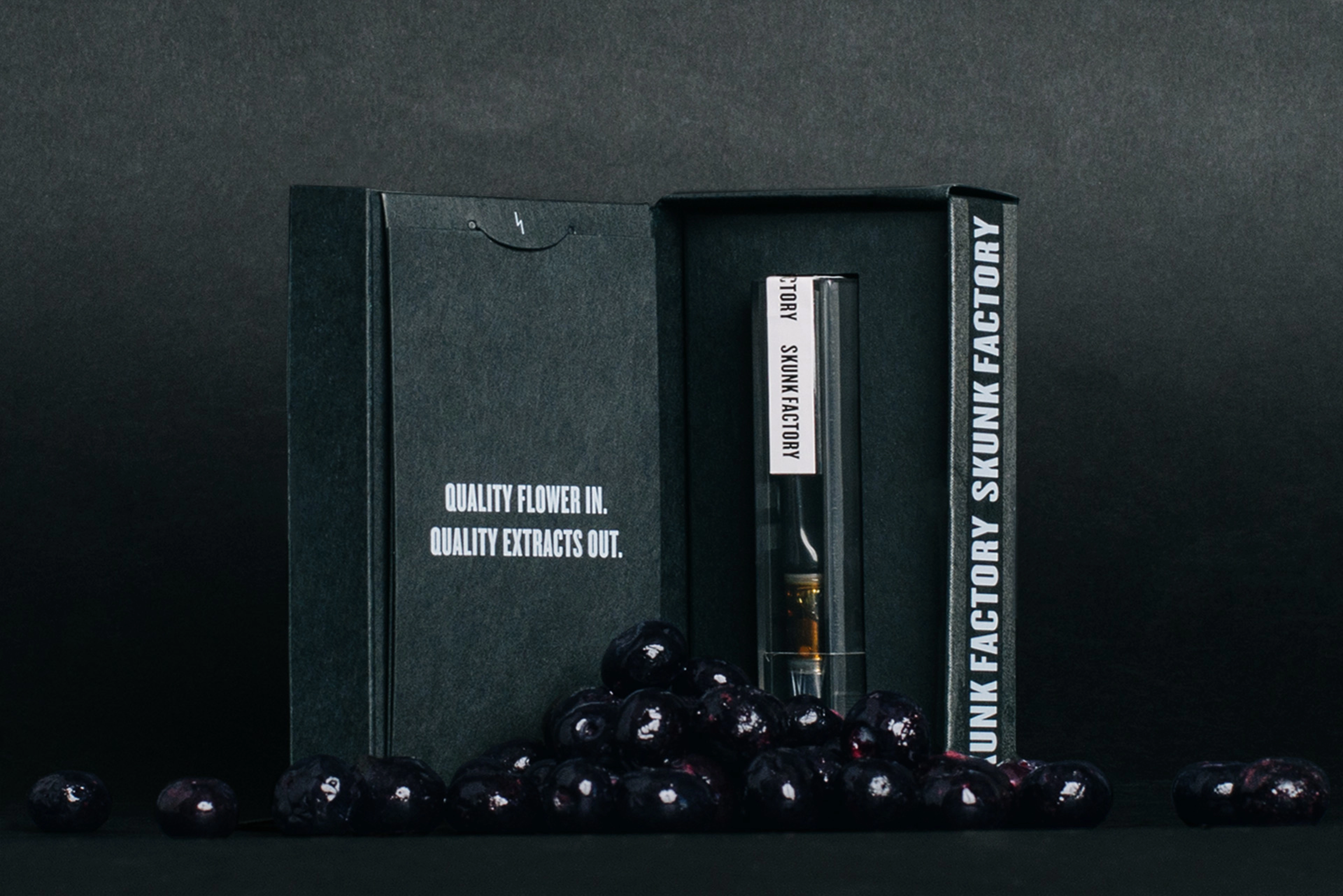
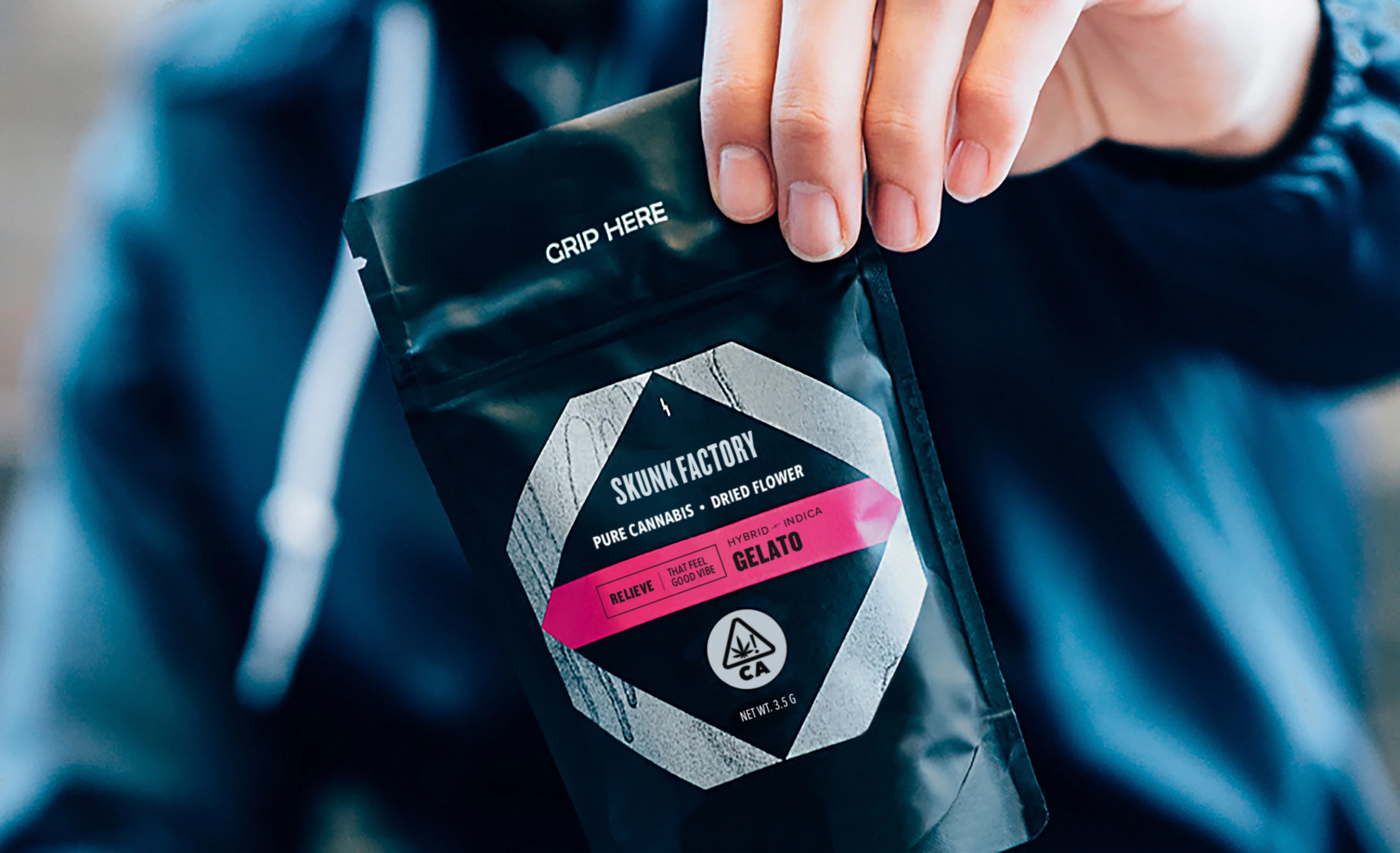
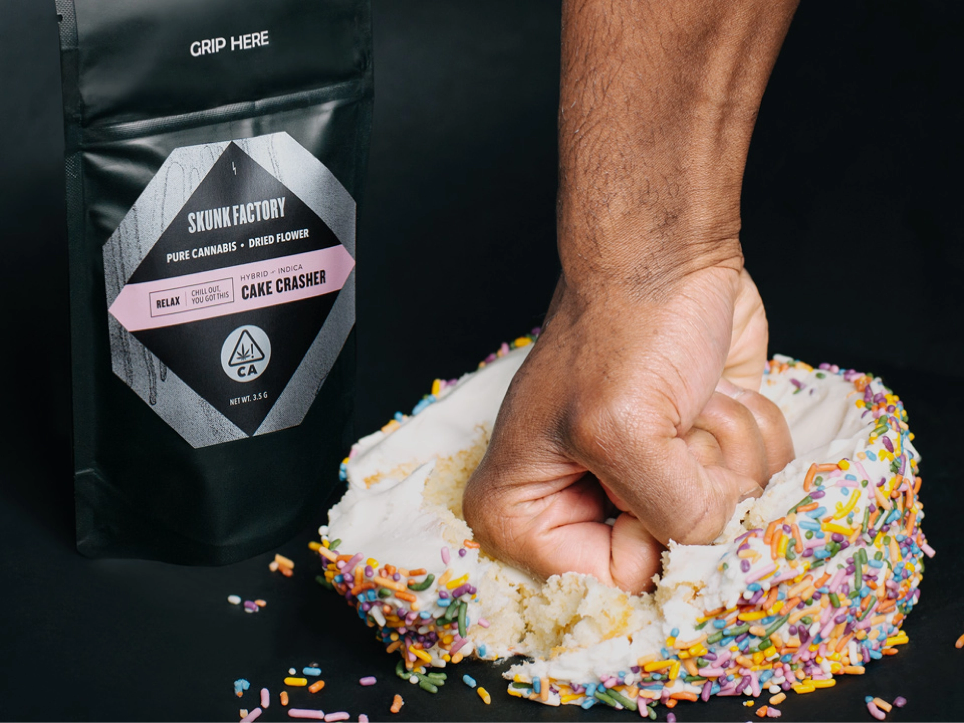
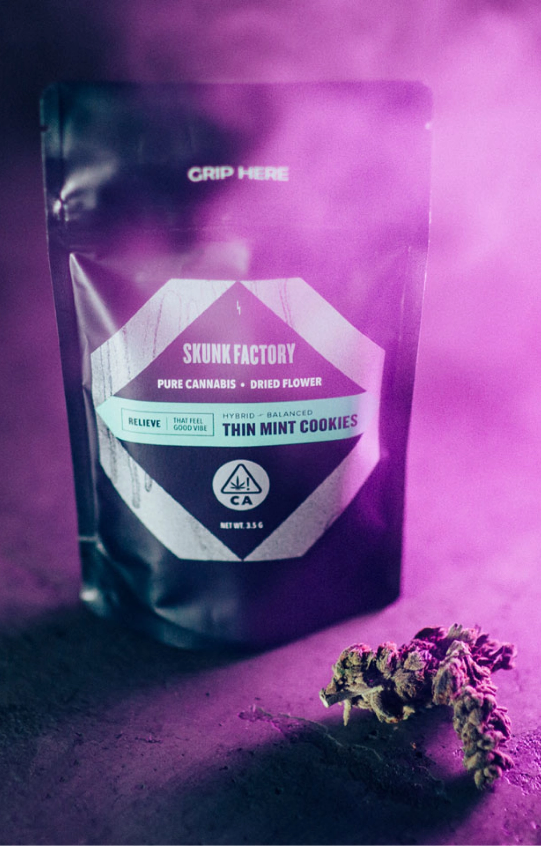
As Skunk Factory prepared to launch into the market, they came to Noise 13 to create packaging for their handheld vape kit, cartridges, and forthcoming flower.
We loved their established street style aesthetic. With that as inspiration, we built a brand identity that showcases their bold, ambitious, and unapologetic attitude, one that will appeal uniquely to their base of younger (25+) cannabis consumers.
Cannabis products have multiple levels of mood/effect, flavor, and product composition. To determine the best way to design for these variables, we collaborated closely with the client to learn about their production methods and goals for the brand.
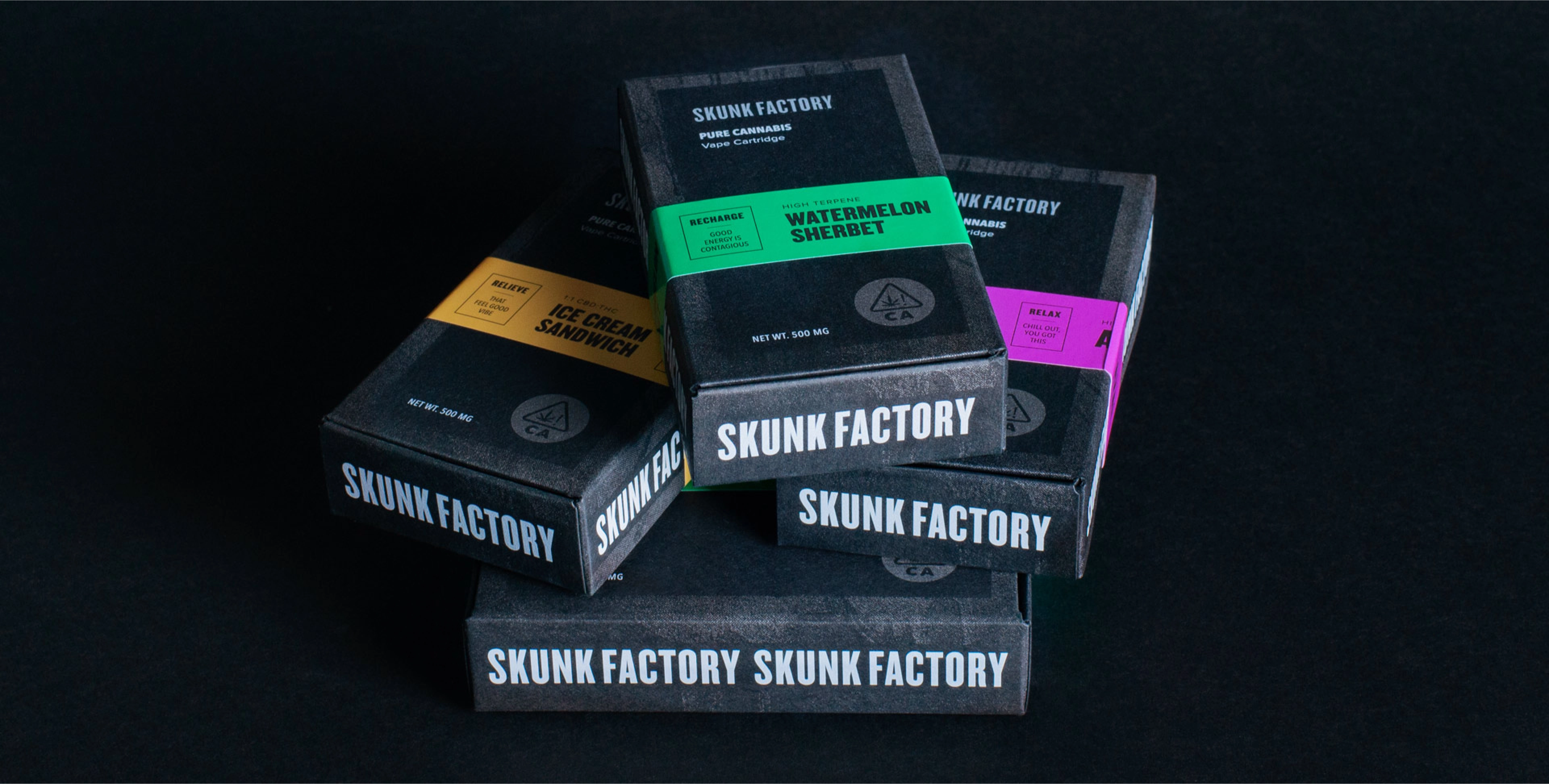
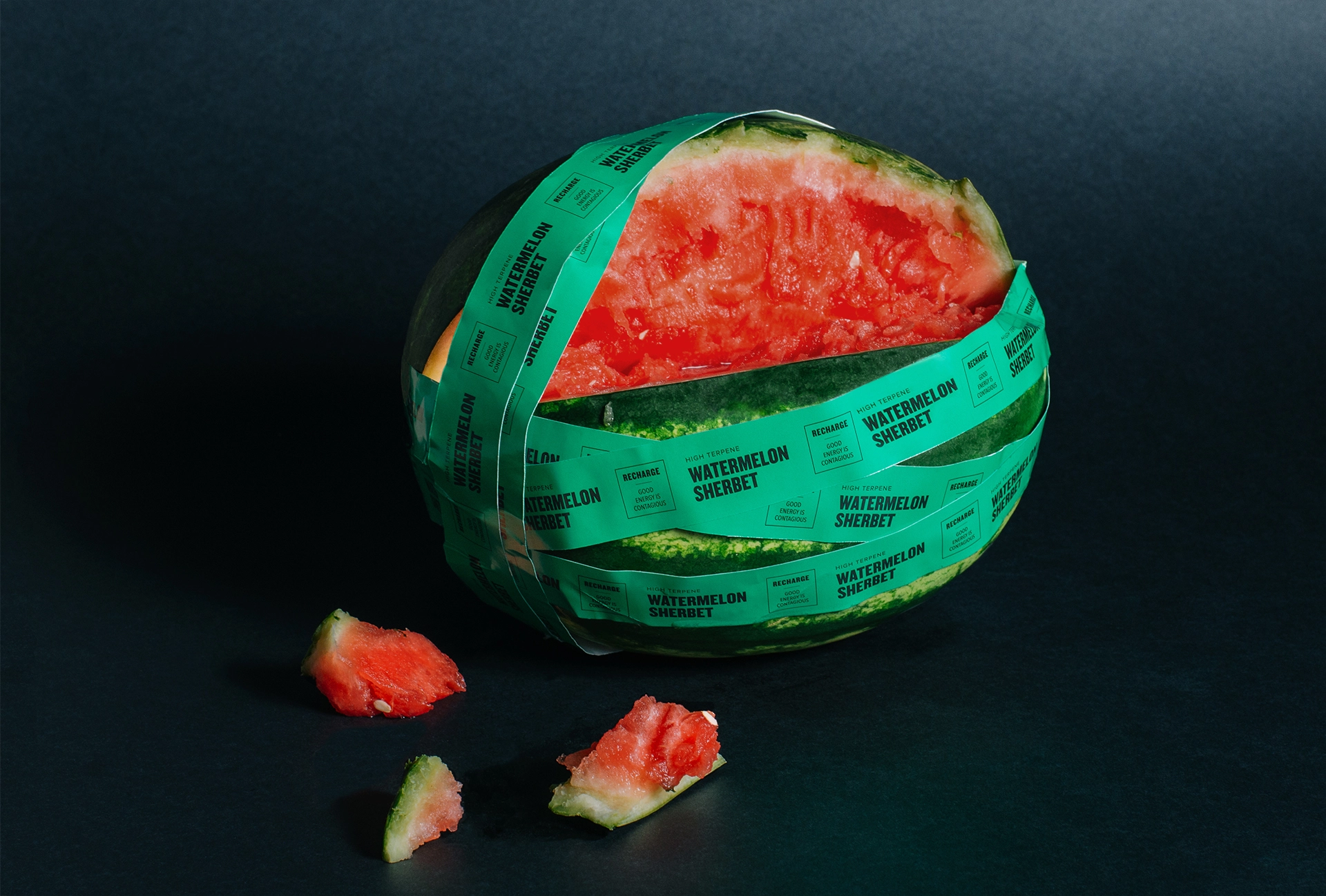
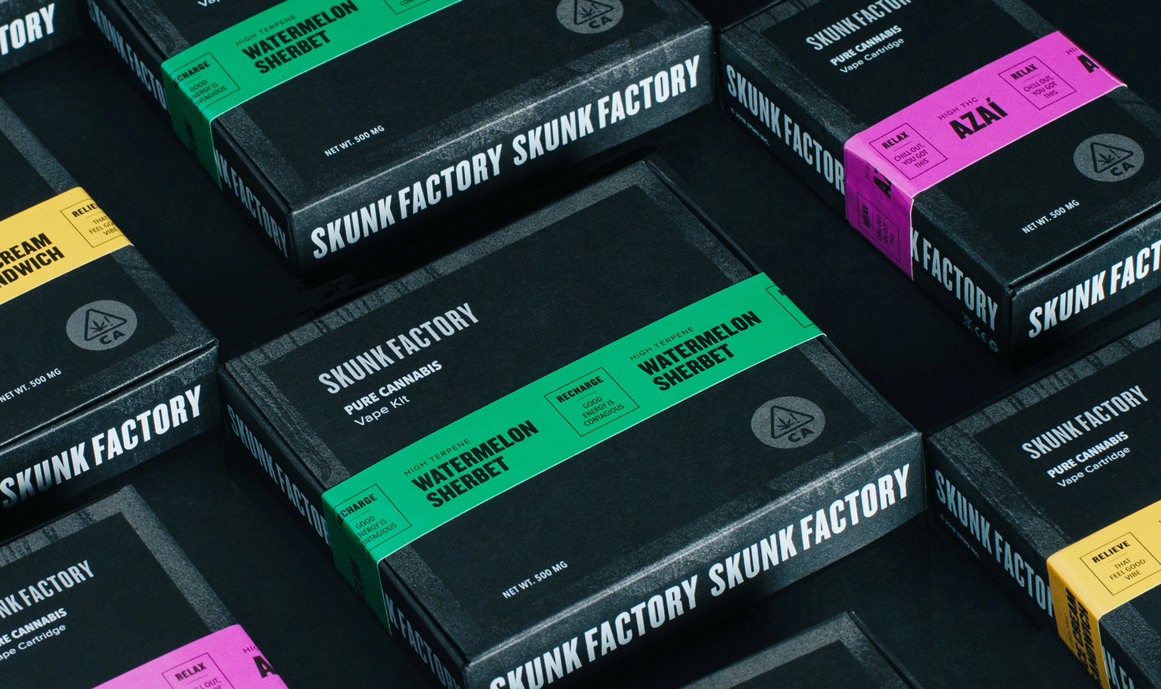
One of Skunk Factory’s primary goals was to elevate their packaging to highlight the product quality. We developed the base packaging using a sleek, uncoated black paper stock with a palette of black, white, and metallic silver. For the flavor indicator, we were inspired by caution tape. By repeating stripes and text—mimicking street signs and streetwear fashions—and incorporating pops of bright color with a glossy sticker, we were able to punch up the look and feel of the brand.
The biggest challenges came from having to work with constantly changing regulations for cannabis packaging. Extensive research went into understanding child-resistant forms, tamper-evident tape, and highly specific legal requirements. We then had to figure out how to cram a lot of less-than-beautiful legal copy onto a small box while making it look cohesive with the brand and high-end.
Strong production was essential to our success, and we were fortunate to have CA Litho as our printing partner. Together we ironed out challenging production issues—like devising a solution for the interior paper tray and getting the silver spray paint texture to read clearly on highly absorbent stock. With collaboration and some compromise, we were able to select something that matched aesthetically and fit within the client’s budget.
