March Top 13: Coffee Designs
Spring is around the corner and the days are getting lighter, but it’s technically still winter and we lost an hour last weekend. Here are our Top 13 coffee designs to kick you out of hibernation.
01
There are a lot of great looking vector-based illustrations for coffee brands out there but we really like how Highwire Coffee has taken a completely different approach.
02
Pod Parcel’s brand and packaging feels very on trend with the playful type and vintage-inspired color palette. What we like even better are that the pods are fully-compostable!
03
Elixir Coffee is derived from an alchemist process and we appreciate how that story is so well-reflected throughout the brand.
04
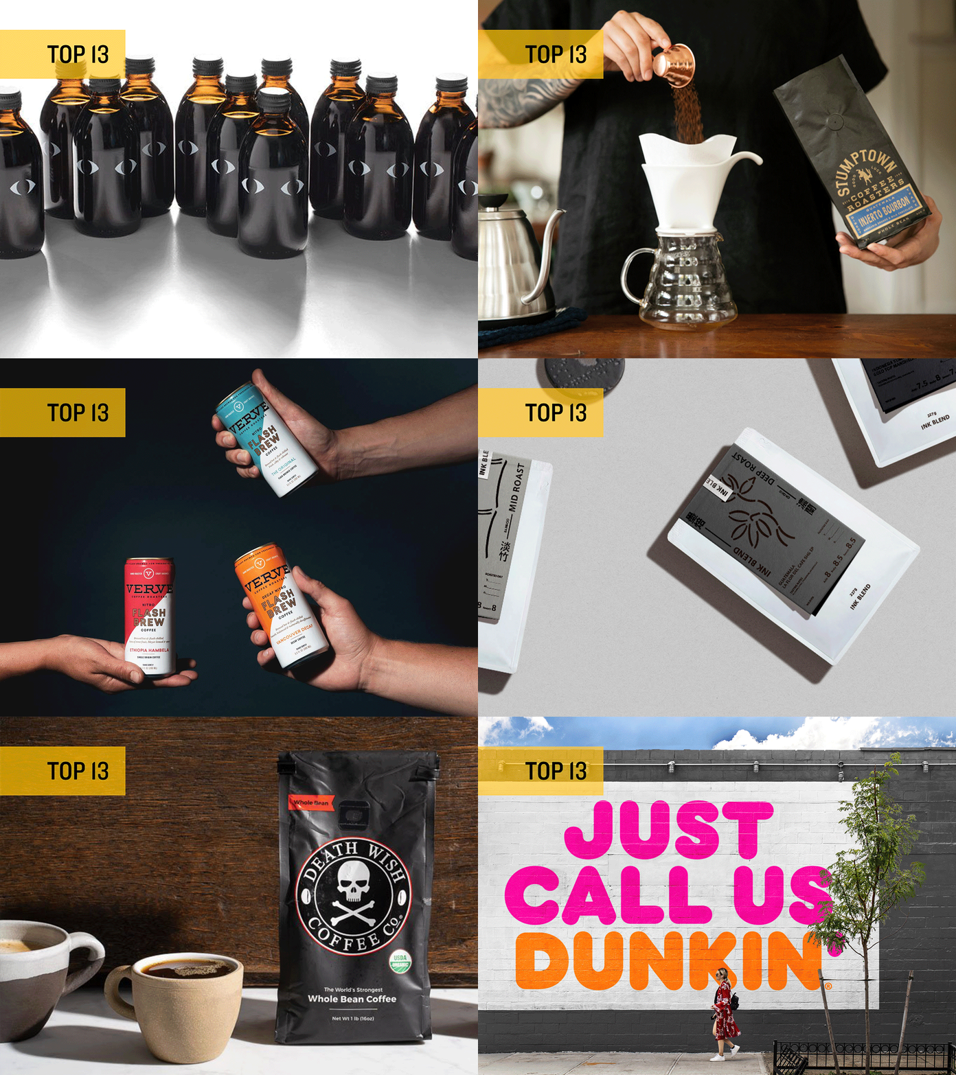
The monochromatic color scheme and bold, simple line illustrations of Ink Blend stand out from much of what is out there.
05
With twice the caffeine of any other coffee on the planet, Death Wish’s name and design fits the product perfectly.
06
A lot of coffee brands go to great lengths to visually separate all of their blends. We dig how Blend Station has kept everything so simple and consistent.
07
You don’t see many coffee brands out there that only use typography on their bags but 25 Coffee Roasters has done it, and done it well.
08
Redemption Roasters is an artisan coffee company whose beans are prepared by inmates enrolled in a roastery and barista academy at Aylesbury Young Offenders Institute, which aims to reduce reoffending rates in young offenders. Fantastic mission and fantastic design.
09
Stumptown Coffee Roasters is credited with the rise of craft, independent coffee roasters and elevating the coffee-drinking experience. Their current packaging is biodegradable (everything except the tie and the valve) and is made primarily of renewable wood pulp. Yes, please.
10
Workaholic is another great example of a brand really having fun with the visual expression of their name.
11
It’s quite a statement for an extremely established brand to delete half its name and redesign all of your packaging. The new Dunkin brand stays true to its roots but is more flexible, perfect for growing beyond their original offering and expanding into new markets.
12
Dark Horse, a small San Diego based roaster has leaned in to so-cal, beach town kitsch. While their packaging is pretty, but safe, their swag program is fun and loud. Dark Horse t-shirts and coffee mugs are perfect for a hipster surfer, looking to knock back a cup of joe before hitting the waves.
13
Verve’s clean, thoughtful packaging system is a wonderful compliment to their beautifully consistent retail interiors. This is third-wave coffee branding done right.
