The theme for this year’s In/Visible Talks is RE:DESIGN, in keeping with that, here’s a look at some of our favorite redesigns from 2020.
We’ve mentioned this one before, but the Fisher-Price update by Pentagram definitely deserves to be on this list. So fun.
A reminder that big, corporate identity systems can take a very long time. Nissan started their rebrand in 2017 and just launched in 2020.
Every time Apple announces a new product they claim that they “rethink everything.” However, the redesign of the Macbook Pro with the new M1 chip is a totally new beast. Can you say, “Twenty hours of battery life with 5X the graphic speed?!” We can’t wait for the 16” version to drop.
Once a year, on Air Max Day, Nike introduces a whole new selection of redesigns of their classic, 1987 Air Max 1. The 2020 Air Max grouping was completely on fire.
On a less serious tip, Bert Loeschner’s redesign of the iconic Eames rocking chair brought a big smile to our faces. And 2020 needed as many smiles as you could find.
Inspired by the visual language of old-school advertisements and wheatpaste posters, Pràctica has created a stunning rebrand befitting of the Irvington Theater.
With a rise of brands relying heavily on illustrative graphics, Colin’s refresh of the financial service company Robinhood has knocked it out of the park with their strong, evocative illustrations on complex topics such as ETFs and Fractional Shares.
In the past year, we have relied heavily on remote office software and spend a ton of time in Google Workspace. In 2020, Google Workspace redesigned its Google G Suite apps, including Gmail, Google Docs, and Google Calendar. The new icons are designed around Google’s four-color aesthetic and remain in their pleasant, minimal style.
Australian Centre for the Moving Image has introduced a new identity that provides a playful expression of ACMI’s curatorial role in framing screen culture. The logo’s modularity allows for some fantastic compositions, giving the design system plenty of flexibility.
Bokhari is a Norwegian brand that produces premium, hand-crafted interior textiles, and bags. They introduced a new look last year. It’s heavily inspired by the process of textile production, weaving techniques, eastern tradition, and craftsmanship. All of that, combined with Scandinavian design values, equals a simple and classy solution.
The brand overhaul of LAKA, a UK-based insurance company targeted at cyclists, is a pure tour-de-force. We’re loving the attitude that the big modern color palette, photography style, and copywriting bring to an otherwise not-so-sexy industry.
Kudos to Plastic Paper for this eco-friendly reenvisioning of the plastic to-go bag. The bamboo paper netting is super low impact and the smiley face design retains that classic corner store charm.
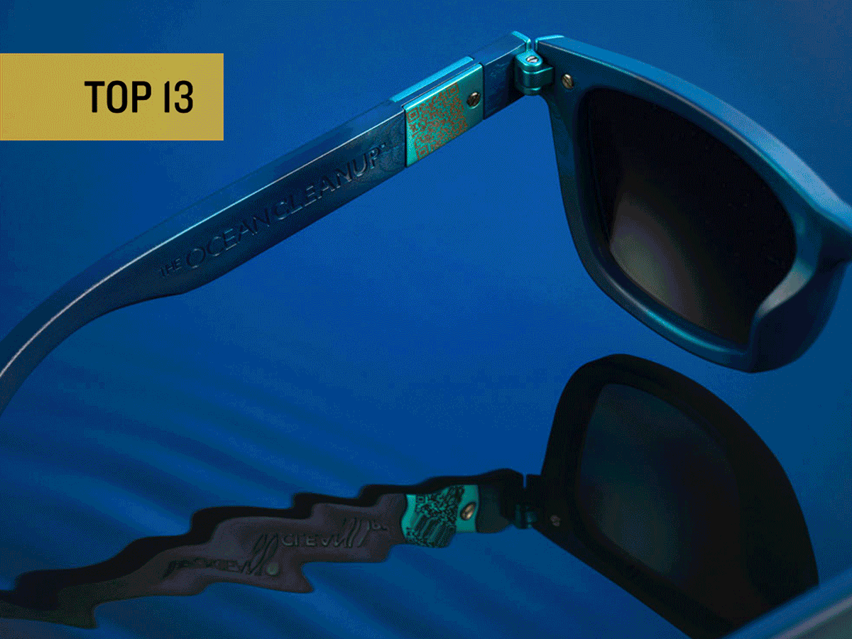
The Ocean Cleanup is reimagining how to reduce the pollution in our seas by producing sunglasses made entirely from plastic removed from the Great Pacific Garbage Patch. Working as a non-profit, 100% of the proceeds go straight back into future ocean cleanup. You get to look stylish while helping the environment, what’s not to love!