Camp Earnest | Brand Identity with Heart
Client
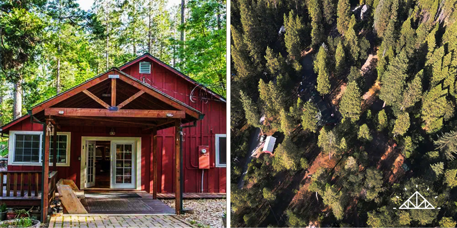
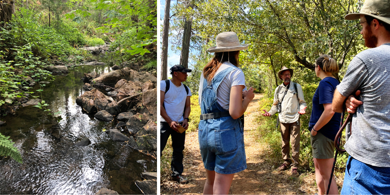
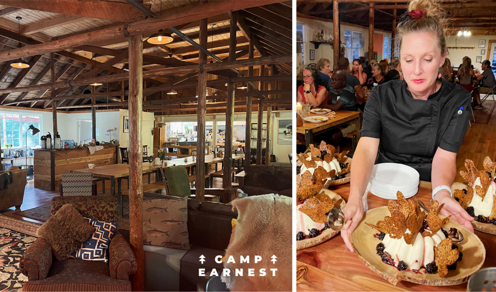
Camp Earnest is a sublime, warm and welcoming place to escape the city, drop in, connect, create and reflect. The site of a former children’s summer camp, each purpose filled space from the cabins, to the bell tents, to the bath house and outdoor amphitheater have been lovingly transformed into the perfect setting for visitors to connect with their purpose and engage as joyful stewards of all life on this Earth. Family-style dinners from local and Bay Area farm-to-table chefs are a main feature at Camp Earnest, filled with the finest produce from organic farms and vineyards in the area. Their on-site regenerative garden is often found filled with afternoon snackers, picking treats from the vine. The goal at Camp Earnest is to help visitors reinvigorate connections with one another, and with nature. They hope to foster mind-expanding conversations and set the stage to make new friends while enjoying shared food and drinks in a safe and healing environment.
Founding Principles
- Inquiry & Civil Discourse
- Humility
- Empathy
- Adventures in Nature
- Food is Love
- Next Paradigm Thinking
Website: www.CampEarnest.com
Industry: Travel & Hospitality
Project
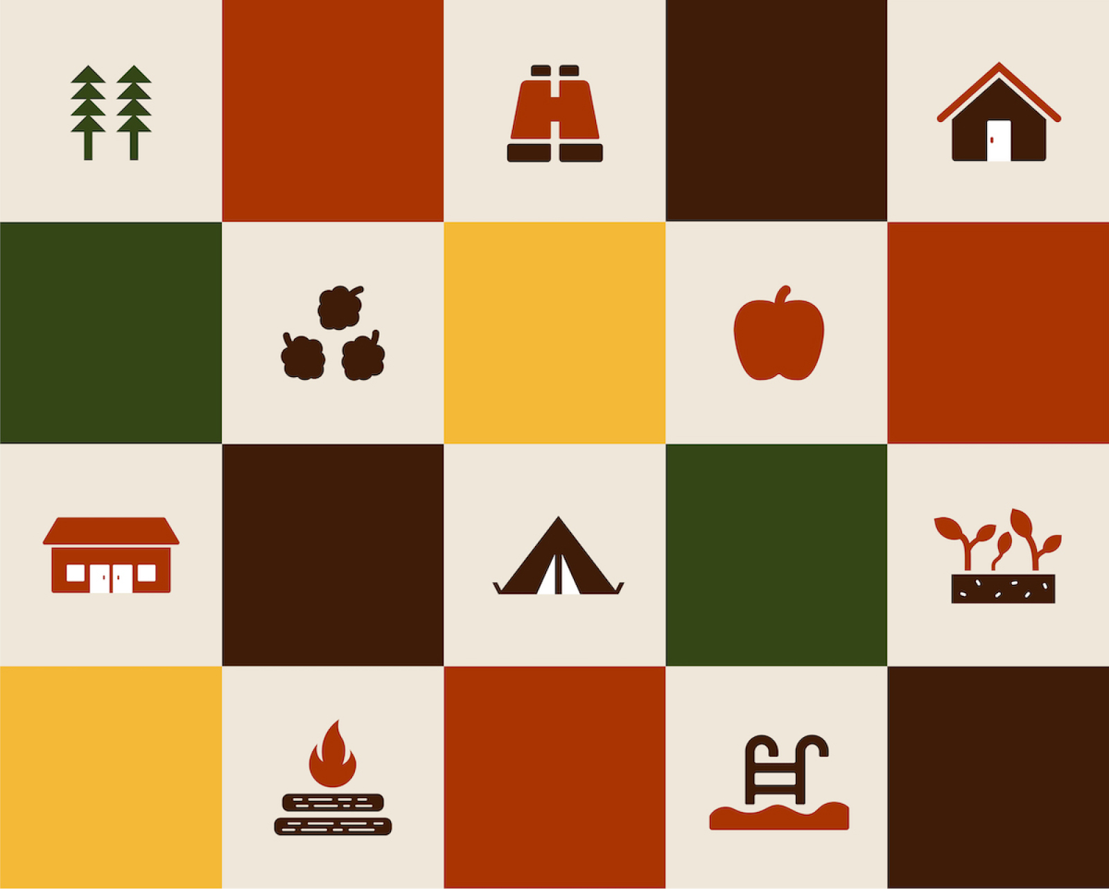
We knew this project would be a joy from the start. Everything about Camp Earnest and its founders matched our values and passions right down to their founding principles. Businesses who stand for wholehearted and purpose-driven practices are our dream clients! The challenge was how to create a foundational brand identity that would help them scale in meaningful ways, quickly, while keeping a tight budget. As any creative knows, the more passion you feel for a project, the more time you’d like to spend with them. So we knew we had a worthy challenge ahead. Camp Earnest needed a brand identity system that could scale beyond logo and monograms, to swag and signage, too.
Work
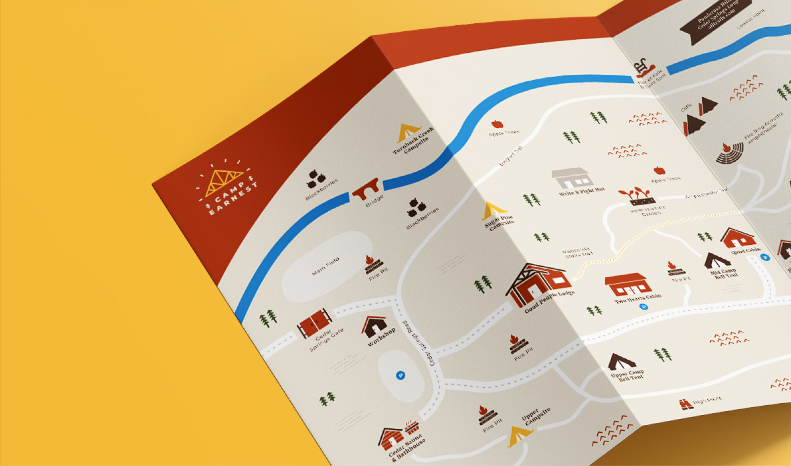
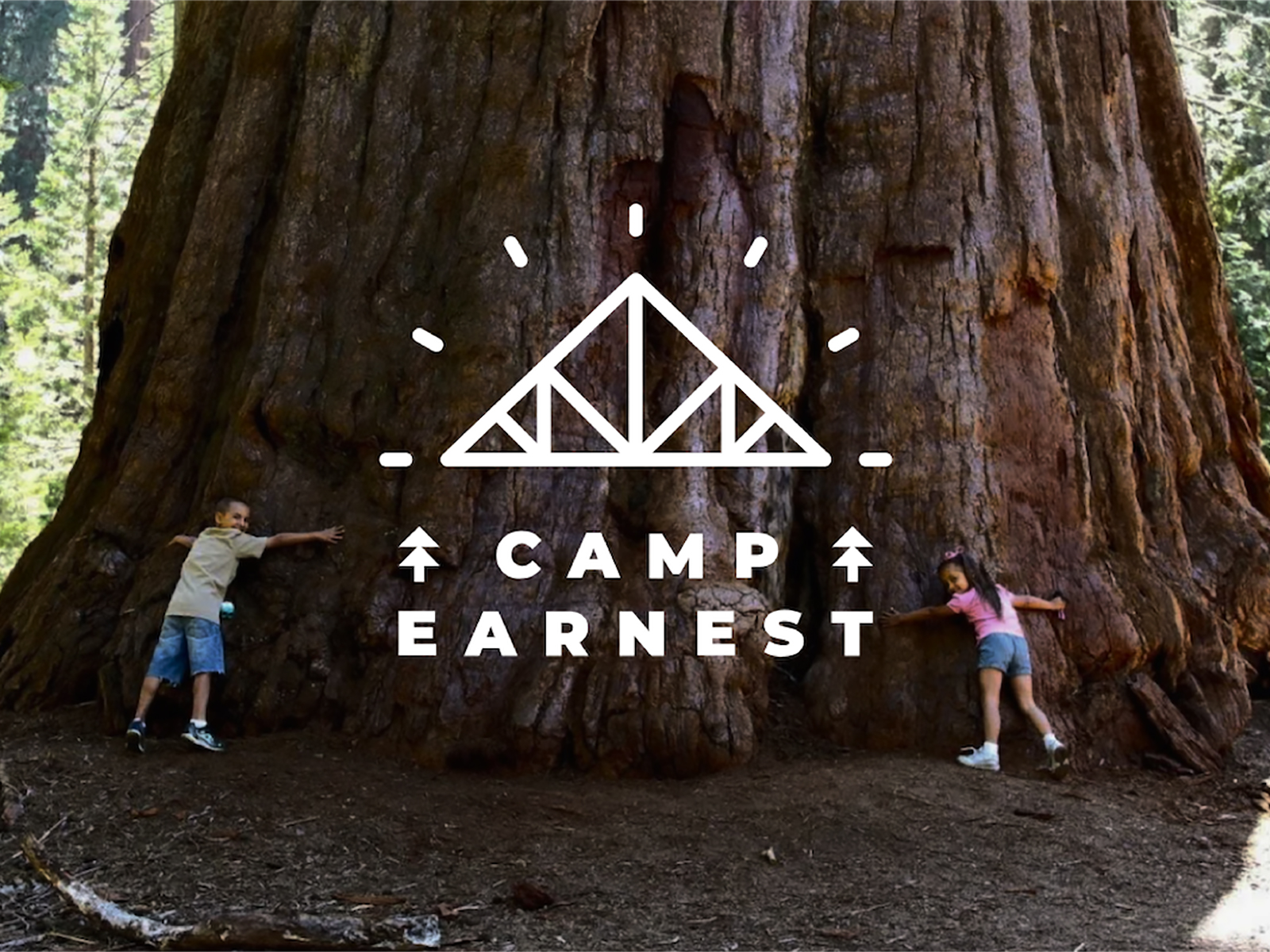
The challenge of landing on a logo for this special space was inspired by the energy of gathering and the main lodge, itself. The lines of the logo closely follow the roof and tresses of the porch, the raw feeling of wood craft and even a nod to the designs associated with our national park systems. This was combined with energetic lines to convey gathering of people and the feeling of the collective power possible with community building. It was a winning combination for the clients and their vision for this special space. By design, this logo translates perfectly to the monogram and was embossed on the many wood benches dotting the property, celebrating the mighty cedar tree. The last touch for our work together needed to be emotional, something that would really connect the visitor to the space and their time spent. There happened to be an old, tattered map on site, left over from the children’s camp. It was worn and no longer logistically accurate but it possessed an energy so full of life and inspiration that we knew this map needed to be renewed in a Camp Earnest light.
Result
We are thrilled to have been able to support these clients in creating a brand identity system that was not only a genuine and loving expression of the business they founded together, but spoke to the bond between them, as well. They feel so connected to the Camp as a place and to the Camp Earnest logo, they’ve had it embossed on their wedding rings, designed by one of our very favorite local SF jewelers, Fiat Lux (also beloved clients)! It is a huge honor to be included in their love in this way and even more dreamy that we could combine our creative craft with another highly respected creative. The world can be wonderfully small in it’s largess! We are so grateful for our ongoing partnership with Camp Earnest and can’t wait to see and experience for ourselves this incredible space. Cheers to the future of connecting authentically and to more excellent projects with incredible clients who are dedicated to serving people and planet.
